Thursday 27 September 2007

Antonio Petruccelli (1907-1994) – a Centenary Tribute


On this day 100 years ago, Antonio Petruccelli was born in Fort Lee, New Jersey. It’s a very good day to pay tribute to the excellence of this most inventive and resourceful of American illustrators. Slowly but surely, the historical record is beginning to take note of his existence but there are many, allegedly exhaustive accounts of the history of American illustration in the Twentieth Century in which he was passed over in favour of yet another chronicler of the American West or a minor master of costume drama. Even Steven Heller’s “Stylepedia” omits him despite finding space for many modest talents, Raymond Peynet for example.


The Fortune magazine cover was his great platform from 1933 to 1945. He created 24 memorable covers with characteristic precision and a wonderful quality of touch. The Fortune cover was a large scale and lavish production, printed by the gravure process on heavy card. Petruccelli’s witty and imaginative contributions made full use of the potential for rich and dense colour combined with a great repertoire of hatch, scratch and stipple. The images he devised were entirely his own and seemed to owe very little to the work of his contemporaries. An early training in textile design supplied him with an eye for the possibilities of repeating images and a flair for unusually rhythmic compositions. Many images suggest an intuitive understanding of the dynamics of Italian Futurism combined with an Art Deco sensibility.


In the early Eighties, when US libraries were busy microfilming and dumping the original issues (the shocking story of this highly dubious episode is told by Nicholson Baker in his excellent book, Double Fold), large quantities of discarded Fortune magazines found their way to the UK and this was my first sight of these visual treasures. Fortune cover art was superb and successive art editors maintained a very high standard but of all the artists, including such great names as Cassandre, Joseph Binder, Diego Rivera and Leger, Petruccelli made the strongest impression. For the first ten years the cover followed a clearly defined template or framing device and Petruccelli, above all others, exploited and played with this device to stunning effect. In compositional terms he favoured oblique viewpoints and strong diagonals. Where possible he would follow the progress of his work at the printing stage and he was very exacting on points of detail especially where colour was concerned. The notes he wrote about his covers for Chris Mullen are very informative and can be seen here.


It is interesting to reflect on the reasons why Petruccelli’s work is generally overlooked by critical opinion. The principal focus at present in historical study is from mid-century onwards and the illustration of the pre-war years gets less attention. Although there is still a lot of interest in Art Deco, Petruccelli’s work does not fit comfortably into that category despite some affinity. There is a long established critical preference for artwork that embodies the hand of the artist; fluid handling of materials and gestural drawing are especially valued. Petruccelli’s preference for formal clarity and crispness of presentation was not calculated to win favour with that sector of critical opinion. The high esteem in which the quality of Fortune artwork was held seemed to decline rapidly in the 1960’s and despite some recent rehabilitation still has some way to recover. Another factor is that Petruccelli’s work was mainly confined to Fortune and the New Yorker, both niche market publications with a mainly well-heeled readership. If his work had graced the pages or covers of Saturday Evening Post or Ladies Home Journal it might receive more attention. Finally, his personal modesty and lack of appetite for self-promotion must have played a part.


Chris Mullen visited Petruccelli at his home in Mount Tabor, New Jersey in the summer of 1986 where he was received with great hospitality and generosity and a pictorial record of his trip and the results of his research can be read on his website, the Visual Telling of Stories. In the course of that visit Petruccelli was kind enough to make a gift of a number of signed and dedicated proof covers to Chris and myself and those covers are highly treasured possessions. Antonio Petruccelli died, aged 87, on November 11th. 1994 – this is dedicated to his memory with deepest thanks for all the wonderful work he produced.

Friday 14 September 2007

En Vacances


Yet another period of silence from buttes-chaumont.blogspot. Paris is the destination this time, which is a good reason for posting some relevant artwork. Images of travel from a kinder, gentler time as lazy journalists say, at least for those who could afford it. The French are conscientious guardians of their graphic traditions (le pub) and there are always new discoveries to be made. Back on September 27th.

Thursday 13 September 2007

Dickies of Fort Worth


As worn by Men of Production since 1922. One of those points where the worlds of Capitalism and Communism intersect with a celebration of the dignity of the working man not to mention an equal imposition of conformity with the provision of a uniform. Heroes of Labour and Men of Production eternally toiling in the service of the cold war. Marching with a purpose, lunch boxes at the ready. The guy who got the girl wears a troubling expression of wide eyed lasciviousness but the others possess a military bearing in keeping with their mission to defend freedom. The brand has survived into the present and the Dickies Texan Waterproof Rigger Boot is the first choice in the building trade.

Monday 10 September 2007

Charles Addams


The lugubrious and macabre talents of Charles Addams would not seem to be ideally suited to the demands of advertising illustration. Few products would on the face of it, benefit from an association with the Addams universe of monstrous malevolence. However, the New Yorker magazine would have been regular reading for the art directors and account executives of Madison Avenue and there’s always the temptation to assume that what goes down well in Manhattan might do likewise in Billings, Montana or Corpus Christi, Texas. Addams’s darkly humorous drawings had been published in the New Yorker since 1933 and it was the manufacturers of Lee Tires who had the imagination to employ his drawings to illustrate some of the more unusual hazards from which Lee Tires would provide protection.


Other advertisers sought to make use of Addams’s drawings to obtain some of the sophistication of the New Yorker and the examples here include a shirt manufacturer, Life Savers and Briggs Luxury Tobacco. Curiously, the Life Savers ad plays upon female insecurity about breath fragrance whilst Briggs tobacco is commended for the strength of character that will enhance the smoker and of course, the threat to breath quality is studiously ignored.

Saturday 8 September 2007

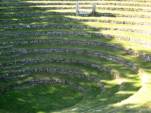
Gwennap Pit

Gwennap Pit
Cornwall is full of surprises of which this is one. Gwennap Pit is situated east of Redruth in the tiny village of Busveal near Carn Marth. This sacred space was made by early Methodists who adapted a landscape depression originally formed by mining subsidence to create a place for preaching and prayer. John Wesley is said to have preached here on 18 occasions between 1776 and 1789. The Methodist church takes great care of this site and operates a modest but very welcoming visitor centre attached to a small chapel. The curator told us that up to 6,000 (standing) can be accommodated in the space!

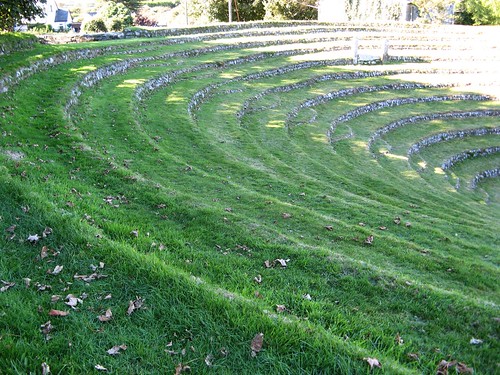
Gwennap Pit
It is still used for services and is said to have excellent acoustic properties. There are photos in the Visitor Centre of rather more secular activities such as displays by the Devon & Cornwall Police Dog Handling Team not to mention picnics and even cream teas!

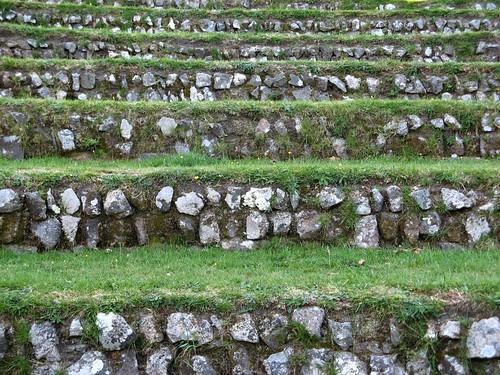
Gwennap Pit
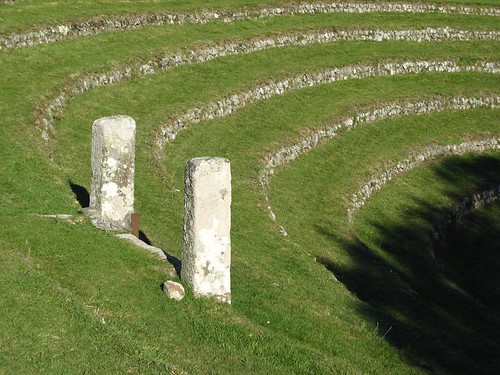
This tranquil place is reached by climbing a short flight of steps. The inverse conical structure is a reverse of our normal expectations and creates a space with minimal visual impact on its surroundings. The concentric terraces emphasise the structure, the scalloped steps are a neat and harmonious touch and the entire experience is a delight to the eye. The upright stones mark the position of the pulpit and provide a focal point.

Gwennap Pit

Monday 3 September 2007

John Falter Revisited


Three more examples of advertising art to admire from one of the unsung heroes of American illustration. The Schlitz ad is a special favourite showing Falter having a little fun at the expense of Modernist painting and sculpture. An unwilling husband has been persuaded to visit a museum of modern art. His female companion thinks a little self-improvement would not go amiss. But the Mondrian, the Pollock and the Paul Klees cannot compete with the unlikely but unmistakeable portrait of a glass of Schlitz. “Here’s one I can understand!” The world of contemporary art and the world of advertising rarely overlapped in the 1950’s and although the concept might not have been his, Falter is to be commended for the relish and enthusiasm he brought to the task.


The other two are excellent examples of Falter’s skill in handling large figure ensembles. Both images share slightly elevated viewpoints but exemplify different drawing styles. The “Gulf Coast Shrimp Supper” is conventionally modelled and conservatively representational. Four couples prepare to celebrate their love of freedom with beer and shrimps under the shade of the live oak trees. The Pure gas station on the right is rendered with a new transparency of colour and a strong linear quality to create a liveliness and sense of immediacy more in tune with prevailing styles at the end of the 1950’s.