Monday 16 May 2022

Walala Parade

Leyton is a mainly Victorian terraced, residential district of Waltham Forest. It has a lower league football club with a long history and a modest record of achievement but major landmarks are few and far between other than a late Victorian Library and Town Hall complex built at a time when Leyton was still an Essex town.  Not far from the Town Hall, on the opposite side of Leyton High Road is a parade of shops and small businesses bookended by a tent making business and a Kwik Fit, now home to a community-funded public art project that extends across eight individual properties.  After several years of fund raising and planning it was completed in Summer 2020 by Walala Studios to a design by artist and urban designer, Camille Walala.  

There’s a rhythmic rectilinear grid filled with areas of high intensity colour, overpainted with a repetition of geometric forms, diagonal stripes and a scattering of more fragmented shapes.  Observers have noted the influence of Memphis and South African township decorative art.  There are some echoes of post-comic book mid period Roy Lichtenstein and the industrial geometry of painters on the fringe of Abstract Expressionism such as Al Held, Burgoyne Diller, John M Miller and Leon Polk Smith.  More delicate sensibilities than mine have complained about a lack of refinement but I’m at a loss to imagine just what an exercise in visual refinement could bring to an urban environment of this character.  However mediocre it may look, it does function as a place of economic activity. For me it’s enough that it gives us something better to look at than the surrounding townscape - a passing contact with a fleeting visual delight with an intent to uplift.  Depressing to note that taggers have left their odious signatures in at least three places.  I would have those art world halfwits who, decades ago, affected to take this vandalism seriously, conscripted to remove every last trace of it.


Friday 13 May 2022

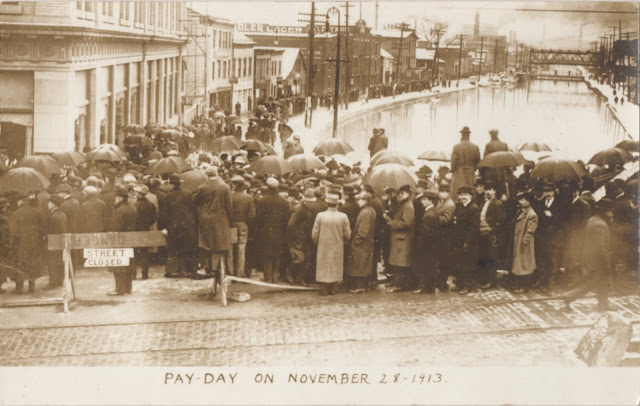
Postcard of the Day No. 109, Orphaned Postcards

If a brand character can be orphaned (as we noted in our last post) the same fate can befall the humble postcard. Careless publishers will often supply inadequate captions or omit them altogether. When this happens some clues can often be obtained from the postmark or publisher’s details on the reverse side. But if the publisher is anonymous and the card has avoided the postal system, we have an orphaned card of an unidentifiable scene.  A nice example is the card above in which a small army of workers shuffle towards their wage packets. This much we know from the caption (which even includes the precise date) but we can only guess at the location.  It looks like a broad canal basin in an American industrial town or city - it could be anywhere between New Jersey and Illinois with Chicago, because of its size, the most likely.  If the camera position had been slightly to the right it would have revealed the full name of the lager advertised in the distance which may have been helpful. None of this uncertainty detracts from the visual drama of a stoical workforce forming a comradely line in drenching rain as they inch their way towards the fruits of their labours.


A pleasing distraction when fumbling through boxes of cards at a postcard fair is overhearing the requests from fellow collectors.  Most have only a single town, village or settlement in their sights - “Any Brixham, Polkerris, Sidmouth, Ipplepen, Liskeard, St. Columb Major?” they bark and if the answer is negative, move on without a word.  Others have based their collections on more obscure areas of human experience and in voices tinged with resignation in anticipation of failure, will ask for anything on dentistry, card games, road works, dog fights, perfumes, shoe making, buildings under construction, clairvoyants, et al.  Of all such requests, the most impressive came from somebody who asked for any unknown or unidentified scenes and even more impressively the dealer handed over a shoebox full of examples to the collector’s great delight.  It seems this is a thing - some value these orphans for their sense of mystery while others turn detective to resolve the mystery.

Above is another orphaned example - on this occasion the caption is obscured by careless overprinting.  An abundance of sand ruled out Brighton and it didn’t look much like either Blackpool, Scarborough or Bournemouth. By squinting at the caption from a variety of angles I just about convinced myself the second word was Eastbourne.  Checking with other cards showing the same glazed pavilion from a different angle on the esplanade soon confirmed that it was. It’s an interesting card because of its informality and animation. What lets it down are gloomy colour values and a general lack of detail. French contemporary publishers, such as Louis Levy (LL), would have done a much better job with their superior print definition.


Monday 9 May 2022

Big Green Man

We have advertising legend, Leo Burnett to thank for the birth of the Jolly Green Giant.  In 1935 Burnett transformed the Giant’s grim looking predecessor into the sleek and glossy finished brand character in a leafy tunic with pointy ears, who remains in service to the present day.  In his twilight years he has become an orphaned brand, discarded by corporate giant General Mills into the hands of the B & G Foods holding company who operate a rest home for senior brand characters while sweating them for every last cent of revenue.  Much of his long career has been spent persuading the consumer that large green peas can be every bit as flavoursome as small varieties.  Among his great adventures are the time he slid down a fireman’s pole and the day he was interviewed by Art Linkletter, a major radio and TV personality and old pal of Ronald Reagan. Otherwise his main occupation was flexing his muscles while cradling an enormous pea pod, the size of a small canoe and overcoming customer resistance with his disarming and occasionally disconcerting grin.


Tuesday 3 May 2022

Archway Tavern - the Vanishing Clock

There’s a monumental London pub in a commanding position at Archway, named the Archway Tavern.  Built in 1888, much of its Victorian external detailing remains intact. Even though the last few years have not been kind, it lives on and occupies its location with confidence.  Since the year 2000 it has hosted a Guinness timepiece in which an unlikely combination of a labourer, a seal, an ostrich and a toucan support a clock. In its complete form it spelled out the words "Guinness Time - Millennium Time” but sadly since 2010 it has been shedding letters at an alarming rate and a mere handful remain to this day.  Streetview images illustrate the steady disintegration. The fate of the falling letters may never be known but if they still exist somewhere it would be nice to see them replaced.  Nobody expects the clock to work but given the rarity of these signs in England, restoration would be welcome. The figures are based on the characters drawn by James Gilroy and can be seen in this example photographed in 2017 in Skibbereen. Two postcards of past Guinness clocks are shown at the end.

2009
2011
2014
2015
2016
1951