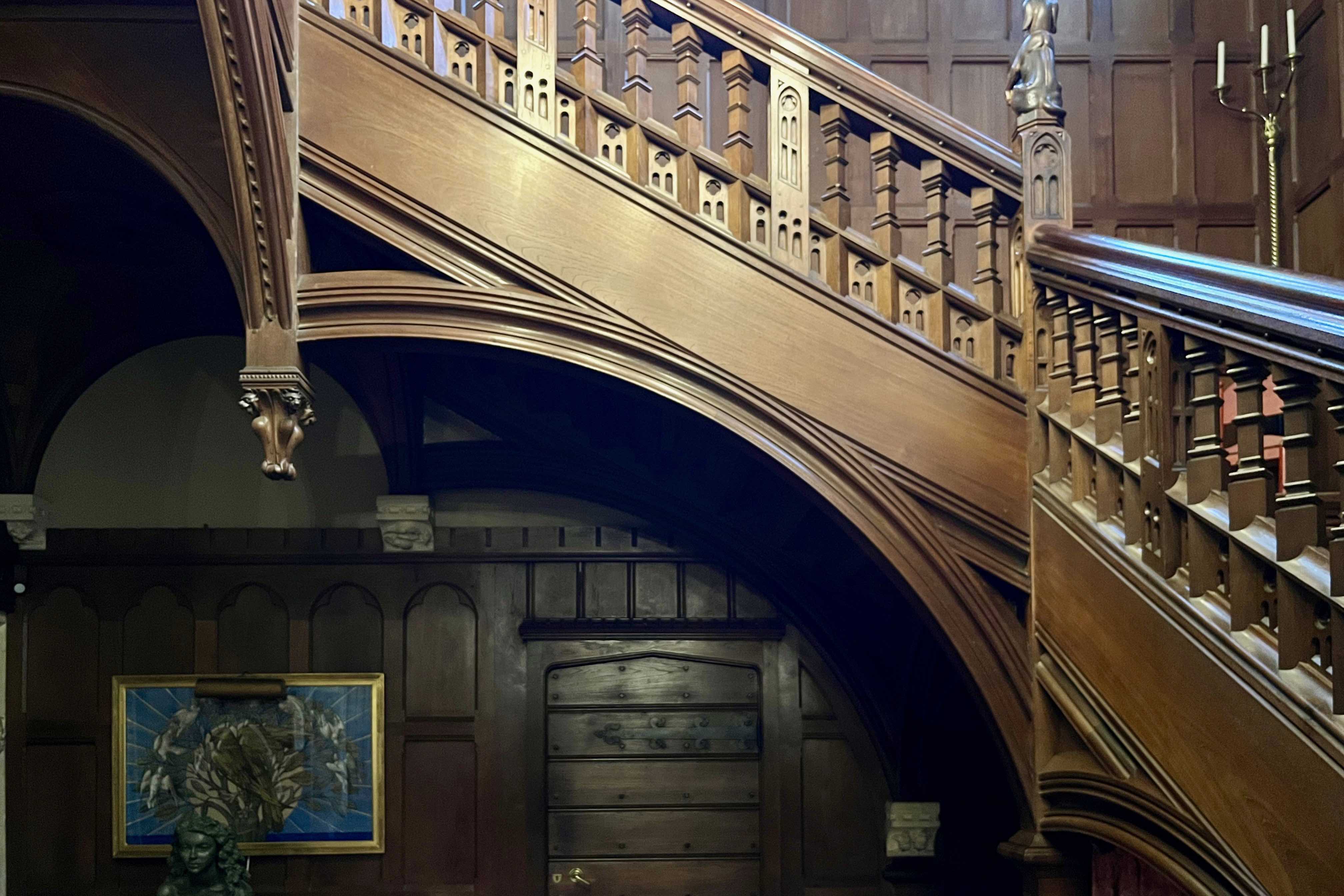
William Burges pulled out all the stops for his Devon client, Sir John Heathcoat Amory, and in 1873 he presented Sir John with a magnificent folio of 57 pages of watercolour drawings of his detailed plans for the interior decor of Knightshayes Court. Burges’ relatively restrained plans for the exterior and internal partitioning had been approved in 1869 and by 1873, construction was well underway. Sadly for Burges, Sir John would prove to be a lot less indulgent than his regular patron, the Marquess of Bute whose financial commitment to Burges’ extravagantly ornate visions had no limits. While Bute’s coal mines and ports delivered an endless stream of cash, the Heathcoat Amory business (lace and textiles) was more exposed to economic downturns and the money simply wasn’t there to pay for Burges’ lavish scheme. Sir John occupied himself with hunting foxes and stags on Exmoor, shooting on his Scottish estate or fishing in Norway where he owned a lodge. It’s easy to imagine that Burges’ bejewelled medievalist fantasies would have held little appeal for such a tweedy character and in 1874 he sacked Burges from the project.

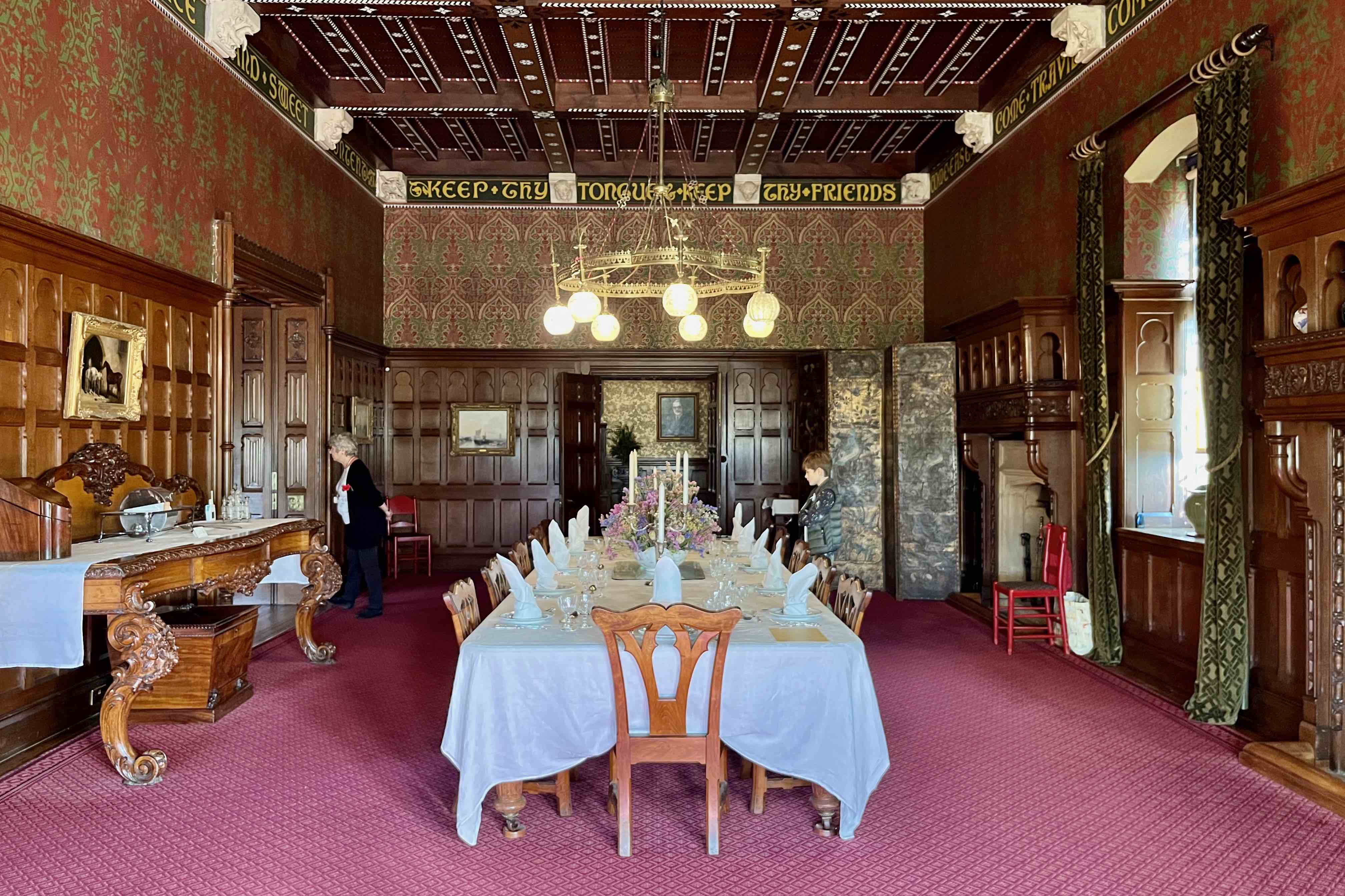
J D Crace inherited the Burges design scheme and diluted it to suit the family purse and taste. Crace was a remarkably versatile and successful interior designer and produced a modified version that retained some of Burges’ ideas (such as the jelly mould ceiling decor), discarded the wilder fantasies and came up with a scheme that had a little of Burges about it while being much easier on the eye. Even this would prove too much for the family who in a few years had contractors in to conceal the ornate coffered ceilings (largely the work of Crace). Fireplaces and other features would follow until what remained was a conventional country house Georgian interior. For Burges, this was another deep frustration, in a career marked by false starts, unrealised projects, and rejected competition entries. Compounded in 1854 when Burgess won the competition for a cathedral in Lille fair and square, only to be laid low by a change in the rules that handed the commission to a French team of architects.

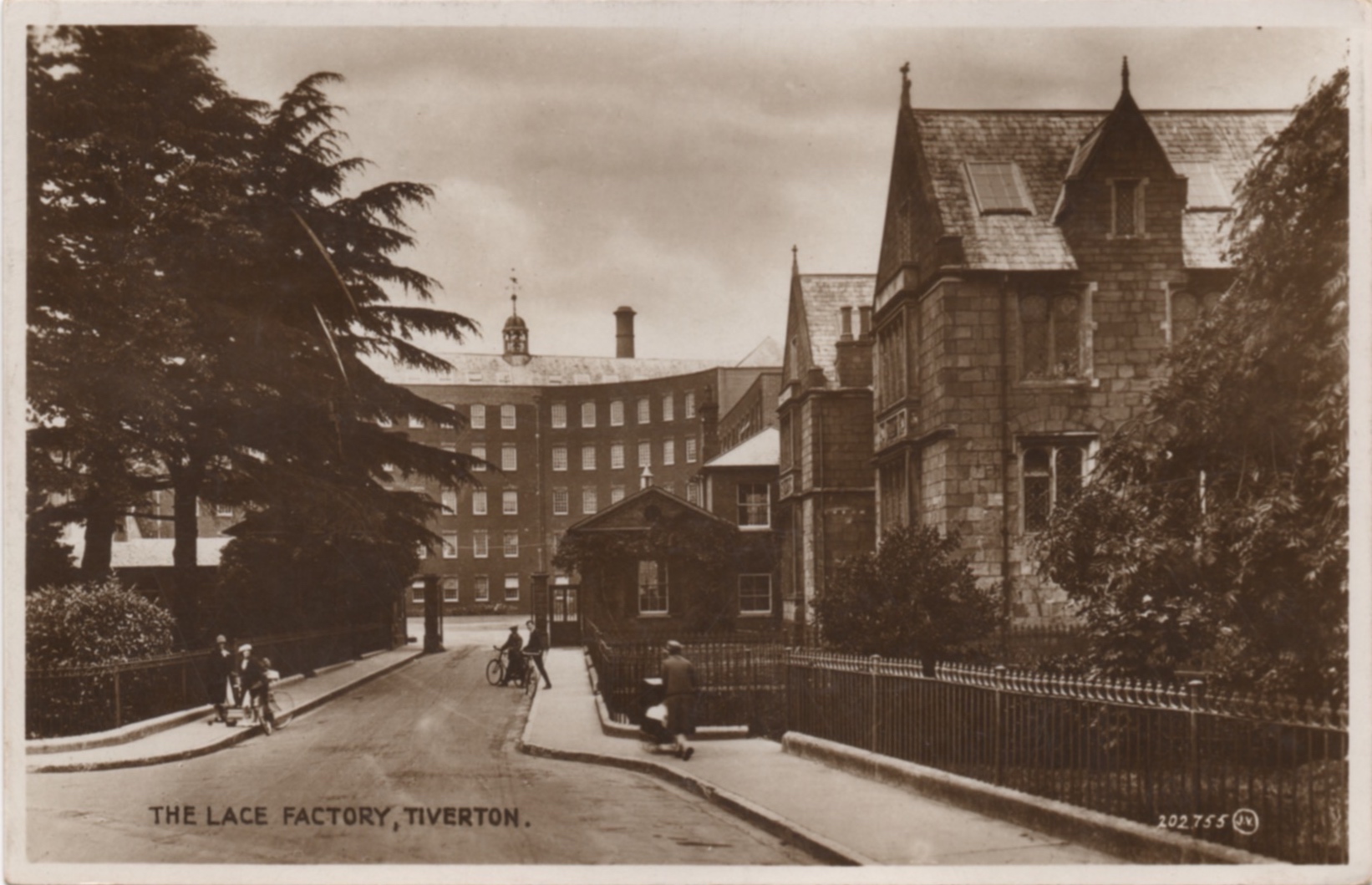
Even without the tower that Burges designed for the west wing, Knightshayes remains an imposing presence thanks to its subtly detailed physical mass. From the Drawing Room the parkland gently descends, offering a distant view of the family factory and its pair of chimneys. Sir John found running a business got in the way of the pleasures of the chase and left the task to his younger brother, but without those profits his fine country house would never have been built. In their growing aversion to all things High Victorian, the family were ahead of the times - several decades would pass before popular taste would finally condemn it to obscurity. When its rehabilitation came to pass, the National Trust was left with an enormous task to return the house to its as-built original condition. The photos were taken in mid-November on a day of exceptional warm sunshine. Regrettably there was no access to the first floor rooms due to a post-Covid shortage of volunteers.