Wednesday, 27 November 2013

Republic Steel


Fortune magazine advertised itself to the trade in the 1930s as the premier medium for steel industry advertising, gathering testimonials from major producers including Republic Steel praising the efficacy of Fortune in an exercise of mutual back-slapping. These examples come from an extended advertising campaign that Republic Steel placed in Fortune magazine. They seem to be themed around weight and mass. A heavy style for a heavy product. It’s a bulk commodity so most readers will not be placing an order for a thousand tons of steel plate in the near future so the value lies in keeping the company name in the public eye. This was an era where weight really mattered – public opinion was easily impressed with heavy construction and engineering ingenuity was more widely admired than it is today when portability and weightlessness are the most desirable characteristics in a consumer product. Back in the Thirties, the image of the white hot crucible in a dark and cavernous industrial space still had the power to impress the audience. 


The message was reinforced by some muscular drawing and restrained use of high colour tones. Sploshy brushwork and vigorous scrubbed-on paint was the visual language of the mass-consumption conventional landscape where the intention was to catch the eye without opening any sort of dialogue with the viewer. These images strive for a romanticised industrial heroism – a sense of hard-won productivity in harsh, elemental conditions. The smell of hot oil and burning cinders and the thunderous noise of steel-hammers and forges are all invoked. 


Republic Steel at the time of this campaign was a newly-merged business struggling with the collapse of demand for steel in the Great Depression. It was not a great place to work being notorious for adversarial labour relations. A refusal to recognise unions at the Chicago plant provoked a strike in 1937 that culminated in the Memorial Day massacre when 10 unarmed demonstrators were shot dead by Chicago police. Republic was number three in the US (behind US Steel and Bethlehem Steel) and keenly felt the need to publicise itself. But while US Steel was busy attempting to humanise itself via Rockwell inspired scenarios Republic remained committed to a hard-line industrial aesthetic. By contrast, U S Steel would abandon its longstanding opposition to unions in the workplace in 1937 when it accepted collective bargaining. 


In later years Republic would become a voluble cheerleader for capitalism and free enterprise in the 1940s and a militant cold warrior in the post-war era. It was an age of high anxiety and Republic was not the only business to sense a responsibility for educating the public in the virtues of free-enterprise and the perils of socialism Demotic language and a matey directness was typical – the voice of good sense from a concerned neighbour. There was also an unrealistic expectation that consumers would happily settle down to a good long read, at the end of which collectivism would be permanently renounced. The real function of message-lead advertising was corporate self-flattery confirmed by the offer to supply reprints for circulation among friends and colleagues who may be showing signs of straying from the path of freedom. For a blood-curdling selection of these ads, please visit Chris Mullen’s Advertising Hall of Shame (The Visual Primer of Advertising Clichés). 


Wednesday, 6 November 2013

Duchamp 1952


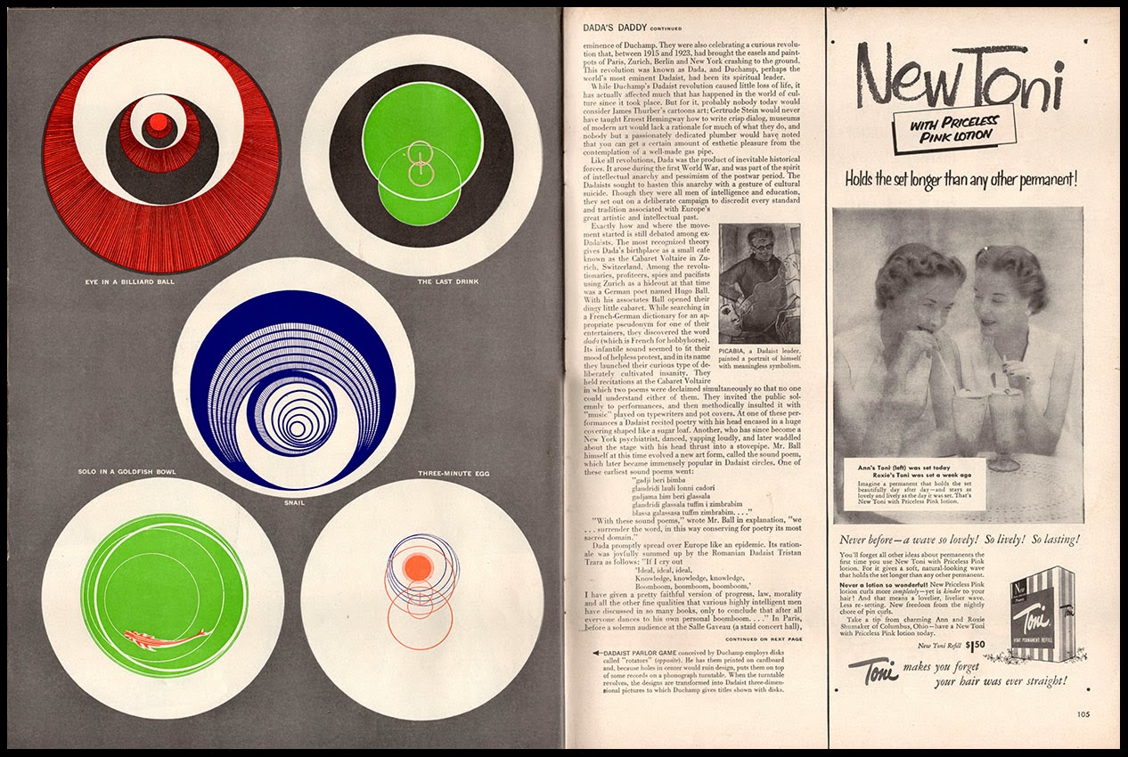
Depending on who you listen to, Duchamp today is the Oracle of Conceptualism, progenitor of a golden age of ideas-based contemporary art or the Great Iconoclast, responsible for the irreversible subversion of all that was great and good in the Western tradition of painting. His admirers claim that he broke down the barriers between art and life enabling the artist to designate anything or anyone as a work of art. All subject taboos were lifted leaving artists free to explore the world at will in any chosen medium. A vocal minority of detractors deplore the death of the hand-crafted object in favour of assembly line methods that Duchamp prefigured and attribute every affront to common decency and good taste in the art world to his malign influence. Duchamp’s parodies of the process of making art and his intellectual game-playing are anathema to the high-minded defenders of autonomous artistic integrity for whom the only art that counts is a product of endless struggle and toil with intractable materials. 


Duchamp would turn 65 in 1952 and had assisted the organisation of an exhibition (Duchamp Frères et Soeur) at the Rose Fried Gallery, New York in February and March. Chess remained his most ostensible preoccupation, while he continued to live in the top floor apartment at 210 West 14th. Street which he had occupied since 1943. All this publicity in the nation’s leading mass-circulation magazine must have tested Duchamp’s celebrated nonchalance about his own reputation. One of the earliest signs of his growing celebrity status may well have made him feel queasy. Whether Duchamp was a regular reader of Life magazine is not a matter of record. Was he more interested in the latest Erle Stanley Gardner story in Saturday Evening Post? Perhaps he leafed through the pages of the New Yorker and Esquire. A secret passion for Breezy Tales and Amazing Stories is not impossible. Chess magazines, View and Cahiers d’Art are more likely to have had his attention. Of course he may also have glanced at Teeny’s copies of Vogue or Harper's Bazaar


Duchamp’s Boîte-en-valise (shown across a double spread) had been a work in progress since 1935 and the first completed examples appeared in 1941. The business of assembly went on for years. A small team (including Joseph Cornell) laboured away as the component parts arrived from France where Duchamp had prepared them before the war. Later editions of the Boîte-en-valise would be more professionally produced and Duchamp would permutate the contents and vary the box to offer 300 versions in 7 editions in much the same way as the fashion industry extracts the maximum revenue from designer brands. In effect, Duchamp curated his own retrospective in compact form. For a collector the finished article was a precious object to be lingered over, cherished and carefully conserved, catering to the instinct for connoisseurship that Duchamp so actively despised. The Boîte-en-valise has a fetishistic fascination linking us to the world of toys, dolls’ houses and model trains via the idea of condensing a lifetime’s creative activity into a single small and confined space.


Tuesday, 22 October 2013

Chicago Century of Progress


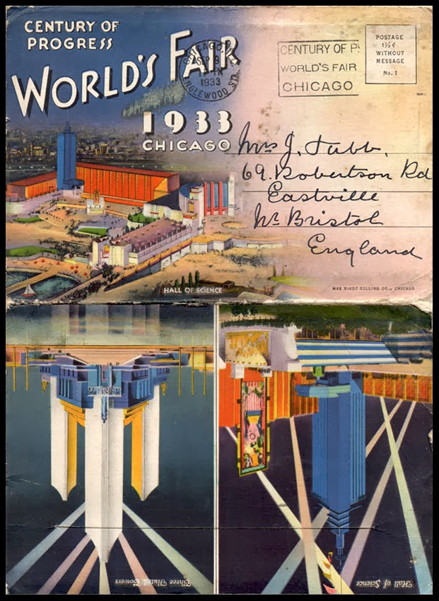
It is 80 years since the city of Chicago hosted the 1933 Century of Progress World’s Fair. As World Fairs go, in popular esteem it ranks well below the New York event in 1939 where the sheer volume of commercial exuberance left a legacy that has been analysed at length in an extensive literature. And yet, the architectural achievements of the Chicago Fair were impressive, being held together by an extravagant colour scheme devised by the Broadway set designer, Joseph Urban. Urban deployed a memorable palette of brilliant colours, perhaps inspired by his work for the Ziegfeld Follies. He died the day before the Fair opened on May 27th. 1933, the same day that Roosevelt’s New Deal was signed into law. 


As a pageant of multi-coloured Streamline Moderne it was a highly effective antidote to the economic gloom of the Great Depression. Enormous effort went in to developing tempting visions of a brighter future such as the Home of Tomorrow exhibit and a range of concept cars from most of the major manufacturers. The Burlington Route railroad brought its streamlined Zephyr to the show and Union Pacific displayed its M-10000 train. Most of the pavilions were designed by an in-house team of local architects with a brief to avoid pastiche and step boldly into the glorious future. One exception was the General Motors Pavilion which was the work of favoured GM architect, Albert Kahn. In line with the theatricality of Urban’s colour scheme the buildings were planned for a short life and mostly constructed from plywood and Masonite, Sheetrock and Maizewood with profiled metal cladding. When the Fair closed the site was rapidly cleared and now functions as a city park. 


The advertising and postcard imagery comes from my collection, including the final souvenir card – one of many thousands for which visitors must have posed. Prohibition remained in force until December 1933, by which time the Fair had closed – so what was in the foaming glass? And whence came the Bonzo dog cut-out? Other cultural landmarks of 1933 included the debut of King Kong, the Lone Ranger and Disney’s Three Little Pigs, not to mention the opening of the first Krispy Kreme doughnut store. 


Friday, 4 October 2013

Foreign Office Foot-Slog


Another trip to Borisopolis, world capital of financial malpractice. The destination is the Foreign & Commonwealth Office (henceforth, the FCO), open to the great unwashed for just two precious days by virtue of the Open House London annual event. It’s big, but not huge – it’s not Versailles, it’s not the Winter Palace. The internal spaces are scaled-up to make an impression but not so large as to overwhelm. William Hague has recorded a comforting video welcome in his much-imitated South Yorkshire vowel sounds, assuring us that the FCO will keep us safe in a hostile world and stands ready to assist when we do stupid things abroad.


The reception rooms and ceremonial spaces are lavishly decorated – it’s easy to imagine the teams of highly skilled craft-workers applying paint, plaster and gold leaf, reminding us that this is part of a world that exists outside our normal experience or comprehension. The decorative schemes belong to a distant era but their painstaking preservation is indicative of the quality of permanence to which all national institutions aspire. These over-sized opulent salons with their profusion of exotic decor form the natural habitat of a higher order of species – the well-bred products of ancient families and exclusive seats of learning, instinctively at home in these surroundings where the rest of us are likely to become self-conscious mutes. 


To enjoy the spectacle we must set aside these dissonant elements and just look at the stuff. The staircases are really special, designed to literally and metaphorically, raise the visitor to a higher level. Ceilings come alive with dazzling white plaster goddesses of plenty or head-spinning paintings and the visiting dignitary must maintain composure while navigating thickly carpeted steps with marble handrails and floors of polished stone and mosaic tile-work. Illustrious predecessors peer down from their stone-cold plinths and in the background murals (by Sigismund Goetze) celebrate Britain’s civilising influence on an often ungrateful world. 


The beautifully proportioned façades of the Durbar Court in the former India Office remind us of the extraordinary extent to which the image of India haunted the Victorian imagination. Its enormous space groans under the weight of colonial associations and iconography. Embedded in the classical detailing are portrait busts of eminent colonials alternating with decorative, swagged tablets inscribed with the names of Indian cities and provinces together with full length figures of the great and good and smaller relief carvings of episodes from the Anglo-Indian narrative. 


There was a plan to demolish the FCO in 1963 and a display of vintage photographs illustrated the state of decrepitude into which it had fallen by the early 1980s when a decision to renovate was taken. Somehow the images of peeling paint and collapsing ceilings come perilously close to inducing nostalgia for the days when British diplomats were either raffish Denholm Elliot-like characters, scripted by Graham Greene or pin-striped buffoons as portrayed by Richard Wattis. It would be comforting to conclude that a renovated FCO would lead to improved international relations but xenophobia remains undiminished as the nation’s default position. 


Not to be churlish, the extent to which the public could wander was generous, the bag-searching was courteous and the security was present but unobtrusive. Those who worked there took a genuine pride in their surroundings and seemed pleased to be sharing it with the public. It’s important to acknowledge this because one day, a hawk-eyed accountant, perhaps as yet unborn, will question whether, as a nation, we can continue to ask the hard-working taxpayer on a low income to contribute towards this sort of event catering to the curiosity of an arty and pretentious minority. After all, by declining to support this year’s Open House London, the London Borough of Bromley has saved the princely sum of £5,000 from a budget of £209 million in 2013-14. To put this in context, this is equivalent to someone earning £20,900 per annum trimming 50p off their annual expenditure. Depressingly, Barnet, Harrow and Kingston-on-Thames have done likewise. 


Monday, 16 September 2013

55 Broadway


These are some notes and photographs from a visit to 55 Broadway, courtesy of the Twentieth Century Society. Completed in 1929 and designed by Charles Holden, who would later design many innovative Underground stations as well as the monolithic Senate House, it has enjoyed a mixed reception. Messrs. Jones and Woodward in their Guide to the Architecture of London describe it sniffily as “difficult to be very enthusiastic”. In recent times it has been celebrated as a masterpiece of Art Deco which seems even more misguided. A few decorative motifs featuring wings and some vaguely Streamline sculptures are not really enough to justify an Art Deco designation. This cruciform, angular, rather severe block has none of the flamboyance associated with Art Deco and might be better seen as a homage to Manhattan – the principle design influence having come from high-rise New York office blocks. 


It was upgraded to Grade I listed status in 2011 and may well be at the peak of public esteem. In a few years it will disappear from the public realm when it’s converted into apartments for oligarchs, non-doms and Asian billionaires. London Underground, the present occupants plan to move out in 2015, and cash in on the asset value. A building that was conceived not only to serve the needs of a public service but also to function as a highly visible statement of its confidence in the future will be reduced to a historical curiosity. The fabric and the detailing may enjoy some protection from the depredations of developers but the space and volume will be emphatically private and off-limits to the public. For all these reasons the opportunity to visit and explore was not to be missed. 


Holden and the client (London Electric Railways) wanted a building that would be as tall as possible within the heavy restraints of 1920s planning controls. They went for a maximum permitted 10 floors of accommodation and added a 4 storey tower which, due to fire regulations had to be left unoccupied. The cruciform plan offered natural light to all offices with services concentrated in a central core. When it opened it was the tallest office building in the city, exceeded only by sundry church spires and domes. London Transport was an organisation where, unusually, genuine pride was taken in the corporate tradition of excellence in architecture and design. This in turn promoted a culture of conservation, even at the expense of commercial considerations, and some of that can be seen still in this building and others. To this day it hasn’t been entirely extinguished despite the economic orthodoxy that dictates that absolutely nothing can be allowed to get in the way of optimising revenues. 


The visit included offices on the 7th. floor that had been occupied by senior luminaries, including that of Frank Pick, who in the 1930s had embedded an enduring culture of excellence in design that extended to every activity. The spirit of Holden and Pick still endures in the sense of sober and principled dedication to design values that hovers in the sombre corridors lined with walnut doors. There was no economising on materials with internally a generous use of Travertine marble on floors and wall-linings plus custom built fixtures and fittings in decorative bronze, an exterior in best Portland stone with Norwegian granite and black Belgian marble, but the overall impression remains one of high-minded restraint. The final treat of the day was a four floor footslog to the top of the tower to sample the panoramic views. We were warned not to photograph either the Home Office or Scotland Yard (it seems paranoia runs high in these places) which was no hardship as both are distinctly repellent buildings. So the final photo is an opportunity to survey London’s chaotic jumble of towers and spires. 


Sunday, 8 September 2013

Postcard of the Day No. 60, Nagasaki


One of the incidental pleasures for the ocean going traveller en voyage to some remote colonial outpost in the service of the Empire, was the opportunity, when in port, to observe the efforts of the native population to resupply the ship by hand with coal. The ill co-ordinated struggle of hundreds of exhausted natives clambering the ship’s side with inordinately weighty baskets of coal must have brought a supercilious smile to the face of many an aspiring minor administrator as he languished on the ship’s rail and reflected on his good fortune in belonging to a superior racial group, destined for far higher things than the unfortunate creatures toiling mightily below. 


These postcard images from Nagasaki present the spectacle of coaling the ship in uncomfortable close-up. Inconveniently they remind us of the demeaning character of slave labour when destitution and despair reduce the cost of labour to a pittance. The contrast in human dignity between those condemned to servitude and the ship’s privileged passengers could not be greater. All this seems to be written across the faces of the workforce as they swarm through a matrix of rope and bamboo, breathing copious quantities of coal-dust into their lungs. An epic composition of human misery makes a curious subject for a postcard - it could also have made a magnificent painting if an artist of the calibre of Géricault had been available. 


Nagasaki’s place in history as Japan’s principal port for trade with the outside world during the years of isolation has been overshadowed by the nuclear destruction of August 1945. The leap in technology from the era of intensive labour to the detonation of atomic weapons took about 4 decades and with hindsight we could imagine that the agonised expressions to be seen somehow foreshadow the appalling events that lay in the future. To compare and contrast, see the jaunty cover of Meccano Magazine dated March 1926 where a distant team of turbaned labourers make light work of their task as the seabirds circle in picturesque formations. 


Wednesday, 4 September 2013

Containers

Public art, Arenc, Marseille
There’s a school of thought that claims the invention of the shipping container did more to transform the world we inhabit then even the invention of the internet. There may be something in it when you consider that all the hardware that gives us access to the digital universe has made its way around the globe, buried deep inside a shipping container. Add to that the impact on world cities as port facilities migrated away from urban areas leaving vast tracts of development land in inconvenient locations. Plus the human cost when millions discovered their cargo handling skills were no longer required. The regeneration industry would hardly exist if it wasn’t for the shipping container. Europe’s largest regeneration project is in the former docklands of Marseille where this installation (above) serves as an affirmation of the instigator of all the urban upheaval. 

Manchester Ship Canal.
Sixties Minimalism, especially the immaculate constructions of Donald Judd, prepared us for the aesthetic contemplation of containers with their structural geometry, ribbed surfaces and industrial paint finishes. Stacked high on the waterfront in random arrangements they combine to offer an arresting visual experience to an audience raised on a diet of Modernist geometry courtesy of the Bauhaus or De Stijl. 

Boatyard at Gweek, Cornwall.
If you wish to own one yourself there’s a thriving market on eBay with a choice of life-expired 20ft. and 45ft. examples at prices between £500 and £1500. Not all are watertight and condition is everything. They may mostly be sought by business and young inner-city creatives but some end up in suburban gardens, transformed into workshops or storage facilities. My preference would be to install one in a vertical position with library shelving around the sides, a circular staircase to access the books and an Observatory on the top. 

Wreckage from the Napoli at Branscombe, Devon.