Tuesday, 22 November 2022

Italian Posters - Irony, Imagination and Eroticism

     Silvana Editoriale, 2011, ISBN 9788836622528


This is just one of a series of volumes published by Milan based Silvana Editoriale that cover a variety of advertising topics including food and drink, motor cars, fashion and travel.  Inside images of posters are arranged by subject and placed on the page to let them speak for themselves in the absence of designer conceits. The selection is brilliant - most of the images were things I saw for the first time.  The archive of Italian graphics must run very deep. Consumer society may have been late in arriving in Italy but once established the originality and ingenuity of the local advertising art was quickly apparent.  This was accompanied by a wave of industrial and product design, from typewriters to cars, from fashion to luxury goods that established a global reputation for formal elegance, innovation and attention to detail.  Swiss and German designers searched for perfection of form via a rigorous reductive process to eliminate the superfluous with impressive, if sometimes impersonal results. In Italy, design traditions were less rigid with results that made space for character and personality without sacrificing refinement. Olivetti and Fiat were pioneers of this approach.

When drawing upon familiar stylistic genres, Italian graphic artists seemed more alert than any other nationality to the humorous potential in their source of inspiration.  Even the geometric proprieties of Modernism were subverted in Italy thanks to the national passion for visual wit deployed with a lightness of touch rarely achieved elsewhere. Likewise the seductive rhythms of Art Nouveau lent themselves to a playful jollity that would have been heretical in Munich or Vienna. This involved a high degree of graphic absurdity, of inventive formal repurposing as much as setting up a comic situation. A favourite strategy of Italian illustrators was to personalise the product with characteristics drawn from the natural world. These excesses of the imagination include an owl with searchlight eyes, a tiger clawing its way into a jar of meat extract, a cockerel in evening dress, a weeping pig, an infant suspended from a clothes line, and irradiated infant buttocks.  What might look coarse and vulgar elsewhere is made acceptable thanks to the Italian lightness of touch and (mostly) gentle humour. This book is a treasure box of the most wonderful delights for the eye and a tribute to the imaginative powers of generations of Italian poster artists.


Previous posts on Italian Graphics can be seen here and here.


Monday, 31 October 2022

Meet the Striding Man

History records that the Striding Man was first sketched in 1908 by the illustrator and cartoonist, Tom Browne. Since then, he has marched with single-minded vigour across Johnnie Walker whisky publicity and packaging, sometimes taking centre stage, at others, lurking in the margins in trade mark form. His anachronistic outfit, polished riding boots, narrow white trousers and scarlet frock coat embodied the longevity of the spirit (first introduced in 1820) and an unstoppable forward momentum.  A knob-handled cane, a monocle and a stovepipe top hat complete the ensemble and the association with a man of substance. A rosbif complexion and a bleary-eyed grin suggest some familiarity with the product. He has the air of a partially reformed school bully.

These vintage examples are from both sides of the Atlantic at the height of his powers, dominating all around him and making his presence impossible to ignore. In Britain the illustrator of choice was Clive Uptton (who also worked for Cadbury and Brooke Bond Tea).  In America a wide range of prominent illustrators were enlisted for their personal responses to the product (a subject for another time) while the distinctive square section bottle shared the focus with the Striding Man. A low point came in the 1930s with a racist tableau in which the Striding Man was pictured extending his monocle to a painfully servile, dungaree-clad small boy, for the privilege of giving it a polish.

Of all brand mascots, the Striding Man is one of my least favourite.  His spiritual home is the world of Vanity Fair via Quality Street, an age of affluent idleness much favoured by unimaginative British advertisers as a nostalgic setting for product placement.  Striding Man, full of confidence and entitlement, is designed to appeal to high earners offering well earned respite from the task of wealth creation and makes no effort to endear himself to drinkers of more modest means. Which enables him and his masters to sidestep any responsibility for alcohol abusers.


Wednesday, 12 October 2022

Steel Globe Tower, Coney Island

Property development is an occupation that attracts more than its fair share of swindlers and confidence tricksters.  A favoured strategy is to conceive a super-scaled and outrageously ambitious building to dazzle the unwary investor with its novelty value and the prospect of a share in stupendous profits.  In May 1906 in New York, Samuel Friede announced his scheme for the construction of a vast 11 storey globe resting on a 150 ft. cast-iron pedestal to tower over the Coney Island resort at Steeplechase Park.  Friede’s inspiration may have been the proposal for a monumental globe in honour of Christopher Columbus published in Scientific American in 1890.  The designer was Alberto Palacio of Bilbao and the location was to be the Chicago World’s Fair of 1893.  At  1300 ft. it would have been almost twice the height of the Steel Globe. Friede’s plan  would be the world’s largest building with space for four circus rings, a theatre and skating rink plus a hotel, restaurants and an Aerial Palm Garden.  A subterranean transport hub of trains and streetcars would connect with every neighbourhood in the city. Up to 50,000 visitors could be accommodated at any one time and the building would be open around the clock.  World class entertainment and a plethora of gambling facilities would keep the dollars rolling in on a grand scale. Postcards of the attraction were rushed into  print as if it was already in existence.  

The volume of publicity and celebratory functions greatly exceeded any activity on the ground. Investor concern turned into panic as it became apparent that Friede’s site held only 30 of the 800 foundation piles despite all the band concerts and firework displays laid on by the developer.  By 1908 the scheme had fallen apart and the ultimate owner of the site (and much else of Coney Island), George Tilyou had to remove the concrete piles at his own expense. For the Dutch architect, Rem Koolhaas, Coney Island was a laboratory for American architectural extremes of which the Steel Globe was the most inspirational. Steeplechase Park was acquired by Fred Trump in 1964. The entire site was then demolished to make way for apartment blocks.  In the early 1950s Fred Trump was Woody Guthrie’s landlord.  Trump’s blatantly racist letting policies became the subject of Guthrie’s 1954 lyric Old Man Trump.


Friday, 7 October 2022

Kugelhaus Dresden

On the north side of Dresden Hauptbahnhof on Wiener Platz there’s an unexceptional low rise modern office block in which is embedded a tribute to one the city’s great lost landmark buildings - the Kugelhaus.  Designed as a spherical building by Munich architect, Peter Birkenholz for the 1930 International Health Exhibition in Dresden’s Grossen Garten park.  Inspired by the unbuilt visions of Claude-Nicolas Ledoux it was quickly adopted as an emblem of the city and hosted a series of exhibitions of technology and engineering.  By the mid-1930s as the novelty faded, it fell out of favour.  Maintenance was expensive and the recently ascendant Nazis took exception to it.  When an operator could not be found it was demolished in 1938. It was Dresden’s misfortune that it fell under the control of an especially brutal Gauleiter, Martin Mutschmann.  The preservation of traditional Saxon arts and crafts was Mutschmann’s obsession when he wasn’t occupied with matters of torture and execution, suggesting he was even less receptive to Modernism than the average Nazi.  It remains the case that spherical buildings always come with problems and often have a short life. Had it been spared by the Nazi culture warriors, it would have been very unlikely to have survived the Allied firestorms of February 1945.  There’s an additional tribute to the Kugelhaus in the form of a spherical cinema in the lobby of the Volkswagen Transparent Factory which now stands on the same spot.


Monday, 3 October 2022

Postcard of the Day No. 110, Regent Circus

There’s no Regent Circus on today’s map of London but, according to Hermione Hobhouse in her History of Regent Street the intersection with Oxford Street was confusingly known as both Oxford Circus and Regent Circus in the first decade of the 20th. century.  It’s no surprise that in later years the name Oxford Circus would prevail, given that Oxford Street has its origin in medieval times whereas Regent Street was a product of more recent city planning.  Indeed the plans of John Nash included a grandiose Regent Circus far to the north of Oxford Street of which only a single quadrant was ever built.

The ornate shopfronts in the first postcard display a Victorian passion for embellishment in the pursuit of customers. Prominent among them are the premises of Peter Robinson, a department store that later expanded into a chain of more than 20 with a flagship store at Oxford Circus. Unusually, the card shows what would then be called a public convenience in an animated street scene including horse-drawn omnibuses and flower girls selling their blooms on traffic island. These itinerant traders made a popular subject for postcard publishers, often under the label of “London Life”. It wouldn’t have been an occupation for the faint-hearted, finding and securing a pitch, resisting extortioners and local bureaucracy alike.  Wherever they gathered the photographer wasn’t far away, even under the railway arches in Brixton.


Sunday, 18 September 2022

Our Latest Merrie Monarch

It will take some getting used to but within just 48 hours we had a new Prime Minister and a new Sovereign to enhance our lives.  For the former, expectations could hardly be lower, but the latter, for all that he’s been part of the landscape for our entire lives, may surprise us all, though not necessarily in a good way.  This 1952 cover story dates from when he was just 4 years of age and it’s a tribute to the expertise of mid-century character analysts that so much evidence of fine qualities could be deduced from scrutiny of his infant features, though it’s notable they had nothing to say on the subject of intelligence.  It will be fascinating to see how many of these attributes will guide his conduct over the course of his reign but it’s inconceivable that he could display fewer than the new Prime Minister possesses. “Tenacity of Purpose” can be detected in disconcerting abundance, beyond that is mostly a vacuum.


Wednesday, 7 September 2022

Heath Robinson’s Merrie Monarchs

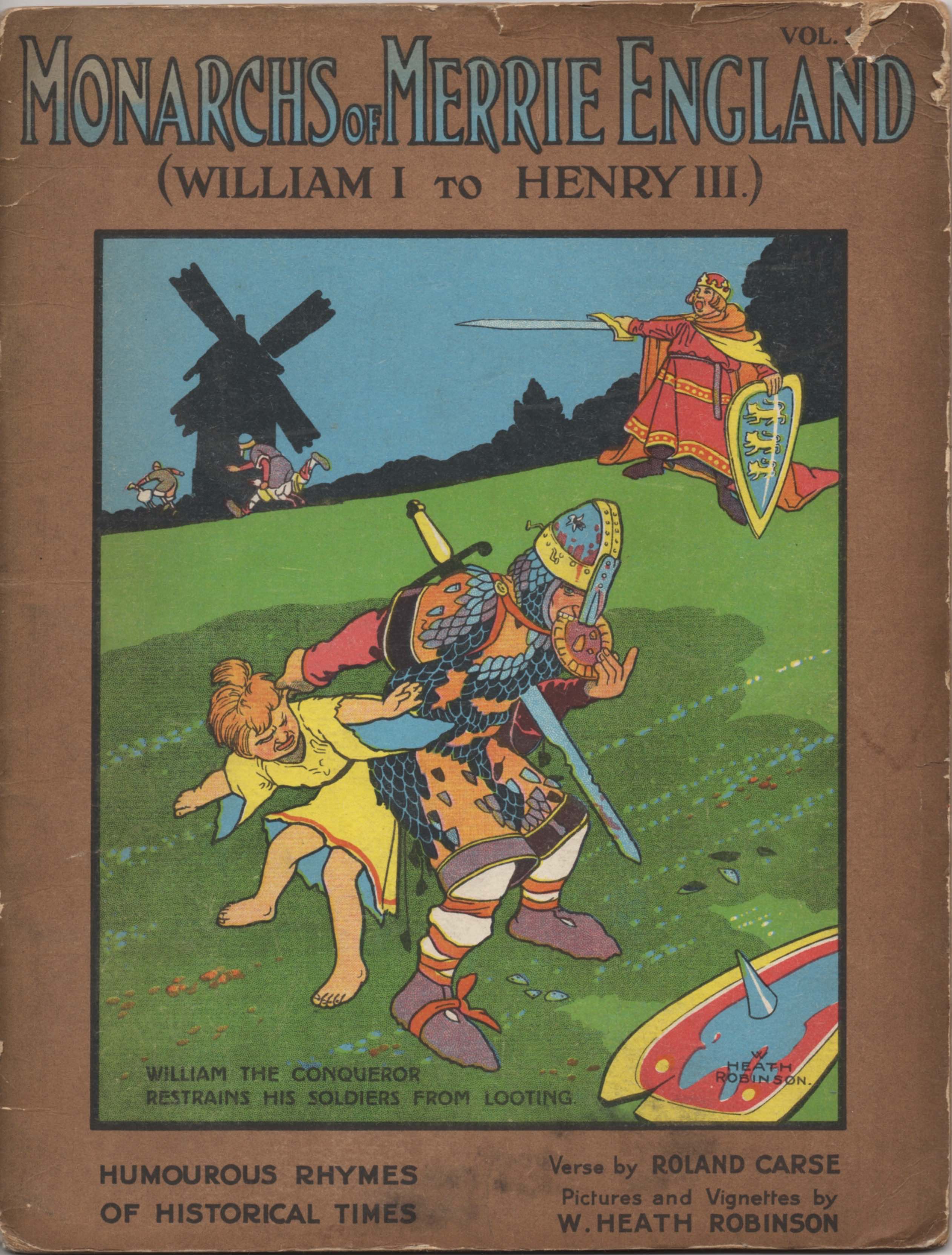
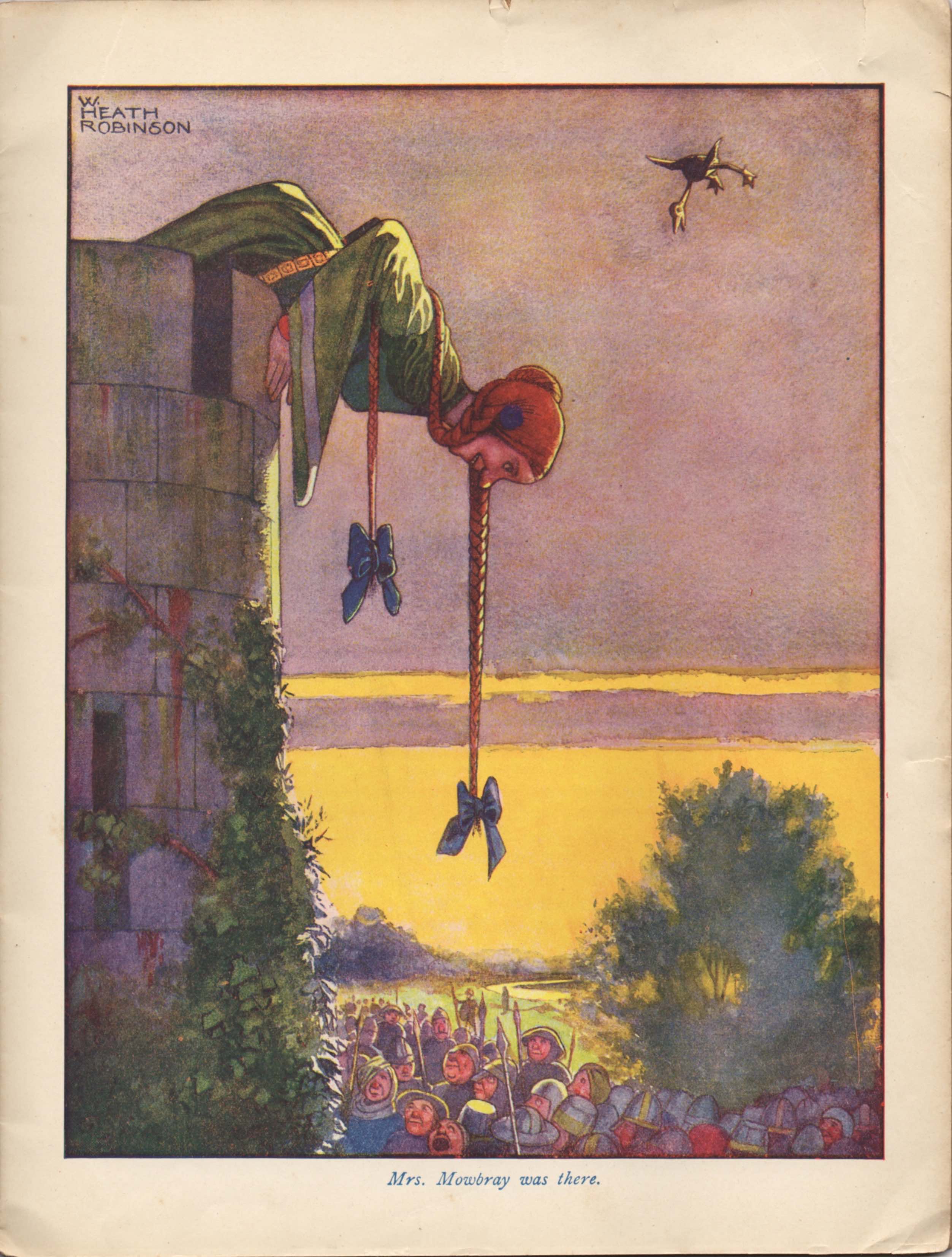
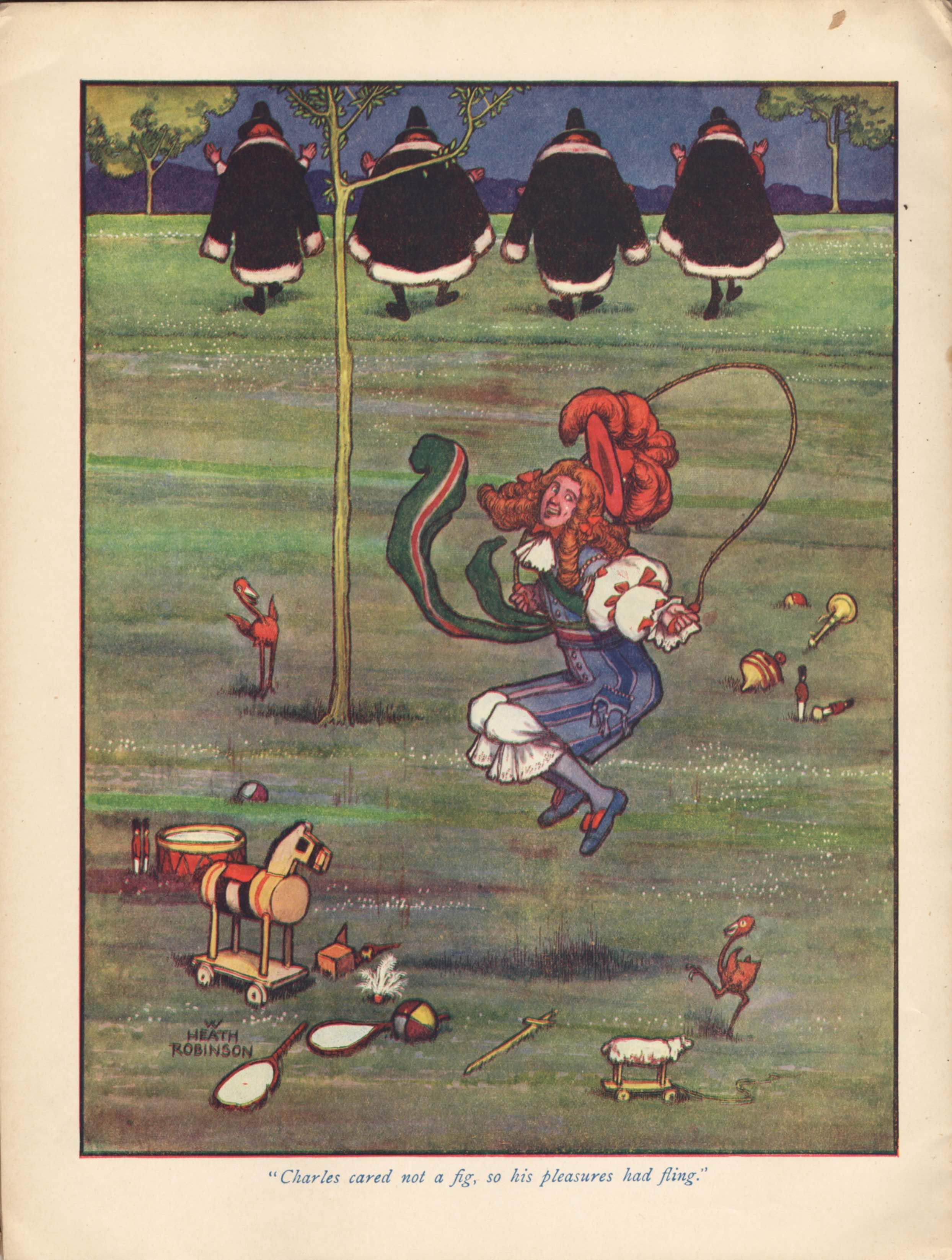
Two volumes of Monarchs of Merrie England were published in 1907. Each volume had 10 colour plates by W Heath Robinson (WHR) and humorous verses by Roland Carse.  A much abbreviated edition followed in 1910 comprising 4 card covered volumes, each with 2 colour plates. Which is what we are showing here.  WHR’s lively illustrations are full of movement and incisive drawing and form a perfect accompaniment to Carse’s rhyming couplets.  At this point in his career, WHR was mostly employed illustrating more prestigious colour-plate gift books and critical voices have overlooked Monarchs of Merrie England in favour of Bill the Minder, Twelfth Night and Hans Andersen’s Fairy Tales.  Printers Thomas Forman of Nottingham extended the life of these illustrations in the form of postcards that were marketed to small traders to publicise their services.