

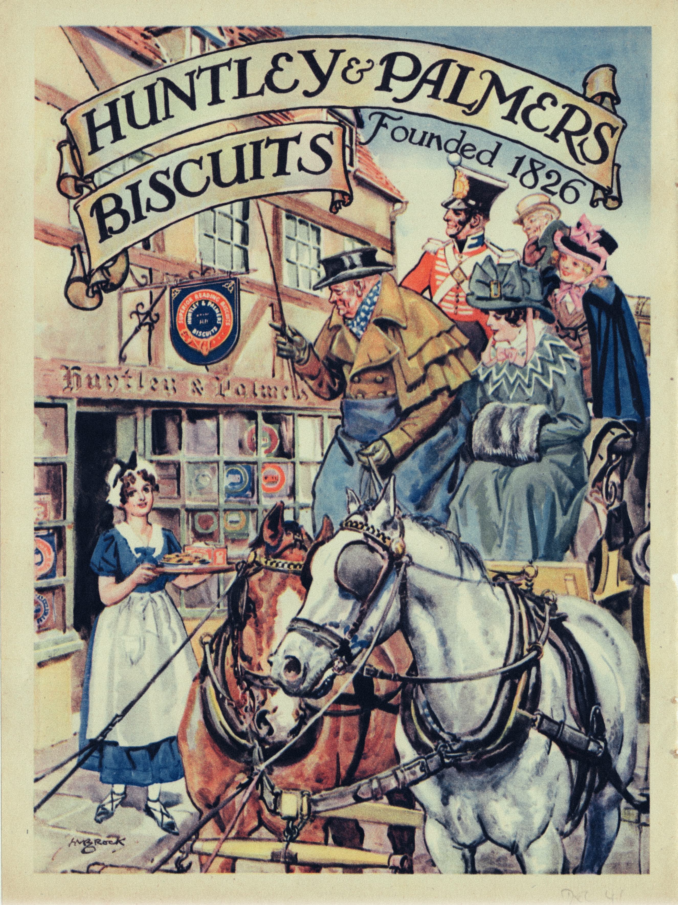
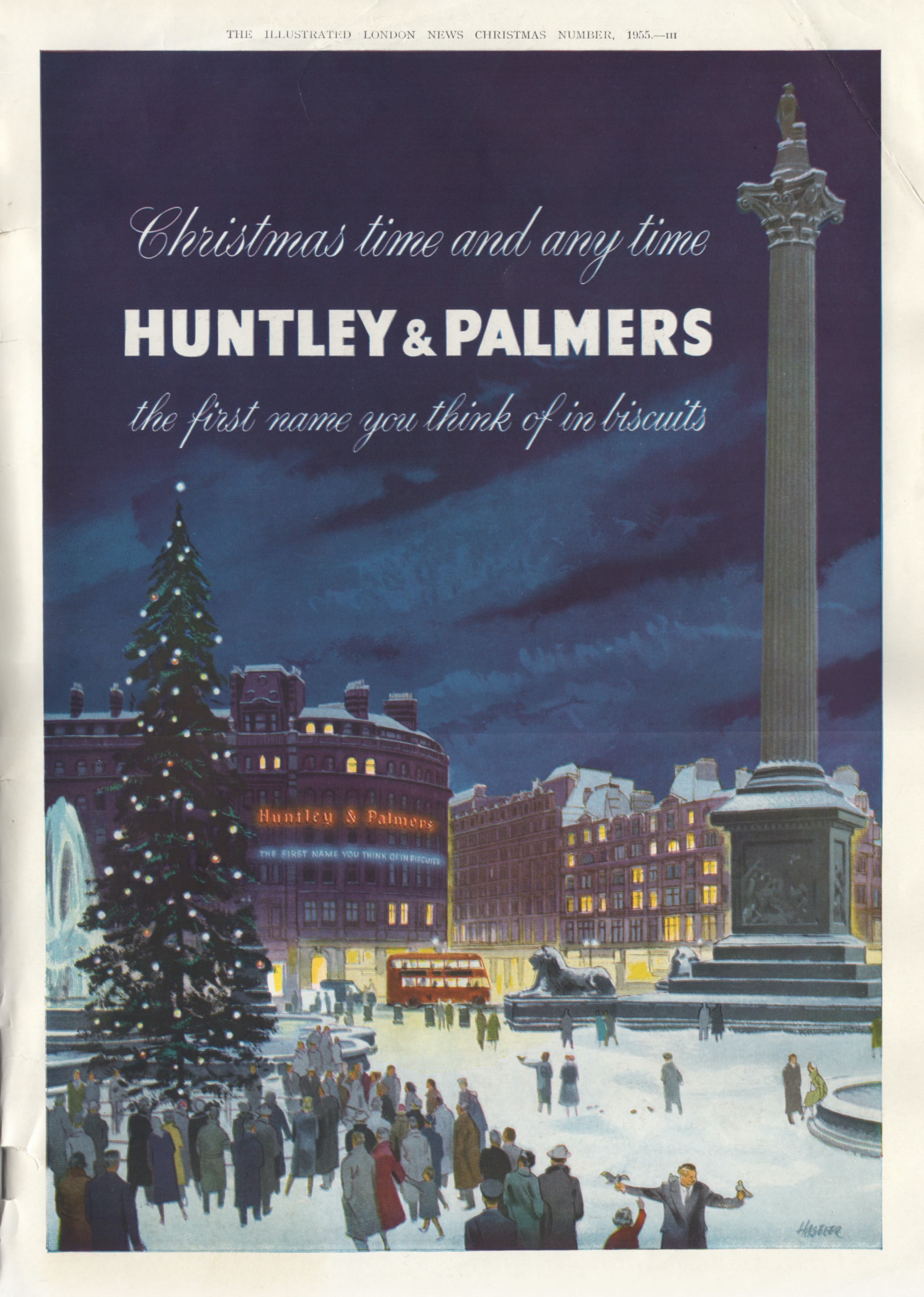
Following on from our previous post is a display of magazine advertising of Huntley & Palmer (H&P) products. H&P never established a reputation for graphic excellence and their output often lacked the kind of house style cultivated by some of their competitors. Which makes for an uneven selection of examples. The earliest from the 1920s depends on a time honoured cliché of an attractive, sophisticated female with little or no obvious association with the product. Our model stares disdainfully at what may be a dish of Imperial biscuits but the real reason for her presence is a shapely pair of legs, conscientiously rendered in all their glory. Schweppes comes to mind as an especially assiduous practitioner of this strategy. Photographic imagery predominated in the 1930s along with some generally unadventurous graphic design. The savoury biscuit ad from 1937 was an unusual exception. A welcome revival in the use of illustration led to more interesting imagery in the 1950, especially on the part of Pauline Baynes whose ice world fantasy made such an impact in 1953. C M Brock, usually a dependably competent illustrator contributed an unhappily crude piece of horsey cliché. The single thread running through this selection is the frequent resort to jingoism and in this respect Huntley & Palmer were very much in the mainstream.


No comments:
Post a Comment