Friday, 29 June 2007
The Art of the Scrapbook
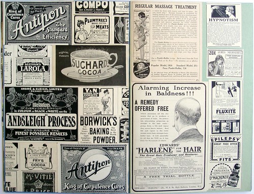
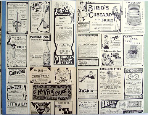
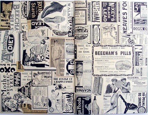
Leisured Victorians were inveterate compilers of scrapbooks and collectors will pay good money to acquire the best examples. Eye-catching images were easily found in the popular press and publishers were on hand to produce richly coloured cut-out figures specifically for scrapbooks. The practice survived the first half of the 20th. century but declined rapidly in the second. Examples can still be found in second hand bookshops and car boot sales but they are not so common as they were.
I have been filling up scrapbooks on an irregular basis since 1980. The selection criteria continually changes but the overall bias is towards advertising and editorial illustration. Some books have been devoted to single themes or subjects; others are collections of collages. At present, 15 have been completed; another 12 are works in progress. These pages celebrate British advertising art of the early 20th. century when colour in advertising was still a luxury. It was a period notable for inventive use of greyscale tones and decoration and for the directness of the appeal to the consumer.
Tuesday, 26 June 2007
The world of Caffè Lavazza
The contemporary world of Lavazza promotion is an alien environment of slick, glossy, high-style publicity. The Lavazza calendar is a playground for art directors and fashion photographers where their passion for adolescent surrealism and soft porn can be indulged to the full. Anything goes so long as sex, fashion and coffee are linked together. Long suffering models protect their modesty with teaspoons, coffee cups and filter papers while photographers prowl in search of the perfect image. Despite all the effort and attention to detail the final results are distinctly cheesy. See for yourself by clicking here.
Lavazza in the 1950’s presented a much more comforting image to potential customers. Collectors’ cards were included in every pack to engage the interest of the young and this set was issued in 1954 to commemorate 60 years of Lavazza coffee. It is always instructive to see how companies celebrate their existence and this is a particularly interesting example. In these times historical and traditional links were much valued so the first card features the founding father and the very first premises. The message is, from these humble origins our great empire grew.
Cards number 2 and 3 illustrate production and packing. Automation, technology and hygiene are the order of the day. All surfaces are polished and buffed to a perfect sheen under cool fluorescent lighting. There is a pride in showing what is behind the scenes that seems anachronistic today. A present day audience would be unimpressed by images of the manufacturing process.
Card number 4 displays the product range in both domestic and catering packs. The mid-century graphics are distinctive and bold. The graphic style seems nicely poised between pre-war decorative complexity and the pared down geometry of the 1960’s. The pack shots are lovingly rendered with a hyper-realist eye. The next card is a real treat. Barring a few landmarks, all traces of the world unconnected with Lavazza have been removed to enable free passage for the fleet of vans and trucks distributing the product throughout the land. This is a capitalist utopia – no obstacles to progress and no competition.
The final card portrays sixty years of coffee preparation and serving. Smoothly modelled forms show progress from the simple saucepan of 1894 to the gleaming reflective machine of 1954 complete with juke-box styling. These images all have great charm which springs in part from the rendering technique but also from the absence of a hard-sell. There are no comparisons with rival brands and no images of happy and contented consumers, nothing about value for money and no life style associations. It would be fascinating to learn the fate of the original artwork for these cards. Any information much appreciated. Please click on the images to see enlargements.
Monday, 25 June 2007
Tramtracks of Milan
In Post-war Britain the tram was everywhere enthusiastically eliminated from the city streets. It was felt that streets cleansed of trams would be greatly enhanced by the presence of buses with the ability to roam at will, unconfined by the need for tracks embedded in the roadway. Victorian and Edwardian city centres were demolished to create a contemporary framework for the free movement of traffic. Decades of industrial decline were to follow, while countries that retained their trams, such as Germany and Switzerland continued to enjoy great prosperity.
Half a century after Britain was purged of trams, the citizens of Milan (world capital of the fashion industry) are served by an extensive network of trams, many of which, externally at least, are more than 80 years old. I suppose I could have done more advance research but, while exploring the great Cathedral of Shopping, the Galleria, I was astonished to catch distant glimpses of trams similar in appearance to those seen and treasured in American vintage postcards.
There are, of course, those who have made these trams the subject of exhaustive study and a detailed account (with many wonderful photographs) can be read by clicking here. From this source we learn that these are American style trams known as “Peter Witts” and date from the late 1920’s. Their external appearance has been carefully maintained in original condition though they have been updated mechanically within the last 20 years. They certainly make a strong impression as they glide through narrow cobbled streets between substantial stone built 19th. century facades. To English eyes it’s almost like witnessing a theatrical recreation of the great industrial cities of Victorian England, of which Sheffield might be the best example. My wife can claim a personal connection with the world of trams, as her maternal grandfather was a carpenter employed by the City of Sheffield to repair and refurbish the interiors of the city’s trams. He was privileged to be an invited guest on the last tram journey when the network closed in 1960.
Trams have played their part in the development of the visual arts. It was a Mexico City tram that almost caused the premature death of Frida Kahlo and Paul Delvaux’s obsession with the mystery of trams has been already noted in this space. Trams feature prominently in the Moscow photography of Rodchenko and in Dziga Vertov’s film “Man with a Movie Camera”. There is an epic tram ride in Murnau’s film “Sunrise”. The German painters of Die Neue Sachlichkeit had trams in the blood – Gustav Wunderwald, Rudolf Dischinger, Hanns Kralik, Max Radler, Wilhelm Heise, Nikolaus Braun all employed images of trams to animate the city streets or as emblems of suburban ennui.
Our last picture dramatically illustrates the perils of crossing the street in front of a tram whilst reading a newspaper. Evasive action on the part of the driver is impossible. On the left, a man in a Borsalino hat takes full advantage of the situation to press his attentions upon a shapely young female while the young woman on the right has formed the belief that the vehicle can be stopped by an outstretched hand! The face of the driver takes on the appearance of a Francis Bacon painting as he contemplates the unfolding tragedy. This hugely entertaining image comes from a series of cards (of which there will be more to come) given away with Lavazza coffee in the 1950’s to promote road safety.
Thursday, 14 June 2007
Holiday Fun
There will be a short interval of silence from this space. On Saturday morning our fragile forms will be encased in a fuselage under the direction of a budget airline. A sustained mechanical effort requiring significant combustion of generous amounts of aviation fuel, will be made to propel this object at enormous velocity into the upper atmosphere, at the same time guiding its trajectory in a south-easterly direction. If this can be satisfactorily achieved, in due course, measures will be applied to restore the object to ground level in a controlled fashion, according to a set of spatial co-ordinates carefully calculated to bring it to a point of rest in Milan.
This is my least favourite means of transport, but as you can see from my scrapbook pages below, advertisers have always sought to portray aviation as a source of joy unconfined. Not such an easy sell today when the experience has been so degraded by security and stripped of glamour.
Wednesday, 13 June 2007
Postcard of the Day No. 5
Today’s card takes us back to the Buttes-Chaumont. In this vintage view the Belvedere can be seen in the upper left. Aragon wrote about this view in “Paris Peasant” as follows.
“There in the front row of the grass, a naked man is running motionless towards the abyss. It is his complete indifference to the evening chill that makes one think he must be made of bronze. This makes it easier to comprehend how, through what mystery, man has always wedded his divine representations to the image of the human body. ~~~~~ And what will become of humanity on that fast-approaching day when the population of statues will have grown to such huge proportions in town and country alike that it will scarcely be possible to make one’s way along the streets choked with statues, across the fields of poses. ~~~~~ Humanity will perish from statuemania, that’s what.”
Tuesday, 12 June 2007
A feeling for Nature at the Buttes-Chaumont
Jarvis Cocker was the subject of Sunday’s ‘South Bank Show’. Paris has been his home for 4 years and when asked to choose one of his favourite places in which to be filmed, being a person of taste and distinction, he opted for the Parc des Buttes-Chaumont. It has an extravagant air of Romantic theatricality that has made it a place of lasting fascination since the Surrealists co-opted it into their Parisian geography in 1924.
Louis Aragon’s book, “Paris Peasant” includes a lyrical description of the Surrealists’ discovery of the Buttes-Chaumont. A nocturnal expedition through its fantastic topography in the company of André Breton and Marcel Noll unlocked the collective Surrealist imagination and transformed a suburban recreation facility into a theatre of dreams. From a present day perspective, the interaction of the Surrealists adds another rich and resonant dimension to the experience of exploring the park.
When I visited the park myself, the weather was sunny and unseasonably warm, the very opposite of the conditions which so exhilarated the Surrealists. Parisians of all ages were enjoying the sunshine untroubled by thoughts of Aragon or Breton. Despite all this, a pervasive sense of unreality was easily detected, especially in the cool depths of the Grotto. Any opportunity to visit this mysterious place should not be ignored. A wider selection of my photographs can be seen by clicking here.
Aragon noted the existence of the railway that ran through the park. Known as the Chemin de Fer de Ceinture (Outer Circle Railway) it closed ten years later in 1934. Amazingly, the track is still in place and very occasionally is used by special trains for enthusiasts. Glimpsing these abandoned rails through the foliage brought to mind Paul Delvaux’s great painting, “La gare forestière”. Photographs of the most recent train to run through the park in June 2003 can be seen by clicking here.
Monday, 11 June 2007
Spot the Errors
We follow up last week’s “Find the Fault” with “Spot the Errors” from 1941, by courtesy of Ovaltine. “It’s not only easy but tests your powers of observation.” The art of marketing to children was raised to new levels with the creation of the Ovaltineys in 1935. Their catchy jingle (which can be heard on the Ovaltine website) together with generous distribution of small brochures and pamphlets of stories and puzzles was designed to win the affection of the nation’s children. This example with its rather fey illustrations of fairy tales was not untypical.
Ovaltine is one of those apparently quintessential English products that has been around for over a century. Its distant origins in Switzerland as Ovomaltine are all but forgotten. The brand is at present the property of Associated British Foods and there is an entertaining selection of press advertising to be viewed on the corporate website.
The adult audience was not completely neglected as these examples show. The product was successfully associated with health and vitality in an era when these qualities could not be taken for granted. The Ovaltine Dairy Maid cheerfully carries a heavily laden tray instead of her customary basket of natural produce, meanwhile, on the right the illustrator, Bury, brings some of the panache of Augustus John to a threesome who positively explode with energy.
Sunday, 10 June 2007
Postcard of the Day No. 4
The city of Pensacola is on the Gulf of Mexico in north west Florida. Of the 18 images in this fold-out card there is one which for sheer poetry stands out from all the rest. Night has descended on Palafox Street. Moonlight silvers the receding tramlines. Dimly lit streetcars glide to and fro beneath a canopy of trees through almost deserted streets. The atmosphere is unsettling and a little threatening. A velvety, penumbral quality has been added to what would otherwise be an unremarkable subject. For this we probably have to thank the retouch artist whose brush and palette has transformed the image. Perhaps because we are used to seeing these pictorial devices employed in the service of sentiment, the neutral subject matter we see here becomes more enigmatic and troubling.
The iconography of Belgian Surrealist painter, Paul Delvaux, can be summarised as night-time, trams and unclothed female flesh. This postcard gives us two out of three. Delvaux’s paintings are often borderline kitsch owing to his artistic preference for wide-eyed nymphettes. When the girls are banished his compositions immediately become more deeply disturbing. And so it is that this humble postcard, quite unintentionally, can equal any of Delvaux’s paintings in its power to stir the imagination and unnerve the spectator.
Thursday, 7 June 2007
Find the Fault
Today is party time! The oppressed and subjugated child of the Fifties was easily entertained if this is anything to go by. In an era when children were constantly reminded of their humble position in the order of things, this activity may well have come as a welcome relief. It was a parental duty to continually draw attention to the faults and defects in the child. It’s easy to see how the child would have enjoyed the opportunity to point out the faults in others. At the same time it would encourage the development of a tidy mind where everything is present and correct in its rightful place.
I have to admit that I got some pleasure from this type of game. Rupert Annuals had similar pages where the reader was invited to spot such incongruities as a policeman wearing his helmet back to front or a postman with two left feet. The street scenes always struck me as the most potent and this is a selection of some of the best. In retrospect, these images take on a dream-like aspect and describe a world where much that is familiar has been inverted. As such they form an ideal introduction to the streetscapes of Giorgio De Chirico.
It didn’t take long to discover that there are connoisseurs of this genre to be found on the web. To explore this topic further, a visit to Planet Perplex is recommended.
Wednesday, 6 June 2007
Barry Craddock – Master of pastiche
To an interested observer like myself, with absolutely no links with the advertising industry, Barry is one of the unsung heroes of commercial illustration. He has the skill to adapt to almost any idiom or style as required. I like to imagine him at work surrounded by an enormous reference library of the finest graphic imagery (Gebrauchsgraphik, Commercial Art, Graphis, Art & Industry) but the reality is probably very different. Here is a small selection of his output that gives some impression of the enormous range of his talents.
In the late 1980’s (or early 1990’s) there was a Shell poster campaign with a strong period feel, calculated to evoke the empty roads and unlimited speeds of mid-century Britain. Barry’s illustrations captured this to perfection with fonts and layout to match. These examples were photographed in London Road, St. Albans.
In my opinion, the wonderful faux woodcuts for Beck’s Bier in 1985 are the very best of his work. There are 3 variants that I know of: portrait format, landscape format and a Christmas themed landscape format. The portrait format is the strongest – a proletarian brewer holds a foaming glass to the light and subjects it to piercing scrutiny in the interests of quality control. Behind, a towering factory hall packed with cylinders, valves and gauges all dedicated to the brewing process. In the landscape image, our muscular worker-hero strides purposefully to the busy waterfront where barges line up to ferry the casks of ale to a thirsty nation. In the background, to the left a medieval bridge and cathedral and to the right a towering industrial facade and smoking chimneys. The style combines the robust immediacy of an Expressionist woodcut with the gravitas of Ludwig Hohlwein. Superb images but, did they work? Did consumption rise? Did the proletarian mood hold any appeal for the style conscious, conspicuous consumers of the Thatcher years?
Barry is still hard at work, to visit his website, click here. Perhaps, before too long, someone will produce a monograph on Barry’s work and collect his entire output into a single place. It would be a great asset to future generations of graphic artists and historians of design and illustration.
Monday, 4 June 2007
Postcard of the Day No. 3
This card shows the locomotive roundhouse of the Southern Railway at Spencer, North Carolina. The town of Spencer was situated midway between Washington DC and Atlanta on the Southern Railway and became the location for a major locomotive maintenance facility. In this image the roundhouse is in the centre and the repair shops are in the background. Although the facility closed in the 1960’s it survives to the present as the North Carolina Transportation Museum. I love this card for its subtly muted colours and because it captures the smoke laden atmosphere of a steam locomotive depot. A characteristic of the Age of Steam is that small towns were often home to implausibly large numbers of locomotives. If the railway arrived before the town it was often the case that the town grew no larger than was needed to service the railway.
Sunday, 3 June 2007
Clifford Webb 1895-1972
Clifford Webb was one of the great practitioners of the challenging art of wood engraving and I am a great admirer of his work. Clarity of structure, dynamic compositions and precision of mark-making typify his output. In all he illustrated eight books for the celebrated Golden Cockerel Press between 1937 and 1954. My only written sources on Webb are the 1982 catalogue of an exhibition held at Leicester Polytechnic and an article in Studio magazine by Christopher Sandford published in August 1949.
The private press books were beautifully produced for a small but discriminating market but alongside them he illustrated and wrote ten books for children. In addition he illustrated about 25 books by a wide range of authors, most notably Arthur Ransome’s “Swallows and Amazons” (in later editions Ransome’s own illustrations supplanted those of Webb).
This book of satirical poetry by Marmaduke Dixey published in 1936 was a rare chance for Webb to display his talent for visual wit and engage with more contemporary material. There was also scope for exploring his preferred themes of wild creatures in their habitat and the pleasures of the countryside. Although the production values lack the scale and quality of the private press editions, the playful character of the verses is reflected to perfection in Webb’s versatile and resourceful illustrations. Further examples of Clifford Webb can be found at Chris Mullen’s compendious Alphabet of Illustrators. Highly recommended.
Subscribe to:
Posts (Atom)