Saturday, 30 January 2021

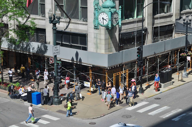
Reliance Building, Chicago

The Reliance Building in the Chicago Loop was constructed between 1891 and 1895 on the site of an existing five storey bank building at the intersection of State and Washington. It was a laborious process that involved demolition of the ground floor which had been acquired with vacant possession while retaining the upper floors until the leases expired.  Supporting the upper section required extensive jack-screwing while a link with the street level had to be maintained for access. The new building would rise to its full fifteen storeys as the upper floors were vacated and demolished.

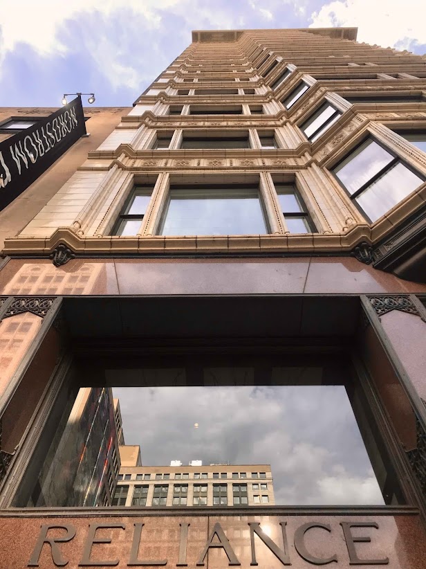
Allocating credit for the innovative design features of the Reliance is problematic.  Chicago firm of Burnham and Root was the lead architect but a key role in terms of engineering was taken by the developer, William Hale, who under another hat was the founder of the Hale Elevator Company; his fortune grew with the height of the buildings.  Hale took charge of the technical challenges of demolition and rebuilding the lower floors while securing the upper floors. John Root died in 1891 during the first phase of construction and is generally credited with designing the innovative steel frame plus the ground floor but it was his replacement, Charles Atwood who took charge of the design and construction of the upper floors including the glazed white terra-cotta cladding. Atwood also takes the credit for the huge bay windows that comprised a pair of fixed windows flanked by opening sashes to either side for ventilation. Burnham raised the finance, marketed the building to tenants and was the public face of the project.


When the Reliance opened in 1895 the first tenant was the Carson Pirie Scott & Co. department store - they occupied the first two floors while the upper floors were subdivided and let as office space, consulting rooms and dental surgeries.  Critics and commentators hailed it as a landmark in the evolution of the Chicago Style but it’s reputation was rapidly overshadowed by the next generation of much larger and taller buildings. By the end of World War 2 its fortunes were in steep decline - professionals moved out, a mix of wholesalers, light industry, and a menswear store moved in.  By 1980 most of the later tenants were moving out without being replaced and the fabric of the building was decaying at speed - the terra-cotta façade was discoloured and cracked and the cornice had to be removed to protect the public from falling masonry.  By this time its importance was forgotten by all but the most dedicated enthusiasts for Chicago architecture. A campaign was launched to rescue the building from neglect and with growing public support and funding a detailed restoration began.  This would conclude in 1999 when the building reopened as an hotel (The Burnham) with its dazzling terra-cotta brought back to life.  Staircases, elevators and circulation areas were returned to original condition so far as regulations permitted.  In recent years the hotel changed hands and the new owners rebranded it in line with others in the chain which is how it came to be landed with the fatuous name of Staypineapple - a moniker that seems like an insult to the dignity and reputation of the building.  The rationale for this decision can be read here.  Warning, contains language that some might find offensive.


Enhanced views from inside the Reliance offer the same sense of optical plunge that Boccioni recorded in The Street Enters the House (1912) - an expanse of glazing that invites an onrush of visual information at an intimidating velocity.  More practically, the occupants enjoyed the optimum quantity of natural light in all weathers.  Books consulted are 1)  Jay Pridmore,  The Reliance Building (2003) and 2)  Dan Cruickshank,  Skyscraper (2018).  Cruickshank’s exhaustive and immensely rewarding account of the Reliance is at the absolute centre of his history of the evolution of the skyscraper - highly recommended.




Tuesday, 26 January 2021

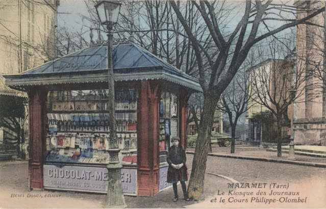
Postcard of the Day No.102 Mazamet, le Kiosque des Journaux


This is the sort of postcard I’m always looking out for - a modest building fully stocked with newspapers and magazines in a melancholy square in a small town in south west France.  It’s a midwinter scene and the only sign of life is a young girl, hands clasped, wearing a beret and an air of resignation that suggests she may be the photographer’s daughter pressed into accompanying her father on a weekend expedition.  In the distance there’s a flat-bed delivery lorry but everything else points to a bitterly cold Sunday afternoon.

To my astonishment, when I took a dive into Streetview, there it was. Almost unchanged after nearly a century - the finials and decorative ironwork fringe still in place in September 2019 when the Google car passed by.  Paris Match has replaced Le Petit Parisien and l’Illustration and the Franc has given way to the Euro but, despite the temporary nature of kiosks, there it stands - a triumphant survivor, still selling the printed word and image in the digital age.


Tuesday, 19 January 2021

Bridges of Paris: 1 Viaduc d’Austerlitz

While most Paris Métro lines (with the notable exception of line 6) burrow underneath the Seine, line 5 crosses over the Seine between Quai de la Rapée and Quai d’Austerlitz by courtesy of the graceful Viaduc d’Austerlitz, a single arch steel bridge built in 1904, slender in appearance but rich in decorative ironwork.  On the north bank the bridge approach is via a curving steel ramp that lifts the tracks to the required height. At the other end the bridge extends over the Quai d’Austerlitz and the roadway before plunging into the roof space of the Gare d’Austerlitz - the only terminal station in Paris where the Métro platforms are situated above the station rather than safely interred beneath.  The view from downstream includes glimpses of the clock tower at the Gare de Lyon and the offices of RATP, the nerve centre of Parisian public transport.  There are houseboats tied up alongside the Quai d’Austerlitz - in an early series of The Spiral, the stocky figure of the eternally compromised Gilou (aka Escoffier) could be seen there, going aboard for a critical meeting with an organised crime boss to whom he would offer his services as an informer from inside the police.

Jean-Camille Formigé (1845-1926) designed the bridge with the engineer, Louis Biette. Formigé is no household name but he left a distinctive mark on the city around the turn of century.  He designed the Pont de Passy (1905) and the extended viaducts that supported Métro line 2 on its aerial sections through northern Paris. His taste for decorative moulded reliefs can be seen on all these structures. The nautical themed coat-of-arms for the City of Paris with its anchor and trident, is stretched and extended and draped with fronds of seaweed and undulating fish, then repeated at intervals across the Viaduc from the main arch to the balustrades.  Robustly carved bulls’ heads surmount the stonework of the massive abutments to amplify the sense of structural strength.


Thursday, 14 January 2021

Eno’s “Fruit Salt”

In 1924, a bold and colourful poster designed by E McKnight Kauffer appeared on the nation’s billboards with the slogan “First Thing Every Morning”. E McKnight Kauffer, an American emigré, was Britain’s most avant-garde designer, the first to absorb the pictorial language of Cubism and a brave choice to publicise an antiquated Victorian product.  This marked a decisive break with Eno’s Victorian heritage and would be followed by a long association with contemporary designers including Ashley Havinden, Charles Pears and Austin Cooper as well as an extended series of variants on Kauffer’s original. The version shown above was an adaptation miniaturised for use on a Bryant & May matchbook cover.

Eno’s was a product of eternal Victorian anxieties around metabolism, digestion and bowel movements. Advertising was essential to its success and the name was prominently displayed on Victorian railway station platforms and almost every passing omnibus. The Victorian public had an insatiable appetite for miracle cures and instant remedies.  Pharmacists leapt into action, concocting an enormous range of chemical compounds and magic elixirs, to meet the demand. One of the most successful was a Newcastle chemist, James Crossley Eno who invented an effervescent powder that promised to ‘clear the intestines, rouse the torpid liver and stimulate the mucous membrane’.  Decoratively packaged and relentlessly publicised, it rapidly became the market leader and spawned many copies and imitations.

Eno saw no need to employ an advertising agency, convinced as he was that he could do a much better job himself with a mind well-stocked with aphorisms and received ideas.  His bizarre contributions to the history of Victorian advertising were memorably described by E S Turner thus.


The most eccentric, the most obstinately ‘different’ advertisements in late Victorian magazines, and for a long time afterwards, were those personally devised by the founder of Eno’s Fruit Salts. Three quarters of his space would be taken up by high-flown quotations on the theme of man’s unconquerable mind, from the ancient and modern philosophers.  The underlying theme, so far as it was distinguishable, was the sin of allowing the human intellect to be harnessed to a sluggish gut; but often the quotations came so thickly and haphazardly that it was impossible to trace a continuity of thought behind them. Now and again the compiler would throw in an uplifting poem which had taken his fancy, or perhaps an original rhymed tribute from a retired major-general. He kept an artist busy drawing scenes in which lost wanderers stumbled into forest glades and found words like ‘Integrity’ mysteriously carved on the rocks, or in which seated greybeards solemnly drew the attention of milkmaids to moral phrases graven on the ground before them. Sometimes the descent from the cloudless peaks of the intellect to the mucous walls of the intestinal canal was achieved almost in one sentence. For a generation the strong-minded founder of the firm fought off any suggestion that he should ‘modernize’ his announcements.


(The Shocking History of Advertising, 1965 Penguin edition, page 89.)

This drawing of the goddess Hygeia banishing the evil imps of ill-health marked a rare excursion by Arthur Rackham into the world of commercial art.  Taking a break from his routine of terrorising the children of the Edwardian professional classes with nursery tales transformed into nightmares, Rackham drew a small army of evil spirits, from Inferiority Complex to Raspberry Tongue via the Pip and Housemaid’s Knee, all sent packing by the purgative powers of Eno’s.  The mood lifted in the late 1920s when Eno’s engaged the services of W S Crawford advertising agency and began a dramatic shift to a more contemporary visual approach. After McKnight Kauffer came the young Ashley Havinden, who in 1927, fresh from an extended visit to study modern publicity in Germany, designed a famously dynamic ad in which 3 angular horsemen trailed banners emblazoned with the virtues of Eno’s on a diagonal march across the page.  The result owed more to the Gebrausgraphik tradition than to any Bauhaus influence.  It would be followed by many more ads designed to appeal to the contemporary eye while conveying a sense of breezy optimism about the comforting sense of well-being that awaited the consumer of Eno’s Fruit Salts.  Eno (minus the apostrophe ’s’) is today owned and marketed as an antacid in Asia and South America by GlaxoSmithKline (GSK) - a curious afterlife for a quintessentially Victorian patent treatment.