In 1956 British-owned volume vehicle builders were about to enter a long period of turbulent decline that would lead inexorably to their extinction by the end of the century. The captive market in the Commonwealth and allegiance to all things British was on the point of disappearing and competition from other European manufacturers and from Japan was about to put the British industry under severe pressure. This vehicle design borrowed from European competitors (especially VW) for its shape and proportions and with revisions would remain in production for another 11 years. Smoother contours and an undivided windscreen distinguished it visually from its predecessors. The publicity brochure shown here relied upon the skill of the illustrator for its cheery visualisation of a gently idealised post-war world, rendered in a style we might call Ladybird-lite. The professional illustrator would soon be supplanted by the photographer as printing techniques improved but in the late 1950s the hand-drawn image conveyed a sense of immediacy and visual power that could not be easily matched in cheaper photographic reproduction.
Monday, 29 February 2016
Monday, 22 February 2016
Hull Streetlife Museum
Hull is one of those cities that is automatically disparaged even by people who’ve never been there, on the basis that however mediocre your hometown may be, it is demonstrably superior to Hull. It’s a useful rule that any universally despised place is well worth a visit and almost always much more interesting than many more over-valued places. Despite being one of the Luftwaffe’s most favoured and easily accessible targets, Hull still possesses a fine group of Georgian, Victorian and Edwardian buildings, significant medieval churches and a great collection of swing bridges and lifting bridges. There remains a strong sense of local identity and civic pride typical of Northern cities. One of Hull’s many attractions is the Museum of Streetlife – an ambitious title that perhaps promises more than it can deliver. It’s really a collection of vintage transport, imaginatively presented in a series of recreated street tableaux that provide context for the exhibits – at one time it would have been called Transport of Yesteryear.
The museum presentation is a masterpiece of compression in which a signal box, a complete level crossing, and a parade of small shops serve as a backdrop to a collection of road and rail vehicles. The world of manual labour is memorably evoked in a dramatic presentation that includes stacks of hessian bales and heavy wooden crates loaded on to a 1933 Scammell 3-wheeler plus trailer, familiarly known as a Mechanical Horse. My only complaint is the absence of litter and detritus – the odour of stale tobacco and burning coal would have been a bonus. It’s interesting to speculate on what might be included in such a museum in the future. Looking back half a century or more to today’s shopping streets might find a place for Betfred, Greggs, Wonga, a Food Bank and a Charity Shop from the days when charity was still a legal activity. The vintage vehicles might include an Ocado van and a selection of delivery vans from Yodel, Hermes, Interlink, DHL and Fed-Ex. Dioramas could feature a crowd of juvenile inebriates spilling out of a pub on a Friday night or a road rage episode involving a cyclist, a black cab, an Uber driver and a Night Bus.
Labels:
bus,
graphic design,
hull,
museum,
packaging,
signal box,
streetlife museum,
trams,
transport
Friday, 19 February 2016
Napoli Galleria Umberto 1
The Galleria Umberto 1 in Naples was conceived as a riposte to the great Galleria Vittorio Emanuele in Milan, twenty years after the latter was built in 1867. It was the centrepiece of a major regeneration project intended to combat the city’s unenviable reputation for squalor and criminality. All this and more is comprehensively explained in the YouTube documentary. The film-makers made the most of privileged access that enabled them to film inside the apartments that occupied the upper floors, the roof top dwellings provided for the maintenance staff and the basement areas that accommodated a theatre, a cinema and a snooker club.
Friday, 5 February 2016
Postcard of the Day No. 81 – Beppu Hot Spring
Today’s card is a distant offshore view of the city of Beppu on the Japanese island of Kyushu – well known for its therapeutic hot springs and for sand-bathing (see a previous post here for more on sand-bathing). Without the right foreground with all its maritime paraphernalia this would be a very dull composition but the sculptural presence of ship’s ventilators and folded canvas awnings resembling mute standing figures offers some visual relief. Included below are more examples of postcard views that employ the deck of a ship as a kind of floating stage. Three of them show mariners going about their on-board duties with varying degrees of sobriety ranging from muscular endeavours at the anvil, via fitness routines to some highly ambiguous dance moves designed to deceive the enemy and convey a false sense of security. For more postcard images of matelots at work and play, please follow this link.
Saturday, 30 January 2016
Alice Through the Guinness Glass
Classic Guinness advertising took divergent paths. In one direction were the boldly drawn John Gilroy menagerie compositions and feats of prodigious strength with brief snappy slogans. In another was a long series of pretentious, whimsical, text heavy magazine adverts in which the over-educated copywriters at S H Benson indulged their fondness for elaborate demonstrations of literary expertise and witty wordplay. Placing the adverts in such publications as Illustrated London News, The Tatler and Country Life represented a conscious effort to reach a more affluent and socially superior consumer. The hallucinatory fantasies of Lewis Carroll were extensively parodied in sometimes interminable verses, deep in which the merits of a glass of Guinness were archly commended. The saving grace was in the accompanying illustrations, especially those of the under-rated Anthony Groves-Raines who possessed a genuine flair for elegantly deadpan rendition of fantastical subject matter. Groves-Raines had a long association with Guinness and was a regular contributor to the series of illustrated brochures that Guinness dispatched to the nation’s doctors every Christmas. One of these, (My Goodness! My Gilbert and Sullivan) was posted on this blog in 2010. Brian Sibley in The Book of Guinness Advertising (1985 and still the definitive book) has chapter and verse on this topic on page 73, (Guinness in Wonderland).
Labels:
advertising,
anthony groves-raines,
guinness,
illustration
Tuesday, 19 January 2016
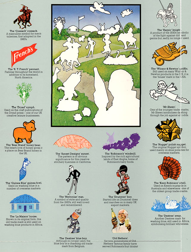
Wandering Brands
Reckitt and Colman was able to assemble this disparate collection of brand characters to grace the covers of its Annual Report in the 1980s. Many of these mascots, so artfully combined, have wandered off in all directions while the parent company merged with a Dutch business becoming Reckitt Benckiser in 1999. Since then the name has been abbreviated to the not very inspirational RB. While Harpic, Dettol, Brasso and French’s Mustard remain part of RB, others have moved on to new ownership (listed below) and a few (Robin Starch, Wren’s Shoe Polish, Drummer Dyes, Bluebell Polish) seem to have vanished leaving very little trace. Even where the products survive many brand characters have been retired and although some are no great loss, the world seems a poorer place without the jaunty monocled Meltonian Man bringing the sparkle of the Drones’ Club to an otherwise unexciting range of shoe care products.
Colman’s Mustard – now Unilever
Robinson’s Drinks – now Britvic
Reeves – ColArt (majority owned by Linden Group, Sweden)
Winsor & Newton - ColArt (majority owned by Linden Group, Sweden)
Cherry Blossom – Granger’s
Propert’s – Kiwi (S C Johnson, formerly Johnson Wax)
Meltonian - Kiwi (S C Johnson, formerly Johnson Wax)
Saturday, 9 January 2016
Car Plants
This is from the pages of Fortune magazine dated April 1944, two months before the Normandy Landings. A brace of shirt-sleeved execs, draft-exempt, kneel on the grass planting the seeds of the post-war rebirth of the auto industry. A hefty block of text explains what’s going on. In the flowery prose favoured by Ivy League-educated copywriters too old to be sent to war, we’re informed that this is the Victory Garden in which a new generation of cars is incubating. The technical advances of a war economy will lead to an innovatory paradise in peacetime. It’s a very odd way to illustrate a concept that most would think so slight as to be not worth the bother. Fortune was full of ads like this where the reader can be forgiven for concluding the entire exercise is otiose. My suspicion is that the advertising sales team at Fortune were adept at out-thinking the masters of persuasion and all too easily induced businesses to take out full page ads they had no real need for resulting in page after page of almost content-free advertising. The killer line was “Tell the readers what you’re contributing to the war effort because all your competitors are.”
The illustration is the work of Slayton Underhill (1913-2002) - a name that sounds more like a Wall Street brokerage or a Purveyor of Fine Tobacco. Underhill was one of many mid-century illustrators who toiled away in the industry without reaching the top flight of illustrators that commanded the highest fees. Underhill’s fame rested on his ability to create a paint finish utterly depersonalised and anonymous, scrupulously eliminating all evidence of material handling. This early example shows a certain technical bravura that the mature Underhill would never have allowed. The companion piece from Underhill was painted for Metropolitan Life Insurance. It’s a limp image of listless horticulture – a middle-aged widow sorrowfully reflects on the financial irresponsibility of her late husband in failing to provide the security of a Metropolitan policy. She is presented to us as a fallen woman, raising the fear she may be forced into prostitution to survive – an unthinkable fate for a decorous, unassuming flower of American womanhood. We will feature more of Slayton Underhill at a future date – be assured, it’s not all as dull as it appears here.
Subscribe to:
Posts (Atom)