Thursday, 18 June 2015

Vintage Matchbooks British Style


The British matchbook tended to be printed on better quality card and to a higher standard than the transatlantic version. They were normally sold to the customer for a nominal penny or given away in hotels and restaurants. The individual matches often carried a brief message and the match heads themselves were sometimes produced in colours to suit the product being promoted. They come from a time when smoking was at the peak of its social acceptance and still traded on associations with masculinity and sophistication. A brief glance at any collection will confirm just how many of them originate in bars, restaurants, gambling dens or nightclubs. 


The best of them display a high degree of visual invention and sophisticated typography. The Eno's example is adapted from a design by McKnight Kauffer. Interesting to note how hospitals took a benign attitude to smoking and made extensive use of them to help with fundraising. Vanished tobacco brands include Rubicon, Rugby, Varsity and Rummy cigarettes as well as the splendidly named Injunella cigar. The shipping lines made very effective use of them, expressing the glamour and excitement of an ocean voyage with dramatic maritime imagery. On the basis of these examples they outperformed the railway companies whose output, with a few exceptions was resolutely prosaic. Of course to be authentically British an appearance by our much loved royals is essential – but on this occasion they must do so in the company of the Scottish Ice Rink at Crossmyloof, the Nottinghamshire Sea Scouts and Butlin’s Luxury Holiday Camps. 


If you need to see more of these beguiling miniature packages – Robin Benson has some here and Chris Mullen has some here


Tuesday, 16 June 2015

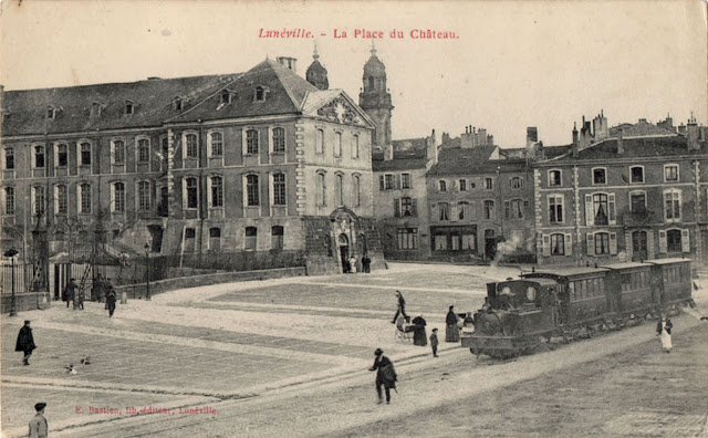
Postcard of the Day No. 75 – Street-running en France


These postcards show that it wasn’t unknown for trains to take to the highway in France. It seems to be something more commonly seen with small trains in small towns although in Nantes mainline express trains ran alongside the city streets making for a fine spectacle. The village of Barbizon is close to Fontainebleau Forest and gave its name to a group of 19th. century landscape painters who made a virtue out of painting in the open-air. On the day the Second World War broke out Picasso travelled from Paris to the Atlantic coastal resort of Royan. He was chauffeur driven in his Hispano-Suiza with an entourage including Dora Maar and his secretary, Sabartés. For almost 12 months he would alternate between Royan and Paris before settling once more in Paris for the rest of the Occupation. Lunéville was described as the Versailles of Lorraine – the Château de Lunéville was the seat of the Dukes of Lorraine. Georges de La Tour, the master of candle light and chiaroscuro lived most of his adult life in Lunéville and died there in 1652. Nantes has a reputation for slave trading, ship building and manufacturing biscuits. The great French brand LU (Lefèvre-Utile) was born in Nantes but like so much else has ended up in the clammy embrace of Mondelez – a neologism created to divert attention away from any negative associations that might cling to the name of Kraft. 


Friday, 12 June 2015

Tunnel walking in Rotterdam


It seemed like the perfect entertainment for a rainy morning in Rotterdam – a ride on a 44 bus southbound through the Maastunnel followed by a northbound stroll through the pedestrian tunnel. The miscalculation arose in not appreciating just how far the 44 bus travels before the first stop after the tunnel exit. The result was an interminable footslog alongside a frenetic dual carriageway on a footway that simply ceased to exist in several places. A waste incinerator, a graveyard for ancient rusting shipping containers and a scrapyard were the best of the diversions enroute. The cycle and pedestrian tunnels share an entrance in the depths of the ventilation tower. Access is via elderly elevators where local cyclists demonstrate their expertise in handling their machines on a moving staircase. Then a short winding staircase leads to the pedestrian tunnel below. 


Tunnels are a lifelong source of fascination and back in 2012 I posted here on the subject of tunnel walking along the Monsal Trail in Derbyshire. The dislocating sense of being in an unauthorised or artificially created space is not unpleasurable. Even on train journeys there’s a childlike satisfaction to be had from the sense of passing through a completely alien geology in a protective space. Especially when travelling through the Alps or under the Channel. Walking through the Maastunnel was a solitary experience – I was halfway before meeting the only other traveller. An elderly chap pushing a supermarket trolley laden with paint tins and DIY stuff that he must have somehow manoeuvred successively down an escalator and a winding staircase. The exit on the north bank is again underneath a ventilation tower – opposite is an undistinguished café/bar and an entrance to a public park. It was still raining. 


Work on the Maastunnel began in 1937 – it was to be the first vehicle tunnel in the Netherlands when completed in 1942. It was built by submerging prefabricated tunnel sections into trenches in the riverbed. By the time it opened the city was under Nazi occupation and there was no official opening ceremony. The austere institutional tiled finish and absence of decoration is typical of a wartime economy. In 1944 the German authorities primed the tunnel with high explosives so they could destroy it as a parting gift but happily they failed to do so. The tunnel remains a vital traffic artery and is well used by cyclists if not by pedestrians. 


Wednesday, 10 June 2015

Vintage Matchbooks of North America


Along with postage stamps these humble artefacts are examples of micro-graphics – design for small surfaces. Unlike stamps, that benefit from high quality printing, in the interests of economy matchbooks were printed at the lowest resolution possible on the cheapest available card. They can often appear exceptionally crude but that doesn’t always detract from their appeal and can even be an enhancement. Design standards were not especially high – the most successful kept it simple and grabbed attention with typographic vigour. The least successful were those that over complicated matters by employing images that simply failed to reproduce on a small scale or those that tried to include too much information. Visual refinement was in short supply and almost exclusively confined to hotel promotions. 


In the US they were given away, free of charge in drugstores and tobacconists, restaurants and bars with the costs being covered by their publicity value. They weren’t without their hazards. Despite the injunction to “Close Cover Before Striking” not everybody did, with predictable results but even a cautious user could get burnt. The combination of floppy card matches and a deteriorating friction strip could induce the user to grip the match ever closer to the tip and end up with an incinerated fingernail. In Hollywood movies the use of matchbooks was a useful indicator of dubious moral character or economic deprivation – anyone with an ounce of self-respect would be using at least a Ronson or a Zippo. These are all taken from an album I bought about 30 years ago that was rediscovered when I went in search of the Wrigley’s items to illustrate the post on “Dorothy and Otis”. 


Friday, 5 June 2015

Dorothy and Otis


Until the arrival of this comprehensive study (Dorothy and Otis: Designing the American Dream Norman Hathaway and Dan Nadel) the only information of substance I had on Otis Shepard was this extract from Art and Industry, May 1937. Primarily a billboard artist, very little of his work found its way on to the printed page. One exception was this example for Chesterfield which re-uses an Art Deco-styled image of a fashionable girl about town originally created for a 1930 billboard. The book includes a wealth of information about Foster & Kleiser, a West Coast agency specialising in billboard and hand-painted advertising where Shepard made his start in the industry. 


The story of Dorothy and Otis on vacation in Europe is told, including an account of the 1929 meeting with Joseph Binder in Vienna. The influence of Binder’s subtle modulations of colour and tone was crucial in refining Shepard’s air-brushed style and imparting the crisp flair that enabled him to market his services to Wrigley’s Gum as a freelance artist, proving himself to be a master in the art of infinite variations on a theme. The association with Wrigley’s lasted over 30 years and extended from the design of the pack to jumbo-size billboards – Shepard had complete control of every aspect of Wrigley’s graphic output. The US was no more receptive to European Modernism than Britain and the Shepards were exceptional in their range of interests. They could have seen Binder’s work in Gebrauchsgraphick or in Posters & Publicity Commercial Art Annuals that in 1927 and 1928 included 6 and 7 examples respectively. It would be interesting to know more about how the Shepards made their journey from the robust camaraderie of Foster & Kleiser to the sophistication of Binder and Cassandre. The relationship with Binder proved to be a lasting one. Later in the 1930s Binder himself would end up working in the US (for Jantzen, Schenley, the Coffee Bureau and Fortune magazine) and the Shepards kept in close touch with him. 


The book rescues Dorothy from footnote status – reminding us that she produced an award-winning series of billboards for Pabst beer as well as designing the great aquatic illuminated neon spectacular for Wrigley at Times Square in 1936 about which I posted here in 2009, unaware that it was the work of Dorothy Shepard. The book only exists because Dorothy made compendious scrapbooks of their work which were cherished and carefully preserved by the next generation. Far too many advertising artists have suffered the ignominy of having their life’s work discarded by their unappreciative descendants. 


Tuesday, 2 June 2015

Van Nellefabriek


A mile or so to the west of Rotterdam Centraal stands a factory complex known as the Van Nellefabriek that has an international reputation as a major development in the evolution of the modern factory. Built between 1926 and 1931, the processing and packaging of tobacco, coffee and tea products continued until 1998. It has been celebrated in all the historical surveys of Modernist architecture and after a visit in 1932, Le Corbusier gave it his seal of approval. In 1987 the business was taken over by Sara Lee/Douwe Egberts who implemented a closure programme from 1995. Since final closure the premises have been converted to office and studio use (known as the Van Nelle Design Factory) whilst the appearance of the original factory has been carefully preserved. In 2014 the factory was designated as a World Heritage Site in recognition of its international importance as an early example of a vertically organised daylight factory. 


The site was chosen because it offered easy access to rail and canal transport – the factory is a prominent landmark on the mainline between Rotterdam and Amsterdam, advertising its presence and products to a daily audience of many thousands. The glazed façades and curtain wall construction, the generosity of scale, the brilliantly illuminated workspaces, and the visual drama created by an ensemble of crisply contrasting forms collectively proclaim that this was manufacturing for a new age of advanced technology and consumerism. Building on a greenfield site marked an escape from the congestion and pollution of the inner-city. Drawings and plans were drawn up in 1926 by Brinkman and Van Vlugt and the concrete superstructure went up in 1927. 


The low-rise office building is the most visible feature from passing trains and the name of the business is prominently lettered in red neon on the top. There are two wings one of which is rectilinear while the second curves. Where the two wings intersect the transition strongly resembles naval architecture. The maritime theme is enhanced by the view of the bridge-like rotunda on the summit of the factory building. The seven storey factory block with its serial geometry of overall glazing and slender steel supports has the strongest association with Modernist principles. 


The anatomy of the business (which began in 1782) is interesting, built on three raw materials, imported in bulk from distant continents, sorted, dried, ground and blended before being packaged and dispatched for retail. Each commodity had its own dedicated building with by far the greater space allocated to tobacco where the packing floors were connected to the dispatch building by overhead glass-walled chain driven conveyors. The theatrical quality of this aerial movement has helped to define the way that the factory has been defined in the public mind as something special and worthy of preservation. 


Which leads us to the mythology and hyperbole that accumulates around highly regarded buildings. The nomination document reaches for such phrases as “a lucid poem in glass and steel” and “an ode to light” whilst locating elements of humanism and spirituality in the factory complex. The more prosaic reality is that a long-established business, guided by a need to rationalise production in a purpose built facility had the vision to take advantage of the most up to date design and building technology. Efficiency, productivity and the avoidance of waste were economic imperatives that inspired large open workspaces designed to move commodities through the manufacturing process with the minimum of energy. The driver of the project was the senior proprietor, Kees van der Leeuw – a progressive businessman with an interest in art and philosophy and the ambition to develop a contemporary manufacturing facility that embodied the highest principles of design, technology and enlightened labour relations. Facilities for staff included generous playing fields, recreational open spaces, a library and canteens for office and factory workers. 


The last word goes to Le Corbusier who wrote the following after his visit in 1932: 

The sheer façades of the building, bright glass and grey metal, rise up ... against the sky ... The serenity of the place is total. Everything is open to the outside. And this is of enormous significance to all those who are working, on all eight floors inside ... The Van Nelle tobacco factory in Rotterdam, a creation of the modern age, has removed all the former connotations of despair from that word ‘proletarian’. And this deflection of the egoistic property instinct towards a feeling for collective action leads to a most happy result: the phenomenon of personal participation in every stage of the human enterprise.