Wednesday, 28 December 2011

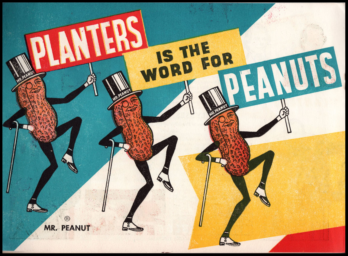
Mr Peanut presents........ Dead Presidents


The young American in 1953 with a thirst for knowledge, after consuming fifteen peanut-related products from Planters, could exchange the fifteen outer wrappers for this scholarly collection of words and images, free of charge. Each president is honoured with a portrait, a brief biography and an illustration to record the most dramatic feature of their term in office. This is usually a foreign war or the acquisition of more territory – in the case of Truman, it’s a nuclear explosion, in the case of Eisenhower, it’s a forest of placards proclaiming their undying affection for the dear leader. Some of the less distinguished occupants of the White House need no more than half a page to record their achievements – it’s comforting to note that Harding and Coolidge come into this category.


Mr Peanut, the noble impresario of all things peanut has preached the gospel of healthy and nutritious snacking since 1916 when the foppish accessories of monocle, top hat and cane were first attached to his peanut incarnation. With this publication he steps up to the task of improving young minds without entirely giving up on influencing their choice of snack in favour of his patron, Planters Nut and Chocolate Company.


Saturday, 24 December 2011

Christmas 1941


Seventy years ago Christmas was a grim wartime affair occurring just 3 weeks after the attack on Pearl Harbor. The comforting, sugary pleasures of Bird’s Custard were in short supply and the three birds are marching off to war with a jaunty but resolute air, wearing their service caps with pride. The three birds were first conscripted by Bird’s Custard in 1929 and in times of peace were tireless in serenading the product as shown below. To this day their chubby well-fed likenesses can be seen, gracing the pack in any supermarket – the McKnight Kauffer-like angularity of their early years has long since departed.

Thursday, 22 December 2011

Johnny-one-note


Today’s seasonal offering comes from the Wurlitzer Company, the only manufacturer of jukeboxes to advertise directly to the American public in mass-circulation magazines. Someone had the bright idea of employing the services of illustrator, Albert Dorne, the poet of the Frigidaire. Dorne transformed the jukebox into the high altar of the American Dream at the centre of a manic throng in advanced stages of rapture. Joy was unconfined yet all was clean and wholesome, although out in the real America, the jukebox was rapidly acquiring a darker reputation as an emblem of the emerging counter-culture in the form of the Beat Generation. The model featured here was the 1015 and by virtue of its styling excellence and ubiquity it would become the most fondly remembered of all jukeboxes. Robin Benson has posted a fine selection of Dorne’s Wurlitzer ads on his blog, Past Print. As for Johnny-one-note, he enjoyed a long life as the Wurlitzer brand character, promising musical excitement and sociability to the post-war pleasure-seeker.


Thursday, 15 December 2011

C W Bacon – another selection


This is the third instalment of Cecil Bacon illustrations. As previously noted, Bacon was the consummate professional whatever the task for more than forty years. The work may sometimes seem a little pedestrian and uninspired but when he was on form he could adapt to current idioms and equal most of his contemporaries. These examples show how he endeavoured to update his practice especially in the poster for Post Office Savings where he captures the mid-century preference for spiky, flattened forms, hard edges and strong colour and surface pattern. Bacon’s contribution was recognised by his fellow professionals in the pages reproduced below from Art and Industry magazine dated March 1937.


Tuesday, 13 December 2011

Great Railway Stations Number 6: Gent Sint Pieters


The Belgian city of Ghent (to Francophones it is Gand, to the Flemish it is Gent but for Anglophones it requires the addition of an ‘h’) has a fine railway station of remarkably eccentric appearance. Next year will be its centenary year, having opened for traffic in 1912 to a design by architect, Louis Cloquet. The main station building with its circular clock tower displays an eclectic stylistic mix of Moorish and medieval influences and results in a complex profile topped off with extravagant battlements. Inside the entrance hall there are carved lattice screens, colonnaded clerestories with columns and arches in two tone polished granite. The upper walls are embellished with painted murals of prominent Belgian towns and cities and the ceilings feature ornate painted decoration. Access to the train platforms is via twin tunnels of medieval design and limited capacity.


A massive redevelopment programme is underway and when completed in 2016 the area around and beneath the station will have been transformed into a state-of-the-art transport hub and interchange. Bus, tram, cycles and private cars will each have their designated zone and new access roads will be constructed. The original buildings have been renovated since 2007 and will be unchanged by all this activity with the exception of the platform access tunnels which will be replaced by something more spacious. A video presentation describing the project in great detail can be seen here.


For many architects, the chance to design a train station was an opportunity to indulge in some architectural fantasy or some spectacular engineering. While some combine both features, Ghent Sint-Pieters falls into the former category and there is much to enjoy and admire, especially in the concourse and in particular the splendid murals, restored to their original splendour in 2010.


Sunday, 11 December 2011

Métro Parisien 1905


The postcard above shows the stupendous engineering works underway in Place Saint-Michel in 1904-5 when Métro line 4 was under construction. This is the point where the tunnel passes beneath the Seine en-route for Porte d’Orleans in the south of the city. Construction techniques had greatly advanced in the decades since London built its first underground lines and the new line was described in detail in the pages of The Sphere magazine from December 1905 reproduced below. The subterranean gloom on the postcards has vanished from today’s Métro where the system runs with a level of reliability and efficiency that Londoners can only dream of. The network continues to expand – an extension of line 4 from Porte d’Orleans to Montrouge will open next year and other schemes exist elsewhere in the city. The French find ways to finance their infrastructure projects from public funds without resorting to the ruinous public-private partnerships that stifle progress in the neo-liberal capital of Babylon on Thames. The state-owned RATP that has responsibility for all public transport in the Paris region has recently acquired London United Busways and operates 80 routes across London. Presumably the profits they make can be applied toward the cost of developing new projects for the benefit of Parisians.


Saturday, 10 December 2011

Modern Wonderland


The town of Watford has been sparing in its cultural legacy but for the single exception of Modern Wonder magazine that rolled off the presses at Odhams each week with inspirational visions of the future rendered in full colour and described in breathless prose. For 4 glorious years (1937 - 41) every Wednesday, exciting news from the frontiers of knowledge was presented to an audience of impressionable schoolboys of all ages. The cover artists portrayed a universe of technological superlatives where everything was the highest, fastest, deepest or most versatile, most lethal or most advanced. Two artists stood out – Bryan de Grineau for his dashing images positively glowing with patriotic fervour and at the other extreme, Leslie Ashwell Wood with his precise and forensic exposures of the inner workings of engineering excellence through the medium of the cutaway. The long slow descent into global warfare was increasingly reflected in the magazine content with a parade of deadly weaponry from land, sea and air.