Showing posts with label brochure. Show all posts

Tuesday, 16 September 2025

Imperial Hotel Tokyo Brochures

A brief follow-up to last year’s post on the centenary of Frank Lloyd Wright’s legendary Tokyo hotel, now rapidly receding in first-hand recollection. Two brochures extolling the merits of a stay in the Imperial Hotel. No evidence to date them but the conservative graphic style suggests the immediate post-war decade before the hotel’s decline as the fabric decayed. The images, hand-drawn and photographic, indicate the grand scale of Wright’s public spaces and help to explain why the lost building still commands a retrospective glow in the collective consciousness of architectural fandom. A mark of its enduring reputation is its inclusion in the premium-priced Lego Architecture range. Now out of production but second-hand examples can be found online starting at about £150.


Tuesday, 27 May 2025

Bourneville 1925 Transport

Another Cadbury brochure published to explain the business of chocolate manufacturing to the general public, based on the notion that the public appetite for geography and economics was as great as the appetite for chocolate. A hundred years have passed since Frank Newbould was commissioned to provide the illustrations - a perfect choice given his expertise in transport and industrial process. Newbould’s cover combines road, rail and maritime traffic into a single composition, enhanced by an elevated viewpoint. Designed to impress with the unstoppable energy of commerce, Newbould has omitted any distracting details to focus on the triumph of mechanisation. There’s a map to show us the global presence of Cadbury, drawing in raw materials from every continent via a network of commercial shipping - what we would now call the mysteries of the supply chain. Export cargoes were nailed into wooden packing cases requiring enormous supplies of raw timber from Russia and Scandinavia, moved by rail to Bourneville to be machined in the company saw mills. Cocoa beans, sugar and hazel nuts were stuffed into sacks, that in turn were lashed into nets to be craned on and off mixed cargo ships.  Newbould shows an early stage in the travels of the cocoa bean where local labour loads heavy sacks into small boats that rendezvous out at sea with cargo liners too large to enter the port.  A fair weather vision of breezy skies and surf in which hard labour looks effortless.

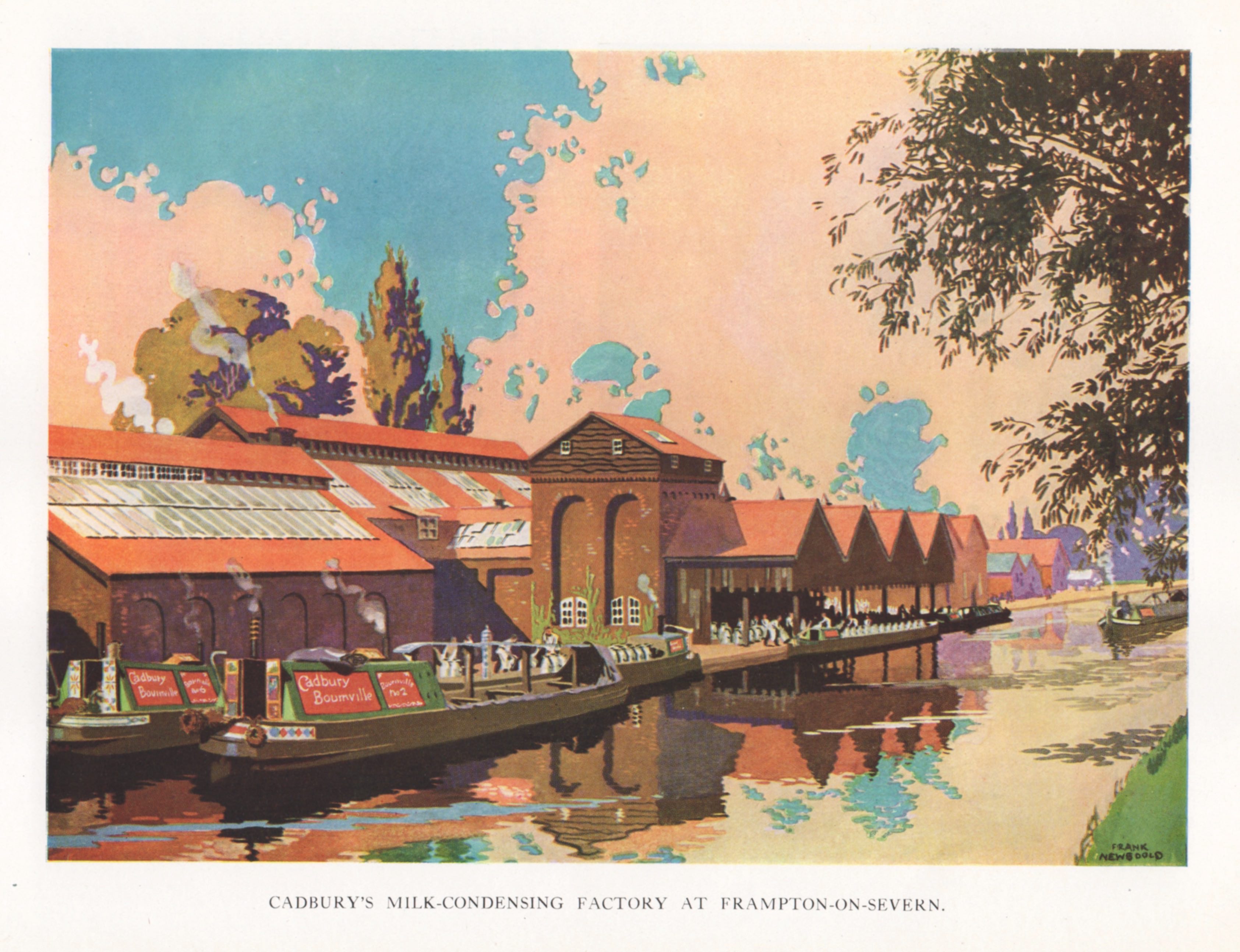
Equally idyllic is Newbould’s bucolic vision of a canal-side milk processing factory built in a restrained vernacular, barges and narrow-boats serenely chugging by. In a double page illustration across the centre pages, Newbould’s attention turns to the Bourneville factory in an aerial view that attempts to balance the vastness of raw industrial power with the sense of the factory cosily enveloped by the splendour of a verdant English countryside in high summer. To finish, Newbould observes the end of the process when the boxed finished products are loaded on to trains by sack truck and trolley.  The facility has all the features of a conventional station minus the passengers. Once again we are invited to admire the scale and complexity of operations thanks to Newbould’s control of colour to create a perfect sense of clarity. Cadbury invested heavily in a wide output of promotional publishing from collectors’ cards and albums to factory guides and brochures like this. Newbould was re-employed in 1927 and dispatched to Trinidad where he made a varied portfolio of location images that featured in Bourneville 1927, Cocoa Story. It can be seen in my post from August 2010.


Tuesday, 11 February 2025

Guinness Scrapbook 1937

We like to think of embarrassment as a uniquely British thing but the concept is present in every known language. It’s especially prevalent among the English thanks to the local tradition of invented codes of behaviour, vocabulary, idioms, pronunciations - all designed to divide outsiders from insiders and perpetuate class distinctions.  Cartoonist H M Bateman arrived in England from South Africa with a readymade chip resting on his shoulder, a grumpy disposition and a casual fluency in drawing social tableaus. Ideally qualified to explore the English world of embarrassment and unwitting social transgression, he took pleasure in distorting the human features to convey all the nuances of social terror and personal humiliation - hair that quivers as it uplifts from the scalp, eyes on the verge of exploding from their sockets, lips that tremble and splutter, bodies that vibrate with shame.  A new genre was created in which the discomfort of disgraced victims was mercilessly exposed for the entertainment of all. When he wasn’t working much of his time was spent in protracted and ultimately unsuccessful disputation with tax authorities having conceived an obsessive aversion to all forms of taxation.

The Guinness offer to the nation’s doctors for 1937 was a collection of literary and visual tributes to the virtues of the famous stout presented the reader as if pasted into a scrapbook with a cover design by Antony Groves-Raines, many if not all of them were extracted from previous advertising campaigns. The page sequence was broken up with full page colour cartoons drawn by Bateman, themed around the worlds of golf, cricket and performance, relatively gentle in tone. Several of these had already featured in press and magazine ads. The choice of subjects reveals an assumption that the medical profession of the day was exclusively male - not really unsafe for 1937. For another selection of Bateman’s work for Guinness, please follow this link.  As for the product, Guinness has never been more popular with a new generation falling for its distinctive charms to the point where the brewers were declaring a shortage late last year which had the desired effect of boosting sales even further as consumers rushed to stockpile.  Diageo (corporate owners of the brand) responded to their good fortune, not as you might expect by expanding production but by considering selling the company to take advantage of its increase in value.  Must be what they teach in business school. 


Thursday, 8 April 2021

Paper - Material of a Thousand Uses

This guide to the uses of paper is a typical mid-century publication aimed at schools, offering free learning materials in return for a chance to advance the cause of business to a new generation.  For a modest financial outlay, businesses could present a human face and claim to be agents of corporate responsibility.  The illustrations will be immediately recognisable to anyone familiar with the artwork in Ladybird Books - formal, descriptive, slightly heightened in colour and unemotional.  Two themes dominate, the first being to impress the young reader with a sense of the mammoth scale of the enterprise - vast machines operated by a workforce of heroes. The second theme is best described as a thousand things you never knew about paper from tabloids to tissues. It shows us an orderly society where the working man wore a flat cap and foremen wore brown coats - a lost world of stoic deference selectively recalled by an older generation desperate to see it revived before they exit the stage.


Wednesday, 10 February 2021

1959 Ford Galaxie

Throughout the 1950s, car designers in Detroit stretched and expanded their vehicles in all dimensions while applying ever more extravagant chrome decoration.  Every piece of trim and every bodywork moulding was designed to emphasise the sense of horizontality. This brochure depended on the talents of illustrators to bring the car to life and inspire some excitement in the reader.  Photography still had its limitations - an accomplished illustrator could subtly glamourise the product with discreet exaggeration and an imaginative way with colour.  A wedding theme runs through the imagery and we see the menfolk drool over the external finish while the women are swooning over the spacious interior.  There’s a touch of Hollywood about the wide-screen visualisation that places the viewer inside the vehicle while the ethereal bridesmaids dance in attendance.  Detroit was a city of ad agencies that specialised in serving the auto industry and the illustrators they engaged would often go on to stellar careers elsewhere, armed with the depth of their experience in keeping one step ahead of the camera with their transcendent visions of automobile perfection. By launching the car as the Galaxie, Ford was capitalising on public interest in the space race - galactic space is the infinity of space. The name survived for 15 years until it was retired in 1974. 1959 Ford models would go on to win a gold medal at the Brussels World Fair for styling elegance - an unusual accolade for Detroit industry.


Tuesday, 24 November 2020

Patsy, Peter and Milly

One thing on which all Americans can agree, red state and blue state alike, is the dreadful condition of British teeth.  Just compare their brilliantly enamelled, broad and confident smiles with our own tight lipped, sheepish grins, desperate to conceal the inner putrefaction and decay.  Americans are quick to attribute this to our NHS and its tradition of socialistic medicine - ineffective by definition.  More to the point may be generations of a sugar heavy diet combined with casual dental care. The most affordable confectionery items for the generation I grew up with were boiled sweets and fruit gums which could not have been more lethal to oral health if they had been designed for the purpose.  The former would crush and splinter tooth enamel while the latter would glue themselves to the tooth, force their way into cavities, and wrench the weakened teeth from their sockets.

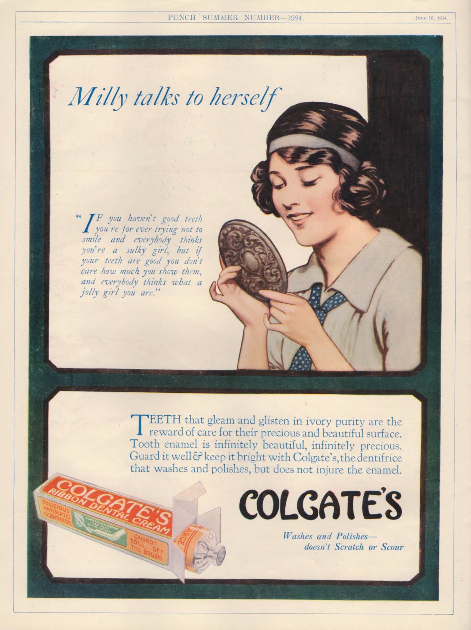
This booklet was designed to encourage children to improve their oral hygiene by making regular use of Colgate’s Dental Cream - the message came wrapped in a simplistic tale. Patsy was dealing with feelings of inferiority brought on by a brief encounter with a pretty girl named May whose teeth shone with dazzling brightness.  A callous nurse assures Patsy that she will never be the equal of May.  All seems lost until an emotionally supportive elf intervenes and deposits a gift-wrapped tube of Colgate at the foot of a pear tree for Patsy to find via a midnight assignation.  Liberal use of Colgate swiftly dispels Patsy’s body image anxieties as she records her efforts on the Clean Teeth Chart. For Colgate this was one small step along the road to world domination. Today’s Colgate has the highest degree of global market penetration of any consumer product.


Saturday, 24 October 2020

Custard on the Wall

Two paintings commissioned by custard manufacturers, Alfred Bird & Sons hang on the walls of Birmingham City Museum and Art Gallery.  Wrapped in gilded frames they offer ecstatic visions of cakes, jellies and custard based delights, piled high on groaning tables. Peering out from under the table cloths, wayward small boys with impish grins have succumbed to temptation and helped themselves.  Unusually for a gallery display, their existence is a purely commercial expedient, having been produced as source material for advertising and promotional purposes. The larger of the pair can be seen in a primitive reproduction in this recipe brochure and no doubt its partner found a use elsewhere.  The product quickly secured its place in the affections of the British consumer - its sugary viscosity offering comfort to some of the worst teeth in Europe. But competition was fierce and Bird’s would defend their position as market leaders with prolific advertising campaigns on posters and in print. I like to think of these paintings proudly hung on the walls of the boardroom, witnesses to earnest discussion of sales targets, corporate projections, income tax liability and depreciation of fixed assets. A later example of Bird’s advertising from 1941 can be seen here, further examples will follow in future posts.