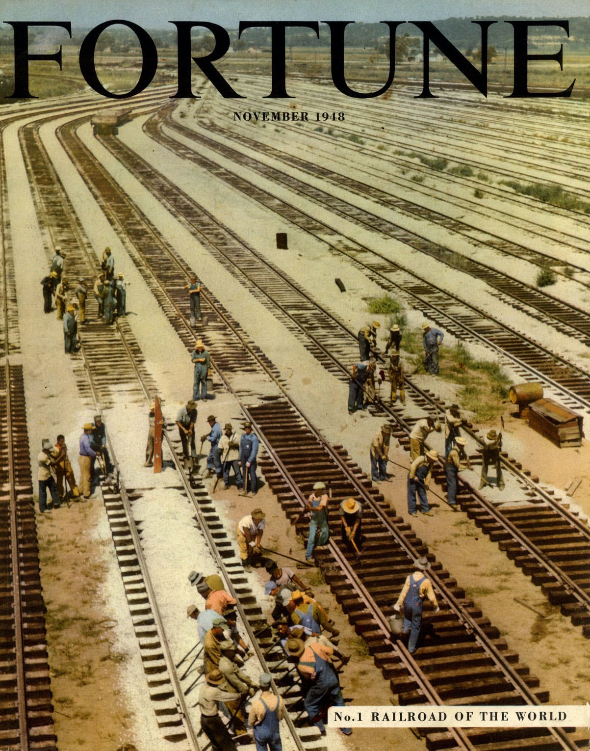
Fortune magazine was launched into the hearts, minds and pocketbooks of America’s business elite in 1930 at a time when steam powered railroads were the nation’s prime movers of raw materials and manufactured goods. Many businesses were highly dependent on the services of the railroad and managerial executives took a close interest in rail pricing and performance. Fortune specialised in long-form journalism, and regular in-depth analysis of the railroad business kept the executive class well informed. In their turn the railroads advertised their services to business leaders while the manufacturers of locomotives, rolling stock and railway equipment advertised to the railroads.

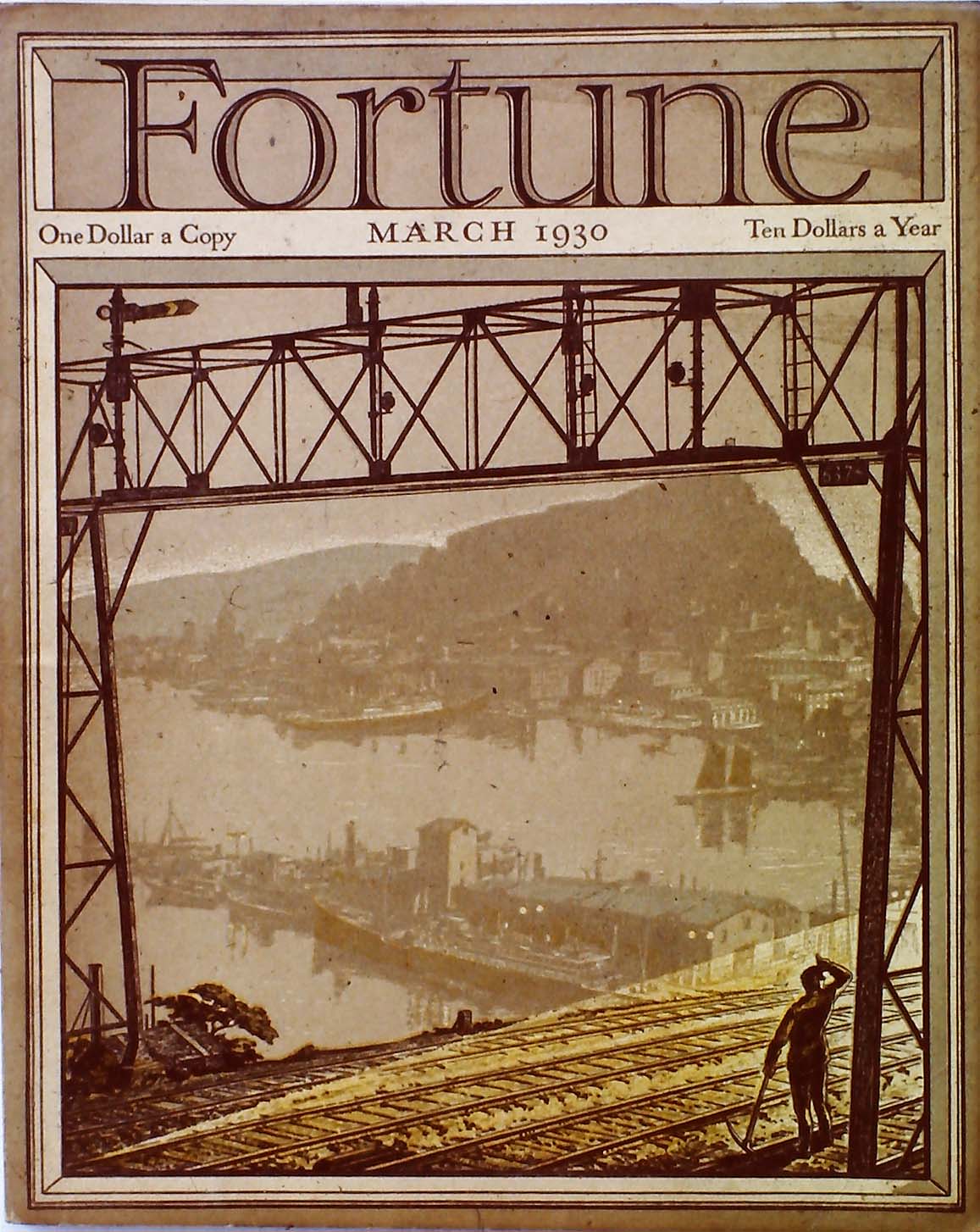
Railroads made their first appearance on the cover of the second issue of Fortune in March 1930 - beneath a signal gantry a track worker shields his eyes from the slanting sunlight while far below we see an idealised harbour scene, part San Pedro, part Amalfi Coast. An example of what might be called “industrial pastoral” where benevolent business dwells in harmony with the natural world, the sort of relationship Fortune commended to its readers. In February 1931 the cover took the form of an aerial illustration of a marshalling yard showing diagonal lines of freight cars under the guidance of a pair of muscular locomotives, each dispatching powerful plumes of smoke and steam into the atmosphere - a stylish celebration of steam power in which railroad grime is transformed via a palette of vibrant complementaries. A lively use of line and flat areas of dynamic colour (blue-green, orange-red and maroon) greatly enhance what might otherwise have been a banal composition. Neal Bose, the artist has left no more than a minimal trace of his existence - a biography that starts and finishes with: born 1894, Columbia TN, lived Chicago area. For the first decade there was a Fortune tradition of covers unrelated to the contents. Covers were treated in the same way that producers of luxury goods would employ the finest of packaging to add another layer of exclusivity.

Fortune cover artists enjoyed remarkable autonomy - some were submitted on-spec while others were the result of one word commissions. Full advantage was taken of this freedom and artists successfully offered up imagery that in subject and treatment, aligned with their personal interests. This culture of tolerance was all part of Fortune’s mission to raise the sights of business leaders to aspire to a higher sense of purpose. A change of policy in the 1940s led to more directed assignments and covers that reflected a major story inside the magazine. Representation and stylisation were succeeded by a cautious embrace of Cubist-inspired semi-abstraction, Modernism, montage and, finally, photography. Several of these cover artists were associated with Precisionism - Francis Criss and Edmund Lewandowski drew on their repertoire of crisply rendered geo-mechanical forms. Lewandowski (August 1945, March 1948) pushed his compositions towards abstraction with a judicious selection of re-ordered simplified details. Criss (November 1942) found visual drama in the intersecting vectors of transmission lines and electric catenary - at ground level a maintenance crew bustle around a fleet of streamlined coaches, every aspect equally favoured by the artist’s dispassionate attention.


For May 1936 John A Cook produced an image of a sequence of passenger trains entering and departing from a busy station observed from an elevated viewpoint. John O’Hara Cosgrave II’s boxcar image for May 1939 shared the Precisionist sensibility and would be revived 35 years later in a modified form as an album sleeve for J J Cale’s Okie issued in 1974. Modernist graphic designer, Lester Beall was responsible for the montage on the cover of the March 1947 issue, announcing an account of Britain’s newly nationalised railways. A subject of crucial importance to an American audience as evidence of the creeping tide of socialism that sent shivers down the collective spine. Finally, from August 1958 is a grid of railroad company emblems, locked together in a black mesh and separated by wedges of vibrant primaries and secondaries. This is the work of Bauhaus graduate Walter Allner, master of hard-edged graphic simplification, who served as Fortune’s Art Director from 1963 to 1974. In all, Allner designed 79 Fortune covers, beginning in September 1951.
Much more about Fortune is readily available at the Visual Telling of Stories and an extended visit is highly recommended. It conforms to nobody’s template and prioritises information over style. Curiosity will be rewarded with a wealth of unexpected visual treasures, under the guidance of unshowy fonts and the gravity-defying inverted pyramid of thumbnails.