Showing posts with label jugendstil. Show all posts

Tuesday, 12 September 2023

Past and Present No. 13: Berlin Bülowstraße Bhf


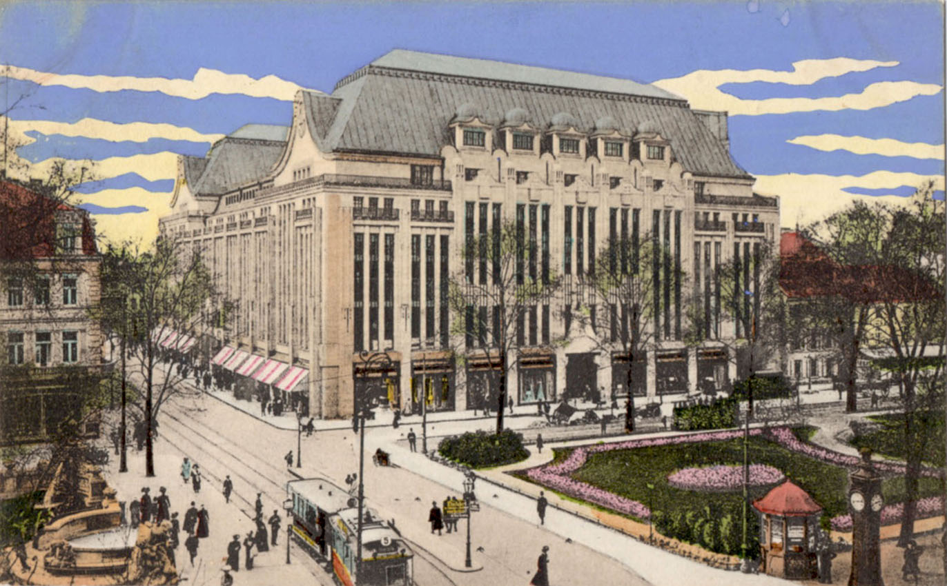
The station at Bülowstraße was on Berlin’s first U-Bahn line and opened in 1902.  It is now on line U2 on a short section of elevated track that runs from Gleisdreieck as far as Nollendorfplatz after which it continues underground. Despite heavy war damage and a 20 year period out of use (1972-1993) due to geo-politics, the building exterior is as close to original condition as any other example of its age.  Comparison with the period postcard shows that little has been lost other than ornamental flourishes on the train shed and some decorative ironwork.  Bruno Möhring (1863-1929), Jugendstil specialist and skyscraper enthusiast, was the architect - elsewhere in the city he designed the Swinemünder Brücke (1902-1905) that crosses the railway tracks to the east of the station at Gesundbrunnen. Another of Möhring’s notable achievements - the Jugendstil Machine Hall at Zeche Zollern colliery in Dortmund - was featured in this blog in 2017 and can be seen here.


Tuesday, 1 February 2022

Deutsche Plakate (1888-1933)

The sheer strength and visual power of German graphics always command attention and admiration.  Their confidence in asserting their message with clarity and simplicity is exemplary. Nothing quite equals the forceful expression of the Sachplakat style - image, text, colour, impact - that was pioneered by Lucian Bernhard in or around 1910.  It was a technique that broke through the visually seductive, decorative and ultimately over-elaborated language of Art Nouveau/Jugendstil that had dominated the previous decade or more. Suddenly all the panels of attenuated floral forms were rendered stale and formulaic.  Distorted and distended letter forms that privileged decoration over legibility gave way to the unadorned brevity of Bernhard’s simple but muscular fonts.  Sachplakat images required no more than a glance from a moving train or vehicle to deliver their content - the accelerating pace of urban life left little time for a leisurely contemplation of the visual complexities of a Jugendstil-inspired poster on a Morris advertising column.  The strong colours and bold imagery of Sachplakat posters were designed to punch through all the visual noise of the urban environment and catch the eye of the consumer in an instant in which the brand name could drill into the unconscious mind.

Based on a Berlin exhibition in 1992, this book (Kunst, Kommerz, Visionen, 292 pages, ISBN 3894660384) is one of the best available surveys of German commercial graphics and many of the illustrated examples have rarely, if ever been seen in other surveys.  The review period is 1888 to 1933 and guides the reader through the early years in which the prime influences were Jugendstil and La Revue Blanche to the Sachplakat era and beyond as the austere Bauhaus geometry became progressively more embedded in the visual culture of Weimar Germany.  What also changed in this period was that advertisers extended their psychological reach into the minds of consumers. It was no longer enough to communicate product information.  Consumers needed to be convinced about the merits of the product in the clearest possible visual language which left no space for gentle persuasion.  Brand names - Persil, Osram, Bosch, Opel, Manoli - needed to be fixed in public consciousness for which Sachplakat was the perfect vehicle, these being the only words you would see on a typical example. The image would be stripped to essentials and expressed via simplified forms and clearly defined areas of flattened colour. Sachplakat was an innovation that prepared the ground in which the Bauhaus philosophy of design could take root and endure.

These page-spreads give a flavour of the book although I have chosen to omit examples from the section that deals with the influence of Expressionism.  This is nothing less than personal prejudice - I have limited appetite for the savagely brushed letterforms and the direct and intentionally crude drawing styles found in the work of Kokoschka, Corinth, Otto Dix and Max Pechstein.  Though I must concede this genre offers a convincing reflection of the ideological conflict and political violence that overshadowed the Weimar era and Otto Dix, in particular, was an enormously impressive painter. I suppose it strikes a discordant note where the main focus is on consumer culture - propaganda versus persuasion. And that might be the point of its inclusion. I have to admit there is value in seeing these distinct genres side by side. Just not here.

Other than to note that the British approach to advertising art was formed in a much more timid, conservative visual culture where innovation was a rich source of ridicule, it seems unfair to make a detailed comparison, given that German designers were able to draw on a much deeper artistic tradition where risk-taking and challenging boundaries was not so unwelcome. There were British designers who were aware of what could be learned from Germany - among them was the figure of Ashley Havinden about whom we posted last year.  In 1926 Havinden and his boss W S Crawford (ad agency founder) visited Berlin on a scouting expedition and met with Bernhard and other designers whose work they were familiar with from the pages of Gebrauchsgraphik then travelling to Munich where they met Ludwig Hohlwein. Following this Crawford established a Berlin office from which to service the Europe-wide Chrysler account which Havinden managed from 1927-28. One of Crawford’s Berlin designers was Terence Prentis (1904-46), whose Chrysler poster is shown below - his work was featured in Gebrauchsgraphik in September 1929. On his return to London Prentis was a co-founder of Colman, Prentis and Varley advertising agency in 1934, a major agency that remained in business until 1974.


Monday, 18 September 2017

Darmstädter Künstlerkolonie


There’s a long tradition of princely enthusiasts of the Arts indulging their passion with a grand project – the Prince of Wales’s fantasy township at Poundbury being a more recent example. In Darmstadt the Grand Duke of Hesse, Ernst Ludwig chose some higher land in the north east of his capital (visible on the 1905 Baedeker map) for the construction of an artists’ colony. The site was already graced by the newly completed Russian Orthodox Chapel built for Tsar Nicholas II whose wife had been born in Darmstadt. Ernst Ludwig was swept up in the late 1890s enthusiasm for the fashionable Jugendstil and fancied himself as the leading patron of this Germanic version of Art Nouveau for which he obtained the services of Joseph Maria Olbrich, co-founder of the Vienna Secession as lead architect. The master plan called for a substantial centre containing multiple studios for artists and craft-workers and a modest number of individually designed houses to be occupied by the most prominent artists. There were three phases of development beginning in 1899 with completion in 1908.

A major exhibition in 1901 featured the newly opened Ernst Ludwig Haus with its shared studio facilities and the newly constructed artists’ homes, several of which had run significantly over-budget. Like many such royal vanity projects the exhibition ended in a large financial loss. A more modest exhibition followed in 1904 and the final exhibition took place in 1908 where the highlights included a new exhibition building and the dedication of the landmark Wedding Tower (Hochzeitsturm) designed by Olbrich and gifted to the Grand Duke on the occasion of his marriage by the grateful citizens of Darmstadt. Olbrich died in August 1908 at the age of 40 while his last building, the Tietz department store in Düsseldorf was still under construction.

Richly decorated entrance to the Ernst-Ludwig-Haus designed by Joseph Maria Olbrich (1867-1908) built for the first exhibition of the Kunstlerkolonie in 1901. Allegorical figures of Strength and Beauty carved by Ludwig Habich (1901) flank the archway.

Five of the first six artists’ houses were designed by Olbrich. The sixth was the work of Peter Behrens, better known as an artist and graphic designer. It was his first excursion into architecture and every detail inside and outside had his mark on it. All internal fixtures and fittings, including the furniture, cutlery and fabrics were designed by Behrens. Despite this personal involvement, Behrens never actually lived there and actually sold it on within a year of construction. In 1909 Behrens designed the influential and monumental AEG turbine factory in Berlin. His legacy was stained by his involvement in Albert Speer’s Prachtstrasse plan – a redesigned Berlin for a thousand year Reich. AEG commissioned an absurdly grandiose design from Behrens for a new corporate HQ. Although it never got built, the design pleased the eye of the Führer who had been a Behrens admirer since he saw the Embassy in St. Petersburg that Behrens designed in 1913.

Russische Kapelle (1899)

There was no place for Guimard’s whiplash curves or Horta’s swooning organic forms in the visual language of Jugendstil. Exuberance and extravagance gave way to a rationalist’s version of Art Nouveau in which visual rhythms were employed with restraint in surface decoration and monumental figure sculptures could still find a home they were denied elsewhere. Floral motifs were invariably anchored by a formal geometry. Ceramic decoration (tiles, mosaic and glazed bricks) was extensively used internally and externally. An especially opulent mosaic of a tender embrace can be seen high on the wall of the main entrance to the Hochzeitsturm (Wedding Tower). The tower itself seems a little problematic – not really a building, more a monument or a landmark. As a seven storey landmark it succeeds, being highly visible across the city and capped by the distinctive and imaginative five spires. Any other function it possesses is secondary. Indeed other than the site specific art works inside, it serves as a modest office space and accommodates a few family treasures and not much else. The scale is intriguing in the context of Olbrich’s work in Düsseldorf where a much larger but no taller building was taking shape. The Tietz department store marked Olbrich’s major step into the architectural mainstream – had he lived longer we might have seen more commercial buildings, perhaps a theatre or even a railway station, with an Olbrich signature.

Mosaic sundial on the Wedding Tower designed by Wilhelm Kleukens.

Hochzeitsturm (Wedding Tower) designed by Joseph Maria Olbrich (1867-1908) - a gift from the city of Darmstadt to Grand Duke Ludwig II in 1906.

This opulent mosaic of a tender embrace is high on the wall of the main entrance to the Hochzeitsturm (Wedding Tower). 

Decorative mosaic ceiling designed by Olbrich - part of the Hochzeitsturm (Wedding Tower) ensemble.

Alcove with bench seating and 1914 Jugendstil mosaic by Albin Müller on Olbrichweg.

The Lily Basin mosaic by Albin Müller (1914) .

The top of the Hochzeitsturm (Wedding Tower). 

Haus Behrens (1901) designed by architect Peter Behrens as part of the Kunstlerkolonie. Behrens never occupied the house and it was sold on. Behrens (1868-1940) would trurn his back on decoration and become a pioneer of the Modern Movement. As well as an architect he was an industrial designer, furniture designer, graphic designer and typographer. 

Main entrance to the Haus Behrens - Behrens' choice of decorative motifs is restrained and mainly rectilinear.

Elevation of the Großes Haus Glückert (1901) Akademie für Sprache und Dichtung. Architect: Joseph Maria Olbrich.

Ovoid entrance to the Großes Haus Glückert (1901), Akademie für Sprache und Dichtung. Architect: Joseph Maria Olbrich.

Haus Deiters (1901), designed by Joseph Maria Olbrich.

Tietz department store in Düsseldorf.

Monday, 17 July 2017

Once Upon a Time in Dortmund


Zeche Zollern is a carefully preserved industrial site to the north of Dortmund that has the distinction of being Europe’s only Art Nouveau/Jugendstil colliery. Stepping from the train at Dortmund-Bövinghausen, I myopically missed all the directional signage and set off in the wrong direction. My walk took me round all four sides of a large rectangle until arriving back where I started. This time the signs were unmistakeable and the rest of the journey, uneventful. Flags, bunting and banners announced my destination, which is more than I usually expect. And the sounds of fairground organs and steam engine whistles suggested an event was underway.


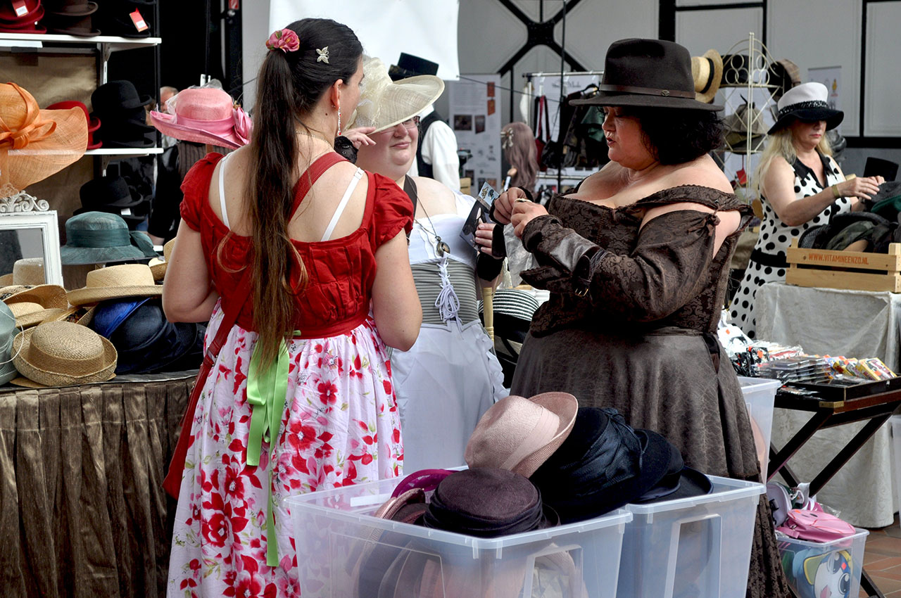
Inside the colliery site was a flurry of activity graced with top hats, fishnet tights, goggles, compasses and pocket watches. An ancient steam road roller and a brace of traction engines were on hand accompanied by the hiss of escaping steam. Stilt walkers and penny farthing cyclists meandered around the site. Recently returned big-game hunters, grouse-shooters and polar explorers mingled with the crowd. Dr. Marrax prepared to bamboozle his audience with a miracle cure – assisted by some mandrake root and assorted paraphernalia. Carousels were in full swing and the Flea Circus was open for business.


Steampunk is one of many minority cults that came into existence without me really noticing – to me it looks like a marriage between Gothic and High Victorian Heavy Engineering. It seems remarkably unthreatening and congenial and, to my knowledge, there are no records of Steampunk hate crimes or civil disorder. The choice of venue for a Steampunk gathering, titled “Once Upon a Time”, was perfect – no better place than a cluster of over-elaborate post-industrial relics.


Zeche Zollern was a prestige project from its inception in1898. Prominent Berlin architect, Bruno Möhring (1863-1929) was engaged and produced an opulent Jugendstil styled series of surface buildings. Most famously the Machine Hall with its stained glass entrance that originally included a Hector Guimard-style aedicule (now lost). The colliery was closed in 1966 and narrowly avoided demolition. Since then it has been extensively restored as a historic industrial relic and a site for cultural events. It was the industrial relic that attracted my interest and the Steampunk event was initially an unwanted distraction. My preference is for minimal human presence in my photographs but, bowing to the inevitable, I tried my hand at documentary photography with mixed results as seen here.