Showing posts with label biscuits. Show all posts

Friday, 19 August 2022

Some Huntley & Palmer Publicity

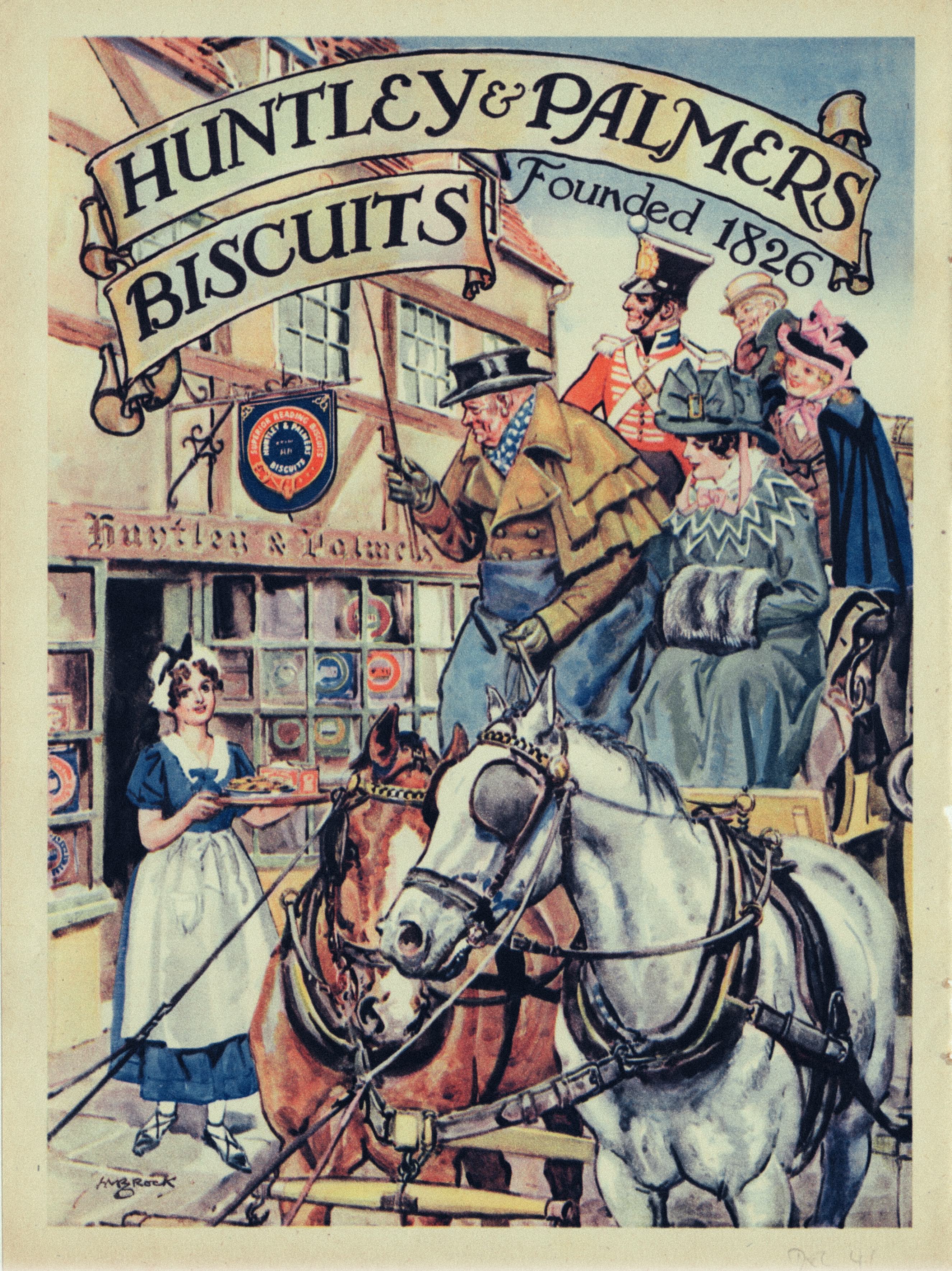
Following on from our previous post is a display of magazine advertising of Huntley & Palmer (H&P) products. H&P never established a reputation for graphic excellence and their output often lacked the kind of house style cultivated by some of their competitors. Which makes for an uneven selection of examples.  The earliest from the 1920s depends on a time honoured cliché of an attractive, sophisticated female with little or no obvious association with the product.  Our model stares disdainfully at what may be a dish of Imperial biscuits but the real reason for her presence is a shapely pair of legs, conscientiously rendered in all their glory.  Schweppes comes to mind as an especially assiduous practitioner of this strategy.  Photographic imagery predominated in the 1930s along with some generally unadventurous graphic design. The savoury biscuit ad from 1937 was an unusual exception. A welcome revival in the use of illustration led to more interesting imagery in the 1950, especially on the part of Pauline Baynes whose ice world fantasy made such an impact in 1953.  C M Brock, usually a dependably competent illustrator contributed an unhappily crude piece of horsey cliché. The single thread running through this selection is the frequent resort to jingoism and in this respect Huntley & Palmer were very much in the mainstream.







Wednesday, 10 August 2022

Walking to Work

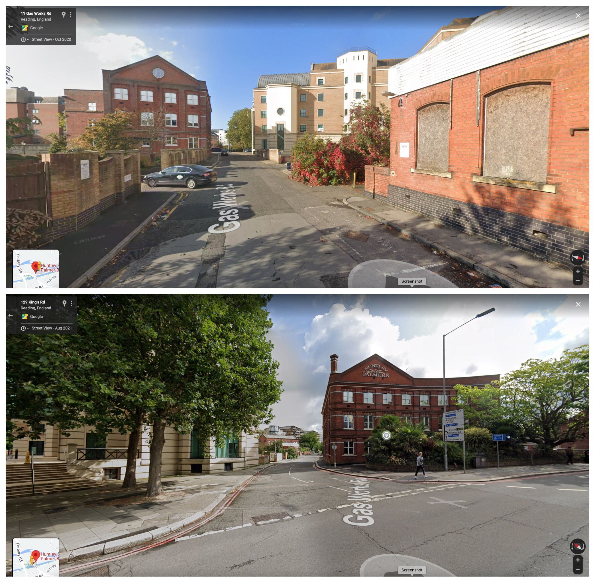
The town of Reading has been turned down for city status four times and remains stuck with the unwanted distinction of being Britain’s largest town by population. For many years it was home to the largest biscuit factory in the world, Huntley & Palmer, and a source of enduring fascination to the producers of picture postcards.  Something about the spectacle of working men and women flooding the streets on their way to and from the factory was held to have significant customer appeal.  Although for many holidaymakers it was a painful reminder of the world from which they had been temporarily released.  The men make their way home with an air of grim determination, while the women appear more relaxed, though a few show signs of high spirits.  For the historian they offer evidence of changing fashions and a measure of workforce morale.  Since their introduction into the marketplace, biscuits have always been an optional purchase and Huntley & Palmer played a major part in developing ever more elaborate recipes in beautifully designed and often luxurious packaging to expand their appeal.  The business followed a traditional path - decades of expansion under private ownership were followed by absorption by multinational competitors and a loss of identity in a vast portfolio of brands.  Manufacturing in Reading ended in 1976 after which the brand had no links with the town.  After further changes in control the brand was sold off in 2006 to new owners who have operated on a much smaller scale with a modest range of sweet and savoury products.  The factory buildings have been gradually replaced with offices and apartments and the last surviving portion is being converted into living spaces.  For an earlier post from 2010 on Huntley & Palmer, please follow this link.


Wednesday, 17 October 2018

Jacob’s Crackers


The brand name Jacob’s can be seen on every UK supermarket shelves but its independent corporate existence ended as far back as 1960 when it became part of Associated Biscuits. Since then it has tumbled around in the capitalist vortex, forever changing hands as the disciplines of the market dictate. It remains a part of United Biscuits, itself since 2014 part of Pladis, owned by Turkey-based Yildiz Holdings. The story won’t end there – in August it was reported that Pladis was looking for a buyer to take it off its hands.


Eaten on its own, the Cream Cracker will instantly absorb the consumer’s saliva, leaving them with the problem of how to deal with the arid, pulpy mass that occupies the oral cavity. The addition of butter, cheese or spreads makes it palatable and it has its devotees, especially in Britain and some of its former colonies in North America, Southeast Asia and South Africa. The rest of the planet seems unmoved by its charms. Without the Cream Cracker it’s unlikely that the Jacob’s brand would have survived as long as it has.


These examples of Jacob’s advertising are from the 1930s to the 1950s and display a preference for the use of children as diminutive brand ambassadors. Pert and winsome juveniles can always be relied upon to unlock consumer resistance. Since 1910 Chloe Preston had been charming her audience with a series of illustrated books for children, featuring a cast of simpering super-cute infants known as Peek-a-Boos. So she was an obvious choice to produce a pictorial Alphabet for Children in which Peek-a-Boos encourage the junior consumer to sample the entire range of Jacob’s biscuits – each with their merits declaimed in alphabetical order.


Saturday, 11 December 2010

Huntley & Palmer 1937


As a seasonal concession we present the pages of the 1937 Huntley & Palmer Christmas brochure promoting the finest in factory made cakes and biscuits to the time-pressed consumer. Huntley & Palmer operated what was once the world’s largest biscuit factory in Reading and offered a huge range of products. The packaging and graphic style is predominantly conservative, designed to offer comfort and reassurance through the repetition of historic traditions and the conventionally picturesque. The only concession to contemporary Art Deco-inflected graphics was in the packaging of savoury biscuits where a modest note of sophistication seemed appropriate. The cocktail biscuits pictured on page 10 were styled to look at home in a Sunspan house or a Highpoint apartment.


Novelty items include a chalet-shaped cake on page 8 and on page 4 there’s a colourful biscuit tin in the shape of a delivery vehicle, described as a “most useful toy” and probably worth a small fortune today in mint condition. Collectors of decorative printed tins have an enormous range from which to choose to specialise but for a significant few the holy grail is the pursuit of the “naughty tin”, allegedly the work of an alienated employee bent on subversion. Those with suspicious minds might conclude that it was a carefully executed plan to produce an instant collectors’ item. For me the most attractive examples are those that imitate the real world – stacks of books, garden rollers, cameras, suitcases, handbags and battlefield tanks complete with camouflage.


In line with the general retreat on the part of British business from the mundane activity of manufacturing actual products in favour of manufacturing investment vehicles and derivative trading, ownership of the brand is now in the hands of French-owned Danone. The Reading Museum is home to the company archives and a selection of Christmas catalogues can be seen by following this link.