Showing posts with label modernism. Show all posts

Tuesday, 16 May 2023

East Tilbury, the Bata Legacy in Essex

A trip to Essex is a rare event so we took the opportunity to take a c2c (owned by Trenitalia) train from Barking to East Tilbury where Bata shoemakers established factories and an industrial village in the 1930s. Public awareness of Modernism in 1930s England was minimal and in the Essex village of East Tilbury even less.  It must have been a shock to the villagers when Modernism landed on their doorsteps in 1932 as they watched towers of welded steel and reinforced concrete rising out of the potato fields of the former marshland.  This marked another stage in the global advance of the Bata Shoe Company founded by Tomas Bata in 1894 in the town of Zlin, Czechoslovakia.  A visit to the Ford factory in Detroit had inspired Bata to adapt the latest production line technology to the manufacture of footwear and the company had expanded rapidly across Europe and beyond.  Bata was attracted to the social ideals and paternalism of the Garden City movement but his aesthetic preference was for Modernism rather than Arts and Crafts or Tudor revivalism.  

Czechoslovakia was much more receptive to Modernism than Britain and a company team of Czech architects led the project. Planning and design principles that had been established in Zlin were applied in East Tilbury and included material specifications and the use of reinforced concrete frames. As originally planned there would have been 3 ten-storey factory blocks plus a rail connection to what was then part of the LMS railway with sidings for loading and unloading. These were scaled down to five-storey blocks and the rail connection never materialised. When the factory opened in 1933 in the Depression, locals welcomed the employment prospects although their eyes must have been startled by the Modernist geometry and the acreage of glazing in the brand new, multi-storey factory buildings.  New housing for workers (a significant number of whom were Czech) and their families along with a clinic, sports ground and village hall were provided and despite the challenge of inducing the English to live under flat roofs, this concern for their welfare was fondly remembered by former employees.  Manufacturing in East Tilbury petered out in 2006 by which time the factory buildings had already been disposed of to an uncertain future. The Bata Company is still in business and based in Switzerland. Its products are sold in many countries from East Asia to Latin America, Europe, Africa to Australia but UK is not one of them. 
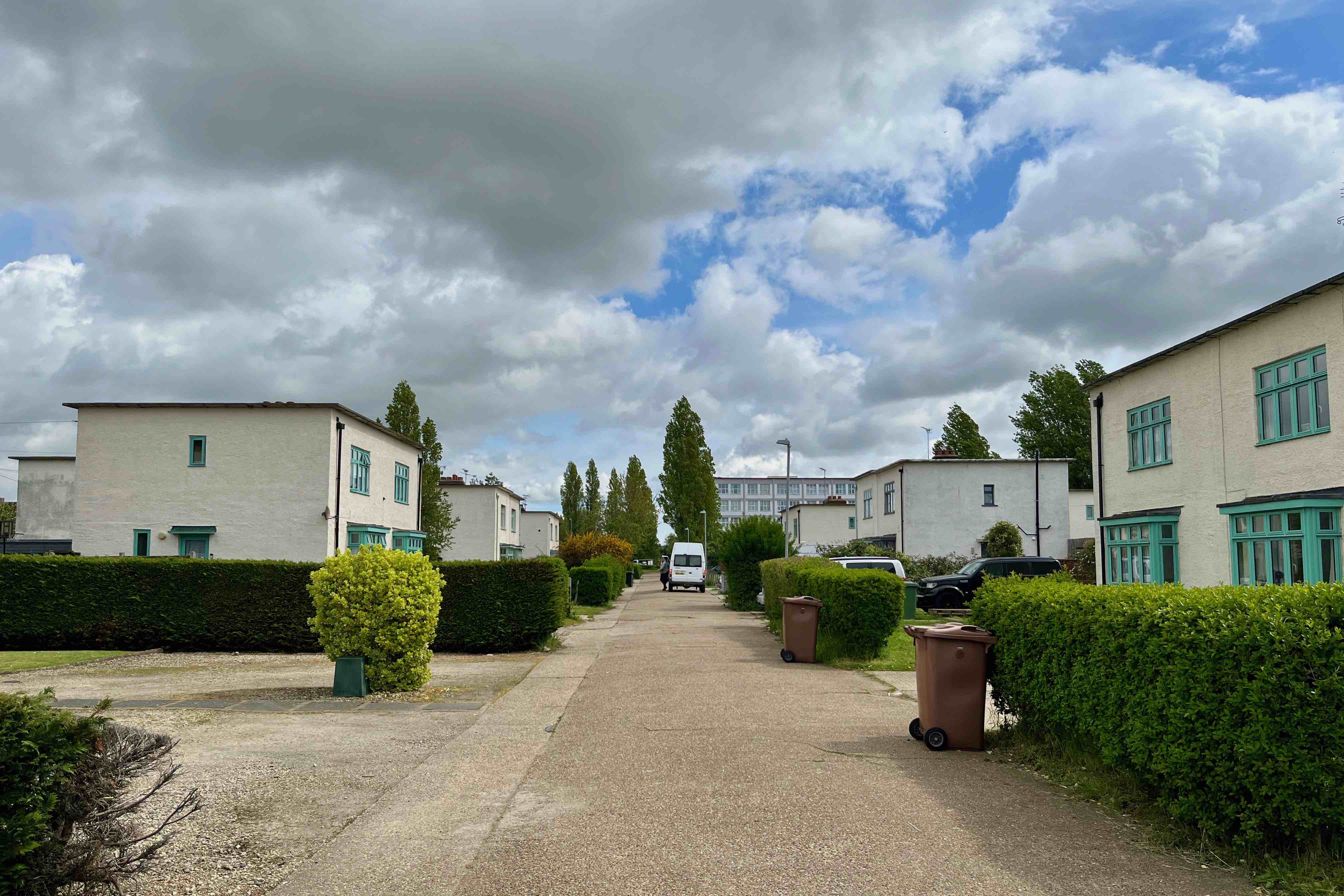
At the peak in the 1950s there were 3000 employees at East Tilbury and over 200 Bata shops on Britain’s high streets but the business was not immune to Britain’s industrial decline and in the 1960s production began moving overseas, mainly to developing countries. The design influence of the Czech parent had gradually faded away and the worker housing  became entirely conventional - semi-detached with pitched roofs. The last company housing was completed in 1966 and in the 1980s the houses were sold off to private buyers in the spirit of the time.  The process of adjustment has been difficult.  Converting the major buildings for new uses has been expensive and attracting investment has been hard but most of the factory premises have found new tenants over the years and the only major building still in need of renovation is Nelson House (the former leather factory) on top of which sits a water tank, lettered on all four sides with the Bata logo, easily visible to railway passengers almost a mile away.

In 1939 Bata completed a new 16-storey HQ in its Czech hometown of Zlin that included a top floor office for the Chief Executive, Jan Bata, designed as a giant lift capable of descending to ground level at the stately pace of 75 cm per minute. The Nazi annexation of the Sudetenland in 1938 and occupation of Czechoslovakia stopped the project in its tracks and despite Jan Bata’s personal appeals to the Nazi overlords, the factory was closed.  The Bata diaspora gathered pace and new businesses were opened in the US and Canada and production expanded in India and Singapore.  When Bata refocused  on emerging economies it withdrew from most European operations leaving an architectural legacy of design excellence that became a serious problem for planners in Bataville in France and Batadorp in the Netherlands (as well as in East Tilbury) as they grappled with the challenge of adapting the buildings without compromising the features that made them worthy of preservation. There are two further sources of detailed commentary on Bata, the first is a Historic Area Appraisal of East Tilbury carried out for English Heritage in 2007 and the second is a wider historic survey of Bata’s global presence from the magazine Azure.


Wednesday, 2 June 2021

Delectaland and the Havindens

There was a time when every town of a certain size would have its own brewery, lemonade factory, biscuit maker and confectionery producer.  Watford was large enough to have most of these businesses - confectionery was represented by Delectaland.  Judging by its publicity it was a business with its roots firmly planted in Fairyland in the belief that repeated exposure to diaphanous flutterings would develop a growing market for their exotically packaged sugary offerings.  This ad is from 1919, less than 12 months after the end of the Great War during which the factory served the nation by turning out thousands of explosive shells.  Eliminating the flavour of cordite from the Delecta range would have been a formidable task.  The Chairman of the company was Gustavus Havinden, who, inspired by the example of Lord Leverhulme’s paternalistic philanthropy, made plans to build housing and welfare facilities for his workforce.  Details of this scheme are hard to come by and it can be safely assumed that it didn’t amount to much. There are indications online that worker housing was built in Neston Road, North Watford but there’s nothing to confirm it.

Another reason for taking an interest in Mr. Havinden is his son Ashley, born in 1903 who would become one of the most versatile and influential designers in Britain.  The family link also explains why the young Havinden spent 18 months absorbing the technical side of the printing industry while employed in various print works in Watford.  This detailed understanding of the principles of typesetting, layout, photogravure and block making led to his first job at the newly established W S Crawford advertising agency where he would remain for his entire working life.  The lack of an art college background was no deterrent and may have been an advantage in allowing his natural instinct to range far and wide in search of visual ideas while rejecting the narrow categorisations of the ‘trained specialist’.  Crawford gave him the chance to live and work in Germany where he came to appreciate the superior power of German graphic design and illustration under the influence of Modernism and the infant Bauhaus. 

Having swerved the perils of art education where ‘commercial art’ was regarded as a second class activity, Ashley had no inhibitions about exploring any aspect of the visual arts that engaged his interests and he happily tried his hand at textile and rug design, interior design, and abstract painting.  Henry Moore, Ben Nicholson and John Piper were in his friendship group and he developed a keen interest in contemporary architecture to the extent that he moved his family into an apartment at Highpoint II, designed by Lubetkin in 1938.  This placed him at the heart of the North London friends of European Modernism where he continued his tireless promotion of Modernist values, working with European emigrés such as Herbert Bayer, Laszlo Moholy-Nagy, and Walter Gropius and instrumental in organising Mondrian’s stay in London.  All of which was accomplished in a deeply conservative visual culture in which the prevailing advertising setting was dominated by a blend of Merrie England and  Imperial Victoriana with a dash of Regency Dandies plus Francis Drake and Walter Raleigh.

The illustrations are, in descending order: an ad for Delectaland from Colour magazine, 1919 - a self-portrait included as a plate in Ashley Havinden’s Line Drawing for Reproduction (published in 1933) - Ashley’s best known design for Eno’s Fruit Salt from 1927 - a post-war ad for Martini (1953), typical of Ashley’s mid-century phase - an illustrated magazine insert promoting the Delecta range for Christmas 1928 (by which time the business was less than 2 years away from closure in 1930) and the book cover for Line Drawing for Reproduction.  The key text is Ashley Havinden, Advertising & the Artist, Michael Havinden et al, Edinburgh 2003.


Sunday, 28 October 2018

Villa Cavrois


Villa Cavrois is what can result when wealth and status consciousness meet invention and ambition. Paul Cavrois had accumulated his fortune in the textile industry and was looking for a family home on a scale that reflected his success in business. Cavrois felt a need to distinguish himself from his fellow plutocrats and was open to a contemporary design. The work of Robert Mallet-Stevens was known to him from seeing his contributions to the 1925 Exposition des Arts Décoratifs and the publicity arising from his designs for ultra-fashionable clients, Paul Poiret (fashion designer) and avant-garde patron, Vicomte de Noailles. Cavrois owned a large vacant plot in an upper class suburb of Roubaix and in 1929 (just months before the Wall Street Crash) commissioned Mallet-Stevens to design a large scale family home in a Modernist idiom.


When the house was completed in 1932 the Cavrois family moved into a remarkably spacious home in which almost every piece of furniture and every aspect of internal decoration was the work of the architect, Mallet-Stevens. The Cavrois fortune comfortably absorbed all the extra cost of purpose-built furnishings in return for a bespoke dwelling in which no detail, from light fitting to door handle or from radiator covers to wall clocks was left to chance. Modernism without excessive formal purity was the result - the harshness and doctrinaire control associated with the movement was neatly sidestepped. For the occupants there was the excitement of living in a home like no other surrounded by elegance and comfort, all wrapped up in sweeping, curving forms influenced by Art Deco. Mallet-Stevens designed a system of stretched yellow bricks, adaptable to concave and convex curves, lintels and corners, and laid exclusively on the stretcher side. The inspiration for this came from Dudok’s recently completed Raadhuis Hilversum.


The Art Deco influence on the exterior can be seen in the cylindrical belvedere tower and the extended sun decks – internally the chromed fixtures and fittings and the proliferation of circular forms continue the theme. The Cavrois appetite for Modernism didn’t run to paintings and sculpture, there are few artworks on the walls in period photos, but Mallet-Stevens themed several of the major rooms around aspects of Modernist painting. In what is described as the Young Man’s Room, the interaction of flat-painted geometric panels and forms resembles the abstract compositions of De Stijl. Unsurprising, given we know that Mallet-Stevens collaborated with Theo Van Doesburg on an earlier project. In the dressing room for the lady of the house, strong curved forms in the chairs, mantelpiece and mirror counterpoint the linear geometry elsewhere to give a Cubist feel to the room. At the centre of the house is a duplex sitting room with double height glass doors on to the sun terrace. The luxurious orange marble fireplace is equivalent to the onyx wall in the contemporary Villa Tugendhat by Mies van der Rohe.


During the war, the Villa Cavrois was requisitioned by the Wehrmacht whose heavy presence caused immense damage. When the family regained possession they commissioned a complete and conservative redesign of the interior which remained in place until the death of the last family member in 1986. At this point it fell into the hands of developers whose intention was to divide the grounds into individual plots. Various attempts to give the building legal protection were frustrated by the developer until a Prime Ministerial decree settled the matter. The developer responded in the time honoured way by allowing the building to deteriorate through vandalism. After a prolonged local campaign, the French state bought the Villa in 2001 – it was opened to the public in 2012 after 10 years of restoration to original condition.


Tuesday, 2 June 2015

Van Nellefabriek


A mile or so to the west of Rotterdam Centraal stands a factory complex known as the Van Nellefabriek that has an international reputation as a major development in the evolution of the modern factory. Built between 1926 and 1931, the processing and packaging of tobacco, coffee and tea products continued until 1998. It has been celebrated in all the historical surveys of Modernist architecture and after a visit in 1932, Le Corbusier gave it his seal of approval. In 1987 the business was taken over by Sara Lee/Douwe Egberts who implemented a closure programme from 1995. Since final closure the premises have been converted to office and studio use (known as the Van Nelle Design Factory) whilst the appearance of the original factory has been carefully preserved. In 2014 the factory was designated as a World Heritage Site in recognition of its international importance as an early example of a vertically organised daylight factory. 


The site was chosen because it offered easy access to rail and canal transport – the factory is a prominent landmark on the mainline between Rotterdam and Amsterdam, advertising its presence and products to a daily audience of many thousands. The glazed façades and curtain wall construction, the generosity of scale, the brilliantly illuminated workspaces, and the visual drama created by an ensemble of crisply contrasting forms collectively proclaim that this was manufacturing for a new age of advanced technology and consumerism. Building on a greenfield site marked an escape from the congestion and pollution of the inner-city. Drawings and plans were drawn up in 1926 by Brinkman and Van Vlugt and the concrete superstructure went up in 1927. 


The low-rise office building is the most visible feature from passing trains and the name of the business is prominently lettered in red neon on the top. There are two wings one of which is rectilinear while the second curves. Where the two wings intersect the transition strongly resembles naval architecture. The maritime theme is enhanced by the view of the bridge-like rotunda on the summit of the factory building. The seven storey factory block with its serial geometry of overall glazing and slender steel supports has the strongest association with Modernist principles. 


The anatomy of the business (which began in 1782) is interesting, built on three raw materials, imported in bulk from distant continents, sorted, dried, ground and blended before being packaged and dispatched for retail. Each commodity had its own dedicated building with by far the greater space allocated to tobacco where the packing floors were connected to the dispatch building by overhead glass-walled chain driven conveyors. The theatrical quality of this aerial movement has helped to define the way that the factory has been defined in the public mind as something special and worthy of preservation. 


Which leads us to the mythology and hyperbole that accumulates around highly regarded buildings. The nomination document reaches for such phrases as “a lucid poem in glass and steel” and “an ode to light” whilst locating elements of humanism and spirituality in the factory complex. The more prosaic reality is that a long-established business, guided by a need to rationalise production in a purpose built facility had the vision to take advantage of the most up to date design and building technology. Efficiency, productivity and the avoidance of waste were economic imperatives that inspired large open workspaces designed to move commodities through the manufacturing process with the minimum of energy. The driver of the project was the senior proprietor, Kees van der Leeuw – a progressive businessman with an interest in art and philosophy and the ambition to develop a contemporary manufacturing facility that embodied the highest principles of design, technology and enlightened labour relations. Facilities for staff included generous playing fields, recreational open spaces, a library and canteens for office and factory workers. 


The last word goes to Le Corbusier who wrote the following after his visit in 1932: 

The sheer façades of the building, bright glass and grey metal, rise up ... against the sky ... The serenity of the place is total. Everything is open to the outside. And this is of enormous significance to all those who are working, on all eight floors inside ... The Van Nelle tobacco factory in Rotterdam, a creation of the modern age, has removed all the former connotations of despair from that word ‘proletarian’. And this deflection of the egoistic property instinct towards a feeling for collective action leads to a most happy result: the phenomenon of personal participation in every stage of the human enterprise.


Sunday, 5 May 2013

Living with Modulor Man - Cité Radieuse


Modulor Man welcomes two visitors to the Cité Radieuse in Marseille. We are all imperfect versions of Modulor but despite this he offers us shelter in an ideally proportioned structure and an accelerated progression into an inconceivably sublime future. The question is – are we really worth it? To fully inhabit the universe of Le Corbusier demands that we submit to the will of the master with a joyful elevation of spirit and transform ourselves into worthy descendants of Modulor. How dare we blame the architect if we lack the self-discipline to live up to his vision? 


J M Richards was editor of the Architectural Review from 1937 to 1971 and two of his books, High Street (he wrote the text that accompanied the superb illustrations of Eric Ravilious) and An Introduction to Modern Architecture (Penguin Books, 1940, revised 1953 and 1963) have left a mark. High Street has become the Holy Grail for collectors of illustrated books, exceedingly difficult to find and astronomically expensive. While the Penguin book was my introduction to Modernist design at the impressionable age of 15 – its pages resonated with an innocent belief in the ultimate triumph of Modernism in transforming the post-war built environment, a process, it was felt by many, that would endure for generations as a new era of conflict-free prosperity unfolded. Another key message was that Le Corbusier’s Unité d’Habitation, as it was then known, held a very special place in this narrative. 


After 1945 the French government established a Ministry for Reconstruction and Urbanism and Le Corbusier who had spent the war beavering away on projects without a client, getting uncomfortably close to the Vichy regime at one point before returning to his Parisian studio, was invited to design a housing complex for the city of Marseille. The hidden agenda here was to keep Le Corbusier as far away as possible from projects in the Val de Seine and the Paris region. The grotesque pre-war Le Corbusier Plan Voisin that would have replaced a vast swathe of central Paris with 18 massive tower blocks and an urban expressway had clearly not been forgotten. Thus the implacable Calvinist (as Richard Cobb rechristened him) came to test his urbanist theories in Bouche du Rhône. With him came Modulor Man, the brise-soleil, béton brut and the doctrine of the house as a machine à habiter


Construction of the Cité Radieuse began on the Boulevard Michelet site in the autumn of 1947 and the completed building was handed over in August 1951 after a protracted and difficult build. The finished block had 19 floors supported by 36 reinforced concrete columns and accommodated 337 apartments (of 23 configurations) accessed via seven internal street levels. Each apartment was spread over two floors with a double height room and windows to both sides of the building. Spatial provision was generous and the physical proportions embodied the Le Corbusier philosophy of golden section guided harmonics. The package came with an internal retail zone, a restaurant and a roof deck providing community facilities including a gym, a pool, a running track and a nursery school. 


With a building as exhaustively examined as this one the chances of coming away with new insight that will illuminate the thinking of future generations are negligible. But there is some value in testing some of the more common assumptions and interpretations. Le Corbusier’s public enthusiasm for maritime architecture and the great ocean liners of the inter-war decades has encouraged many observers to note an affinity between the building and an ocean going vessel. The distant view across Boulevard Michelet as the nautically inspired roof structures become visible confirms this interpretation, as does the way in which the mass of the block is visually uplifted by the reinforced concrete supports when seen at close quarters. There are arguments about the efficacy of the brises-soleil in capturing winter sun and restricting summer sun and the alignment of the building gives rise to some uneven results. The dimensions of the projections are identical on both east and west facing façades, which additionally undermines their effectiveness though in visual terms the repetition of shadows, colours and forms delivers an animated façade that engages the eye. 


Modulor Man, armed with fifteen controlling dimensions was the orchestrator of formal harmony – every space and every linear dimension was subordinate to his power to impose proportion. His British counterpart, Parker Morris man, was no match for his expansive generosity and when equivalent developments were planned in Britain (Park Hill in Sheffield for example) the occupants found themselves in much more cramped accommodation. The third member of Le Corbusier’s entourage, béton brut, generated the most significant legacy. The coarse finish of rough cast concrete left an indelible mark over two decades, in equal part esteemed by the construction industry for whom it was a commercial bonanza and loathed by the public for its ubiquity, its physical repellence and its insensitivity. Le Corbusier was measured in his use of concrete surfaces and had the ability to handle it with delicacy and balance. This lesson was lost on many lesser practitioners whose crude and unforgiving buildings, offered to us as paragons of Modernism, did so much to bring the profession of architect into disrepute. 


No pilgrimage to a Modernist landmark would be complete without some abuse or obstruction. On this occasion, the much venerated rooftop ensemble was in the process of restoration - thus no public access and the weekly guided visits were suspended due to fire damage in the show apartment. The ritual harangue from an enraged local duly took place – how could anyone in their right mind travel so far to look at such an eyesore? With his glacial uncompromising personality, Le Corbusier continues to be a convenient hate-figure and scapegoat for the excesses and conspicuous failures of Modernism – frequently blamed for social breakdown, racism and delinquency – see any discussion thread on the subject of Le Corbusier. As for the triumph of Modernism, it has been a melancholy episode. The world of conflict-free prosperity and leisure is as far away as ever and many of the places where Modernism has truly prevailed (Dubai, Las Vegas, Brasilia) have added the least to the sum of human happiness. 


Monday, 23 July 2012

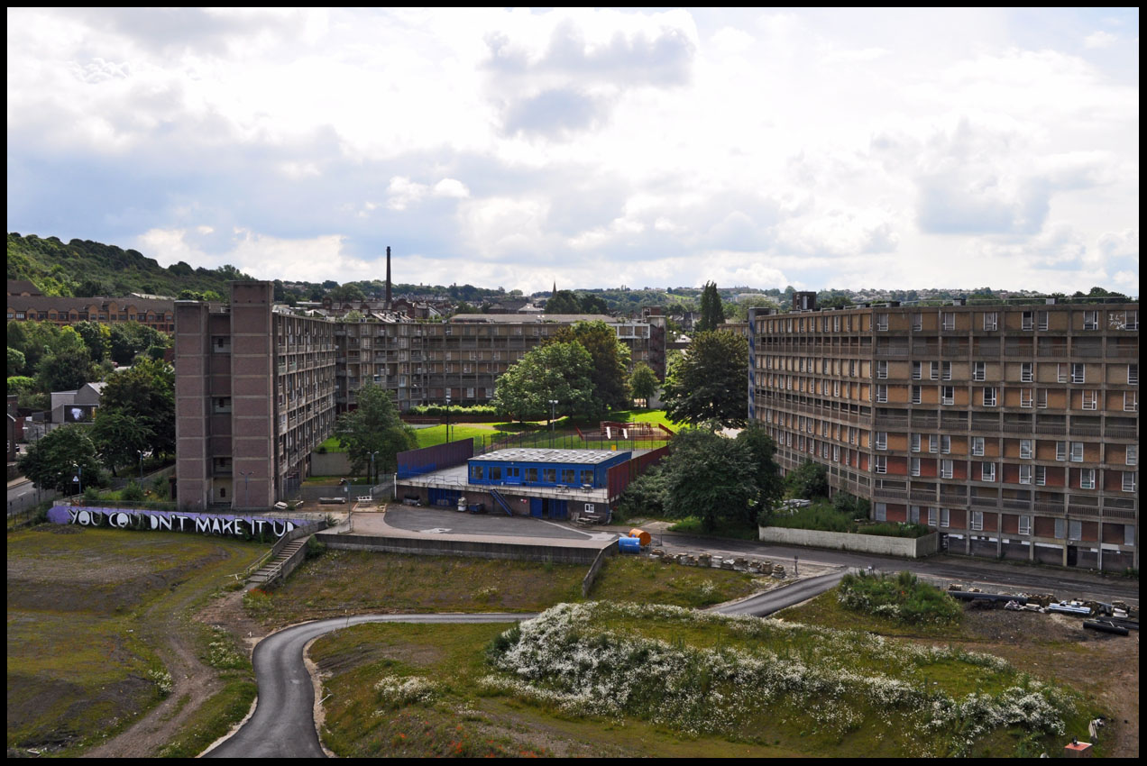
Park Hill – Utopia Remodelled

Most utopian visions go into gentle decline as the years pass by but Park Hill in Sheffield, like many high-rise social housing developments, fell from grace at speed. The fame it now enjoys is a product of its dramatic domination of the city skyline and the scale of ambition, all the more striking in a culture where the preference is for modest, provisional, interim, incremental solutions to housing needs. It was a major statement that reflected the city’s self-confidence. Almost 3,500 residents were accommodated here when the buildings were completed in 1961 but as the novelty wore off it became an increasingly unpleasant place to live – poor maintenance, sound insulation issues, sub-standard materials and anti-social behaviour all contributed. The argument about responsibility for this goes on – target-obsessed city planners insensitive to the needs of families with children, architects with grandiose ambitions, constant downward pressure on housing budgets and feckless tenants have all attracted blame from one quarter or another.

Fifty years having passed since completion, the scheme fits a historic narrative that leads back to Marseille and le Corbusier’s Unité d’Habitation and to the Karl-Marx-Hof in Vienna. The linked access decks (streets in the sky) at every third level caught the public imagination and the buildings attracted admirers and detractors in equal measure until in 1998 English Heritage awarded grade II* listing. Fourteen years later, only the southernmost low-rise buildings remain occupied by council tenants. The greater part of the scheme is vacant with the initial phase of refurbishment and internal remodelling by developers Urban Splash (closely monitored by English Heritage) nearing completion. The first block to be finished should be ready for occupation in December and a sales campaign is underway. The campaign must contend with a generalised cultural antipathy to concrete and high-rise (brutalist, unsympathetic, inhuman scale, anti-individualist, un-English) and additional hostility from enemies of the “heritage industry” and opponents of gentrification.

When you go inside, you find yourself trying to imagine exactly what it would be like to live there when the fascination of the spectacular views begins to fade into dull familiarity. Storage space is minimal, so a spare and austere lifestyle would be an advantage. An occupant with acquisitive habits would rapidly come up against the limits of what could be accommodated in rooms of modest dimensions. The original room plans were designed to Parker Morris standards – practical for 1961 but incompatible with the world of home cinema, jumbo-size fridge-freezers, walk-in wardrobes and wet-rooms. These confined spaces will have little appeal for the young professional looking forward to rolling out a four-seater leather sofa and a runway sized coffee table in a city centre loft apartment. Perhaps there’s a developing market for Modernism as nostalgia – a place where the coarse texture of brutalism serves as a corrective to the dazzling surface gloss of corporate aggrandisement. Will the rectilinear Modernist rhythms of horizontal and vertical elements appear models of restraint when compared with the computer-designed formal travesties that tower over the Gulf states or the Shards and Gherkins to be found closer to home?