Showing posts with label marketing. Show all posts

Friday, 8 March 2019

Fresh From Battle Creek


We begin with a postcard from 1958 on which an impressed visitor from South Africa writes home with an account of a visit to the Kellogg’s factory in Battle Creek, Michigan. Unlike many of its competitors, the Kellogg Company has retained its independence and still resides in Battle Creek, where it was founded in 1898. As the postcard illustrates, it has a global presence and there are very few countries where its products are not on sale. It operates in an ultra-competitive market and pioneered the inclusion of free collectable figures and toys in its packages. Offering modest books of pictures and stories for children in return for a nominal sum was another successful strategy in popularising the product with children. Brand characters played their part from Snap! Crackle! and Pop! (Rice Krispies) to Tony the Tiger (Frosties) while established cartoon characters such as Yogi Bear were drafted in on an as-required basis, all to embed themselves in the affections of juvenile consumers. Their efforts were probably more effective on television than they were in print. The logo has been regularly and subtly remodelled but remains recognisable as the signature-based original from 1900. And there’s a Kellogg’s Sans font to support the corporate identity. Movie tie-ins are the staple of today’s promotional activity.


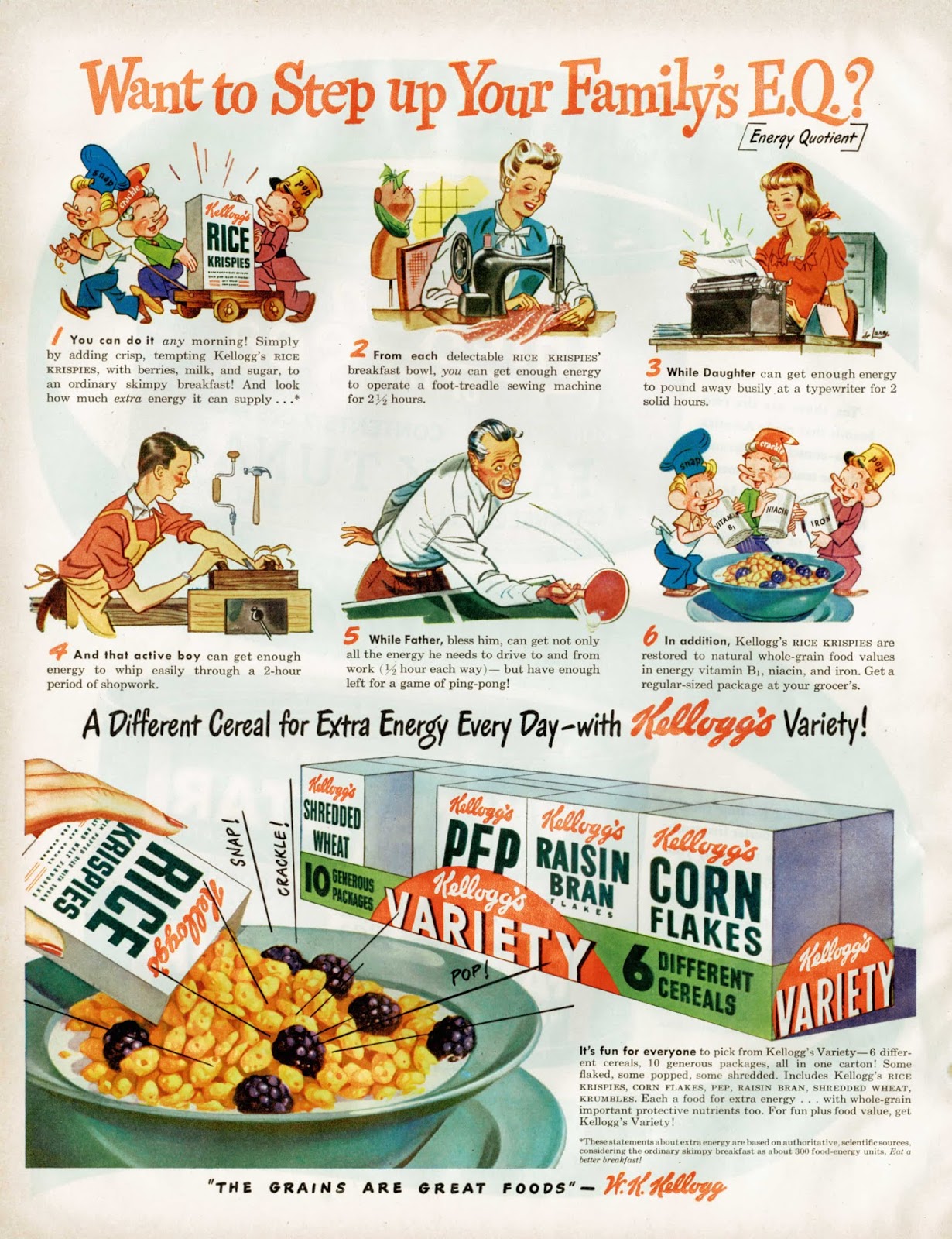
Kellogg’s print advertising is unspectacular but persistent. Sometimes directed exclusively to the junior end of the market – at other times focused on the needs and anxieties of adults. The message to adults is often designed to exploit fears about physical health with a special emphasis on regular bowel movements. Mothers are frequently reminded of their parental responsibilities for child welfare with an implication that a child without Kellogg’s in her diet is a victim of neglect. The use of slogans and taglines is functional but not especially imaginative – few, if any, have passed into popular culture. This survey is concentrated on the period 1930 to 1960 and the only slogan with any staying power seems to be The best to you each morning. Efforts such as The Grains are Great Foods or Mother Knows (Kellogg’s) Best are justly forgotten. The invention of the Variety pack – 5 types of cereal, 10 small servings, all wrapped in cellophane was a masterstroke. Smaller quantities and increased packaging boosted margins while the direct appeal to children made life difficult for parents in the supermarket.




Saturday, 11 May 2013

Child Soldiers of Madison Avenue


Today we expose another cross-section through the geological record of mid-century American advertising and consider the impact of child centred publicity. Few images are as potent in emotional appeal as that of the child and for advertisers it is one of the basic elements in the visual vocabulary. A well-chosen image can help to convince the public that they are buying from an essentially honest and benevolent business when these qualities are reflected in the eyes of an innocent and guileless child. If the product contributes directly to the welfare of children (medicinal, infant foodstuffs, hygiene) the image must be modified to maximise parental anxieties and engage with protective instincts. When the product is primarily designed to meet the desires of children (breakfast cereal, confectionery) the chosen image will show the child transformed in terms of energy, alertness, health and contentment. A fortunate few graduate to the status of brand characters and enjoy long lives in a state of arrested development. Gender stereotyping is everywhere – boys are adventurous and naughty while girls are sensitive and helpful. The unimaginative advertiser is most likely to resort to cuteness of countenance to overcome consumer resistance – what monster could deny happiness and security to such an adorable and ingratiating child? Most of the following examples fit into one or other of these basic categories but a minority defy any classification and seem to have been conceived in a perfect storm of conflicting ideas. These are the ones that give the greatest pleasure to the detached observer of human folly.


Tuesday, 16 February 2010

Three-Letter Products


Advertisers’ wisdom had it that brevity was all when it came to naming a product. A single syllable, easily remembered, would lend itself to simpler, more punchy, graphic treatment enabling the busy shopper to quickly locate it on the crowded supermarket shelf. There is a long tradition of three-letter product names and a selection is presented here. The popularity of this strategy seemed to peak in mid-century and many of these examples come from that era. Some, such as Lux, Oxo and Vim have a long history, the last-named having been launched by Lever in 1904 as a successor to the great Victorian colossus of branding, Monkey Brand. A few have sunk into commercial oblivion but most survive into the present suggesting there may be a longevity factor associated with three-letter names. Today’s preference in product names is for cryptic combinations of letters and numerals and a large and profitable industry has evolved to shoulder the burden of finding new names for old tosh.