Showing posts with label american illustration. Show all posts

Thursday, 11 May 2023

Bruce McCall (1935-2023)

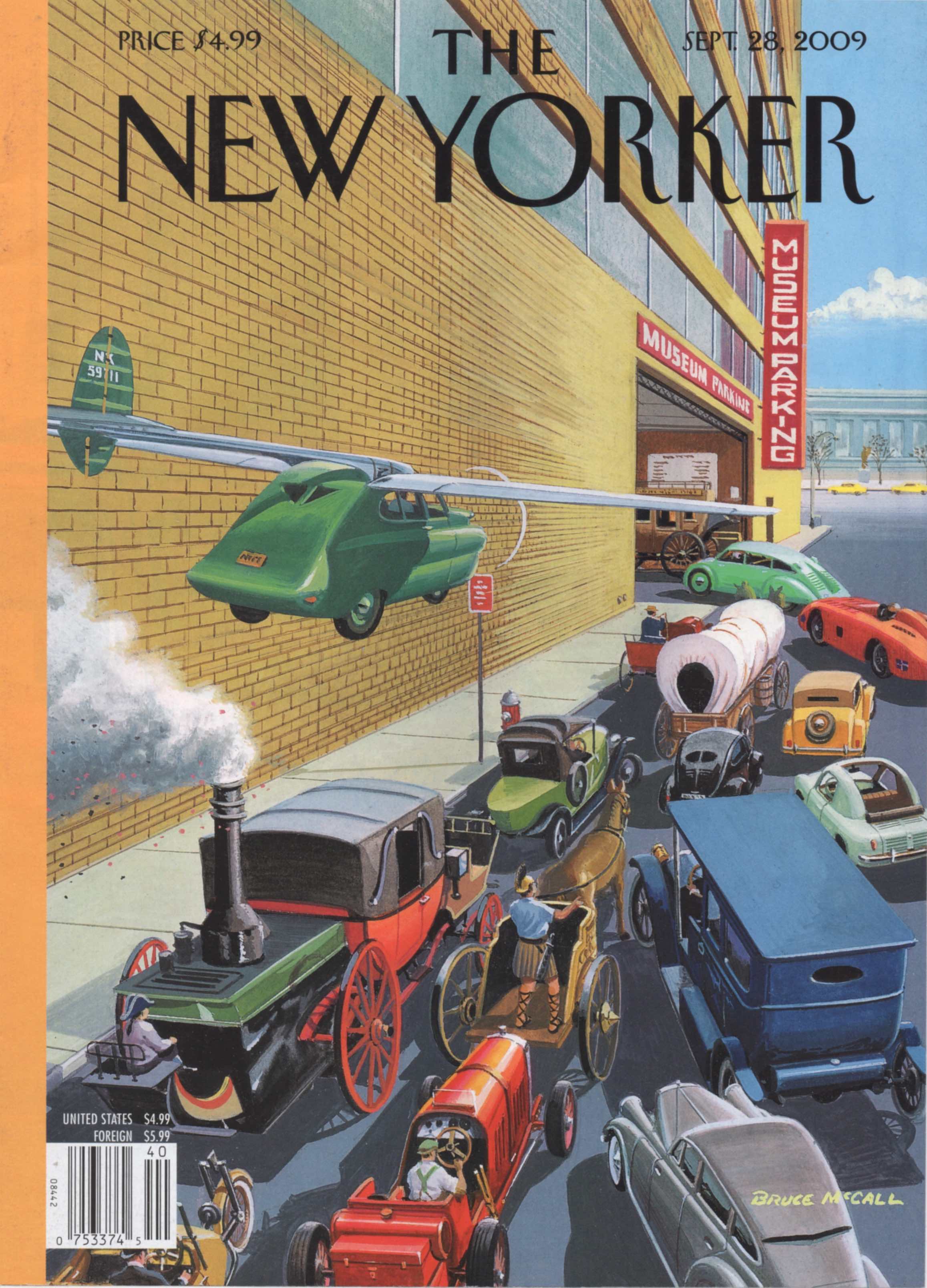
I’ve been a fan of Bruce McCall’s illustrations since I first saw his parodies of Streamline Moderne in the pages of National Lampoon (see above). When he became a regular cover artist at the New Yorker I collected his covers as well as his books (Zany Afternoons, All Meat Looks Like South America).  In the past I’ve read some snide criticism of his work - stylistically conservative, unadventurous and boring, but that ignores the ingenuity and asperity with which he undermined the conceits and social pretensions of self-conscious modernity. His experiments with the visually incongruous could rival those of Magritte, an artist whose work was greatly enhanced by conservative techniques of representation. By the time of his death he had drawn 83 New Yorker covers (almost 18 months worth) and though he kept returning to the same themes (human vanity, bears, ocean liners, aviation, motor vehicles, advertising) he always found something fresh to say in his familiar deadpan fashion. With decades of experience toiling in the advertising industry he knew whereof he spake. He died last Friday at the age of 87, by way of tribute this is a selection of my favourites of his streetscene covers for the New Yorker taken from my scrapbooks.


 Plus two examples kindly provided by Robin Benson.


Monday, 10 May 2021

Mid-century Romance and Misadventure

Bernard D’Andrea, Saturday Evening Post, November 1957.

Romantic fiction was a staple offer in the pages of Saturday Evening Post and a legion of highly proficient illustrators were on hand to give visual form to tragic and comic stories of love and betrayal. Some of the visual interpretations reveal a psychological complexity in a single image, every bit as effectively as a narrative spread over 8 or 10 pages of text.  These illustrators were masters of gesture and expression, expert in capturing minute variations in body language to convey emotional subtleties.  This was an age in which prosperity and anxiety seemed to advance in step - the Cold War undermined the sense of national security along with a growing unease that over-consumption and the breakdown in community values as millions moved to the suburbs was corroding the American soul.  The fear of crime couldn’t be washed away by alcohol and barbiturates.  Communism was an ever present, if ill-defined threat to the American way of life and efforts to eradicate its influence fed the climate of political paranoia.  Casual violence toward women and children was broadly condoned while adultery and coercive sex were only condemned if they came to public attention.  Maintaining an appearance of moral rectitude was imperative - any fall from grace would be ruthlessly punished by community pressure as much as legal proceedings. Women were often unwelcome and underpaid in the workplace and protection from harassment and exploitation was minimal. All these threads could be found in popular fiction and may explain why so many of these images contain unsettling and ambiguous gestures, glances and facial tensions. Carefree relationships and romantic bliss are in short supply.  Surrender to passion is more common, perhaps because it paves the way to the high drama of disillusion, treachery, desertion and cruelty.  This selection of images are mostly from Saturday Evening Post - artists are identified and dates of publication supplied where known.  Some examples are better than others. The subjects all include a couple - among them are several examples of what illustrators referred to as “the clinch” plus a few from other fiction genres such as crime and adventure.


Unknown illustrator, Saturday Evening Post.

Alex Ross in Ladies Home Journal, December 1948.


Saturday Evening Post, illustrator and date unknown.


Joe Bowler, Saturday Evening Post, date unknown.


An expedition to a lingerie store illustrated by Joe De Mers for Saturday Evening Post.


Jon Whitcomb for the readers of Ladies Home Journal, July 1948.


Coby Whitmore for Saturday Evening Post, date unknown.


Saturday Evening Post, date unknown.


A frantic couple under siege - illustrated by Bernard D’Andrea, Saturday Evening Post, "The Hounds Of Youth" (1961).


Thornton Utz illustration for Saturday Evening Post.


Saturday Evening Post, illustrated by Edwin Georgi (1896-1964).


Saturday Evening Post, illustrator and date unknown.


James Bingham, Saturday Evening Post, December 1955.


Alex Ross in Ladies Home Journal, October 1948. 


Saturday Evening Post, illustrator and date unknown.


Coby Whitmore for Saturday Evening Post, date unknown.


Peter Stevens (1920-2001) for Saturday Evening Post, September 29, 1956.


Steamy mid-century romance illustrated by Jon Whitcomb for Ladies Home Journal, September 1948.


Coby Whitmore for Saturday Evening Post, 1953.


Saturday Evening Post, illustrator and date unknown.


Lionel Gilbert (1912-2005) for Collier’s Magazine, January 1952. 


Saturday Evening Post, illustrator and date unknown.


Peter Stevens (1920-2001) for Saturday Evening Post, date unknown.


Saturday Evening Post, illustrator and date unknown.


Thursday, 12 November 2020

John Gannam in the American Boudoir

John Gannam was working at a time when the wartime climate of permissiveness was under sustained attack from the guardians of public morality - the forces of American prudery having been quick to regroup in peacetime and push back against the slightest hint of sensuality in the media or the arts.  Intruding into the privacy of the American bedroom and emerging with such hedonistic imagery was a brave thing to do.  Gannam’s watercolour brushes danced over the topography of crumpled sheets, casually flicked here and there by the unconcerned occupants. Alongside a tender image of mother and baby and the innocence of childhood, the boundaries were pushed by a generous quantity of indecorous romping elsewhere. Reading Treasure Island in bed is just about acceptable but teenage absorption in the comic section is a morally defective surrender to indolence. Gannam’s art director, Kurt Josten was quoted (Art Directors’ Annual 27) saying that the aim was to appeal to the reader by showing vignettes of human interest in the bedroom while prominently displaying sheets.  This explains the asymmetric compositions which had the advantage of providing space for text. Human interest was to be found in the energy and vitality more often associated with the sports field.  As well as working for Pacific Mills, Gannam was engaged by St. Mary’s Blankets to bring a tone of more subdued glamour to their product. By all accounts Gannam was a self-effacing character and physically unimposing, unlike his more stereotypically extravert colleagues forever hustling in pursuit of the next commission. Relying on his skilled handling of watercolour to offer something different he also worked for Ford and Chevrolet but his best work was editorial illustration for the fiction pages of Good Housekeeping magazine. Leif Peng has a judicious selection to be seen here.


Friday, 29 May 2020

Railroads in Fortune Magazine


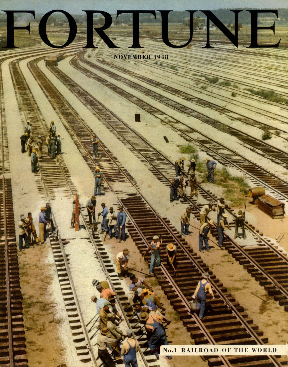
Fortune magazine was launched into the hearts, minds and pocketbooks of America’s business elite in 1930 at a time when steam powered railroads were the nation’s prime movers of raw materials and manufactured goods. Many businesses were highly dependent on the services of the railroad and managerial executives took a close interest in rail pricing and performance. Fortune specialised in long-form journalism, and regular in-depth analysis of the railroad business kept the executive class well informed. In their turn the railroads advertised their services to business leaders while the manufacturers of locomotives, rolling stock and railway equipment advertised to the railroads.


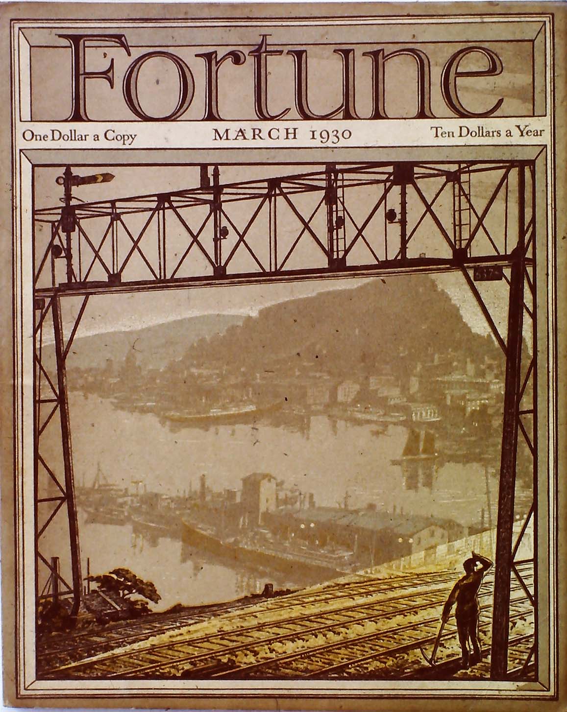
Railroads made their first appearance on the cover of the second issue of Fortune in March 1930 - beneath a signal gantry a track worker shields his eyes from the slanting sunlight while far below we see an idealised harbour scene, part San Pedro, part Amalfi Coast. An example of what might be called “industrial pastoral” where benevolent business dwells in harmony with the natural world, the sort of relationship Fortune commended to its readers. In February 1931 the cover took the form of an aerial illustration of a marshalling yard showing diagonal lines of freight cars under the guidance of a pair of muscular locomotives, each dispatching powerful plumes of smoke and steam into the atmosphere - a stylish celebration of steam power in which railroad grime is transformed via a palette of vibrant complementaries. A lively use of line and flat areas of dynamic colour (blue-green, orange-red and maroon) greatly enhance what might otherwise have been a banal composition. Neal Bose, the artist has left no more than a minimal trace of his existence - a biography that starts and finishes with: born 1894, Columbia TN, lived Chicago area. For the first decade there was a Fortune tradition of covers unrelated to the contents. Covers were treated in the same way that producers of luxury goods would employ the finest of packaging to add another layer of exclusivity.


Fortune cover artists enjoyed remarkable autonomy - some were submitted on-spec while others were the result of one word commissions. Full advantage was taken of this freedom and artists successfully offered up imagery that in subject and treatment, aligned with their personal interests. This culture of tolerance was all part of Fortune’s mission to raise the sights of business leaders to aspire to a higher sense of purpose. A change of policy in the 1940s led to more directed assignments and covers that reflected a major story inside the magazine. Representation and stylisation were succeeded by a cautious embrace of Cubist-inspired semi-abstraction, Modernism, montage and, finally, photography. Several of these cover artists were associated with Precisionism - Francis Criss and Edmund Lewandowski drew on their repertoire of crisply rendered geo-mechanical forms. Lewandowski (August 1945, March 1948) pushed his compositions towards abstraction with a judicious selection of re-ordered simplified details. Criss (November 1942) found visual drama in the intersecting vectors of transmission lines and electric catenary - at ground level a maintenance crew bustle around a fleet of streamlined coaches, every aspect equally favoured by the artist’s dispassionate attention.


For May 1936 John A Cook produced an image of a sequence of passenger trains entering and departing from a busy station observed from an elevated viewpoint. John O’Hara Cosgrave II’s boxcar image for May 1939 shared the Precisionist sensibility and would be revived 35 years later in a modified form as an album sleeve for J J Cale’s Okie issued in 1974. Modernist graphic designer, Lester Beall was responsible for the montage on the cover of the March 1947 issue, announcing an account of Britain’s newly nationalised railways. A subject of crucial importance to an American audience as evidence of the creeping tide of socialism that sent shivers down the collective spine. Finally, from August 1958 is a grid of railroad company emblems, locked together in a black mesh and separated by wedges of vibrant primaries and secondaries. This is the work of Bauhaus graduate Walter Allner, master of hard-edged graphic simplification, who served as Fortune’s Art Director from 1963 to 1974. In all, Allner designed 79 Fortune covers, beginning in September 1951.

Much more about Fortune is readily available at the Visual Telling of Stories and an extended visit is highly recommended. It conforms to nobody’s template and prioritises information over style. Curiosity will be rewarded with a wealth of unexpected visual treasures, under the guidance of unshowy fonts and the gravity-defying inverted pyramid of thumbnails.