Throughout the 1950s, car designers in Detroit stretched and expanded their vehicles in all dimensions while applying ever more extravagant chrome decoration. Every piece of trim and every bodywork moulding was designed to emphasise the sense of horizontality. This brochure depended on the talents of illustrators to bring the car to life and inspire some excitement in the reader. Photography still had its limitations - an accomplished illustrator could subtly glamourise the product with discreet exaggeration and an imaginative way with colour. A wedding theme runs through the imagery and we see the menfolk drool over the external finish while the women are swooning over the spacious interior. There’s a touch of Hollywood about the wide-screen visualisation that places the viewer inside the vehicle while the ethereal bridesmaids dance in attendance. Detroit was a city of ad agencies that specialised in serving the auto industry and the illustrators they engaged would often go on to stellar careers elsewhere, armed with the depth of their experience in keeping one step ahead of the camera with their transcendent visions of automobile perfection. By launching the car as the Galaxie, Ford was capitalising on public interest in the space race - galactic space is the infinity of space. The name survived for 15 years until it was retired in 1974. 1959 Ford models would go on to win a gold medal at the Brussels World Fair for styling elegance - an unusual accolade for Detroit industry.
Showing posts with label vehicle brochure. Show all posts
Wednesday, 10 February 2021
Wednesday, 27 July 2016
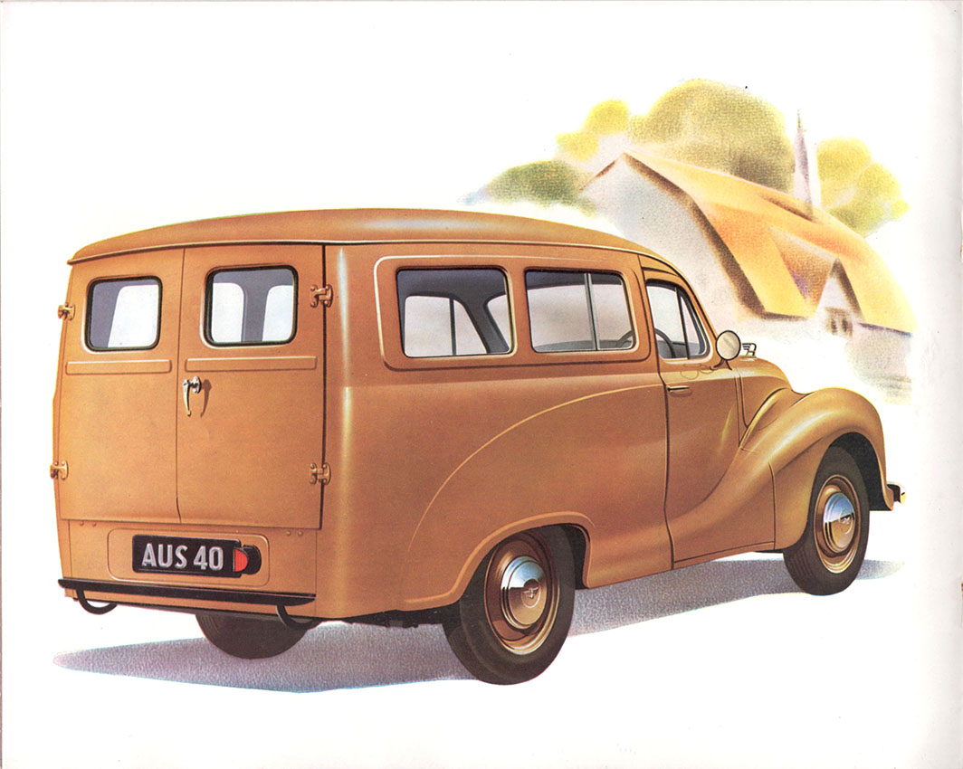
Austin A40 Light Commercials, 1951
A sales brochure from the Festival Year, 1951 – when British-built vehicles ruled the streets. Brexit roads where Japanese cars were as yet unknown and only the occasional Fiat or VW intruded on an Anglo-Saxon virtual monopoly. Not only that, but in the pre-container era large volumes of British vehicles were hoisted on to merchant ships for distribution across the Commonwealth and Empire. The cover illustration is an unlikely sun-drenched evocation of a typical mid-century city centre (minus the bomb-sites) where sturdy Neo-classical Edwardian buildings tower over streets busy with pedestrians. Post-war optimism unlimited – with a curious absence of street lighting. On the inside pages air-brush artists have been busy creating flawless likenesses of all the new models in their natural habitats. Plus exciting cutaways of advanced technical features. All-steel construction and dependability were key selling points as well as “congenial driving conditions”.
Monday, 29 February 2016
Austin Omnivan 1956
In 1956 British-owned volume vehicle builders were about to enter a long period of turbulent decline that would lead inexorably to their extinction by the end of the century. The captive market in the Commonwealth and allegiance to all things British was on the point of disappearing and competition from other European manufacturers and from Japan was about to put the British industry under severe pressure. This vehicle design borrowed from European competitors (especially VW) for its shape and proportions and with revisions would remain in production for another 11 years. Smoother contours and an undivided windscreen distinguished it visually from its predecessors. The publicity brochure shown here relied upon the skill of the illustrator for its cheery visualisation of a gently idealised post-war world, rendered in a style we might call Ladybird-lite. The professional illustrator would soon be supplanted by the photographer as printing techniques improved but in the late 1950s the hand-drawn image conveyed a sense of immediacy and visual power that could not be easily matched in cheaper photographic reproduction.
Subscribe to:
Posts (Atom)