Away from the bustle of a Cross-Channel port and the casinos and luxury hotels of a fashionable resort, another very different world existed – a literally marginal community whose homes were carved out of the cliff face. Images of destitution and deprivation are uncommon on postcards unless they are simultaneously picturesque and colourful. Not the case here among the cave dwelling fishing community in Dieppe. The fascination here seems to have more to do with the frisson of superiority to be experienced when gazing upon the wretched and dispossessed. They offer intriguing glimpses of a world of hard labour and primitive living conditions. By the time that W R Sickert settled in Dieppe in 1920 he had left behind the sordid and squalid subject matter of Camden Town in favour of café society and casino high-life, otherwise this disadvantaged tribal group might well have attracted his attention.
Saturday, 30 March 2013
Sunday, 24 March 2013
Flavor-Town
One of the most prized directives in the corporate witch-doctor’s bag of tricks is the need to identify your mighty enterprise with a small town or rural location. Plant the idea in the public mind that yours is a business just like the reader’s – you struggle along against all the obstacles that government puts in your path making just enough profit to keep going. At the end of the day you are just plain folks, nothing fancy or pretentious to unsettle the customer. The makers of Beech-Nut Gum made the most of their small town origin in the Mohawk Valley town of Canajoharie employing the service of a bucolic Adonis complete with pitchfork to bring the news to the visitor from the city. Just a bunch of local boys who got together to process wholesome smoked country hams and invented the vacuum jar – everything from ketchup to jam, from peanut butter to marmalade went into those jars until chewing gum was added to the product lines. To overcome the problem of pronouncing Canajoharie it was renamed Flavor-Town.
Now for a Declaration of Bias – I have the undiluted petit-bourgeois aversion to the habit of chewing slabs of synthetically flavoured latex. The mechanical rhythms of the rotating jaw and associated vacuous facial distortions are self-inflicted and everyone has a right to look stupid, but the practice of transferring discarded gum to the clothing and footwear of strangers via the agency of table undersides and public seating is genuinely objectionable. So shed no tears for the demise of Beech-Nut. The company was swallowed up and spat out by a succession of competitors including Life Savers, Squibb, Nabisco, Nestlé, Ralston Purina, Madison Dearborn and the Hero Group. Somewhere in this marathon the gum expired and all that remains today is baby food. In 2011 the very last production facility in Flavor-Town moved elsewhere.
Labels:
advertising,
americana,
confectionery,
illustration
Thursday, 14 March 2013
Global Ambitions
When businesses expand, dreams of worldwide domination with consumers in every land and advertising in every language begin to form. There will be a network of offices across the globe and the name in lights in the centre of every major city. A reputation for excellence will extend into the most remote regions of the planet. To become part of a supra-national global community orbiting the earth at supersonic velocity, detached from the deadweight of national allegiance was the ambition of the visionary CEO. Advertising agencies stood prepared to translate these glittering visions into reality with the assistance of a well-stocked repertoire of clichés. Foremost among these were images of the globe, infinitely adaptable and instantly recognisable. We present a small selection below but a special mention for Colgate whose loyal customers were rewarded with a globe of their own to dominate in the privacy of their own homes.
Wednesday, 6 March 2013
Postcard Memory Palace
Introducing a new place to view postcards
After almost 6 years of posting here I hope there are a few readers who share some of my enthusiasm for vintage postcards. With this in mind a new blog has been set up at WordPress to display a much deeper selection of postcard imagery than we have space for here. There will be no commentary but the tags should enable visitors to make their own choices and navigate around. It should eventually develop into an extensive archive with the opportunity to select and browse by theme, genre and location. Postcards will continue to feature here as long as I have something to say about them but from now on there will be a complementary space for those of you who wish to see more.
Thursday, 28 February 2013
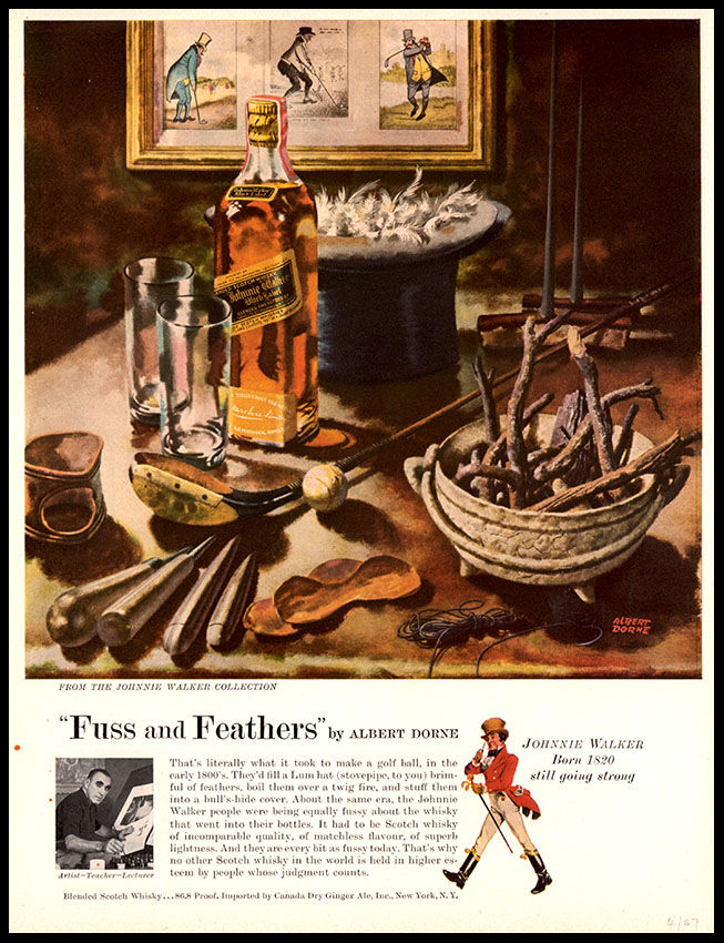
Albert Dorne, commercial artist
Q: Have you ever painted what you wanted to paint – for your own pleasure, so to speak?
A: I have never felt a need to make pictures for my own so-called pleasure.
The anatomy of mid-century America and the post-war carnival of consumption were recorded in exhilarating detail by the illustrators of the period. There are some who had a greater range than Albert Dorne and some who explored in greater depth but Dorne intrigues for his single-minded pursuit of revenue and an absolute absence of artistic pretension. The publication of a book* devoted to the activities of a commercial artist and illustrator is something to be grateful for. It may be churlish to complain because, despite my hope for something a little more definitive and authoritative, it does shed some much needed light on the professional world of the mid-century illustrator. The authors have collected some fascinating detail (especially on the subject of the Famous Artists School) and some first hand reminiscences and a more handsome and comprehensive book was presumably outside the budget. Albert Dorne worked exclusively for advertisers and magazine publishers – there are no illustrated classic books for the likes of the First Edition Club and no collections of paintings of steamships or racing cars or regattas or exotic landscapes. Dorne claimed to have acquired his drawing skills through years of sketching as a teenage visitor to the Metropolitan Museum and he was not uninterested in Fine Art (he admired aspects of Cézanne and Picasso) but he had no ambitions to try his hand at anything outside his core activities.
*David Apatoff Albert Dorne: Master Illustrator Auad Publishing, 2012
Dorne saw himself as primarily a businessman – as he became successful he employed a team that eventually expanded to include an accountant, business manager, secretary and studio assistant. Keeping the reference files in good order was the most important responsibility of the studio assistant. Speed of execution and consistent excellence were his selling points in pitching to art editors and advertising agencies and he made a point of never delegating a single brush stroke to an assistant. An exceptional talent for caricature was his most popular attribute and much employed by corporate advertisers to give their product a human face. Shoot-outs, mass brawls and fisticuffs generated enormous volumes of business from Saturday Evening Post, Colliers and Lady’s Home Journal but viewed in retrospect an unrelieved diet of pop eyes, bushy brows, bulbous noses, droopy moustaches, pot bellies, Stetsons, suspenders and dungarees can rapidly get tedious. Rather more impressive is Dorne’s flair for handling animated crowd scenes seen to best advantage in the great series of images painted on behalf of Wurlitzer juke-boxes. These extraordinary tableaux burst with vitality and display a high order of spatial organisation. Dorne was proud to supply his clients with exactly what they wanted, free of all artistic pretension, and what they wanted was mostly caricature surrounded by white space. Coloured inks were his choice of media and he developed a method of application that equalled the density and depth of colour achieved by his colleagues working in body colour or gouache.
Dorne’s public persona was formed by his working class New York childhood and he may have had more in common with an artist like De Kooning who liked to present himself as an uncomplicated proletarian. An assertive personality, a pugnacious manner, frequent profanity and an ability to charm when necessary are the qualities he was remembered for. Commercial success translated into a life of suburban affluence, hand-made suits and shoes and a custom Mercedes with all the accessories befitting to a self-made man born and raised in the East Side slums. The illustrations come from a trawl through the tear-sheets – most, but not all of Dorne’s work bears his distinctive signature. A few of these examples have no signature and are a result of guesswork that may stand to be corrected.
Labels:
advertising,
albert dorne,
illustration
Tuesday, 26 February 2013
Bearing Witness
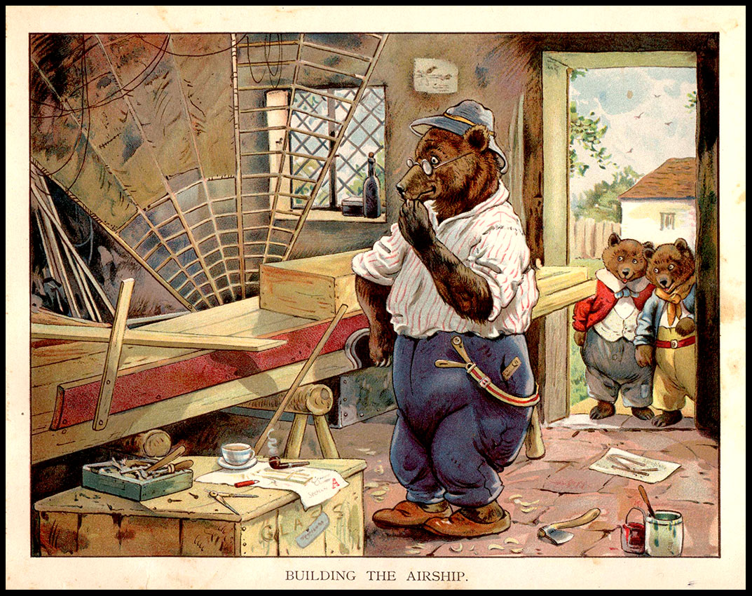
Bears are obliging creatures. They can be held up to terrify us with their implacable savagery or they can be infantilised to amuse us with their cuddly charms. We can thrill to the horror of being casually dismembered by an ursine enragé or be captivated by winsome tales of adorable cubs. In the postcard universe bears are working for Homeland Security and make well-behaved visitors at the tea table. Bears are useful product ambassadors for business – symbolising unrivalled strength or cheery good humour. In the world of books for children a useful guide to threat assessment is to relate it to the amount of clothing on the bear. A well-dressed bear is a benevolent presence whereas an unclothed specimen is unlikely to be well intentioned. Below we have a number of illustrators who have risen to the challenge including Rojan, Leslie Brook, Freda Derrick, Alfred Bestall, Arnrid Johnson, Clifford Webb and G H Thompson.
Subscribe to:
Posts (Atom)