Thursday, 12 December 2013

Pennsylvania Railroad Serving the Nation


There’s an entertaining case-study in Roland Marchan’s Creating the Corporate Soul (1998) on the subject of the Pennsylvania Railroad (PRR) and its pioneering enthusiasm for the devious art of public relations. Second only to the New York Central in terms of passenger numbers, the railroad was unloved by both customers and employees according to an opinion survey it commissioned in 1926. Travellers were unimpressed by singularly unhelpful and discourteous staff while the workforce was confronted by an employer hostile to unions and bent on reducing wages and pensions. To break this vicious cycle, a campaign was launched with the aim of raising employee performance by celebrating instances of exceptional assistance rendered or displays of outstanding courtesy (both actual and fictional) in magazine advertising and internal newsletters. Nothing less than a corporate spirit of virtuous service would suffice. A wedge was driven between the workers and their union by assiduously promoting a company employee association. Another company ambition was to develop a close relationship with all the small communities served by its network and convince the populace that despite its monolithic scale, at heart it was a small business like any other that only existed to serve the needs and desires of ordinary folks. Every bit of publicity was designed to reinforce the notion that the PRR possessed a heart and soul dedicated at every level to the welfare and happiness of its customers. This campaign was regarded as an exemplar by the infant public relations industry but as Marchan points out, there was no conclusive evaluation of the results and such indications as there are suggest it accomplished very little. By 1933 some 67,000 workers had been laid off and the remainder casualised and an industry expert is quoted saying that the PRR was “easily the most hated railroad and General Atterbury (company president) the most hated railroad executive”. 


From 1941 the priority was to demonstrate the company’s resolute commitment to serving the military campaign – every freight train carried essential supplies and munitions and every passenger train conveyed troops to their point of embarkation. Public morale was boosted by restating the fundamental values of American greatness, elevating vast clouds of patriotic fervour into the upper atmosphere alongside the smoke from the locomotives. The rewards of victory were held out, offering a return to an era of peace and plenty to sustain the public through the privations of war. Every operational aspect was reconfigured to save waste and improve efficiency and then reported to the public via mass circulation magazine advertising. Copy was written to personalise the PRR and communicate in the voice of a concerned citizen, gently reminding the readers that all essential supplies, raw materials, power, light, energy, food etc. were dependent on the activities of the railroad. Blue-collar and white-collar put aside their differences and united in the national interest. 


When peace returned there was a focus on rebuilding the infrastructure although the deeper message was to enlist support for the campaign for tax breaks. New improved coaches offered passengers enhanced space and comfort while new freight wagons destined to transform industrial efficiency rolled off the production lines to be waved on their way by enthusiastic small boys. Then there was the moment when the military uniform was set aside in favour of a return to the railroad blue, a transition celebrated in an ecstatic hyper-real tableau that captures the resumption of peacetime normality in an effort to reinforce esprit-de-corps. Molly Pitcher was doubtless sent packing as other servicemen returned to reclaim their former positions. The sunny prospects of vacation travel replaced the exigencies of wartime that demanded that every passenger train was shown passing through an industrial underworld beneath glowering apocalyptic skies. Despite the gleaming new trains with their recreation cars, the convenience and superior speed of airlines were rapidly stealing the customers away. When the network of interstate highways was complete, the end came quickly and in 1968 the PRR was merged out of existence. 


Friday, 6 December 2013

Postcard of the Day No. 61, Albulabahn


We seem to be faced here with a scene from a mediocre and depressing comic opera set in the Swiss Alps. It looks like the moment when a passing prosperous lederhosen-clad traveller pauses to get his glass of local wine refilled by the innkeeper’s wife while an unprepossessing agricultural labourer looks on in silent resentment. But what brings the image to life is the magnificently irrelevant presence in the distance of a tiny train lead by two locomotives, blasting its way uphill with copious clouds of smoke and steam trailing behind. The horse and cart represent old technology while the railway viaducts that scale the mountainside are a triumph of the most advanced civil engineering. The card is a pleasing addition to the select group of postcards that feature a wheelbarrow. The spectacular Albula railway was constructed between 1898 and 1903 and since 2008 has been a UNESCO World Heritage Site. There are 55 bridges and 39 tunnels over its 39 mile length. To conclude we offer a further selection of cards in which trains can be seen crossing bridges.


Tuesday, 3 December 2013

Whilst We Sleep with Typhoo Tea


This is a series of 25 collectors’ cards issued in 1928 by Typhoo Tea. It’s a tribute to the anonymous individuals who keep us safe and ensure the wheels of commerce keep turning throughout the night. We are presented with a sober law-abiding group, responsibly and purposefully occupied in the interests of an orderly productive society. So, no place for the courtesan, the croupier or the cat burglar. Most of these worthy folk would today be working for Serco or G4S on Zero Hours contracts, clad in Hi Vis jackets. Today’s Pantheon of Heroes of the Night would have to include the office cleaner, the Paramedic, the Amazon order picker, the all-night DJ, and the Samaritans volunteer. The images are ideally suited to the elongated vertical format designed to fit inside a packet of tea and, unlike cigarette cards could be collected without exposure to the health risks associated with smoking. 


Sunday, 1 December 2013

Italia Grafica


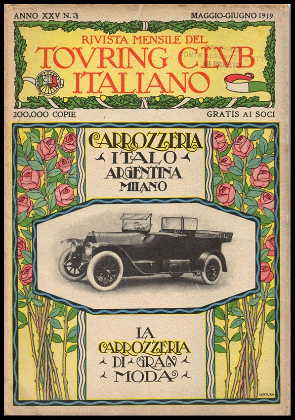
Italy was slow to adopt the poster form of advertising and when Les Maîtres de l’Affiche publication was complete in 1900 there were only 3 examples from Italy out of a total of 256. Although Italian graphic arts never quite acquired the distinctive national flavour or global influence of the French, German or Swiss traditions there were many fine artists and illustrators whose work combined visual wit with a directness of approach. These images come from 1919-20 when the most influential Italian illustrator for advertising was the incomparable Cappiello (who largely lived and worked in France). The Cappiello style of an arresting, gently humorous central image and a detailed portrayal of the product package against a flat colour ground can be seen in Italian advertising as late as the 1960s. What we see here include some examples from an earlier Art Nouveau influenced genre as well as some robust examples of the Cappiello tradition. 


Wednesday, 27 November 2013

Republic Steel


Fortune magazine advertised itself to the trade in the 1930s as the premier medium for steel industry advertising, gathering testimonials from major producers including Republic Steel praising the efficacy of Fortune in an exercise of mutual back-slapping. These examples come from an extended advertising campaign that Republic Steel placed in Fortune magazine. They seem to be themed around weight and mass. A heavy style for a heavy product. It’s a bulk commodity so most readers will not be placing an order for a thousand tons of steel plate in the near future so the value lies in keeping the company name in the public eye. This was an era where weight really mattered – public opinion was easily impressed with heavy construction and engineering ingenuity was more widely admired than it is today when portability and weightlessness are the most desirable characteristics in a consumer product. Back in the Thirties, the image of the white hot crucible in a dark and cavernous industrial space still had the power to impress the audience. 


The message was reinforced by some muscular drawing and restrained use of high colour tones. Sploshy brushwork and vigorous scrubbed-on paint was the visual language of the mass-consumption conventional landscape where the intention was to catch the eye without opening any sort of dialogue with the viewer. These images strive for a romanticised industrial heroism – a sense of hard-won productivity in harsh, elemental conditions. The smell of hot oil and burning cinders and the thunderous noise of steel-hammers and forges are all invoked. 


Republic Steel at the time of this campaign was a newly-merged business struggling with the collapse of demand for steel in the Great Depression. It was not a great place to work being notorious for adversarial labour relations. A refusal to recognise unions at the Chicago plant provoked a strike in 1937 that culminated in the Memorial Day massacre when 10 unarmed demonstrators were shot dead by Chicago police. Republic was number three in the US (behind US Steel and Bethlehem Steel) and keenly felt the need to publicise itself. But while US Steel was busy attempting to humanise itself via Rockwell inspired scenarios Republic remained committed to a hard-line industrial aesthetic. By contrast, U S Steel would abandon its longstanding opposition to unions in the workplace in 1937 when it accepted collective bargaining. 


In later years Republic would become a voluble cheerleader for capitalism and free enterprise in the 1940s and a militant cold warrior in the post-war era. It was an age of high anxiety and Republic was not the only business to sense a responsibility for educating the public in the virtues of free-enterprise and the perils of socialism Demotic language and a matey directness was typical – the voice of good sense from a concerned neighbour. There was also an unrealistic expectation that consumers would happily settle down to a good long read, at the end of which collectivism would be permanently renounced. The real function of message-lead advertising was corporate self-flattery confirmed by the offer to supply reprints for circulation among friends and colleagues who may be showing signs of straying from the path of freedom. For a blood-curdling selection of these ads, please visit Chris Mullen’s Advertising Hall of Shame (The Visual Primer of Advertising Clichés). 


Wednesday, 6 November 2013

Duchamp 1952


Depending on who you listen to, Duchamp today is the Oracle of Conceptualism, progenitor of a golden age of ideas-based contemporary art or the Great Iconoclast, responsible for the irreversible subversion of all that was great and good in the Western tradition of painting. His admirers claim that he broke down the barriers between art and life enabling the artist to designate anything or anyone as a work of art. All subject taboos were lifted leaving artists free to explore the world at will in any chosen medium. A vocal minority of detractors deplore the death of the hand-crafted object in favour of assembly line methods that Duchamp prefigured and attribute every affront to common decency and good taste in the art world to his malign influence. Duchamp’s parodies of the process of making art and his intellectual game-playing are anathema to the high-minded defenders of autonomous artistic integrity for whom the only art that counts is a product of endless struggle and toil with intractable materials. 


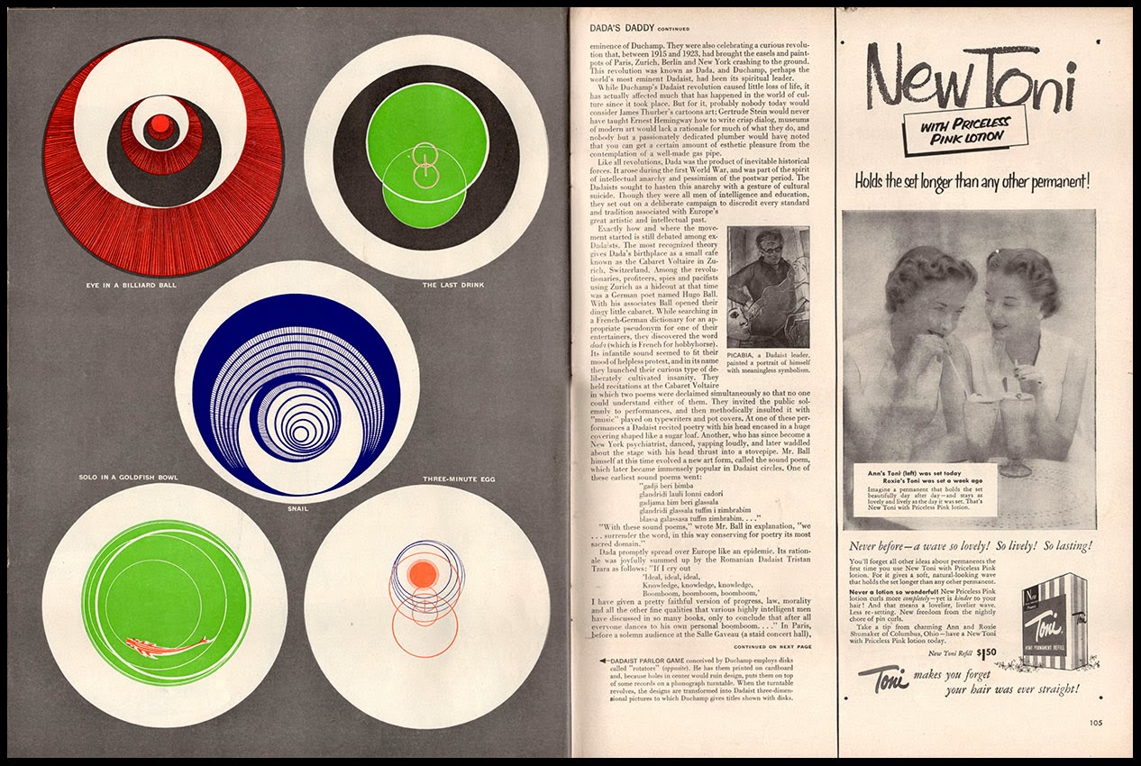
Duchamp would turn 65 in 1952 and had assisted the organisation of an exhibition (Duchamp Frères et Soeur) at the Rose Fried Gallery, New York in February and March. Chess remained his most ostensible preoccupation, while he continued to live in the top floor apartment at 210 West 14th. Street which he had occupied since 1943. All this publicity in the nation’s leading mass-circulation magazine must have tested Duchamp’s celebrated nonchalance about his own reputation. One of the earliest signs of his growing celebrity status may well have made him feel queasy. Whether Duchamp was a regular reader of Life magazine is not a matter of record. Was he more interested in the latest Erle Stanley Gardner story in Saturday Evening Post? Perhaps he leafed through the pages of the New Yorker and Esquire. A secret passion for Breezy Tales and Amazing Stories is not impossible. Chess magazines, View and Cahiers d’Art are more likely to have had his attention. Of course he may also have glanced at Teeny’s copies of Vogue or Harper's Bazaar


Duchamp’s Boîte-en-valise (shown across a double spread) had been a work in progress since 1935 and the first completed examples appeared in 1941. The business of assembly went on for years. A small team (including Joseph Cornell) laboured away as the component parts arrived from France where Duchamp had prepared them before the war. Later editions of the Boîte-en-valise would be more professionally produced and Duchamp would permutate the contents and vary the box to offer 300 versions in 7 editions in much the same way as the fashion industry extracts the maximum revenue from designer brands. In effect, Duchamp curated his own retrospective in compact form. For a collector the finished article was a precious object to be lingered over, cherished and carefully conserved, catering to the instinct for connoisseurship that Duchamp so actively despised. The Boîte-en-valise has a fetishistic fascination linking us to the world of toys, dolls’ houses and model trains via the idea of condensing a lifetime’s creative activity into a single small and confined space.