Friday, 30 October 2015

Rembrandtlaan – an Arts and Craft suburb in De Haan


De Haan is a small select resort on the Belgian coast developed in the late 19th. and early 20th. century and laid out in conscious imitation of English town planning. Unlike the grid patterns that prevail in neighbouring resorts De Haan has a network of informal winding streets with a large circular open space in the centre. Outsize villas and hotels, mostly in the Style Normand, occupy the town centre with residential suburbs to the north-east and south-west where the street names honour great artists and writers. Rembrandtlaan is a short street that follows the route of the Kusttram (coastal tramway connecting De Panne and Knokke) in which all the homes were designed by the Ghent based architect, Valentin Vaerwyck (1882–1959) and built in 1924-27. In style these modest, unassuming houses seem to be Flemish rural vernacular meets post-war suburbanised Arts and Crafts. Hips, gables, dormers, ridge tiles, arrowslits and painted shutters set the tone. Privacy and cosiness are the priorities. The Sundial House (Zonnewijzer) was Vaerwyck’s own personal holiday home. An extensive list of buildings designed by Vaerwyck can be seen by following this link – he had a hand in designing the imposing railway station at Oostende, a full-blown exercise in French Classicism.


Monday, 19 October 2015

Postcard of the Day No. 78 – Napoli


Il lustra scarpe ed il ladroncello 

 “Shining shoes and the little thief”, according to Google translate, which sounds just about right. A social tableau from the mean streets of Naples in which a pompous and negligent toff gets his comeuppance when a barefoot, slightly diffident scoundrel abstracts his silk underwear, or something very like it. It’s not uncommon for tourist destinations of dubious reputation to attempt to derive some advantage from drawing full attention to its social problems. In this case the postcard publisher re-stages an episode of petty crime in the hope of making a profit. The card shown below is a documentary record of shoe shining in the Levantine city of Alexandria.


Thursday, 15 October 2015

Paul Delvaux – Surrealist in Suburbia


One of the attractions of the Kusttram (Belgian coastal tramway) is the Paul Delvaux Museum at Sint-Idesbald. Appropriately located in the depths of respectable suburbia the museum occupies a former hotel in which almost all the gallery space is to be found below ground level. A generous selection of paintings and drawings is on display together with a full size re-creation of the artist’s studio. Bric-a-brac from the Delvaux personal collection – skulls and skeletons, scale model trams and trains, plaster casts and props – supply context for the artworks in which they frequently appear. Although Delvaux is routinely described as a Surrealist painter, his association with the Belgian Surrealist group centred on Magritte, Mesens and Scutenaire was brief. The frequent boisterous jeux d’esprit that occupied the Belgian Surrealists held little appeal for the introverted and unsociable Delvaux for whom painting was very definitely a solitary pursuit. Constant repetition of a limited range of subject matter (nudes, classical ruins, skeletons, trains and trams) made him an easy target for their scorn.


The Delvaux imagination seems largely formed in adolescence - ancient steam locomotives and vintage electric trams journey without end through the artist’s imagination while in another cranial region wide-eyed young women disrobe to reveal slender limbs and pallid flesh. Elsewhere characters from childhood immersion in the science-fiction of Jules Verne haunt the adult imagination. Delvaux orchestrates these disparate elements into a single compositional fantasy often under cover of darkness. What Delvaux took from Surrealism was the freedom to develop a repertoire of dream-like imagery that integrated a lifetime obsession with trams and trains (a legacy of an introverted childhood) with a taste for unclothed or semi-naked female forms (an expression of erotic anxieties) set against the Palm Court architecture of the Belle Époque or the ruins of Classical civilisation (imprinted on the artist’s consciousness as an architectural student). In finished paintings Delvaux’s universe of dreams was a frozen and lifeless place where the spatial organisation of forms was slightly off-key while the forms themselves were rigid and highly stylised. His drawings and water-colour sketches show a fluency and confident mastery of proportion and spatial relationships that is excluded from the paintings.


Having made his breakthrough he seemed content to continue recycling familiar themes. Genuine menace is rare in his work – gently disturbing or puzzling is more often the case. But there are instances where he achieves something more profoundly unsettling as with “La Gare Forestière” where the bustle of a busy railway station is silently and incomprehensibly transposed into the depths of a woodland glade. The enigmatic figures of two girls observe the scene. Their faces are turned away from us but we can imagine their perplexity and sense of wonder. At his best he finds some genuine poetry and disquiet in the twilight scenes where all seems suspended indefinitely between life and death.


Wednesday, 7 October 2015

The Visual Delights of Belgian Beach Huts


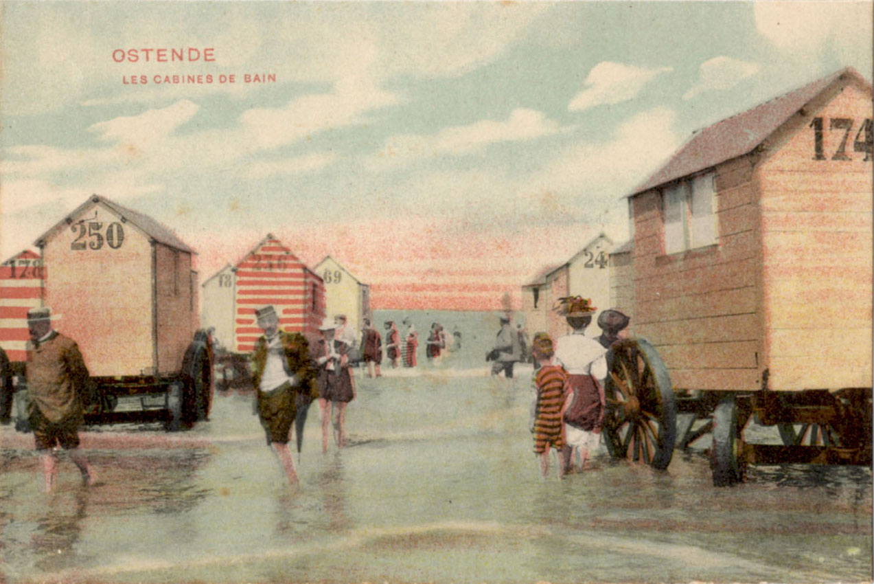
A heavy blanket of cloud, a sharp cold wind off the North Sea and a deserted sandy beach at De Panne with a late September autumnal feeling in the air. Perfect conditions against which to observe the painted geometry of a small army of beach huts silently confronting the ocean. Rich colour statements, some bold, some subtle, sing out under leaden skies. The beach becomes a temporary art installation for lovers of abstract geometric form. The vintage postcards confirm that Belgium has a long tradition of this sort of seashore display.


Saturday, 19 September 2015

James R Bingham, Illustrator of Fiction


The illustrations of James Bingham (1917-71) in Saturday Evening Post are not among the most highly regarded. It’s easy to see why – there’s no flashy brushwork, no painterly flourishes and no crowd-pleasing caricatures. The flat and undifferentiated surfaces are not especially inviting and the use of colour can appear garish at times. But Bingham was a consummate professional and his understanding of composition and ability to organise and combine form on the printed page never failed him. There was a strong cinematic element in his images, often suggesting the asymmetric dynamics of Hollywood film noir where dramatic slanting beams of light contrasted with deep pools of shadow to enhance the sense of unease. At his best in images like the erotic encounter between doctor and nurse or the femme fatale stealing from a suitcase outside a motel he captures a deep sense of foreboding that events are going out of control and all will end badly. Plunging perspectives and a preference for a low eye-level all played a part. His talent for visualising criminal behaviour made him the first choice to illustrate Earl Stanley Gardner’s “Perry Mason” stories whenever they appeared in Saturday Evening Post. Only once, for the issue dated 22 December 1945 did Bingham paint a cover for Saturday Evening Post but he produced an enormous volume of illustration for advertising which will feature in a future post.


Friday, 18 September 2015

Great Railway Stations Number 11: Wemyss Bay


Wemyss Bay station was built by the Caledonian Railway in 1903 to connect with the ferry service to Rothesay on the Isle of Bute. It’s the terminus of a line that runs from Glasgow Central. Behind a rustic exterior with half-timbered gables, a fine glazed canopy extends over the concourse and platforms in a splendid ensemble of elegant curving steelwork. The ticket office occupies a central rotunda from which the lofty glazing arcs over the concourse. Access to the pier is via a gently descending covered walkway perfectly integrated with platforms and concourse. Much overdue and no doubt expensive renovation was underway at the time of my visit in June curtailing the views along the platforms and cluttering the site with security fencing and scaffolding. By next summer the station should be restored to its full glory for another twenty years. Accounts of the station in its inter-war heyday report teeming throngs of Glaswegian day-trippers enroute for sorely needed recreation on the Isle of Bute – scenes that are very unlikely to be ever repeated.


Sunday, 30 August 2015

Old Dutch Cleanser Girl


The Old Dutch Girl had none of the freedom of movement granted to the Dutch Boy. While the Dutch Boy scampered around at will, she remained a prisoner in her traditional native costume with her face concealed, doomed for eternity to chase away dirt with her stick at the ready. The Dutch connection was chosen to benefit from the association the Dutch have with high standards of cleanliness – an association we British have never had to contend with. These examples come from a time when Old Dutch Cleanser was a major presence in the American marketplace and advertised extensively in prime positions in mass circulation magazines. Over the decades it seems to have faded from the public eye although it remains in production and the Old Dutch Girl still disports herself on the pack in the interests of continuity. In the example above, illustrator Andrew Loomis has captured the moment of revelation – the scientific proof that Old Dutch Cleanser will never scratch thanks to the addition of Seismotite, a substance that despite the Atomic Age name seems to be nothing more than pumice.