Sunday, 20 December 2015

Christmas 1945


The first post-war Christmas in America and the rush is on to reconnect the customer with their peace-time duty to consume. American industries found it much easier to adapt the production lines to cater for the consumer than their British counterparts where resilience had been shattered by the ravages of war and a desperate shortage of labour, compounded by decades of under-investment. It would take the UK economy a decade to recover to the point the US economy reached in 12 months. This small selection features some great illustrators, including Haddon Sundblom’s exuberant pageant of blissful parenthood for Coca-Cola and Constantin Alajolov’s witty sequence of multiple Santas for Arrow Shirts. The big Christmas crowd pleasing movie of 1945 was “The Bells of St. Mary’s” with Bing Crosby (Father O’Malley) and Ingrid Bergman (Sister Mary Benedict) – a sentimental tale based in a Roman Catholic inner-city school. For those whose taste ran to darker themes, both “Scarlet Street” and “Spellbound” were released in December 1945.


Tuesday, 15 December 2015

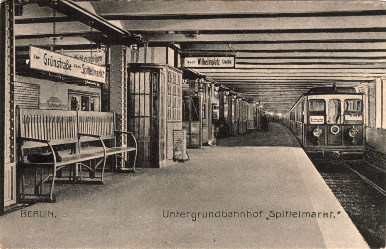
Postcard of the Day No. 80 – Berlin Spittelmarkt (above and below)


Postcards like this illustrate just why in the decade preceding the Great War, Berlin was so frequently held up as an exemplar of the modern metropolis – a vast ever expanding city driven by infernal energy. Trade and commerce leaves a mark on almost every building in Spittelmarkt – business names and slogans compete for attention with enormous painted advertising on gable ends. Culture is also visible - an advertising column bears a poster for the current exhibition of the Berlin Secession. The artist was Thomas Theodor Heine who produced this image of a fashionable lady holding brushes and palette while extending a crown of laurel leaves to the great bear of Berlin. It was first used in 1901 and again in 1906, 1911 and 1915 and it may well have been re-used in 1909, the date given for the photographic original. The Sinalco soft drink came on the market in 1902 and was clearly being aggressively promoted in 1909. It remains one of Germany’s most popular beverages, sold worldwide with a particularly strong presence in the Middle East and former Soviet republics. Comparison with the original photograph reveals an enormous amount of lost detail in the postcard version. Reproducing a similar quality of detail in postcard form would have been prohibitively expensive and postcard publishers were more interested in exploiting the novelty value of colour images. Cheaper colour printing meant it was worthwhile to employ artists to add colour to the photographic originals. The second postcard offers a view of what lay beneath. A new U-Bahn station opened in 1908 as the terminus of the U2 line.


Sunday, 13 December 2015

Ligne de Sceaux 1946


This elegant book was published in 1946 by the Paris Métro to mark the centenary of the Ligne de Sceaux – a suburban service, one of the earliest railways in Paris, and for most of its existence, unconnected to the national network. From 1846 until 1895 the line terminated at the Place Denfert-Rochereau (below) before being extended closer to the city centre at Gare de Luxembourg. In 1937 the Paris Métro assumed ownership of the line and embarked on a programme of electrification and new station building. It would be 1977 before the line was fully integrated into the Parisian RATP network when it formed part of the new RER line B. The commemorative book only becomes interesting in the final section when describing the modernised line and illustrating new stations and infrastructure in crisp line drawings. The post-1937 stations as shown were boxy but imposing and suggest an affinity with some of Charles Holden’s London Underground designs for the southern end of the Northern Line, especially Morden. Sceaux remains one of the most salubrious and prosperous Parisian suburbs.


Tuesday, 8 December 2015

Postcard of the Night No. 10 – On the Night Mail


In the flickering light we see Prince Peter Kropotkin at the controls while Lenin stokes the fire. The mighty locomotive steams headlong into the darkness. Next stop – the triumph of the proletariat. Always a stirring spectacle, the image of the train by night is a powerful emblem of the romance of travel. This is the work of a postcard artist in the employ of Raphael Tuck, London-based and one of the great postcard multi-nationals of the boom years of the industry. Tuck specialised in hand-painted imagery and this example comes from the Oilette series Firelight and Lamplight published in 1909. The other cards are either hand-painted or much enhanced by over-painting and take full advantage of the pictorial possibilities of the subject.


Sunday, 29 November 2015

Medics on Parade – the Nicotine Infirmary


Possibly the most unscrupulous and irresponsible advertising campaign in the history of persuasion was when the American tobacco industry co-opted the image of the medical profession to proclaim the harmless nature of their product. On top of attempting to convince the public that there were no health risks in smoking they offered a counter-narrative in which smoking was actually beneficial to health. In the process they significantly damaged the reputation of American health professionals by implicating them in a concerted plot to undermine the growing body of evidence linking smoking with respiratory illness, lung cancer and heart disease. Before these concerns arose, it had been an easy life, supplying the public with a product to which, in their millions, they rapidly became physically addicted. All their corporate energy had gone into a vicious struggle for market share but this new threat could not be ignored and would consume vast sums of new advertising expenditure.


A significant element in this plot was a massive public relations campaign to promote scepticism and uncertainty about connections between smoking and health. A free periodical, Tobacco and Health was mailed to doctors and dentists. The pages were full of studies that questioned the validity of cancer researchers’ statistics, spreading doubt and confusion about their methodology, demanding unachievable standards of proof, alongside profiles of lifelong smokers in ripe and healthy old age. But the major element was the relentless barrage of advertising aimed at a bewildered public in which a procession of bogus doctors declaimed their equally bogus professional expertise that nothing could be less dangerous to health than smoking.


This battle climaxed in the 1950s but America’s physicians had already had their goodwill and public esteem exploited by the tobacco industry for more than two decades. It began with endorsing individual brands for “kindness to the throat” or for “less irritation”. From offering reassurance to smokers that chronic expectoration was nothing to be concerned about, it was a short step to advancing claims that smoking protected the user from the worst of coughs and colds with mysterious anti-septic properties. During the war the doctor virtually disappeared from tobacco advertising as the armed forces moved centre stage to remind the public just how much was owed to the tobacco companies for their part in allied military victories. When peace returned and medical researchers intensified their scrutiny of tobacco and public health, the image of the doctor was back on front-line duty with a vengeance.


R J Reynolds led the post-war push-back against the emerging medical consensus with a long series of ads with the slogan, More Doctors Smoke Camel Than Any Other Cigarette, above which doctors were portrayed by suitably avuncular models from central casting, busily employed doing very good things – delivering babies, inventing new drugs, treating sick children and dashing off on midnight emergency calls. Reynolds backed up their claim by polling doctors at medical conventions about their favourite brand immediately after a generous distribution of complementary Camel cigarettes. As for the public – who could reject the considered opinions of these paragons of Hippocratic virtues?


Unsupported claims were everywhere - Leading Nose and Throat Specialists Suggest ...... “Change to Philip Morris!” – the only cigarette proven to be less irritating, recommended by top-ranking specialists. Like Camel, Philip Morris (a late-comer to the market) had ambitions to position itself as the preferred brand for doctors, advertising extensively in medical journals and deluging physicians with free samples. Old Gold was another Depression-era brand that kicked its way into contention via uniquely aggressive promotion – in the 1950s Old Gold endlessly repeated a most curious message – If you want a TREAT instead of a TREATMENT ... smoke Old Golds. We’re tobacco men ... not medicine men – the public was reminded. This might have been the most subtle campaign of all, designed to deflect all the negative associations around smoking on to competing brands without making any dubious claims of their own. Lucky Strike followed a similar strategy with its Be Happy-Go Lucky! campaign that said to the public – stop depressing yourselves with all that gloomy medical stuff and have yourself some fun like all these deliriously cheery Lucky Strike smokers. Throughout this inglorious episode all the tobacco companies pursued similar tactics to defend their position but Camel deserves a special mention for mendacity on a grand scale in the service of peddling their lethal product and for their studied indifference to the life-chances of their loyal and addicted customers.


Tuesday, 24 November 2015

Liotard - Quack and Impostor


In Vienna, in 1745, Jean-Etienne Liotard made a pastel portrait that later would become known as Das Schokoladenmädchen or the Chocolate Girl. The image took on a life of its own as its decorative potential was co-opted by generations of chocolate manufacturers to publicise their products and add decorous distinction to their packaging. This example comes from the Walter Baker Co. of Dorchester MA who obtained the right to use it in 1883. The artist’s descendants could have greatly enriched themselves if they had been able to legally enforce their title to the image. Baker products remain on sale in the US – now a tiny pimple on the Giant Octopus Mondelēz.


Like a medieval mason moving from Bruges to Poitiers via Winchester and Ravenna, Jean-Etienne Liotard moved his portrait studio across Europe and beyond in search of business. Swiss by birth, trained in Geneva and Paris, Liotard plied his trade from Amsterdam to Rome, from London to Vienna plus a four year spell in Smyrna and Constantinople. He demonstrated great flair for self-promotion, charged a premium rate for his services and developed a profitable side-line in later years as a collector and dealer in Old Masters. Even his appearance, assiduously recorded in a lifelong series of self-portraits, was cultivated to attract public attention. When he arrived in London from Constantinople he wore exotic Oriental costume and sported a magnificent jihadi-style beard, in step with the upper-class fashionable obsession with all things Turkish.

The Royal Academy (RA) survey begins with a room of family and self-portraits, many of which accompanied him on his travels as evidence of his skills. Two works stand out in this room, for their psychological curiosity as much as their undeniable technical brilliance. “Self-portrait, Laughing” is an oil painting in which he presents himself as a grinning, gap-toothed eccentric, gesturing and pointing out of the picture frame with a stretched index finger – its defiance of reasoned analysis makes it a thing of wonder. Equally strange is the pastel portrait of his 7 year old daughter with a much loved and expensive doll held by her right hand while her left hand and index finger are raised to her face – a juvenile face of a rich expressiveness of which the doll bears no trace. The combination of the animate and inanimate is truly arresting – a painted and hand-carved human replica in wood and fabric pressed close to a beating human heart. Without Liotard’s amazing ability to breathe life into his subjects this contrast would be negligible.

Pastels have come to be associated with the practice of sketching rapid observation with a light touch. In the hands of Liotard they fix a human presence with immense authority, lacking nothing in physical detail while capturing the expressive nuances of living forms. Noted, and apparently tolerated for his open depictions of his subjects’ infelicitous facial features, he would, nevertheless, condition their complexions to a peak of unblemished perfection. Much amazing nasal topography was redeemed by the careful elimination of broken veins, blotchy skin and misplaced facial hair. Vellum and parchment were the favoured surfaces on which to work – vellum being especially effective in conveying physicality and depth of substance.

Another room at the RA is full of Brits resident in Constantinople in their Ottoman finery – some blowing in on the Grand Tour, others making a good living as traders in Oriental treasures. Men of fine breeding – a Ponsonby here and a Pococke there – discarding the constraints of Western formal dress and packaging themselves in garments of rich and colourful fabrics, fur-trimmed and turbanned, inside which they could fancy themselves as intimidating, yet seductive Asian warrior-princes enjoying a well-earned break from their military duties. The 4th. Earl of Sandwich encouraged Liotard to move from Rome to Constantinople and later would provide him an entrée into London society when he moved there. The exotic contents of Liotard’s dressing-up box would be much in demand among his London clients.


Many years ago I saw a Liotard in the Rijksmuseum – a pastel portrait of a young woman in Levantine dress perched on the end of a divan, her head supported by hand and elbow. Her air of boredom, the asymmetric composition, the masterly sharp focus representation of textile and fabric surfaces, the deep shadow on the left and the vast neutral space occupying almost half the picture plane were all intriguing. The postcard I took away with me identified the subject as the Countess of Coventry – it now seems fairly certain that she was Marie Fargues, wife of the artist. Over the years I’ve seen a few more but an entire exhibition is a wonderful event. Artists that seem mysteriously to be fractionally out of alignment with their times, whose work often resists categorisation and have a habit of delivering more than we might reasonably expect are often the most interesting and rewarding.

Unsurprisingly sobersides Joshua Reynolds was unimpressed by Liotard when he turned up on his patch in London in 1753, calling him a Quack and Impostor. Sadly for him, while Liotard’s work fills the Sackler Wing at the RA, Reynolds must stand outside in the rain, all but engulfed by Ai Wei Wei’s self-assembly trees.


Thursday, 19 November 2015

James R Bingham, Illustrator for Advertising


This is a follow-up to a post dated 19 September 2015. Alongside the work he supplied to Saturday Evening Post, Bingham had a successful career illustrating for a wide range of advertisers. The noir-style imagery that so effectively accompanied crime fiction in the Post was never going to meet the needs of advertisers but Bingham had no problems working across genres and could offer an accessible style for almost any occasion. In World War 2 he supplied his clients with imagery that reflected the visual drama of armed conflict – the rampaging Cadillac tank crushing all before it and the fire-fight in the jungle achieve a sense of enhanced realism that photographers struggled to equal. Transport-related subjects engaged his interest – in the ad for US Airlines he conveys the visual poetry of a snowbound nocturnal landscape with the reassuring aerial presence of the latest turbo-prop airliner in the starry sky. For Southern Comfort he created a romanticised image of a vintage riverboat cruising upriver on the moonlit Mississippi, the rays of the setting sun appearing to ignite the smoke rising from the chimney stacks. All of which evoke the timelessness and the easy-on-the-palate quality of the product. There’s more romance in the advert for Nash cars, an ad that rests on a much-used theme found at the end of the war – an effort to re-engage the post-war public with the business of consumption. The happy couple behind the wheel have an affinity with Bingham’s editorial illustration. As does the period illustration for Western Electric with theatrical caricatures of a type frequently seen in the Post. The image of Western Electric girls toiling on an assembly line is one of Bingham’s finest – a beautifully controlled repetition of forms tells all we need to know about the anonymising tedium of the workplace. Two dramatic skies complete this far from definitive selection. The first, again for Western Electric adds much-needed interest to a mundane desert landscape while the second, for Barrett Chemicals is even more dominant, graced by a fortuitous rainbow that illuminates a passing vehicle.