Classic Guinness advertising took divergent paths. In one direction were the boldly drawn John Gilroy menagerie compositions and feats of prodigious strength with brief snappy slogans. In another was a long series of pretentious, whimsical, text heavy magazine adverts in which the over-educated copywriters at S H Benson indulged their fondness for elaborate demonstrations of literary expertise and witty wordplay. Placing the adverts in such publications as Illustrated London News, The Tatler and Country Life represented a conscious effort to reach a more affluent and socially superior consumer. The hallucinatory fantasies of Lewis Carroll were extensively parodied in sometimes interminable verses, deep in which the merits of a glass of Guinness were archly commended. The saving grace was in the accompanying illustrations, especially those of the under-rated Anthony Groves-Raines who possessed a genuine flair for elegantly deadpan rendition of fantastical subject matter. Groves-Raines had a long association with Guinness and was a regular contributor to the series of illustrated brochures that Guinness dispatched to the nation’s doctors every Christmas. One of these, (My Goodness! My Gilbert and Sullivan) was posted on this blog in 2010. Brian Sibley in The Book of Guinness Advertising (1985 and still the definitive book) has chapter and verse on this topic on page 73, (Guinness in Wonderland).
Saturday, 30 January 2016
Tuesday, 19 January 2016
Wandering Brands
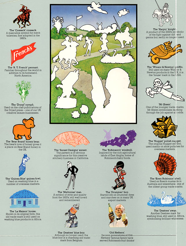
Reckitt and Colman was able to assemble this disparate collection of brand characters to grace the covers of its Annual Report in the 1980s. Many of these mascots, so artfully combined, have wandered off in all directions while the parent company merged with a Dutch business becoming Reckitt Benckiser in 1999. Since then the name has been abbreviated to the not very inspirational RB. While Harpic, Dettol, Brasso and French’s Mustard remain part of RB, others have moved on to new ownership (listed below) and a few (Robin Starch, Wren’s Shoe Polish, Drummer Dyes, Bluebell Polish) seem to have vanished leaving very little trace. Even where the products survive many brand characters have been retired and although some are no great loss, the world seems a poorer place without the jaunty monocled Meltonian Man bringing the sparkle of the Drones’ Club to an otherwise unexciting range of shoe care products.
Colman’s Mustard – now Unilever
Robinson’s Drinks – now Britvic
Reeves – ColArt (majority owned by Linden Group, Sweden)
Winsor & Newton - ColArt (majority owned by Linden Group, Sweden)
Cherry Blossom – Granger’s
Propert’s – Kiwi (S C Johnson, formerly Johnson Wax)
Meltonian - Kiwi (S C Johnson, formerly Johnson Wax)
Saturday, 9 January 2016
Car Plants
This is from the pages of Fortune magazine dated April 1944, two months before the Normandy Landings. A brace of shirt-sleeved execs, draft-exempt, kneel on the grass planting the seeds of the post-war rebirth of the auto industry. A hefty block of text explains what’s going on. In the flowery prose favoured by Ivy League-educated copywriters too old to be sent to war, we’re informed that this is the Victory Garden in which a new generation of cars is incubating. The technical advances of a war economy will lead to an innovatory paradise in peacetime. It’s a very odd way to illustrate a concept that most would think so slight as to be not worth the bother. Fortune was full of ads like this where the reader can be forgiven for concluding the entire exercise is otiose. My suspicion is that the advertising sales team at Fortune were adept at out-thinking the masters of persuasion and all too easily induced businesses to take out full page ads they had no real need for resulting in page after page of almost content-free advertising. The killer line was “Tell the readers what you’re contributing to the war effort because all your competitors are.”
The illustration is the work of Slayton Underhill (1913-2002) - a name that sounds more like a Wall Street brokerage or a Purveyor of Fine Tobacco. Underhill was one of many mid-century illustrators who toiled away in the industry without reaching the top flight of illustrators that commanded the highest fees. Underhill’s fame rested on his ability to create a paint finish utterly depersonalised and anonymous, scrupulously eliminating all evidence of material handling. This early example shows a certain technical bravura that the mature Underhill would never have allowed. The companion piece from Underhill was painted for Metropolitan Life Insurance. It’s a limp image of listless horticulture – a middle-aged widow sorrowfully reflects on the financial irresponsibility of her late husband in failing to provide the security of a Metropolitan policy. She is presented to us as a fallen woman, raising the fear she may be forced into prostitution to survive – an unthinkable fate for a decorous, unassuming flower of American womanhood. We will feature more of Slayton Underhill at a future date – be assured, it’s not all as dull as it appears here.
Wednesday, 30 December 2015
Bridge Postcards of 2015
To follow up last week’s post about bridges, this is a selection of vintage postcards of bridges around the world acquired in 2015. Some are bridges that I visited in the past and two were visited in 2015 - most of them are bridges that I shall never visit, not least because so many no longer exist. The card above shows two adjacent bridges that still exist in Rotterdam. In the foreground is the Koninginnebrug of 1929 that remains open for traffic. Towering in the background is De Hef of 1927, a lifting bridge for rail traffic. The last train crossed in 1993 and after a public campaign against its destruction, it was preserved as a rijksmonument. Joris Ivens made a fine 12 minute documentary tribute in 1928 that can often be seen on YouTube – it comes and goes as uploaders do battle with copyright restrictions.
Monday, 28 December 2015
Ellsworth Kelly (1923-2015)
It wouldn’t seem right not to mark the passing of Ellsworth Kelly, who died yesterday. I was still a schoolboy when I first saw his painting Broadway (1958) hanging in the Tate as a new acquisition. I recall that I had just subjected myself to the dubious delights of a Francis Bacon retrospective in which I had struggled to find any merit. So the clarity, simplicity and starkness of Kelly’s image was a cleansing experience and the start of a lifelong interest in his work. The early 1960s was the high point for Abstract Expressionism and Kelly’s work was clearly not part of that. Nor did it have anything in common with the Pop Art of the mid 1960’s. There was a misleading and superficial resemblance to late 1960s Minimalism but Kelly was following his own path and his inspiration came from a very different place to that of say, Donald Judd or Carl Andre. Six years of living in Paris made Kelly an object of suspicion in the nationalistic fervour of a New York art scene swaggering with pride at its newly acquired status as global capital of the visual arts. Kelly made no secret of the fact that his abstract images had links to perceptions of the natural world and the built environment, placing him at odds with the prevailing Greenberg orthodoxy of an abstraction that lived by its own autonomous rules and rejected any linkage with banal reality.
Kelly was never quite an All-American artist – there was greater affinity with the work of Max Bill or Jean Arp than with Barnett Newman or Clifford Still. That often lead to an assumption that his was a European sensibility, for which, read effete and over sophisticated. It makes more sense to consider his work on its own terms without attempting to allocate it to one tradition or another. Indeed much of its power to attract lies in the independence of the artist and his resistance to categorisation. The 1997 Tate exhibition was one of the most exhilarating retrospectives I ever saw. A magnificent display of stilettos and wedges of intense flat colour, appearing to float, orbit and detach from the enormous canvases to which they were tethered. Move in close and your vision is dominated by vast slabs of colour, separated by the sharpest of contours, step back and the massive forms become weightless and mobile. Precise, controlled, fastidious to a fault – that’s more than good enough for me.
Labels:
art,
ellsworth kelly,
tribute
Sunday, 27 December 2015
Bridges of 2015
I rarely pass a bridge without pausing to take a photograph unless the situation prohibits it. This has been an exceptionally good year for bridges with a visit to Newport Transporter Bridge (described here) and a trip to Rotterdam, a city generously supplied with river crossings old and new. Other examples were recorded in Oostende, Folkestone, Leeds, Sunderland and Renfrew. Plus Ribblehead Viaduct in North Yorkshire and Lowgill Viaduct in Cumbria.
![]() |
|
De Hef lifting bridge in Rotterdam with the
centre section temporarily removed for repairs. It opened for rail traffic in
1927; the designer was Peter Joosting.
|
![]() |
| Rotterdam - the Koninginnebrug - a double bascule bridge built in 1929. |
![]() |
| Erasmusbrug, Rotterdam – cable-stayed and bascule bridge opened in 1996. |
![]() |
|
Rotterdam - the Lafe Erfbrug near Delfshaven.
|
![]() |
|
Rotterdam – Willemsbrug – cable-stayed bridge
completed in 1981.
|
![]() |
|
Lowgill Viaduct in Cumbria - 11 arches, built
1858-59 on the Tebay - Ingleton branch line. Last trains crossed in 1965. Grade
II listed.
|
![]() |
|
White Cart Rolling Lift Bridge at Renfrew. Built
in 1923 as a Scherzer Rolling Lift Bascule Bridge and a Grade A listed
structure.
|
![]() |
|
Ribblehead Viaduct in North Yorkshire – 24
arches built by the Midland Railway and opened in 1875. Grade II* listed.
|
![]() |
|
Victorian railway bridges in Globe Road, Leeds.
|
![]() |
|
Newport Transporter Bridge.
|
![]() |
|
City Bridge - Newport's major road crossing,
carrying the A48 over the River Usk. Bow-string arch construction completed in
2004.
|
![]() |
|
Newport - George Street Bridge (1964), UK's
first cable-stayed bridge. Grade II* listed structure.
|
![]() |
|
Newport – Town Bridge for road traffic in the
foreground, Great Western Railway Usk Bridge in the background.
|
![]() |
|
Sunderland – on the left Wearmouth Bridge, completed
in 1929. On the right, Monkwearmouth Railway Bridge, constructed in 1879. Both Grade
II listed structures.
|
![]() |
| Unusual pedestrian bridge over the N34 Belgian coast road. |
![]() |
|
Oostende - De Smet De Naeyer Bruggen (1905) -
bridge for tram and bus use only.
|
![]() |
|
Folkestone – Foord Viaduct opened in 1844.
|
![]() |
Folkestone Harbour Bridge – swing-bridge
section.
|
![]() |
|
Folkestone Harbour Viaduct – opened in 1849.
|
Labels:
bridges,
engineering,
ostende,
photography,
rotterdam
Subscribe to:
Posts (Atom)