This Meccano Magazine cover from December 1954 is a perfect evocation
of the mid-1950s. Soberly dressed small boys stare at a window display of pristine
toys and models. These are the wonders of the age, beyond the reach of all but
the most generously indulged child. For the rest they remain unattainable. Childish
exuberance was greatly frowned upon – the solemn duty of every child was to
grow up with the greatest possible speed and the least possible fuss. These
were serious times – excitement and frivolity were in short supply where they
weren’t actively discouraged. Recreational activities were either sporting or
educational – entertainment in any but the most modest amounts was undesirable,
an irresponsible diversion from the business of forming a new generation of
productive economic units. Note how the boys are wearing scaled down versions
of their fathers’ outfits in coarse woven fabrics – gabardine, tweed and worsted.
(One of the few pleasures to be had observing the latest infant generation of
the House of Windsor is their adherence to this anachronistic dress code.) Physical
comfort was held in low esteem so textiles with the power to irritate the skin
were broadly held to be character-forming. Caps were worn to make young people
more easily identifiable, especially in instances of antisocial behaviour.
Among the most serious offences a child could commit was to neglect to wear a
cap. As the years advance the tendency to romanticise the experiences of
childhood marches in step. Nostalgia begets amnesia and the discomforts are
forgotten. Sadistic schoolmasters, school bullies, knitted swimming costumes,
itchy baggy underwear, damp and unheated homes and a diet of overcooked
flavourless stodge all fade away in the diffuse glow of the lost Golden Age
that never happened.
Tuesday, 20 December 2016
Tuesday, 13 December 2016
Postcard of the Night No. 11 – Broadway on a Rainy Night St. Louis
Night time photography may have been difficult in the early 1900s but postcard producers were happy to try. Perhaps they thought the market would be attracted by the moody glamour of crepuscular imagery. In the rain the night streets were transformed by reflected light from puddled sidewalks and gleaming asphalt. Here on Broadway an umbrella dance is underway while silhouetted figures shuffle into an uncertain future or escape from a dark past. The visual clichés of Film Noir are on display – a sinister shadow in every doorway, human decency cast aside under cover of darkness. Three more examples of nocturnal precipitation from Salt Lake City, Denver and Portland ME complete this selection.
Thursday, 8 December 2016
Cragside, Northumberland
What we now see at Cragside is an 1870s transformation of a modest rural retreat built in the previous decade near Rothbury in Northumberland. Richard Norman Shaw was the architect for the next 15 years of additions and modifications - the result was an imposing mansion in a dramatic hillside position with lavish interiors featuring much fine Victorian craftsmanship. The proud owner was the 1st. Lord Armstrong (1810-1900), founder of Armstrong Whitworth Scottswood Works on the banks of the Tyne at Newcastle. Armstrong began his working life as a lawyer who followed a personal interest in engineering, became an amateur inventor of hydraulic cranes and established his own business to exploit the commercial potential. The business rapidly expanded to include bridge-building, warship construction, armaments and locomotive building. The core of the business by the 1860s was field and naval gunnery concentrated in a subsidiary, the Elswick Ordnance Company. Technological innovation helped develop an international market for the products and the business famously exported weaponry to both the Confederacy and the Union states in the Civil War. One of the finest representations of the Northumbrian industrial landscape is William Bell Scott’s painting, In the Nineteenth Century the Northumbrians Show the World what Can Be Done with Iron and Coal.
The classic Cragside view of the western frontage is an extraordinary assemblage of extensions and accretions, impressive in scale and ambition but lacking any stylistic unity. The absence of an overarching plan may be inharmonious but it makes for a compelling visual spectacle with its exuberant aggregation of gables, bays, towers, castellation and lofty chimneys. The space on which it stands was hacked out of the cliff face – with a Victorian eye for economy the excavated stone was used in construction of the house. Below the rock garden at the foot of the slope is a graceful Iron Bridge of 1870-75 crossing Denton Burn, the stream being the source of the hydro-electricity that famously powered the world's first indoor lighting in 1878. Armstrong would invite his most important business clients, foreign ministers, ambassadors, and senior politicians to dazzle them with the best that Cragside could offer - advanced technology, opulent interiors, long sessions in the billiard room and lavish hospitality including the finest of Havana cigars. Even an art gallery well stocked with eclectic Victorian painting, much of it acquired from North Country artists to engage the higher faculties. The gallery includes a room of Japanese prints donated by a member of the Japanese Royal Family. A G F Watts portrait of Armstrong, Millais’s Chill October (now in the Lloyd Webber collection) and an early Turner landscape were present but sentimental portrayals of ragged children, orphaned lambs, calves at play and faithful border collies were, presumably, more to Armstrong’s taste.
We were fortunate to visit Cragside on an April day of brilliant sunshine and it made a wonderful spectacle despite the best efforts of the National Trust to get in your face. Among the Victorian highlights are wall tiling by William de Morgan, stained glass by William Morris and a monstrous marble Baroque fireplace by W J Lethaby.
Shaw’s exterior is both an expression of wealth and power and a Romantic vision of a country cottage scaled up to the size of a fortified palace. Is it fair to see it as a house built on the proceeds of weapons of war? Or a marketing tool in the arms dealing industry? With customers for warships in Chile, Japan, Italy, Russia, Norway, Brazil and the US Armstrong must have entertained representatives from some notably despotic regimes. There was the 100-ton Gun, by far the most massive and lethal in its day, initially supplied to Italy, to the alarm of the Royal Navy when the threat to Malta became apparent. A lucrative order from the Royal Navy swiftly followed – very smart business. Was Armstrong ever haunted in the depths of the night by images of battlefield carnage, did the submerged corpses of drowned mariners drift uneasily through his dreams? Or was he comforted by the thought of the tens of thousands of Tynesiders who owed their gainful employment to his entrepreneurial talents, or the tens of thousands of British servicemen whose lives might have been lost if enemy forces had been unopposed by Armstrong artillery and ordnance? It seems unlikely his conscience was troubled in the light of his recorded observation, "If I thought that war would be fomented, or the interests of humanity suffer, by what I have done, I would greatly regret it. I have no such apprehension". Like many other great Victorians it would seem that the Armstrong character was a combination of the admirable and the dubious. Much the same as Cragside itself.
Sunday, 20 November 2016
W H Smith Decorative Tiles
Newsagents and booksellers for more than 200 years, W H Smith has more than 600 stores on British high streets plus another 700 at airports, train stations and motorway services. In most of these locations it is unchallenged by any competition. Despite its longevity and ubiquity it seems to command little affection on the part of its customers. The shops are fitted out to a rigid and universal formula and the range of products is severely restricted to items that can be reliably sold in large quantities. Harsh lighting, artificial fibre floor coverings and a persistent smell of cleaning products makes for an uncomfortable browsing experience. It’s common to find only a single staffed checkout with a long, slow moving queue from which shoppers can contemplate the generous provision of frequently malfunctioning self-service checkouts. Any staff savings are cancelled out by the need for attendants to sort out all the customer problems. It wasn’t always so – in the inter-war years the business had a reputation for its ornate oak shop fronts (a few of which survive) and decorative pictorial tile panels designed and manufactured by Carter & Co. of Poole. An exhaustive survey of these panels was published in the 2015 Journal of the Tiles and Architectural Ceramics Society by Ian M Betts who listed 60 stores where examples can still be seen. The four examples shown here come from the branch in Mostyn Street, Llandudno – the postcard shows a W H Smith store in the right foreground. The present store where these photographs were taken is some half a mile further up Mostyn Street – presumably the tiled panels migrated with the shop to its new location.
Labels:
architectural ceramics,
carter of poole,
ceramics,
design,
llandudno,
poole pottery,
shopping,
wales,
whsmith
Friday, 11 November 2016
Church Island
Church Island lies in the Menai Strait, between the Menai and Britannia Bridges. A short causeway connects it with Anglesey. It is entirely occupied by the church of St. Tysilio and its surrounding graveyard. On the highest point there’s a simple memorial to the local servicemen who lost their lives in the two world wars. Without being at all remote, the quiet offshore location with its omnipresent signals of mortality is conducive to reflection. The war memorial is all the more affecting for the absence of rhetoric - the beautifully carved roll of honour with dates and places of death carries a lot of weight. Each name stands for a fractured family and the grief of relatives and friends. As the poppy emblem mutates from a message of “Peace among Nations” to a nationalistic symbol of patriotism, it’s a relief to be reminded of more dignified and restrained methods of commemorating human sacrifice than indulging in a phoney war with FIFA.
An English translation of the above inscription: "To the glory of God and in memory of the men who fell in the war. That their name will live forever."
Labels:
anglesey,
bridges,
britannia bridge,
cemetery,
menai bridge,
menai strait,
remembrance,
wales,
war
Monday, 7 November 2016
Het Schip – Part 2: The Post Office
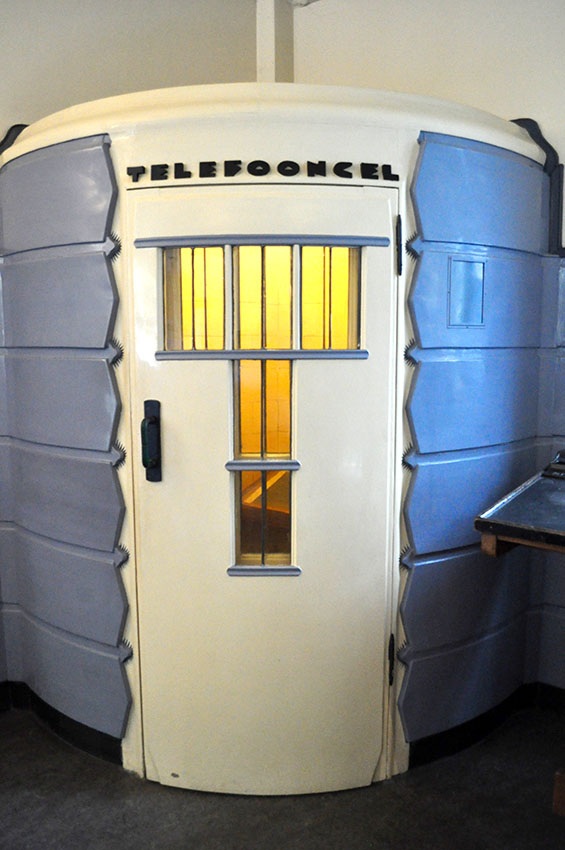
When the Dutch Post Office at Het Schip closed in 1999 it was converted into a small museum telling the story of the development and the Amsterdam School. The original fixtures and fittings, many of which were designed by architect Michel de Klerk, were mostly preserved in their original locations. The distinctive forms of the telephone kiosk and the blue tiled wall finishes with built-in wooden benches are evidence of de Klerk’s attention to detail. De Klerk designed a door to the inner offices of the Post Office complete with chevron motif and the fist and baton to reinforce the “Verboden”/"No Entry" message. The beautifully finished cabinet for the telephone switchboard (Telefoongel) is especially striking with Art Deco-type elements incorporating stylised electrical sparks to symbolise telecommunications. Equally impressive is the elegant enclosure for the public telephone – at the top left of each window is a bird motif include by de Klerk to remind callers they can easily be overheard. The museum space is an imaginative re-use that preserves the community’s communication hub in close to original condition.
Thursday, 3 November 2016
Het Schip – Part 1: Workers’ Palace in Amsterdam
Visiting Holland House recently (described here) was a reminder that architecture with strong maritime associations is very much a Dutch thing. One of the attractions of Amsterdam is a visit to Het Schip – an idiosyncratic social housing development dating from 1920 that abounds in maritime references and symbols. Eigen Haard was formed by trade unionists in 1909 with the aim of providing quality housing for working class families trapped in sub-standard, high density slums. The appointed architect, Michel de Klerk (1884-1923), himself the product of a working class childhood in the Jewish quarter of Amsterdam began work on the Het Schip project in 1917. De Klerk was a long time admirer of the Arts and Crafts movement from which he drew inspiration that he imaginatively combined with indigenous Dutch traditions of ornamental masonry. He shared his client’s commitment to social justice and designed an apartment building in a form that would serve as a landmark for Socialist principles.
When completed in 1920 Het Schip offered over one hundred apartments for rental and included a Post Office – a school was added later. The first tenants were employees of the city’s tramways, gas and water companies whose wages tended to be above the average. Unskilled labourers and dock workers could not have afforded the rents and were later housed nearby by the municipality in new blocks of higher density provided with sculleries rather than kitchens. These residents tended to be Communist party supporters leading to an ideological divide between them and the predominantly Social Democrats in Het Schip. Eigen Haard continues to rent out the apartments to the present day and maintains the building to the very highest standard.
Het Schip occupies a three sided site and was designed to offer different prospects from each point. A tall cylindrical tower marks the Post Office on one corner, a cigar-shaped extrusion marks a second and a centrepiece with spire on Hembrugstraat offers a third landmark. The skin of the building is a master class in the inventive deployment of brick and tile to delight the eye with infinite contrasts in tone and texture. De Klerk recognised no limits to the versatility of brick, cheerfully wrapping it round tilting, tapering and curving surfaces. Wave-forms, projecting galleries and prow-shaped bays enhanced the maritime connections. The Zaanstraat façade shows many classic Amsterdam School touches - hung tiles, vertical brick bonds, eccentric window shapes and undulating projections. Only the most accomplished craft skills were acceptable to de Klerk and the sculptor Hildo Krop was employed to provide decorative reliefs carved from bricks to embellish the structure. The idea was that nothing was too good for the workers and their families – fit for purpose and no more was not enough. The building had to have presence and send out a signal that the days of working class slums were over. In terms of commanding attention, Het Schip succeeds magnificently. What’s more, de Klerk achieved this result with a building that looked forward to the future without being avant-garde or challenging public taste.
Subscribe to:
Posts (Atom)