Tuesday, 23 April 2019

To Key West in Postcards


The Florida town of Key West is at the southernmost point in the continental United States at the end of a chain of small islands linked by a causeway. It is closer to Havana (106 miles) than it is to Miami (127 miles). Other than an association with Ernest Hemingway (who had a home there from 1931-39), its distinction is its location. Visitors to places situated at extremities are frequently moved to send postcards home and the industry was quick to supply them in copious amounts.
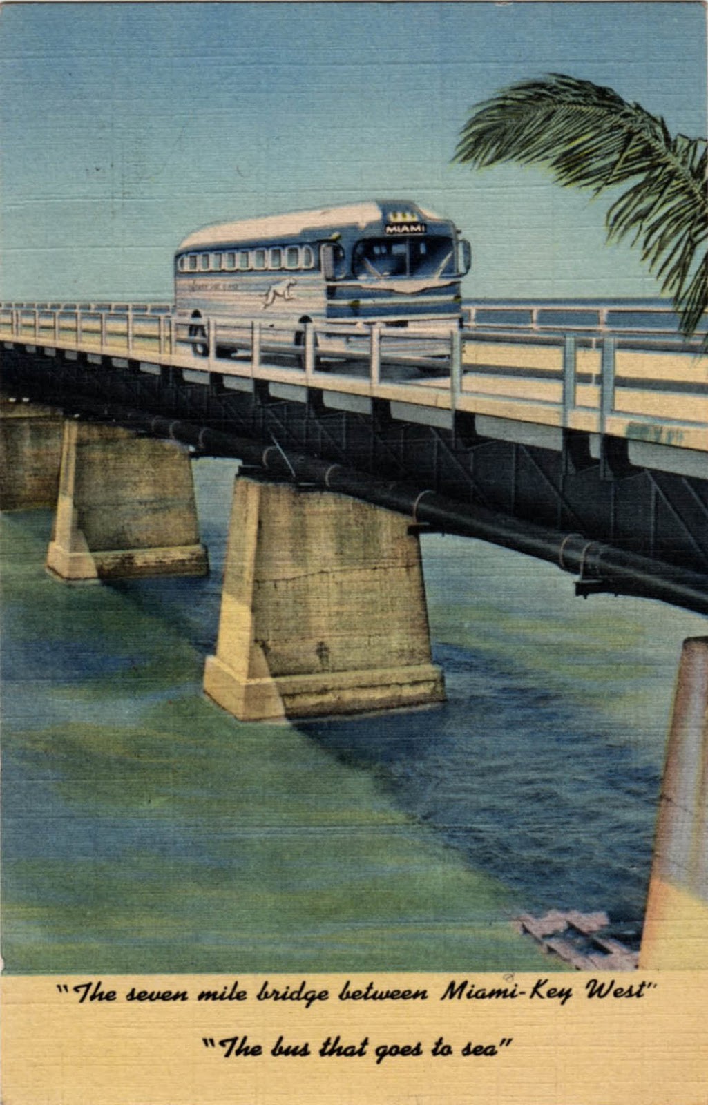

There was a time when it was connected to the mainland by rail. The Overseas Railroad to Key West operated from 1912 to 1935 when it was destroyed in the Labor Day Hurricane – forty miles of track was washed away on September 2nd. With no funds to rebuild, it was abandoned by its owner, the Florida East Coast Railway. There being no compelling economic case for the railroad, most of the track-bed was converted to road use and designated US Route 1 – the Overseas Highway.


The Overseas Highway made a frequent postcard subject in the inter-war era of the linen card. The endless perspectives, big skies, gaudy sunsets and expanses of tropical blue seas lent themselves to the saturated colour of the linen postcard. For those without a motor vehicle, the Greyhound bus (the bus that goes to sea) was the only way to travel and they too turn up on postcards. One view of Pigeon Quay shows a queue of traffic driving off to sea with no seasickness as the caption has it. Amazingly it includes a pair of nonchalant pedestrians – difficult to believe they’re walking the entire 127 miles.


Sunday, 7 April 2019

Great Railway Stations No. 14: Anhalter-Bahnhof, Berlin


More properly, this is a former station with surviving remnants. Once it was Europe’s largest station offering luxury train travel from the capital to Frankfurt, Leipzig, München and Dresden. Initially it was a casualty of war – massive bombing raids in 1943 and 1945 brought it to the brink of ruin. After some post-war patching up it was partially functional but by this time it was in West Berlin serving destinations that were almost all in the Deutsche Demokratische Republik (DDR). In 1953 the DDR redirected trains to the Ostbahnhof in the Eastern Sector and the Anhalter-Bahnhof was empty and abandoned. All but the central section of the facade was demolished in 1960. Most of the derelict land was repurposed although some melancholy remains of the platforms can still be seen close to the Landwehr Kanal.


The grandiose, monumental design for the station was an early work of Franz Heinrich Schwechten (1841-1924) – it had the illusory air of a building planned to last at least 500 years. Construction began in 1872 at a time when Prussian nationalism was riding high following the humiliation of France in 1870-71 and both the Kaiser and Bismarck were present for the opening ceremony in 1880. The main entrance was topped off with a pair of zinc reclining figures, allegorical representations of Day and Night. Modern replicas have replaced the originals which are now on display in the Deutsche Technikmuseum. In the days when wealthy passengers could access the Excelsior Hotel via an underground passage, the Anhalter cultivated an air of exclusivity with an architectural grandeur to match.


Albert Speer’s plan for Germania centred on a new north-south boulevard to be known as the Prachtallee (Avenue of Splendours). The chosen route would have severed the tracks running into the Anhalter-Bahnhof and it was decided to close the station – Speer’s preference was to make it the site of a new swimming pool. None of that happened and when the station finally closed in 1953, there was a proposal to convert it into a museum of transport. Another scheme that failed to materialise.


The splendid scale model of the station environs was photographed in the Deutsche Technikmuseum and offers an idealised portrait of the station forecourt in the 1930s. It can easily be compared with the reality of the fragmentary ruins that are little more than 10 minutes walk away. Somehow these ruins embody two contrasting aspects of German culture. The building was conceived as a bombastic statement of Prussian militarism, while the ruins serve as a recognition that the station played a key role in the deportation of Berlin’s Jewish population, a cause of national shame that has to be acknowledged and memorialised. A reminder of how problematical it can be to read architecture in this way comes in this quote from Axel Foehl writing in Great Railway Stations of Europe (Thames and Hudson, 1984) describes it thus, “a small pile of rubble for which it was no longer possible to feel any emotion...”


Follow these links for previous posts about the Anhalter-Bahnhof and the Excelsior Hotel.


Thursday, 14 March 2019

Empty Chairs


The image of the empty chair has a potent symbolic value for artists and photographers. It denotes both absence and an imagined presence. When Van Gogh was immersed in his personal identity crisis in the Yellow House in Arles he employed the subject of the empty chair to stand in for himself and his reluctant companion, Gauguin, in a pair of symbolic portraits. These postcards have no explicit symbolic content but that doesn’t stand in the way of what the viewer can read into them. Some seem to anticipate the imminent arrival of an animated crowd while others suggest abandonment, a sense that they may never again be occupied. A few are enveloped in a deep melancholy suggesting they won’t be adding to the sum of human happiness any time soon. The ultimate in empty chairs is the Electric Chair, built with a single purpose, temporary occupation and no reason for consideration of human comfort.


Friday, 8 March 2019

Fresh From Battle Creek


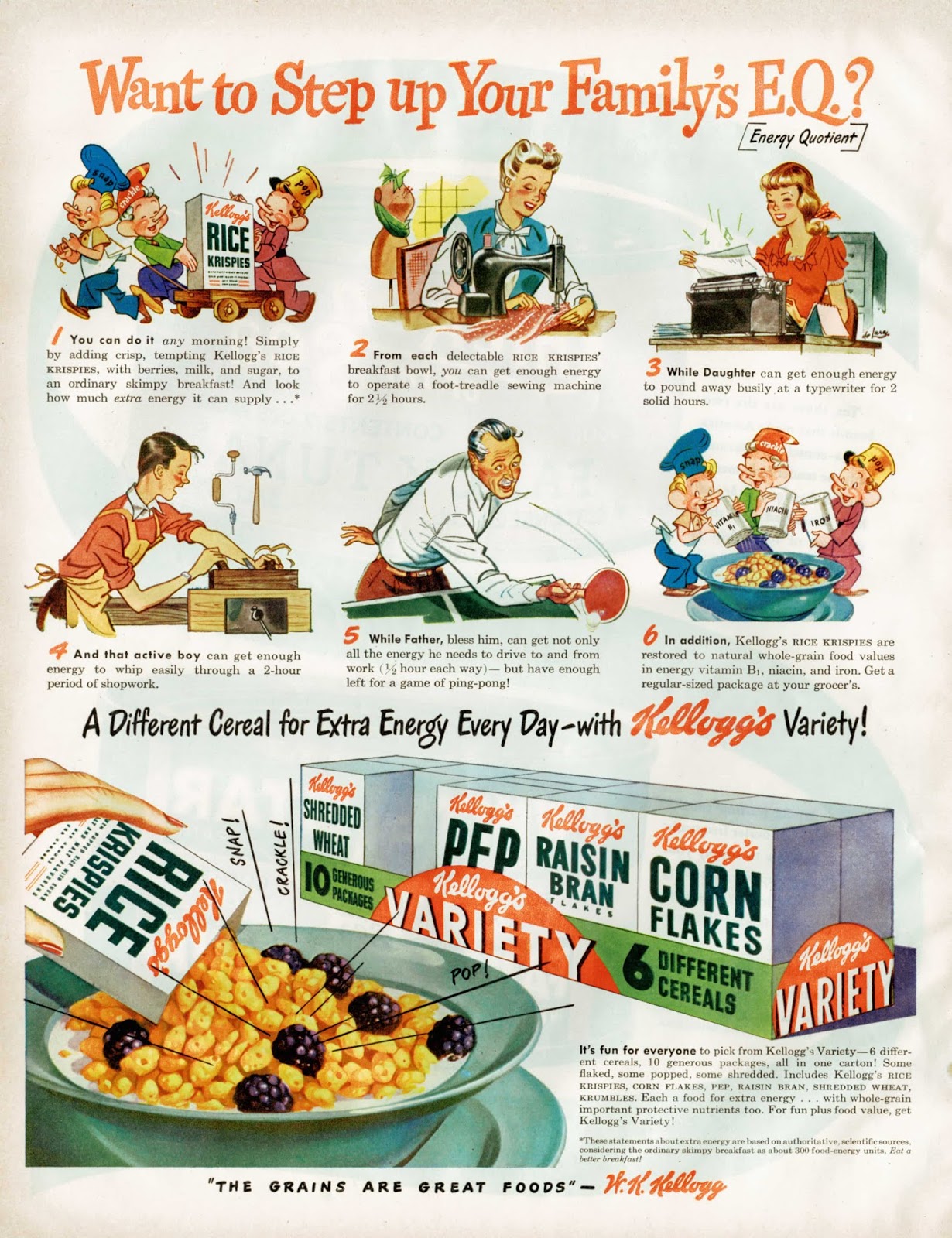
We begin with a postcard from 1958 on which an impressed visitor from South Africa writes home with an account of a visit to the Kellogg’s factory in Battle Creek, Michigan. Unlike many of its competitors, the Kellogg Company has retained its independence and still resides in Battle Creek, where it was founded in 1898. As the postcard illustrates, it has a global presence and there are very few countries where its products are not on sale. It operates in an ultra-competitive market and pioneered the inclusion of free collectable figures and toys in its packages. Offering modest books of pictures and stories for children in return for a nominal sum was another successful strategy in popularising the product with children. Brand characters played their part from Snap! Crackle! and Pop! (Rice Krispies) to Tony the Tiger (Frosties) while established cartoon characters such as Yogi Bear were drafted in on an as-required basis, all to embed themselves in the affections of juvenile consumers. Their efforts were probably more effective on television than they were in print. The logo has been regularly and subtly remodelled but remains recognisable as the signature-based original from 1900. And there’s a Kellogg’s Sans font to support the corporate identity. Movie tie-ins are the staple of today’s promotional activity.


Kellogg’s print advertising is unspectacular but persistent. Sometimes directed exclusively to the junior end of the market – at other times focused on the needs and anxieties of adults. The message to adults is often designed to exploit fears about physical health with a special emphasis on regular bowel movements. Mothers are frequently reminded of their parental responsibilities for child welfare with an implication that a child without Kellogg’s in her diet is a victim of neglect. The use of slogans and taglines is functional but not especially imaginative – few, if any, have passed into popular culture. This survey is concentrated on the period 1930 to 1960 and the only slogan with any staying power seems to be The best to you each morning. Efforts such as The Grains are Great Foods or Mother Knows (Kellogg’s) Best are justly forgotten. The invention of the Variety pack – 5 types of cereal, 10 small servings, all wrapped in cellophane was a masterstroke. Smaller quantities and increased packaging boosted margins while the direct appeal to children made life difficult for parents in the supermarket.