Thursday, 29 April 2021

Bridges of Paris: 2 Pont de Bir-Hakeim

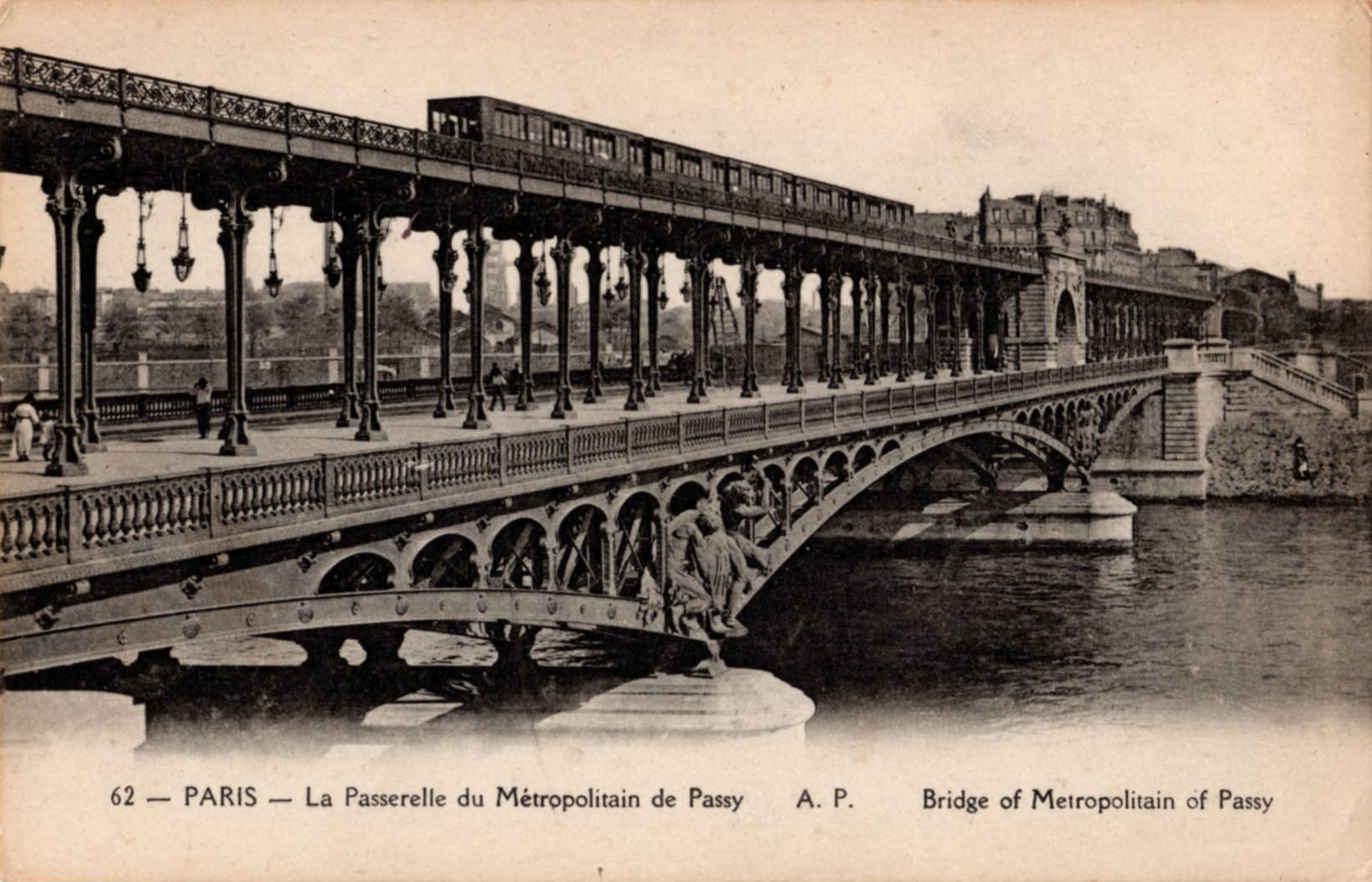
Pont de Bir-Hakeim links the Parisian districts of Passy (16th.) and Grenelle (15th.) and carries Métro line 6 over the Seine on one of two such crossings on its circuitous arc from Charles De Gaulle - Étoile in the west to Nation in the east. Approaching the Passy Métro station on rue de l’Alboni ends in a deep visual dive over the river Seine as if poised at the top of a ski slope.  From the railings at the end of the street the view takes in the platforms and canopies of Passy station and the ribbons of steel rail leading to the next station and beyond, deep into the 15th. arrondissement. Less obvious are the bridge abutments that mark the passage over the Seine which is the reason for this spectacular view opening up. 

The bridge itself is a two tier viaduct for road and rail (Métro) - in the centre of the roadway a pedestrian walkway and cycle route runs underneath the rail bridge.  The railway runs on a concrete deck supported by tall slender steel columns, each formed from four plate sections that taper and flare to make them easier on the eye. There’s more beautification in the form of Classical reliefs representing Electricity and Commerce on the stone built central arch. Additional sculptures grace the steel substructure where it rests on the stone pier of the Île aux Cygnes.  The bridge designer was Jean-Camille Formigé whose work can be seen all over the city on Métro infrastructure and the Viaduc d’Austerlitz. When the bridge was completed in 1905 it was known as the Viaduc de Passy – in 1948 it was renamed in honour of the Free French military victory at Bir-Hakeim in 1942.

The colonnade is a popular location for fashion photo-shoots and the bridge has made many appearances on screen, most notably in Zazie dans le Métro and Last Tango in Paris. The photos conclude with images of the elevated platforms at Métro Bir-Hakeim (formerly Quai de Grenelle).




Sunday, 18 April 2021

Postcard of the Day No. 103 Morlaix

A busy scene in the Breton market town of Morlaix where a narrow-gauge train operated by Chemins de Fer Armoricain, a metre-gauge network of lines built to connect small towns and neighbouring coastal settlements along the north coast of Finistère.  The Morlaix section opened in 1912 which may well be the year of the postcard. A group of women in Breton headdress are making their way into town, passing the modest but decoratively detailed station building, complete with édicule.  Above the train, the massive piers of a railway viaduct can be seen on its march across the steep sided valley in which the town is located.  What we see here is just the first level of the structure which has 9 arches - the upper level is more than 60 metres in height and has 14 arches.  Its presence is inescapable - it dominates the view from all districts of the town and must have been a hugely resented intrusion when it was under construction in 1861-63.  The lower level incorporated a pedestrian walkway but last time I was in Morlaix (more than 10 years ago) I discovered it locked and barred in a way that suggested it was unlikely to ever reopen.

After several years of construction the viaduct was fully opened in 1865 as a vital link in the main line from Paris to Brest operated by Chemins de Fer de l’Ouest. Today, up to 7 TGV services from Paris-Montparnasse cross overhead each day and the viaduct is protected as a national monument. These postcards are a reminder of how private commercial interests could transform a townscape that had evolved over many centuries by promising connectivity and future prosperity. At the same time public perception changes from outright hostility via gradual acceptance to popular veneration as a monument to engineering achievement.  The narrow-gauge railway was barely viable from the start and never generated enough traffic to pay its way - the convenience of delivering passengers to the heart of the town was offset by the lack of potential business in the sparsely populated hinterland. It closed for good in 1934 after only 22 years of service. Despite several visits to Morlaix over the years, I had no idea of its existence until I saw this postcard.


Wednesday, 14 April 2021

Down the Mississippi in Monochrome

Recent lockdown rooting through old negatives and digitising turned out to be a lot less rewarding than I hoped. Resulting scans were often hazy, unfocused, poorly exposed and tonally flat.  The passage of time has stubbornly failed to confer much in the way of retrospective luminosity. This group of photographs are from a $7 boat trip from Canal Street, New Orleans along the Mississippi river, the Algiers Canal and the Harvey Canal. It was a heavily overcast and humid day - the photos correspondingly low-key and devoid of shadow. It’s striking to see so much decay and dereliction - even the ships are drowning carcasses with flaking paint streaked with oxidisation.  Surprisingly some of them are from the Soviet Union and Iran. Waterside warehouses crumble into the river while fishing boats moulder at their moorings. The most viable economic activity appeared to be servicing the oil rigs in the Gulf of Mexico.  This was 1978 - by some measures the high point of the post-war era of universally rising incomes, taxation funded benefits and social care and a shrinking gap between income extremes. Jimmy Carter was in the White House but Ronald Reagan was on stand-by to roll out the great neocon pushback.  Major US cities were sliding into bankruptcy, the drug culture had crossed over into the mainstream and a sense of profound exhaustion seemed to have set in. The stage was set on which Reagan would declare “Morning in America.”

Part of the itinerary was a visit to the Rene Beauregard House at Chalmette, owned and cared for by the National Park Service.  The ante-bellum mansion overlooks the site of the Battle of New Orleans of 1815 in which a smaller, nimbler American force trounced a much larger, belligerent but incompetent British invading force.  Americans have every reason to celebrate this engagement while the British, who swaggered into battle with every expectation of an easy victory were taught a lesson that to this day appears less than fully learned.  A team of Southern Belles in period costume were on hand to explain - they were silent on explaining how the prosperity of the plantation depended on the labour of slaves.

Revisiting these photographs involves a little, lightweight soul-searching.  The question is whether the air of decay was a result of selection on my part, overlooking anything that didn’t fit with my preconceptions. This is where I suspect the influence of David Plowden whose gritty, beautifully composed  photos of the depredations of the industrial landscape in America I much admired.  Instead of looking through my own eyes, I was looking through what I thought were the eyes of Plowden.  All this speculation leads to an uncomfortable place where there needs to be a reckoning with the way that over familiarity with the work of eminent photographers can easily generate a culture of imitation - something I’m all too aware of when I take a hard look at my own efforts. Looking from another angle, perhaps expectations are just too high and the pursuit of authenticity and originality is best left to those with greater ability.  Thanks to the mobile phone there have never been so many photographers on the planet as there are now. As their efforts multiply in the cloud in their millions and billions of images I get no sense of widespread agonising over issues of authenticity and it’s only to be expected that some (or many) of these photos will quite transcend our own in boldness of conception.


Thursday, 8 April 2021

Paper - Material of a Thousand Uses

This guide to the uses of paper is a typical mid-century publication aimed at schools, offering free learning materials in return for a chance to advance the cause of business to a new generation.  For a modest financial outlay, businesses could present a human face and claim to be agents of corporate responsibility.  The illustrations will be immediately recognisable to anyone familiar with the artwork in Ladybird Books - formal, descriptive, slightly heightened in colour and unemotional.  Two themes dominate, the first being to impress the young reader with a sense of the mammoth scale of the enterprise - vast machines operated by a workforce of heroes. The second theme is best described as a thousand things you never knew about paper from tabloids to tissues. It shows us an orderly society where the working man wore a flat cap and foremen wore brown coats - a lost world of stoic deference selectively recalled by an older generation desperate to see it revived before they exit the stage.


Friday, 12 March 2021

My Travel Book

Middle class children growing up in the first half of the last century could be assured that at least one of their Christmas or birthday gifts would be a children’s annual. Many of these formulaic publications offered gender specific entertainment in the form of short stories of little merit but much moral instruction. Others aspired to be educational, dealing with subjects commonly thought to be healthy pastimes or appropriate studious topics. A diet of lawn tennis, nursing and dog grooming was provided for girls while boys could indulge their fantasies about imperial adventure among primitive tribes, every kind of excellence on the sports field or testing their skills at the wheel of a sports car. In turn the concerned parent or relative could depend upon the absolute avoidance of vulgarity on every page. Their characteristics are succinctly described by Chris Mullen at Visual Telling of Stories - his conclusion that the reading experience was a long downhill journey from the gaudy attractions of the brightly coloured boards, via the frontispiece and some dull explanatory text all the way to a series of increasingly nugatory illustrations in pen printed on the coarsest of paper stock, holds good for almost every example. Fractious and ungrateful children would actively resist these attempts to nurture their intellects and avenge themselves by drawing and scribbling across the pages in colour pencils, pens and wax crayons. Their sense of satisfaction with their efforts would only have been intensified if they had been around decades later to witness the fury their vandalism would arouse in the hearts of bookdealers as they saw their margins evaporate at the sight of a single overwritten page.
Today’s example, My Travel Book is no exception to the general rule. The cover illustration is a triumphant success in grabbing attention - precision in drawing, thoughtful graphic simplification and vibrant colour, all making for a dynamic composition. The repetitive rhythm of the ship’s funnels pushes its way up into the text block while the diagonal energy of the onrushing train is a thrilling visual counterpoint. Hand-drawn lettering gives the design a distinct flavour of Thirties art deco - especially in the second line where the up-stroke of the uppercase A rests on the baseline of the L and E. The journey into the book is a slow decline - the frontispiece (a Metropolitan Railway electric train) is a fresh and breezy evocation of the sunlit hedgerows and hills of Metroland. Next is a cutaway drawing of the inner workings of a similar locomotive, lacking the annotation that might have led to greater understanding. There’s a further dip when we come to the anecdotal illustrations of a country station platform bearing the signature of Savile Lumley (1876-1960), a stalwart of the children’s annual. The colour is insipid, the trains are generic but the accessorising of the upper middle class children is well observed and it’s pleasing to see their confidence in addressing the lower orders. There are two further shipping-related colour plates, sloppily drawn and coloured by the same casual hand and the book peters out with a few desultory pages about airships and bi-planes.
The pictorial excursion into Metroland is another excuse to write about this book - I’m old enough to have travelled behind these electric locomotives in the early 1960s from Rickmansworth, where home was on the Cedar’s Estate, into Baker Street and beyond. The locomotives were built by Metropolitan-Vickers in 1922-23 and soldiered on until 1961 when electrification reached Amersham and new build trains replaced them. Such visual charm as they possessed lay in their anachronistic appearance, reminiscent of bulky pieces of Edwardian furniture from Waring and Gillow. Their duty had been to convey a pin-striped army of bankers, lawyers, company directors and bureaucrats from the pastures of Metroland to their dusty offices in the City and West End. Observing these creatures on their daily migration could be rewarding, especially the lengths to which they would go to avoid acknowledging the existence of their fellow travellers. Many had been born in the reign of Queen Victoria and survived two world wars. Fraternisation with strangers would have compromised their natural reserve - anyway there were pipes to be smoked and crosswords to be completed. Seating was arranged in separate compartments with no internal corridor, something that commended itself to Metrolanders of a predatory disposition whose victims could only escape unwelcome attention by hurling themselves on to the tracks at high speed.