Tuesday, 26 July 2022

Laxton, last open-field village in England


On July 11th. the open fields of Laxton lay scorched under blistering sunshine.  Not the best day to explore this Nottinghamshire village that, by the vagaries of history escaped enclosure and today survives as the last functioning open-field village in England. It’s one of those fascinating rural anomalies that seems worthy of a pilgrimage even in the knowledge that it will yield little in the way of spectacular sights. What makes Laxton unique is best appreciated by looking at a map that shows how each field is divided into strips which are then allocated to local farms.  The origin of this system lay in the early medieval period when the small farms clustered in the village expanded their land use by clearing the woodland that surrounded them for cultivation.  In the interests of fairness the newly available land was divided into strips and distributed among the local farmers, all of whom were tenants of the Lord of the Manor, so that all received portions of good, average and poor quality land. Which is the reason that Laxton farmsteads are concentrated in the village centre rather than being dispersed through the surrounding countryside.


These egalitarian arrangements couldn’t survive the gradual erosion of tenants’ rights that began in the 13th. century when manorial lords acquired the right to consolidate the strips of land into single fields. For the open-field system it was a lingering death as the 18th. and 19th. century enclosure acts accelerated the process with the last examples being lost by 1850.  Elsewhere in Europe where various versions were  widely used it lasted a little longer.  In Russia it took Stalin’s policy of forced collectivisation to bring it to an end.


Among several explanations for the survival of Laxton are a lack of agreement on enclosure by local farmers and an impecunious Lord of the Manor (Earl Manvers of Thoresby Hall) lacking the funds to pay for the work. In 1952 the village land freehold was sold to the Ministry of Agriculture by Gervas Pierrepont, 6th Earl Manvers and then passed into the control of the Crown Estate both of whom favoured preserving the existing system as a historic survival. In 2018 the Crown Estate put the village of Laxton up for sale with the following classic, mealy mouthed excuse, “As a commercial real estate business, we recognise we may not be best placed to manage the estate moving forwards and have therefore reached a decision to sell.” They claim to be looking for an owner in the heritage sector who would honour the commitment to maintain the open-field system but the real reason must be a desire to be rid of an asset that can’t be endlessly sweated to maximise a financial return.  Since 2020 the new owner in an unusual circular move is The Thoresby Settlement, part of the Thoresby Estate, owner of Thoresby Hall, once the home of the impecunious Earl Manvers.


There’s a fascinating text online from 2010 when the resident of Thorseby, Hugh Matheson, delivered his thoughts on the past and future of Laxton.  To a layman it reads as an admirably objective assessment of the problems that flow from maintaining Laxton in its present state - elderly and difficult to replace tenants and the need to make farming small parcels of land financially viable.  At the same time there was a genuine desire to find a way forward that could secure Laxton’s future.  The conclusion was that the growing number of agencies and stakeholders involved required strong leadership and a willingness to invest in the future.  This would appear to be beyond the capacity of the Crown Estate, implying that a change of stewardship was essential. Twelve years on and Mr Matheson has his wish and it will be interesting to see what the future holds for Laxton as the Thoresby Estate exerts its influence. It will certainly be a challenge to develop Laxton as a heritage attraction with a wide appeal to the general public without compromising the features that make it a really special place.


 

Saturday, 2 July 2022

Noisiel Revisited in Postcards

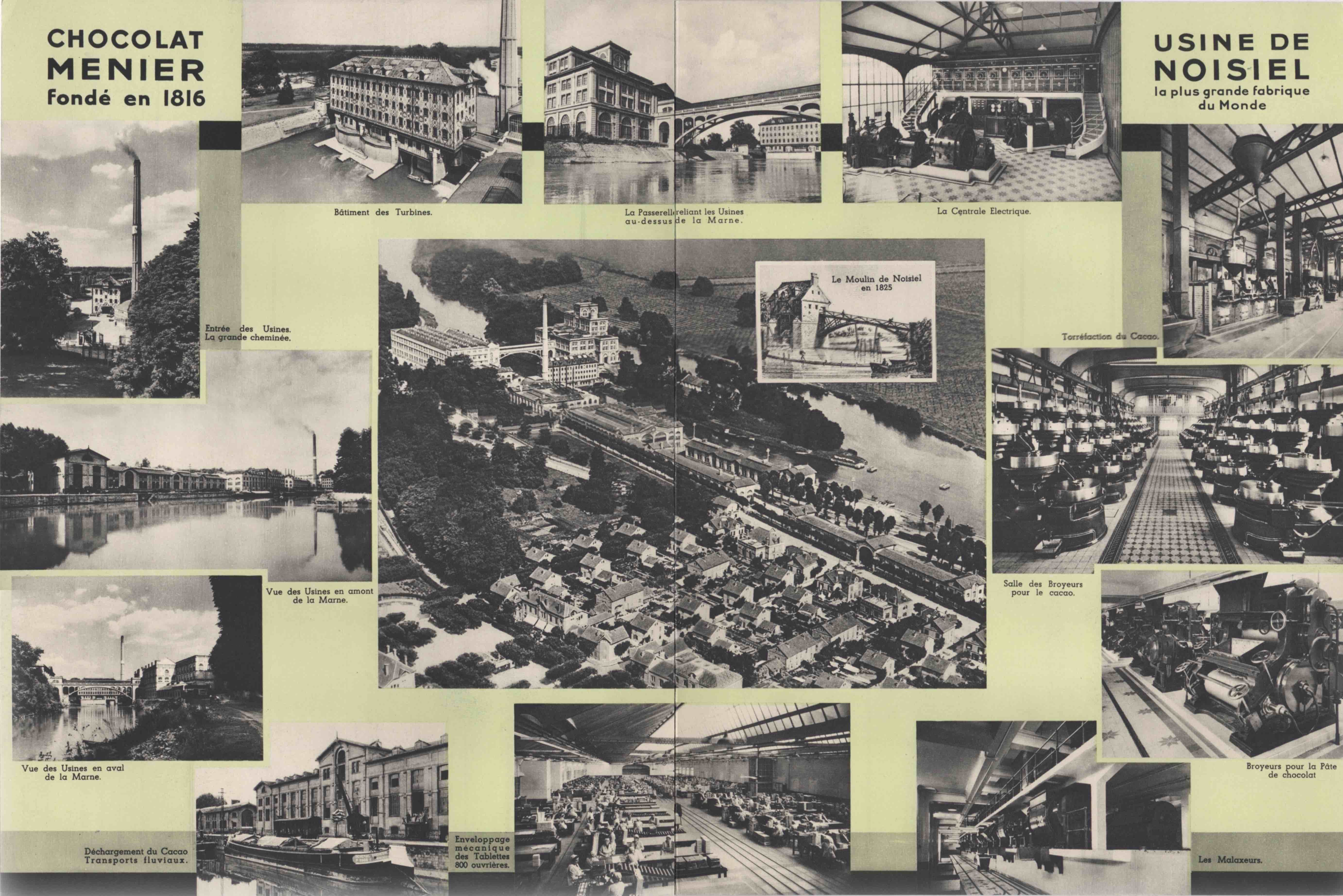
Twelve years ago I visited Noisiel to see the unique Chocolat Menier factory complex designed by Jules Saulnier on the banks of the River Marne, east of Paris.  The factory was in production from 1871 to 1993 and in 1997 was remodelled to serve as the headquarters of Nestlé France. Le Moulin Saulnier is the landmark building - behind the chromatic brilliance of its ceramic cladding lies an interior in which iron box girders and arched roof trusses create uninterrupted floor space for machinery.  Since 2010 I’ve acquired some vintage postcards of Noisiel that can be seen below, what they confirm is how well everything appears to have been conserved. A recent acquisition is this corporate prospectus of the Noisiel factory published by Menier in the 1930s to mark more than a century of progress. On the cover is a familiar school girl figure in use in Menier publicity since 1892, as airbrushed and updated 50 years later for the 1930s. There’s a double page spread of photos illustrating the major buildings and the manufacturing process at the Usine de Noisiel.  Alongside a chance to win a Peugeot 302 “luxe”, more photos can be seen on the back, including views of the internal railway that ran through the premises.  

In 2020 Nestlé France moved out of Noisiel to new premises in Issy-les-Moulineaux and disposed of the entire site to a developer, leaving the buildings to face an uncertain future.  Much wrangling is now going on between developers, local authorities and nearby residents - developers want to maximise the residential potential while locals are looking for community and cultural facilities.  The buildings have some protection as National Monuments but many spectacular interiors could be lost whichever way the argument is settled. Some reports say that the developers intend to permit a number of community enterprises to operate within the site on a temporary basis until 2024, the date set for launching the redevelopment.  This is unlikely to offer any public access to the site. More Chocolat Menier posts can be seen here and here.


Wednesday, 8 June 2022

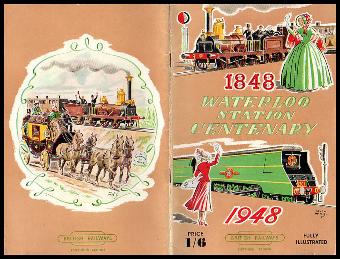
London Stations in Postcards and Photos - Waterloo

London’s south facing railway termini have never quite achieved the sense of occasion found in those that face east, west and south.  Victoria, Charing Cross, Cannon Street and Waterloo are all less architecturally ambitious than most of their neighbours to the north.  Victoria is compromised as a result of evolving as two adjacent stations while Charing Cross lost all its best features when it was submerged beneath Terry Farrell’s Po-Mo conceit. Waterloo is the only terminus south of the Thames and what we see today is an Imperial Baroque design, years in the planning and construction and only completed in the 1920s.  Two distinguishing features are the ridge and furrow glazing and the generous crescent shaped concourse.  There’s a flood of overhead natural light, unmatched in any of the great Victorian London stations and the lofty, expansive concourse makes a fine space through which to pass. Working against this is the heavy, ponderous feel of the Portland stonework and ornamentation. It has the air of being designed by the Ministry of War, something that’s enhanced by the pompous Victory Arch that serves as the main pedestrian entrance. Since 2012 a retail balcony has run almost the full length of the concourse - it offers a great location from which to observe the activity but at the expense of a coherent sense of the long façade of the main station building.  With 24 platforms, Waterloo is often claimed to be the largest station in Britain.  Post-Covid, Waterloo has lost its position as Britain’s busiest station to Stratford.


Waterloo Station Network Day, October 1st. 1988


Monday, 16 May 2022

Walala Parade

Leyton is a mainly Victorian terraced, residential district of Waltham Forest. It has a lower league football club with a long history and a modest record of achievement but major landmarks are few and far between other than a late Victorian Library and Town Hall complex built at a time when Leyton was still an Essex town.  Not far from the Town Hall, on the opposite side of Leyton High Road is a parade of shops and small businesses bookended by a tent making business and a Kwik Fit, now home to a community-funded public art project that extends across eight individual properties.  After several years of fund raising and planning it was completed in Summer 2020 by Walala Studios to a design by artist and urban designer, Camille Walala.  

There’s a rhythmic rectilinear grid filled with areas of high intensity colour, overpainted with a repetition of geometric forms, diagonal stripes and a scattering of more fragmented shapes.  Observers have noted the influence of Memphis and South African township decorative art.  There are some echoes of post-comic book mid period Roy Lichtenstein and the industrial geometry of painters on the fringe of Abstract Expressionism such as Al Held, Burgoyne Diller, John M Miller and Leon Polk Smith.  More delicate sensibilities than mine have complained about a lack of refinement but I’m at a loss to imagine just what an exercise in visual refinement could bring to an urban environment of this character.  However mediocre it may look, it does function as a place of economic activity. For me it’s enough that it gives us something better to look at than the surrounding townscape - a passing contact with a fleeting visual delight with an intent to uplift.  Depressing to note that taggers have left their odious signatures in at least three places.  I would have those art world halfwits who, decades ago, affected to take this vandalism seriously, conscripted to remove every last trace of it.


Friday, 13 May 2022

Postcard of the Day No. 109, Orphaned Postcards

If a brand character can be orphaned (as we noted in our last post) the same fate can befall the humble postcard. Careless publishers will often supply inadequate captions or omit them altogether. When this happens some clues can often be obtained from the postmark or publisher’s details on the reverse side. But if the publisher is anonymous and the card has avoided the postal system, we have an orphaned card of an unidentifiable scene.  A nice example is the card above in which a small army of workers shuffle towards their wage packets. This much we know from the caption (which even includes the precise date) but we can only guess at the location.  It looks like a broad canal basin in an American industrial town or city - it could be anywhere between New Jersey and Illinois with Chicago, because of its size, the most likely.  If the camera position had been slightly to the right it would have revealed the full name of the lager advertised in the distance which may have been helpful. None of this uncertainty detracts from the visual drama of a stoical workforce forming a comradely line in drenching rain as they inch their way towards the fruits of their labours.


A pleasing distraction when fumbling through boxes of cards at a postcard fair is overhearing the requests from fellow collectors.  Most have only a single town, village or settlement in their sights - “Any Brixham, Polkerris, Sidmouth, Ipplepen, Liskeard, St. Columb Major?” they bark and if the answer is negative, move on without a word.  Others have based their collections on more obscure areas of human experience and in voices tinged with resignation in anticipation of failure, will ask for anything on dentistry, card games, road works, dog fights, perfumes, shoe making, buildings under construction, clairvoyants, et al.  Of all such requests, the most impressive came from somebody who asked for any unknown or unidentified scenes and even more impressively the dealer handed over a shoebox full of examples to the collector’s great delight.  It seems this is a thing - some value these orphans for their sense of mystery while others turn detective to resolve the mystery.

Above is another orphaned example - on this occasion the caption is obscured by careless overprinting.  An abundance of sand ruled out Brighton and it didn’t look much like either Blackpool, Scarborough or Bournemouth. By squinting at the caption from a variety of angles I just about convinced myself the second word was Eastbourne.  Checking with other cards showing the same glazed pavilion from a different angle on the esplanade soon confirmed that it was. It’s an interesting card because of its informality and animation. What lets it down are gloomy colour values and a general lack of detail. French contemporary publishers, such as Louis Levy (LL), would have done a much better job with their superior print definition.


Monday, 9 May 2022

Big Green Man

We have advertising legend, Leo Burnett to thank for the birth of the Jolly Green Giant.  In 1935 Burnett transformed the Giant’s grim looking predecessor into the sleek and glossy finished brand character in a leafy tunic with pointy ears, who remains in service to the present day.  In his twilight years he has become an orphaned brand, discarded by corporate giant General Mills into the hands of the B & G Foods holding company who operate a rest home for senior brand characters while sweating them for every last cent of revenue.  Much of his long career has been spent persuading the consumer that large green peas can be every bit as flavoursome as small varieties.  Among his great adventures are the time he slid down a fireman’s pole and the day he was interviewed by Art Linkletter, a major radio and TV personality and old pal of Ronald Reagan. Otherwise his main occupation was flexing his muscles while cradling an enormous pea pod, the size of a small canoe and overcoming customer resistance with his disarming and occasionally disconcerting grin.