Sunday 30 December 2007

L’art entre en gare


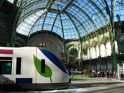
French Railways (SNCF) had the bright idea of dragging three locomotives through the streets of Paris and displaying them in the Grand Palais to mark 70 years (1938-2008) of publicly owned railways in France. Our own British Rail (or British Railways as it was then) was born 10 years later in 1948 and survived for only 46 years before being slowly strangled to death between 1994 and 2000 on the orders of John Major and the Adam Smith Institute. The French public have not yet signed up to the Blair-Thatcher consensus in which “public equals bad; private equals good” and carry on in their misguided way to support the idea of a nationalised railway. All they get for their ideological inflexibility and resistance to progress is a passenger service which is faster, more frequent, more comfortable and costs a fraction of the price demanded by the privately owned operators in Britain.


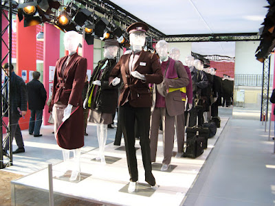
The Grand Palais is a magnificent structure combining engineering ingenuity with the decorative excess of the Belle Époque and made an appropriate setting in which to display the technological achievements and cultural by-products of seven decades of railway activity. The exhibition entitled, “L’art entre en gare” was a broadly cultural survey and correspondingly light on the engineering detail that many rail buffs find so absorbing. In doing so, it covered art, photography, cinema, architecture, publicity and the changing fashions in staff uniforms in equal measure. Attendance was no more than modest – most visitors were either in the Buffet or queuing up to climb into the locomotive cabs. The photographs were taken on Christmas Eve with the assistance of some brilliant winter sunshine. It’s a sad reflection on our times that the French public were queuing for over an hour to visit the Courbet exhibition next door at over three times the price!


Sunday 16 December 2007

St Pancras


There has been an enormous amount of publicity to celebrate the reopening of St Pancras Station as the Eurostar terminal for London. As a regular user of St Pancras in the Seventies and Eighties, I still struggle to comprehend this transformation. The place I knew was gloomy and uncared for. Its former glory, especially that of the train shed, could still be dimly appreciated and the hotel outside retained its sense of presence in the turmoil of the Euston Road but it seemed to be well and truly, on the skids. When the Thameslink line opened in 1988 the commuter trains from Bedford, Luton and St Albans no longer ran into St Pancras. They were hustled down a tunnel into the meanest possible subterranean platform that somehow epitomised the scorn that the Thatcher government had for public services. From that point I saw very little of St Pancras.


The last time I visited with a camera was twenty years ago in October 1987 and these are a few of the photographs. The clock and the train shed had an air of distinction but the overall impression was of a half empty facility which only intermittently came to life and then not for long. The trains and locomotives often looked shabby and neglected; these examples are not untypical. There was a sense that in a climate of persistent underinvestment in public services its days must be numbered. When the idea emerged that it could be the terminal for a high speed rail link with the Channel Tunnel it seemed improbable. Simply in terms of geography it made no more sense than running trains from Norwich into Waterloo and involved an immense amount of tunnelling under East London. Despite my reservations the project went ahead and I have been preparing myself for my next Eurostar trip by reading Simon Bradley’s book and watching a series of documentaries shown on BBC2.


The TV programmes were typically shallow being almost exclusively focused on human interest stories among the workforce to the exclusion of the engineering, construction and restoration. The misadventures of a sinister PR team and their champagne bar obsession took up two episodes and there was a lot more than I needed about the “iconic” meeting place sculpture. Someone writing on Flickr seemed to get that right in describing it as a 3 dimensional Jack Vettriano. Bradley’s book, on the other hand is readable and well informed and free of the sound of axe grinding that accompanied Simon Jenkin’s ill tempered Guardian article on November 9th. I prefer the uncritical enthusiasm of Jonathan Glancey’s feature (The Miracle of St Pancras) on October 11th. I doubt that he was surprised that so many Guardian readers found things to complain about. Residents of the East Midlands and South Yorkshire feel marginalised in the new order while travellers into Waterloo are unexcited about the prospect of spending the 20 minutes (and more) of saved journey time to Paris along the Jubilee and Victoria lines just to reach St Pancras. Some have observed that the covered platform extensions are singularly lacking in imagination and others have questioned the expenditure of 1 million pounds on a sculpture that is pure kitsch. So, I am now fully prepared for my expedition to St Pancras on December 18th. although nothing can quite prepare you for the surly security staff or the ice cold glare of suspicion at passport control.

Wednesday 12 December 2007

Lyme Bay Sunrise


This morning brought another stunning sunrise over Lyme Bay. At this time of year, sunrise takes place over the sea with often spectacular results. And there’s no need to get up early! Look for the seagulls that do their best to add a note of contrast. And in the last two images, look for the foreground mist. This occurs after a night of frost when the water flowing out of the River Axe is colder than the sea water in the bay. As soon as the sun comes up, condensation forms on the surface. It can stretch out in a ribbon for up to a mile out to sea.


Monday 10 December 2007

Postcard of the Day No. 11 - Mumbai Gothic


Searching for a postcard of St Pancras Station, this view of Municipal Hall and Victoria Terminus, Bombay came to light. It was timely because I’ve been reading with some fascination, “Bombay Gothic” by Christopher London. Both these buildings are the work of the same architect, Frederick William Stevens (1848-1900). Victoria Terminus (VT) built for the Great India Peninsular Railway came first and was completed in 1888; the Bombay Municipal Corporation (BMC) was constructed between 1888 and 1893. The BMC was designed to be 20 feet taller than the neighbouring railway station. The architect, Stevens, spent virtually his entire working life in India and with these two structures he created twin edifices of polychromed, finialed, crocketed, gargoyled, inventively carved masonry in the idiom of the Gothic Revival that serve as perfect embodiments of the imposition of imperial power. Like St. Pancras, the station came complete with portes-cochères for the convenience of passengers arriving via horse drawn carriage. Both buildings survive in good order to this day and form a significant element in the architectural heritage of India’s most dynamic city. Victoria Terminus (now known as Chhatrapati Shivaji Terminus in honour of a Maratha warrior) has been a UNESCO World Heritage Site since 2004. 2.5 million commuters pass through the station every day. When I last looked there were 987 photographs of the station to be seen on flickr, which suggests the building has lost none of its power to fascinate. Acknowledgements to “Bombay Gothic” for much of this information.

Friday 7 December 2007

Citizens of Truro


In a recent posting the anonymous citizens of mid-century Moscow made an appearance. As so often, it took a while to appreciate that the same thing was going on in my own photographs. Today’s images are unintentional or accidental photographs of street life in the Cornish city of Truro. The intention was to photograph buildings of interest. Serious photographers go on the prowl in unsocial hours or simply Photoshop unwanted human presence out of existence. Not being attracted to these options, this is what happens when you take your chances on a Saturday morning. I can take no credit for these images because in every case my attention was exclusively on the building behind. It is demoralizing to note that some of the vignettes are more interesting than the photographs from which they have been cropped. Hardcore street photographers have to either cultivate an air of invisibility or take the William Klein route of direct confrontation with the subject. There are some awkward ethical issues to consider relating to privacy whatever your approach. Having lived and worked in London for many years my own likeness must have been recorded many times over in the margin of visitor snapshots. A short detour or a brief check in forward momentum is not always possible. And in Surveillance Britain it is said that a citizen (or, more accurately, subject) can be recorded up to 300 times a day in a country where there is one CCTV device for every 14 people. A dystopian future beckons in which images of individuals gathered on a random and purposeless basis, multiply ad infinitum requiring ever more complex management systems to analyse and store data. Perhaps a socially responsible photographer should refrain from adding to this vast stockpile of surveillance data and concentrate on still-life subjects. An alternative would be to establish one’s own surveillance project, select a target and start accumulating data. It may sound unwholesome but it’s exactly what Walker Evans did when he took a concealed camera with him on his travels in the New York subway. It later became a fascinating book of un-posed subway portraits (“Many Are Called”, 1966).

Thursday 6 December 2007

Postcard of the Day No. 10


There’s a distinct flavour of Maxfield Parrish about the mountain range on this advertising postcard but I have been unable to track it down so it can’t be confirmed. The young diaphanously clad women posing seductively on the bench could be Parrish creations but the weedy gent in suit and spats is unconvincing and looks like the work of another hand. The splashes of light on the classical columns, the swags of foliage that follow the contours of the peaks and the illuminating rays of the setting sun on the mountain slopes are all characteristic Parrish touches so perhaps this was sold off the peg for the advertiser to customise. These matters aside, if this is what it takes to exercise such fascination in young and attractive females, the case for “White Rose” tailoring could hardly be more convincing. The outcome of the narrative could depend on whether the figure on the left is preparing to stand up or to recline. Any lingering sexual tension is dispersed by the vacuity of expression on the part of the Bertie Wooster figure. A decorous air of deferred gratification is presented for our approval.

Monday 3 December 2007

Leonetto Cappiello, Master of Exuberance


Guillaume Apollinaire, wearing his popular culture hat, had this to say about Cappiello in October 1912. "Leonetto Cappiello has transformed the art of the advertising poster. He has peopled our streets with tiny, multi-coloured industrial genies who nimbly proclaim to passers-by the merits of products whose artistic aspects were unearthed by his talent." In 1912, Cappiello was at the height of his powers and had more than 25 years of creative life ahead of him. Jack Rennert’s massive and compendious book (The Posters of Leonetto Cappiello, 2004) illustrates 28 examples of Cappiello’s posters from 1912, among them some of his most iconic images – the Elephant that smokes only le Nil (cigarette papers) and the reclining sultan smoking JOB (cigarette papers again). It seems fitting that Cappiello should be saluted by Apollinaire, the champion of Cubism as Cappiello’s work forms a bridge between the lavish fin-de-siècle decoration of the era of Les Maîtres de l’Affiche and the altogether more robust and pared down post-Cubist imagery of Cassandre and Loupot.


The formula is simple – individual members of a cast composed of exotic birds and animals, paragons of female beauty, creatures of mythology, monks, devils, orientals and men about town plus stock theatrical characters from La Belle Époque respond with unrestrained enthusiasm to the formidable qualities of the product against uncluttered but richly coloured backgrounds. There is more than a little repetition but it’s easily forgiven, not least because Capiello had an unerring ability to incorporate a novel twist in terms of costume, character or expression. A powerful and dynamic sense of visual movement is conveyed by the restless, gravity defying animation of the figures themselves, by the linear qualities in the brushwork employed to define form and mass and on occasion, by the explosive orbital trajectories of the products themselves which take on a life of their own as they spiral out through the composition. The colour combinations range from stark contrasts to subtle harmonies while the compositions vary between kinetic complexity (Gancia Vermouth) and utter simplicity (the Bouillon Kub). Everything is conceived in terms of how best to arrest the attention of the mobile and preoccupied urban populace.


Cappiello’s studio accommodation and practice was comparable with that of a successful society portraitist. It’s an uncomfortable fact that if his images were put before us with all commercial references deleted, there would be a lot less to admire. Thankfully, Cappiello was an early master of the pack-shot – however flamboyant the poster may be in execution and design the package is always accorded a lovingly detailed treatment and a high focus finish. The images radiate vitality and a level of sustained invention that is always impressive. Apollinaire’s remark confirms that to have seen these posters in their original context, inhabiting the Parisian street scene, would have been a wonderful experience.


Jack Rennert’s book itself is a model of unobtrusive clarity, the commentaries are brief and to the point and the images are given space to speak for themselves. There are no overlapping images and the pages are organised on a grid – so no crazy angles and no reversing out of text. The scale of the author’s task is staggering (534 posters reproduced in colour and 336 pages) and the whole enterprise is a true labour of love that lasted for decades. It would be wonderful to see some of the other under appreciated masters of poster art rewarded with similar treatment – my nominees would be Lucian Bernhard, Joseph Binder, Niklaus Stoecklin, Paolo Garretto and Tom Purvis.


The Jack Rennert Collection of Cappiello posters is on show at the Rahr-West Art Museum in Manitowoc, Wisconsin until July 6th. 2008. Meet the Collector Reception on Sunday, June 29th 1:00-4:00 pm featuring Jack Rennert.
Thursday 29 November 2007

Moscow


It’s fascinating to discover that many of the artistic avant-garde heroes and heroines of pre-Revolutionary Constructivism survived and went on to work for the state deep into the Stalinist era. El and S Lissitsky and A Rodchenko and V Stepanova consolidated their experimental graphic techniques in a series of propaganda publications in praise of Soviet achievements throughout the Twenties and Thirties. It took the cataclysm of the Second World War to finally sever all links between Modernism and the Soviet state. The post war visual language was profoundly conservative, calculated to reflect the power of the centralised state, and projected a sense of monumentalism and stability appropriate to a regime which placed control over all other values.


Moscow under Reconstruction was published in 1938 in a wonderfully elaborate production designed by Alexander Rodchenko and Varvara Stepanova in which the dynamic quality of urban life were conveyed via a sequence of photographic panoramas, montages, cutaways, fold-outs, and keyhole flaps which open to reveal details of following pages. The images on display here come from 1957, nearly twenty years and one world war later. This book, a simple large format picture book of Moscow, has minimal captions and no other text. The city portrayed is a sober, orderly and visually dull conurbation bathed in pallid sunshine. Massive, ponderous buildings dwarf the thinly spread human population and vast boulevards accommodate little more than a trickle of traffic. All is clean, free of litter and clutter and seems a world away from the frantic motion and dynamic energy of the city as visualised by Rodchenko and Stepanova.


The limitations of the colour process and printing contribute to the lack of definition and naturalism but they cannot be blamed for the pictorial conception which seems designed to convey an image of an ageless and eternal civilisation destined to endure into a more or less indefinite future. The graphic devices of 1938 have been abandoned in favour of a basic and simple presentation that arises more out of an absence of design than out of positive design decisions. A new conservatism predominates.


Half a century has passed and utopian visions of architectural imperialism are very much out of favour. Documentary photography often acquires additional significance as time passes but these images seem to travel in the opposite direction and take on the appearance of a world that may never have existed in a real sense. The wide open spaces and deep perspectives encourage the imagination to seek explanations for the urban anomalies. After a while they assume a theatrical air, at least one step removed from quotidian reality. Human traces are reduced to unfocused smudges; they seem to be in the city but not of the city. This is a city totally free of commercial branding. The power of the state resides in the monumental architecture and the rooftop sculptures that pierce the skyline. To find a city like this today would require a trip to North Korea.


Wednesday 7 November 2007

Moscow Metro


The Moscow Metro is justly famous for its architectural opulence and makes a brief appearance in the 1957 book. Curiously the late 1950’s was the period when this architectural splendour fell out of fashion and was replaced by a new austerity in design terms. The images here are not very clear but give some flavour of these remarkable interiors inhabited by a rather unsettling cast of petrified figures. There is a splendid selection of contemporary photographs by Bee Flowers available by clicking here. What makes them even more attractive is the introduction to the site – “It's not an art project. No vision, no interpretations, no artistic contributions or ambiguities.”