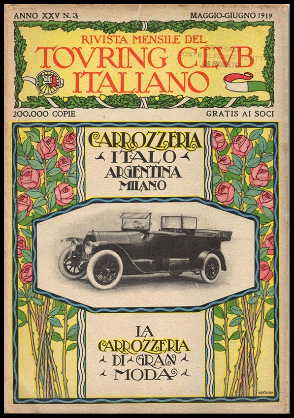
Italy was slow to adopt the poster form of advertising and when Les Maîtres de l’Affiche publication was complete in 1900 there were only 3 examples from Italy out of a total of 256. Although Italian graphic arts never quite acquired the distinctive national flavour or global influence of the French, German or Swiss traditions there were many fine artists and illustrators whose work combined visual wit with a directness of approach. These images come from 1919-20 when the most influential Italian illustrator for advertising was the incomparable Cappiello (who largely lived and worked in France). The Cappiello style of an arresting, gently humorous central image and a detailed portrayal of the product package against a flat colour ground can be seen in Italian advertising as late as the 1960s. What we see here include some examples from an earlier Art Nouveau influenced genre as well as some robust examples of the Cappiello tradition.
Showing posts with label illustration advertising. Show all posts
Sunday, 1 December 2013
Monday, 9 February 2009
Komet Weiss

Today’s image comes from 1930s Germany where the business of promoting Portland Cement was obviously taken very seriously. It’s a highly competent exercise in sachplakat employing clearly defined areas of flat colour to describe form in the manner made famous by Lucian Bernhard and Ludwig Hohlwein. The trick lies in precision drawing technique, skilled simplification of form and shape and an excellent eye for colour. The influence of William Nicholson and James Pryde helped to kick-start this reaction against the formal complexities of Art Nouveau but the robustly reductive approach was especially popular with German graphic designers and poster artists. As the style developed in the inter-war years it began to absorb some of the formal innovations of Cubism. The detail of the hands could almost be the work of Juan Gris.
Thursday, 10 July 2008
Soda Fountain Nightmare

If it were possible to compile an Atlas of Human Happiness there is no doubt in my mind that its very epicentre would be at the soda counter in an American drugstore as portrayed in Coca Cola publicity between the 30’s and 50’s. Such a concentration of ecstatic smiling faces, unblemished complexions and perfect teeth is a wonder to behold. The talk is all of proms, math tests, barbecues, football games, Saturday night dances and the innocent pleasures of the wholesome Christian life. I like to imagine the intrusion of a long dark shadow into this idyllic scene, as the door swings open to admit the figure of Robert Mitchum in his role of Max Cady or the Reverend Harry Powell. Smiles freeze and all colour drains from the picture as Mitchum slowly crosses the store, takes a seat at the counter and tips his hat to his fellow customers with affable insolence.

Artists of the calibre of Andrew Loomis and Haddon Sundblom were employed to create these radiant visions of the triumph of commerce over human isolation and misery. Week after week they graced the pages of ‘Saturday Evening Post’ and ‘Life’ gradually accumulating into a vast aggregation of happiness unlimited until the default position of the American consumer would be that the soda fountain is the undisputed and exclusive territory of the Coca Cola corporation. The text makes much of the democratic virtues of soda fountain culture, open to all in the spirit of companionship and good humour. The imagery possesses an intensity that promises a quasi-religious transfiguration into an elevated condition of exhilaration – no mean achievement for a blend of sugar, water and colouring agents.
Monday, 12 May 2008
Gladys Peto (1890-1977)

I’ve always been intrigued by the illustrations of Gladys Peto. The combination of a precision line wrapped around flattened areas of colour and pattern gives them an unmistakeable flavour enabling them to be spotted at twenty paces. There’s some affinity with the world of William Brown but the children are often listless and lacking in energy. Another distinctive feature is the absence of shadows. Her figures, mostly children, inhabit a sunlit world in which not a single shadow falls on the ground. The result is subtly disorientating and contributes a certain dreamlike quality. They are superior versions of the type of drawing for children that inspired Glen Baxter’s exercises in the absurd.

The Bookman cover from October 1929 shows her at her best, employing a limited colour palette with a lovely wandering line and a perfectly weighted distribution of pattern and contour. This example of her advertising work for Allenbury’s Infant Foods is a striking image of a squadron of rosy-cheeked children in night attire drifting silently through the night sky with more than a hint of Art Deco. I soon discovered after some casual research that Gladys already has her internet champion in the person of Jeanette Payne whose blogspot (highly recommended) is entirely dedicated to her work. Jeanette is clearly an expert on her subject and has displayed the entire range of the Peto output including a fascinating selection of advertising illustration.

In the twenties and thirties there was a Gladys Peto industry turning out large format colour illustrated books for girls at Bedtime, Twilight or in the Gloaming! Times were Merry, there were Sunshine Tales, Playtime Stories, Summer Days, Holiday Stories and Happy Tales. There was a Peto product for every occasion and well behaved children everywhere were likely to be rewarded with gift-wrapped copies. Despite all this emphasis on pleasure, the children in the illustrations were almost always unsmiling, often with distinctly ambiguous expressions of the sort that Balthus became famous for. The sense of orderly tweeness is undercut by curious images of Alsatians taking afternoon tea or serried ranks of passive mute schoolgirls.


Monday, 22 October 2007
Christopher Wormell

This is a fan letter to an artist whose books are an unadulterated pleasure to the eye. I’m not going to survey his entire output but focus on the books I’ve collected for myself. There is no active book illustrator who is better for clarity of design, simplicity of presentation, and vibrancy of colour. Most of his books are made for children but they all possess visual qualities to delight even the most jaded eye. A useful biographical note can be found here.

His output falls into 3 main categories. Starting in 1997 with Blue Rabbit and Friends there is an extensive series of mass market story books for children with titles like Henry and the Fox, The Saddest King, George And The Dragon, Two Frogs, and Off to the Fair. Well told tales with cheerfully competent drawings in a combination of colour washes and line, they have many qualities to make them attractive to children but they lack the visual impact that makes the large picture books so distinctive. This is not intended to be dismissive but simply to place them in context. Next is a smaller group of books illustrated in a traditional wood engraving manner. Examples of this include Mowgli's Brothers and English Country Traditions. These productions reflect a high degree of technical mastery and a genuine respect for a traditional craft. The ability to render form and texture in this most demanding medium is admirable but overall they are not so effective when it comes to visual rhythms and a sense of movement. The surfaces and forms seem to exist in an airless atmosphere; they need a fraction of additional space into which to expand and animate. Finally, there is a growing series of large format primers with bold and dynamic full page colour illustrations. These are by some distance his greatest achievements and maintain the highest overall standard of quality.

This series began in 1990 with the publication of An Alphabet of Animals. It established a generously proportioned square format with full page four colour lino-cut illustrations with black borders which with some modifications has lasted to the present. The appeal of apparent simplicity and the revitalization of a traditional form was immediately recognised and the book won the Graphics Prize at the Bologna Book Fair in 1990. A Number of Animals followed in 1994, published by Jonathan Cape in a yellow embossed cloth binding with a wraparound pictorial dust jacket displaying an image not included in the body of the book. This volume introduced the device of a small character (a chick in this case) that appears somewhere in every image. The practice has been maintained through the life of the series and makes a minor but continuing contribution to the sense of visual wit inherent in the work.

The series continued with the New Alphabet of Animals in 2000 and Teeth, Tails and Tentacles in 2004. Mice, Morals and Monkey Business was published in 2005, followed by Through the Animals’ Eyes in 2006. The latest volume, Wings, Horns and Claws appeared in September 2007. Handsomely produced in cloth bindings with printed labels inlaid on the front, these books have been published by the Running Press in Philadelphia and there is no sign as yet that the formula is becoming stale. The design and page layouts have an air of classic simplicity that allows the images to speak for themselves. The books have a sense of internal rhythm created by alternating single images and double page images interspersed with text. The images are then repeated either as vignettes at the back with additional text or employed on reduced scale between the endpapers and the title page. This all serves to enhance the process of absorbing the imagery.

CW learned his wood engraving skills from his father and never attended art college. He is largely self taught but has a keen awareness of the long traditions of book illustration for children. There is an interview in which he talks about this and other matters that can be read by clicking here. There are echoes in his work of Japanese wood-block prints and some affinities with the prints of Bonnard and the woodcuts of Raoul Dufy. Like Dufy in his illustrations to Apollinaire’s Le Bestiaire, he is a master of the power of line, controlling the width, weight and direction to describe and enclose form and texture as well as intensifying colour sensation. Image placement in relation to the pictorial frame is judged with perfect finesse. Decisions about whether to contain a form within the frame or whether to crop are expertly made. Even more impressive is the unerring ability to make the areas of flat saturated colour, the negative shapes, work to maintain tension in the image. It is this quality that is reminiscent of Bonnard especially when large and small forms are contrasted within the same image. All these, in combination with a flair for developing movement within the image are calculated to exercise and delight the eye.

I also have a few items that lie outside these three categories of book. Mediterranean Flavours is a cookbook, published in 1995 and lavishly illustrated in colour lino-cuts by CW. The images of tomatoes and aubergines, peppers and olives, lemons and pomegranates and sardines and squid ornament the pages with wonderfully intense colour contained within supple and rhythmic contours. Labels is a small card covered 34 page book, published in 1997 with a text by Louis de Bernières, a brief first person narrative describing an unlikely instance of compulsive behaviour leading to wealth and fortune. CW contributed small atypical line drawings, one to sit opposite each page of text plus a more characteristic single colour lino-cut on the book’s theme of tinned cat food to decorate the front and back cover.

In 2005 Adnams Brewery launched a poster and magazine advertising campaign under the slogan, “Beer From The Coast” with full colour seaside imagery from CW. I saw them first as full page ads in the Guardian Weekend magazine where they positively leapt off the page, surrounded as they were by the usual visual mediocrity. On a train trip a few months later I saw them as full size posters effortlessly dominating the suburban platforms along the track leading to Waterloo. Once again, they looked stupendous, in a class of their own in the company of ads for mobile networks and financial services. Adnams made much of this rich vein of material on their website and for a while were marketing prints, postcards, mouse mats and mugs bearing CW’s images. The posters brilliantly evoke the breezy, sunlit horizons of the East Anglian coast in a series of visual puns in which bottle tops stand in for pebbles, shells, limpets, and sails while beer bottles stand in for bollards and groynes. It was an opportunity for CW to make use of a pictorial language hitherto exclusively applied to natural forms, on the built environment and man-made objects. Contemporary illustrators rarely get an opportunity like this and seeing his work widely reproduced on such a massive scale must have been a source of great satisfaction. Adnams is a family firm with a long established reputation for high quality traditional real ales. Linking up with an artist and illustrator with a flair for distinctive imagery and a respect for the traditions of his craft seems like the perfect partnership.
Thursday, 13 September 2007
Dickies of Fort Worth

As worn by Men of Production since 1922. One of those points where the worlds of Capitalism and Communism intersect with a celebration of the dignity of the working man not to mention an equal imposition of conformity with the provision of a uniform. Heroes of Labour and Men of Production eternally toiling in the service of the cold war. Marching with a purpose, lunch boxes at the ready. The guy who got the girl wears a troubling expression of wide eyed lasciviousness but the others possess a military bearing in keeping with their mission to defend freedom. The brand has survived into the present and the Dickies Texan Waterproof Rigger Boot is the first choice in the building trade.
Monday, 10 September 2007
Charles Addams

The lugubrious and macabre talents of Charles Addams would not seem to be ideally suited to the demands of advertising illustration. Few products would on the face of it, benefit from an association with the Addams universe of monstrous malevolence. However, the New Yorker magazine would have been regular reading for the art directors and account executives of Madison Avenue and there’s always the temptation to assume that what goes down well in Manhattan might do likewise in Billings, Montana or Corpus Christi, Texas. Addams’s darkly humorous drawings had been published in the New Yorker since 1933 and it was the manufacturers of Lee Tires who had the imagination to employ his drawings to illustrate some of the more unusual hazards from which Lee Tires would provide protection.


Other advertisers sought to make use of Addams’s drawings to obtain some of the sophistication of the New Yorker and the examples here include a shirt manufacturer, Life Savers and Briggs Luxury Tobacco. Curiously, the Life Savers ad plays upon female insecurity about breath fragrance whilst Briggs tobacco is commended for the strength of character that will enhance the smoker and of course, the threat to breath quality is studiously ignored.
Monday, 3 September 2007
John Falter Revisited

Three more examples of advertising art to admire from one of the unsung heroes of American illustration. The Schlitz ad is a special favourite showing Falter having a little fun at the expense of Modernist painting and sculpture. An unwilling husband has been persuaded to visit a museum of modern art. His female companion thinks a little self-improvement would not go amiss. But the Mondrian, the Pollock and the Paul Klees cannot compete with the unlikely but unmistakeable portrait of a glass of Schlitz. “Here’s one I can understand!” The world of contemporary art and the world of advertising rarely overlapped in the 1950’s and although the concept might not have been his, Falter is to be commended for the relish and enthusiasm he brought to the task.

The other two are excellent examples of Falter’s skill in handling large figure ensembles. Both images share slightly elevated viewpoints but exemplify different drawing styles. The “Gulf Coast Shrimp Supper” is conventionally modelled and conservatively representational. Four couples prepare to celebrate their love of freedom with beer and shrimps under the shade of the live oak trees. The Pure gas station on the right is rendered with a new transparency of colour and a strong linear quality to create a liveliness and sense of immediacy more in tune with prevailing styles at the end of the 1950’s.
Wednesday, 6 June 2007
Barry Craddock – Master of pastiche

To an interested observer like myself, with absolutely no links with the advertising industry, Barry is one of the unsung heroes of commercial illustration. He has the skill to adapt to almost any idiom or style as required. I like to imagine him at work surrounded by an enormous reference library of the finest graphic imagery (Gebrauchsgraphik, Commercial Art, Graphis, Art & Industry) but the reality is probably very different. Here is a small selection of his output that gives some impression of the enormous range of his talents.


In the late 1980’s (or early 1990’s) there was a Shell poster campaign with a strong period feel, calculated to evoke the empty roads and unlimited speeds of mid-century Britain. Barry’s illustrations captured this to perfection with fonts and layout to match. These examples were photographed in London Road, St. Albans.

In my opinion, the wonderful faux woodcuts for Beck’s Bier in 1985 are the very best of his work. There are 3 variants that I know of: portrait format, landscape format and a Christmas themed landscape format. The portrait format is the strongest – a proletarian brewer holds a foaming glass to the light and subjects it to piercing scrutiny in the interests of quality control. Behind, a towering factory hall packed with cylinders, valves and gauges all dedicated to the brewing process. In the landscape image, our muscular worker-hero strides purposefully to the busy waterfront where barges line up to ferry the casks of ale to a thirsty nation. In the background, to the left a medieval bridge and cathedral and to the right a towering industrial facade and smoking chimneys. The style combines the robust immediacy of an Expressionist woodcut with the gravitas of Ludwig Hohlwein. Superb images but, did they work? Did consumption rise? Did the proletarian mood hold any appeal for the style conscious, conspicuous consumers of the Thatcher years?

Barry is still hard at work, to visit his website, click here. Perhaps, before too long, someone will produce a monograph on Barry’s work and collect his entire output into a single place. It would be a great asset to future generations of graphic artists and historians of design and illustration.
Subscribe to:
Posts (Atom)