A year-end treat for cat lovers lithographed with characteristic subtlety by the under-rated Eileen Mayo for Puffin Picture Book 84 in 1951. Beautifully composed and immaculately rendered, it’s typical of the exceptionally high standards maintained in this series of books for children. Chris Mullen at the Visual Telling of Stories (VTS) has tirelessly scanned the entire book for your pleasure. It’s exactly 70 years since the first four Puffin Picture Books were published in December 1940. These modest illustrated books for children, with their distinguished continental ancestry in France (Père Castor) and the Soviet Union (Vladimir Lebedev) have ever since been held in high regard. Their enduring appeal is a tribute to the enlightened editorial policies of Noel Carrington and the impressive depth of colour achieved by the printers, Cowell’s of Ipswich. The format was dictated by the need, in the interests of wartime economy to print each book on a single sheet of paper with colour on one side and black and white on the reverse. This would produce a 32 page book ready for cutting and binding in a single pass. The challenge for the artists was to draw directly on a plate for each colour separation. The contrasting styles of artists of very different approaches and graphic techniques were unified by the distinctive production process. This is my modest tribute to the graphic excellence that makes these books so special. For a much more comprehensive and considered overview I must direct the reader once again to VTS.
Friday 31 December 2010
Puffin Picture Books Seventy Years On
A year-end treat for cat lovers lithographed with characteristic subtlety by the under-rated Eileen Mayo for Puffin Picture Book 84 in 1951. Beautifully composed and immaculately rendered, it’s typical of the exceptionally high standards maintained in this series of books for children. Chris Mullen at the Visual Telling of Stories (VTS) has tirelessly scanned the entire book for your pleasure. It’s exactly 70 years since the first four Puffin Picture Books were published in December 1940. These modest illustrated books for children, with their distinguished continental ancestry in France (Père Castor) and the Soviet Union (Vladimir Lebedev) have ever since been held in high regard. Their enduring appeal is a tribute to the enlightened editorial policies of Noel Carrington and the impressive depth of colour achieved by the printers, Cowell’s of Ipswich. The format was dictated by the need, in the interests of wartime economy to print each book on a single sheet of paper with colour on one side and black and white on the reverse. This would produce a 32 page book ready for cutting and binding in a single pass. The challenge for the artists was to draw directly on a plate for each colour separation. The contrasting styles of artists of very different approaches and graphic techniques were unified by the distinctive production process. This is my modest tribute to the graphic excellence that makes these books so special. For a much more comprehensive and considered overview I must direct the reader once again to VTS.
Labels:
books,
illustration,
printing
Tuesday 28 December 2010
This Year Next Year
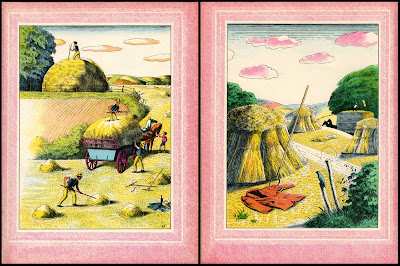
Though this fine example of the work of illustrator Harold Jones (1904-92) was first published in 1937 it has a genuinely timeless quality. Verses on seasonal themes written by Walter de la Mare are paired with lithographed images of disarming freshness and vitality. According to information in the de Grummond Children's Literature Collection*, the illustrations preceded the poems. The colour and texture of the English countryside, the invigorating English seaside and the measured pace of small town life are brought to life in Jones’s deceptively simple pen and colourwash illustrations employing a line that is simultaneously sensitive and incisive. Harvest time in high summer, the bare outlines of winter trees, autumn’s log piles and slanting rains, the drama of rockpools and seaside entertainment are organised into beautifully calibrated compositions. The selection that follows includes two double page spreads (to demonstrate the felicitous combination of image and text) and some paired illustrations on similar themes.
* The Harold Jones Papers are to be found at the University of Southern Mississippi in the de Grummond Children's Literature Collection.
Please follow this link for an interview from 1986 with Harold Jones in the magazine, Books For Keeps.
And Chris Mullen has a generous selection of Harold Jones material at the Alphabet of Illustrators.
Friday 24 December 2010
Let it snow
After yesterday’s visit to the dark side of Christmas we turn to something a little lighter in both tone and hue. Refrigerated rainfall, popularly and more concisely known as snow is much in our minds at the present. This is day 8 of life under a covering of 20 cm. in the balmy South West so on this slender pretext, images of snow excavated from the archive follow below. At the top is W Heath Robinson, with a typically inventive piece on the cover of The Humorist in 1938. Below is a Good Housekeeping cover from 1945 presented in isometric splendour by the dashingly named Clixby Watson. Next is a cosy Alfred Bestall cover for the 1949 Rupert Annual from the days when it was issued in a thin card wrapper. This Year Next Year, published in 1937 supplies the image of a snowman from the incomparable Harold Jones, a true master when it came to conveying the uniquely English discomforts of wind and weather and the way they shaped our landscape and cultural traditions. The snow plough is the endpaper from Virginia Lee Burton’s Katy and the Big Snow (1943) where female stereotypes were challenged by naming the snowplough Katy. The cross-cultural encounter in the frozen wastes is from another favourite illustrator Clifford Webb (more about him here) – North Pole Before Lunch, published in 1936. The last image is a Bruegel pastiche painted by Peter Brookes from about 1980. Brookes had a genius for creatively reworking the Old Masters and was a regular illustrator for Radio Times in the 1970s and last time I looked, still working as a political cartoonist for The Times.
Labels:
christmas,
illustration,
snow
Thursday 23 December 2010
Access Denied
There is a long tradition of misery at Christmas and in this corner of Devon we are fortunate to live in a place where this has not been forgotten. The local authority reached deep into their purse and splashed out on a generous length of security fencing to enclose the Christmas tree and a cheery seasonal message to warm our hearts, the only regret being that funds wouldn’t run to the addition of some razor-wire. The national mood of coalition-inspired austerity has been captured to perfection. The Reverend A W Nix (below) must have been the most terrifying Christmas guest as he climbed down from his Black Diamond Express To Hell to deliver his gift-wrapped incendiary sermons. Our tabloid newspapers in their capacity as guardians of the nation’s Christian values are ever vigilant in campaigning against those who threaten to compromise the traditional Christian Christmas message in the name of multi-culturalism so perhaps they will lend their support to my Christmas wish to have Death May Be Your Christmas Present played every Christmas Eve from Blue Waters to Brent Cross via Meadowhall and Cribbs Causeway.
Wednesday 15 December 2010
Postcard of the Day No. 42, Havre-Caumartin
The subject of today’s card is a massive wedge of masonry of the sort that typically command Parisian street intersections. This one is here to inspire public confidence in the insurance policies of la Mutuelle Européenne. Convinced that reality can always be improved on, American postcard publishers were as enthusiastic about re-touching images as the French were reluctant, making this a rare exception. The foreground figures look distinctly posed and costumed to give a good impression of the clientele. Around the Métro entrance in the detail below, the faces in the crowd reflect some fairly brutal treatment from the artist’s brush.
Below is another view of the same Métro entrance – Havre-Caumartin. The flooding that overwhelmed Paris for nearly four weeks in early 1910 rapidly penetrated the tunnels and stations on the Métro network and led to bizarre scenes such as this where the entrance staircases were transformed into slipways descending to subterranean lagoons. The only beneficiaries of all this misery were the publishers of postcards, the volume of their production being only slightly exceeded by the volume of floodwater.
Saturday 11 December 2010
Huntley & Palmer 1937
As a seasonal concession we present the pages of the 1937 Huntley & Palmer Christmas brochure promoting the finest in factory made cakes and biscuits to the time-pressed consumer. Huntley & Palmer operated what was once the world’s largest biscuit factory in Reading and offered a huge range of products. The packaging and graphic style is predominantly conservative, designed to offer comfort and reassurance through the repetition of historic traditions and the conventionally picturesque. The only concession to contemporary Art Deco-inflected graphics was in the packaging of savoury biscuits where a modest note of sophistication seemed appropriate. The cocktail biscuits pictured on page 10 were styled to look at home in a Sunspan house or a Highpoint apartment.
Novelty items include a chalet-shaped cake on page 8 and on page 4 there’s a colourful biscuit tin in the shape of a delivery vehicle, described as a “most useful toy” and probably worth a small fortune today in mint condition. Collectors of decorative printed tins have an enormous range from which to choose to specialise but for a significant few the holy grail is the pursuit of the “naughty tin”, allegedly the work of an alienated employee bent on subversion. Those with suspicious minds might conclude that it was a carefully executed plan to produce an instant collectors’ item. For me the most attractive examples are those that imitate the real world – stacks of books, garden rollers, cameras, suitcases, handbags and battlefield tanks complete with camouflage.
In line with the general retreat on the part of British business from the mundane activity of manufacturing actual products in favour of manufacturing investment vehicles and derivative trading, ownership of the brand is now in the hands of French-owned Danone. The Reading Museum is home to the company archives and a selection of Christmas catalogues can be seen by following this link.
Monday 6 December 2010
Postcard of the Night No. 5, Atlantic City
Kent’s Restaurants was a small chain based in Atlantic City. All their outlets were publicised on linen postcards, presumably gratis to customers. In pursuit of this example, here embellished with a jumbo-size crimson crustacean, I made the obligatory trip on Street View to discover an empty, boarded-up demolition site. From Flickr I learned that it had traded for 30 years as the Poseidon Restaurant before closing in 2006, suggesting the demise of Kent’s was some time ago. Swept off the map by competition and now only the cards remain.
Thursday 2 December 2010
Death and Chocolate
A brave and subversive effort from Chocolat Menier, placing their product in the sombre surroundings of Père-Lachaise Cemetery alongside the sententious and lugubrious Monument aux Morts by Albert Bartholomé (1848–1928). The hand carved emblems of bereavement and human wretchedness rest uneasily in the company of the tempting charms of Chocolat Menier. The ensemble serves as a reminder that in the midst of death we are in chocolate.
Subscribe to:
Posts (Atom)