Showing posts with label design. Show all posts

Tuesday, 5 May 2020

Great Railway Stations No. 15: Rotterdam Centraal


On 14th. May 1940 the centre of Rotterdam was destroyed by the Luftwaffe - 4 days had passed since the German invasion and patience was wearing thin in the German High Command who had expected to take total control of the Netherlands in 24 hours. In response to the fierce resistance mounted by the Dutch armed forces the first major airstrike of the war was ordered on Rotterdam as a message to the country that worse was to follow - the surrender took place the very next day. One of the casualties was the largest of the four railway stations that connected Rotterdam with the rest of the country - Delftsche Poort and in the post-war reconstruction train services were rationalised and combined into a single all-new station, Rotterdam Centraal. The new station which resembled the gently curving facade of a Modernist office block opened in 1957. By 2007 it was deemed inadequate and was demolished to be replaced by the present structure which opened in 2014.


The 1957 station (shown in the final image) was designed by Sybold van Ravensteyn, a long time specialist in railway architecture. Van Ravensteyn’s post-war career was overshadowed (but not curtailed) by his cooperation with the occupying forces, which included his design for a special carriage for the Reichskomissar for the Netherlands, the egregious Arthur Seyss-Inquart. Despite this his design was held in some affection by local citizens who campaigned for the retention of the station clock and the letters that spelled out the name of the station. Both were incorporated into the new expanded station.


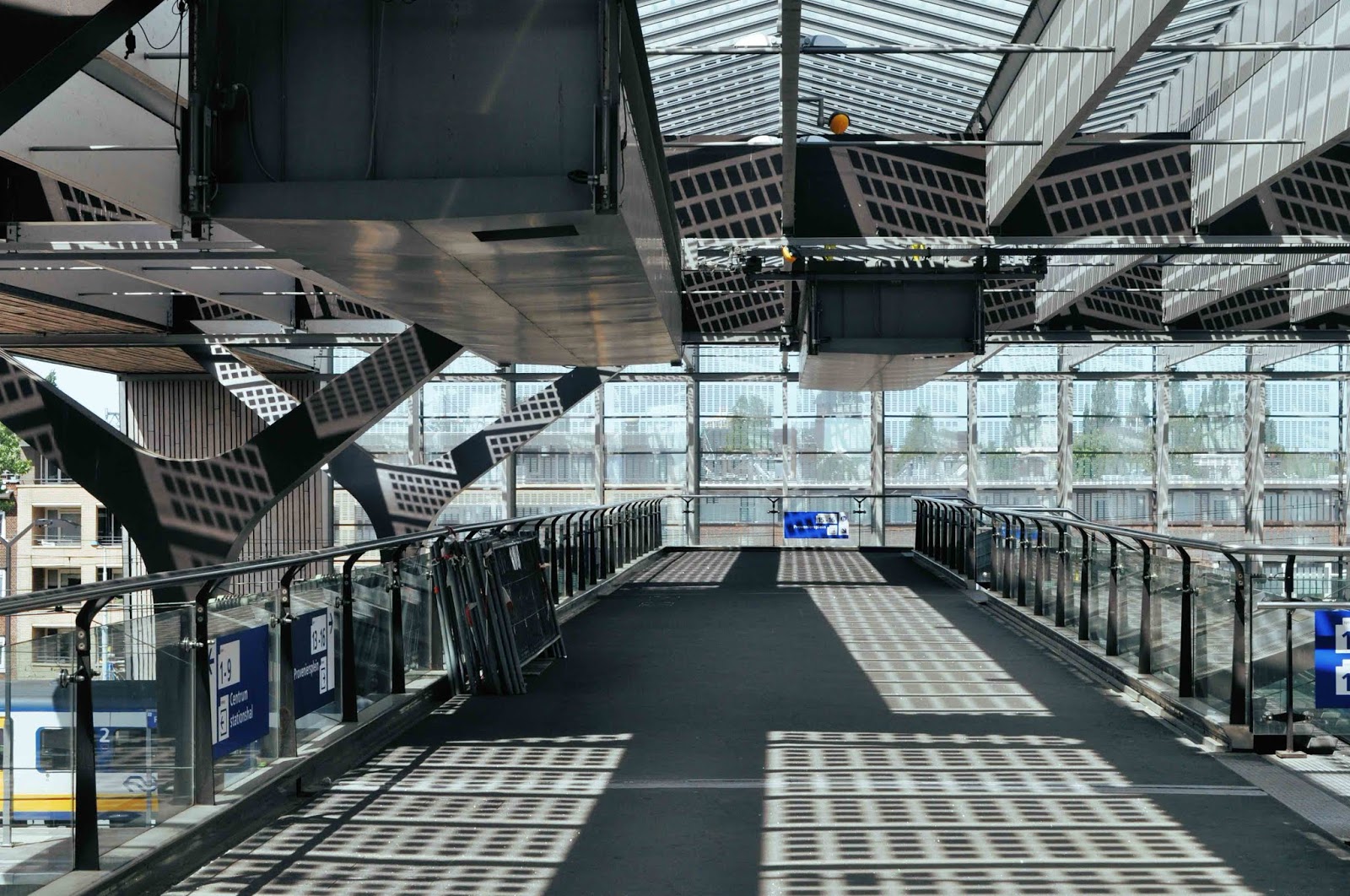
A dramatically angular and asymmetric frontage makes for a bold and assertive landmark but elsewhere the new station is relatively understated. Designed for capacity and flow and not given to rhetorical vanities - the most striking visual effect is achieved by filtering sunlight through ridge-and-furrow roofing of alternating glazing and solar panels. It was built with an eye for detail. Y-form roof supports are echoed in the handrail clamps. The architects have spoken about the struggle they had with the brand managers at the state-owned railway (Nederlandse Spoorwagen) when it came to repositioning the letterforms from the old station. Their insistence that the name of the city must be included was eventually overcome by pointing out that anyone approaching the building would already be well aware they were in Rotterdam. Direct Eurostar trains to London were due to begin in March 2020 with the installation of security screening but are now postponed indefinitely. Since 2018 the Eurostar service to Amsterdam stopped at Rotterdam on the outward journey but passed straight through on the return.


Thursday, 23 February 2017

Olivetti


In the 1950s and 1960s Olivetti promoted itself in Italy and beyond with a dazzling range of publicity. Lead by Giovanni Pintori and Marcello Nizzoli, the company created a unique reputation for excellence in graphic and product design and a powerful brand identity. Half a century later the advertising and poster designs look as fresh as when they were new. It remains astonishing to observe the ingenuity with which the intractable form of the typewriter was so fluently transmuted into a vast portfolio of modernist graphics. Every visual element that could be derived from the paraphernalia of typing, including numerals and letterforms, was put to work in an impressive sequence of designs that placed Olivetti products at the forefront of contemporary design around the world.


The manufacturing base was at Ivrea, a small town in Piedmont 35 miles north of Turin. Founded in 1908, the company quickly expanded to the point that Ivrea became a company town of 14,000 employees at its peak, complete with modernist styled worker housing and factory buildings. It survives to the present as a product badge in the ownership of Telecom Italia, a business that mopped up the last of Olivetti in 2003. In 2014 there were 580 staff employed in Ivrea – the current product offer comprises colour copiers, cash registers and a 3D printer. Olivetti’s demise was gradual but irrevocable. A range of electronic typewriters, desk-top calculators and basic word-processors was overwhelmed by the competition from a new wave of IT suppliers in the 80s and 90s and a transition to digital competence proved impossible. But with its design-lead philosophy, obsessive attention to detail and presentation plus the innovative use of coloured finishes, Olivetti in its prime was a blueprint for the future success of Apple.


In New York the Museum of Modern Art was the first institution to collect Olivetti products as exemplars of the modern movement in 1952. This modest selection of Olivetti graphics is supported by a feature from Graphis magazine 59 (1955) and some pages from a book published in 1996 by Somogy in France (“Et aussi des crayons”).


Tuesday, 21 February 2017

Italia Grafica 2


Continuing this month’s Italian theme with a selection of Italian graphics from the 1920s and 1930s. There are other national graphic traditions where a higher value is placed upon simplicity, elegance and refinement but Italian graphics have a flavour of their own with a preference for robust and bizarre humour. The influence of international Art Deco is also much to the fore. An Italian taste for broad humour is very much present in the Aspirin ad where the sickly occupant has evaporated leaving a pile of clothing behind while the reinvigorated former patient makes a hasty exit. An earlier selection can be seen by following this link.


Sunday, 20 November 2016

W H Smith Decorative Tiles


Newsagents and booksellers for more than 200 years, W H Smith has more than 600 stores on British high streets plus another 700 at airports, train stations and motorway services. In most of these locations it is unchallenged by any competition. Despite its longevity and ubiquity it seems to command little affection on the part of its customers. The shops are fitted out to a rigid and universal formula and the range of products is severely restricted to items that can be reliably sold in large quantities. Harsh lighting, artificial fibre floor coverings and a persistent smell of cleaning products makes for an uncomfortable browsing experience. It’s common to find only a single staffed checkout with a long, slow moving queue from which shoppers can contemplate the generous provision of frequently malfunctioning self-service checkouts. Any staff savings are cancelled out by the need for attendants to sort out all the customer problems. It wasn’t always so – in the inter-war years the business had a reputation for its ornate oak shop fronts (a few of which survive) and decorative pictorial tile panels designed and manufactured by Carter & Co. of Poole. An exhaustive survey of these panels was published in the 2015 Journal of the Tiles and Architectural Ceramics Society by Ian M Betts who listed 60 stores where examples can still be seen. The four examples shown here come from the branch in Mostyn Street, Llandudno – the postcard shows a W H Smith store in the right foreground. The present store where these photographs were taken is some half a mile further up Mostyn Street – presumably the tiled panels migrated with the shop to its new location.


Wednesday, 5 February 2014

Destination Southgate


The centre of cultural life at the grammar school I was privileged to attend was located somewhere between the rugby scrum and the parade ground where members of the school Cadet Corps were prepared for the task of inheriting the earth. Cruelly, nature had ill-endowed me for chasing the oval ball and lacking the temperament for square-bashing, I gave my time to more effete pursuits including the study of architecture via the pages of Bannister-Fletcher and J M Richards. A book that I spent many hours browsing was Richards’s Pelican paperback Introduction to Modern Architecture where I learned about such wonders as the Gardner Warehouse in Glasgow and the Cité Radieuse in Marseille. I’ve written before about the strange power of this modest book to shape my preferences and another example was the inclusion of Charles Holden’s Arnos Grove tube station (above). The photograph of Arnos Grove was one I kept returning to, comparing its pristine Modernist lines with the ramshackle (Moor Park, which then still had wooden platforms) and drearily suburban cottage specimens (Chorleywood and Rickmansworth) to be seen in my corner of Metroland. But although it was only 20 miles from home there was never any compelling reason to visit that part of North London. 


From a contemporary perspective the partnership of architect and administrator that existed between Charles Holden and Frank Pick at London Transport in the 1930s seems both miraculous and anachronistic and I finally went to see for myself the legacy of this creative collaboration. Miraculous in the excellence of design and the consistency of vision at every level. Anachronistic in the way that it was a product of a high-minded sense of public duty, simplistically caricatured as the patronising art of knowing what’s best for people and imposing it upon them without regard for their views. The difference was that Holden and Pick were designing to meet the needs of all Londoners – not just a minority of the wealthiest and most influential. 


Charles Holden designed a spectacular low-rise cylindrical station building for Southgate, like a spacecraft touched down on a roundabout – an affinity enhanced after dark by the concealed lighting round the cornice and the concentric rings of a lighting beacon on the station roof that glows with the promise of the power of future technologies. Even after 80 years the conceptual clarity of design retains its excitement. The clean flowing lines have been protected by a Grade II* listing at English Heritage (that includes all surface buildings, platforms and escalators) and careful stewardship on the part of Transport for London. The street level interior is illuminated by a glazed clerestory and a central steel column supports the roof. Passengers ascend via escalators into an airy and elegantly curved interior enhanced by vertical and horizontal tiled surfaces. 


Arnos Grove is another Holden design, listed by English Heritage in 2011 at Grade II* and featuring a tall brick built drum with vertical glazing surmounting the station. Like Southgate and others, it was designed to function as a prominent landmark and succeeds triumphantly whilst maintaining a strong sense of dignity and restraint. The lofty ticket hall interior complete with fluted central column offers a generous sense of space for public circulation. Holden drew inspiration from Scandinavian architecture, adapting the style of large public buildings to the more modest proportions of local stations while resisting any compromise on quality or detail. 


The story of Frank Pick’s all-embracing commitment to design excellence has been told elsewhere but Southgate and Arnos Grove offer a great opportunity to experience the full impact of how this worked. The northern extension to the Piccadilly Line in 1930-33 was enabled by a government loan guarantee scheme for construction projects to relieve unemployment while planners and developers built large new housing estates to expand the market for the new service. This level of co-ordination seems impossible to achieve in the age of PFI and outsourcing. While Crossrail is a stunning engineering project, there is no associated planned approach to any industrial or residential development that may follow.