Showing posts with label publicity. Show all posts

Friday, 19 August 2022

Some Huntley & Palmer Publicity

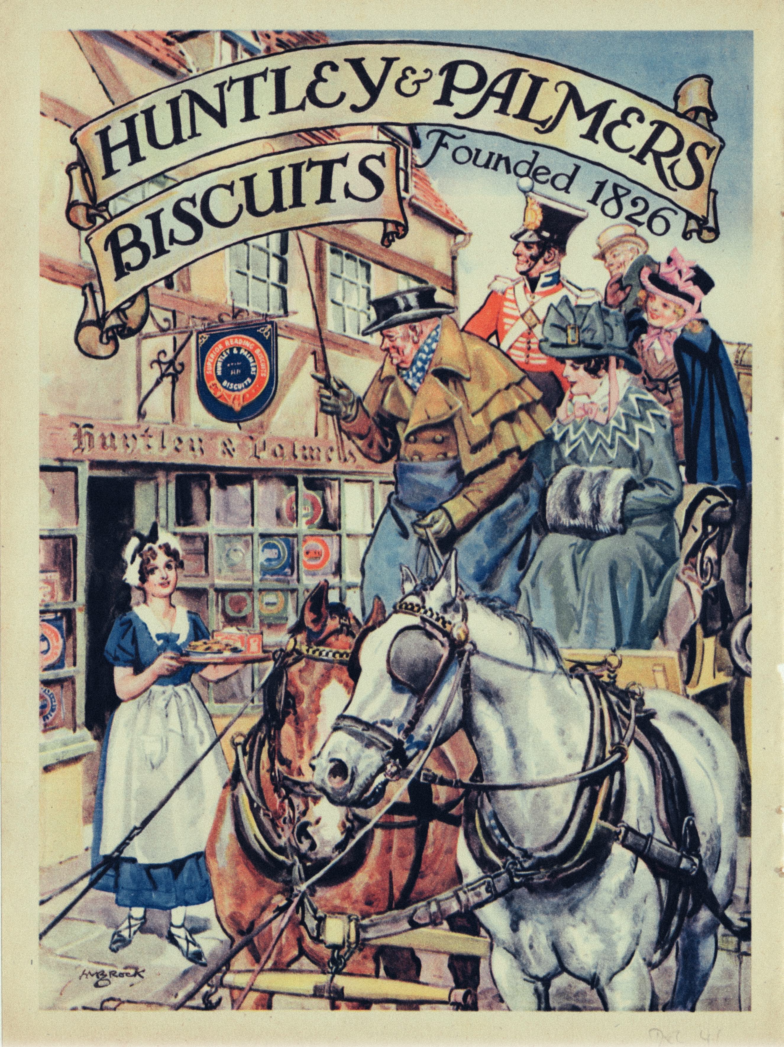
Following on from our previous post is a display of magazine advertising of Huntley & Palmer (H&P) products. H&P never established a reputation for graphic excellence and their output often lacked the kind of house style cultivated by some of their competitors. Which makes for an uneven selection of examples.  The earliest from the 1920s depends on a time honoured cliché of an attractive, sophisticated female with little or no obvious association with the product.  Our model stares disdainfully at what may be a dish of Imperial biscuits but the real reason for her presence is a shapely pair of legs, conscientiously rendered in all their glory.  Schweppes comes to mind as an especially assiduous practitioner of this strategy.  Photographic imagery predominated in the 1930s along with some generally unadventurous graphic design. The savoury biscuit ad from 1937 was an unusual exception. A welcome revival in the use of illustration led to more interesting imagery in the 1950, especially on the part of Pauline Baynes whose ice world fantasy made such an impact in 1953.  C M Brock, usually a dependably competent illustrator contributed an unhappily crude piece of horsey cliché. The single thread running through this selection is the frequent resort to jingoism and in this respect Huntley & Palmer were very much in the mainstream.


Tuesday, 1 February 2022

Deutsche Plakate (1888-1933)

The sheer strength and visual power of German graphics always command attention and admiration.  Their confidence in asserting their message with clarity and simplicity is exemplary. Nothing quite equals the forceful expression of the Sachplakat style - image, text, colour, impact - that was pioneered by Lucian Bernhard in or around 1910.  It was a technique that broke through the visually seductive, decorative and ultimately over-elaborated language of Art Nouveau/Jugendstil that had dominated the previous decade or more. Suddenly all the panels of attenuated floral forms were rendered stale and formulaic.  Distorted and distended letter forms that privileged decoration over legibility gave way to the unadorned brevity of Bernhard’s simple but muscular fonts.  Sachplakat images required no more than a glance from a moving train or vehicle to deliver their content - the accelerating pace of urban life left little time for a leisurely contemplation of the visual complexities of a Jugendstil-inspired poster on a Morris advertising column.  The strong colours and bold imagery of Sachplakat posters were designed to punch through all the visual noise of the urban environment and catch the eye of the consumer in an instant in which the brand name could drill into the unconscious mind.

Based on a Berlin exhibition in 1992, this book (Kunst, Kommerz, Visionen, 292 pages, ISBN 3894660384) is one of the best available surveys of German commercial graphics and many of the illustrated examples have rarely, if ever been seen in other surveys.  The review period is 1888 to 1933 and guides the reader through the early years in which the prime influences were Jugendstil and La Revue Blanche to the Sachplakat era and beyond as the austere Bauhaus geometry became progressively more embedded in the visual culture of Weimar Germany.  What also changed in this period was that advertisers extended their psychological reach into the minds of consumers. It was no longer enough to communicate product information.  Consumers needed to be convinced about the merits of the product in the clearest possible visual language which left no space for gentle persuasion.  Brand names - Persil, Osram, Bosch, Opel, Manoli - needed to be fixed in public consciousness for which Sachplakat was the perfect vehicle, these being the only words you would see on a typical example. The image would be stripped to essentials and expressed via simplified forms and clearly defined areas of flattened colour. Sachplakat was an innovation that prepared the ground in which the Bauhaus philosophy of design could take root and endure.

These page-spreads give a flavour of the book although I have chosen to omit examples from the section that deals with the influence of Expressionism.  This is nothing less than personal prejudice - I have limited appetite for the savagely brushed letterforms and the direct and intentionally crude drawing styles found in the work of Kokoschka, Corinth, Otto Dix and Max Pechstein.  Though I must concede this genre offers a convincing reflection of the ideological conflict and political violence that overshadowed the Weimar era and Otto Dix, in particular, was an enormously impressive painter. I suppose it strikes a discordant note where the main focus is on consumer culture - propaganda versus persuasion. And that might be the point of its inclusion. I have to admit there is value in seeing these distinct genres side by side. Just not here.

Other than to note that the British approach to advertising art was formed in a much more timid, conservative visual culture where innovation was a rich source of ridicule, it seems unfair to make a detailed comparison, given that German designers were able to draw on a much deeper artistic tradition where risk-taking and challenging boundaries was not so unwelcome. There were British designers who were aware of what could be learned from Germany - among them was the figure of Ashley Havinden about whom we posted last year.  In 1926 Havinden and his boss W S Crawford (ad agency founder) visited Berlin on a scouting expedition and met with Bernhard and other designers whose work they were familiar with from the pages of Gebrauchsgraphik then travelling to Munich where they met Ludwig Hohlwein. Following this Crawford established a Berlin office from which to service the Europe-wide Chrysler account which Havinden managed from 1927-28. One of Crawford’s Berlin designers was Terence Prentis (1904-46), whose Chrysler poster is shown below - his work was featured in Gebrauchsgraphik in September 1929. On his return to London Prentis was a co-founder of Colman, Prentis and Varley advertising agency in 1934, a major agency that remained in business until 1974.


Tuesday, 23 February 2021

Paris Métro 1931

Every decade in the first half of the 20th. century one or other of Europe’s colonial powers would mount an exhibition to celebrate and legitimise their imperial dominions and plunder.  The principle audience was a domestic one but it also offered an opportunity to remind rival powers of France’s global reach.  Years of planning and a purpose built exhibition building was essential to do justice to the scale of the colonial project and L’Exposition Coloniale opened in May 1931. A subsidiary aim of the exhibition was to portray the French colonial presence as enlightened and benign as if colonial subjects were almost equal partners in a global French nation.  We may look back and see a shaming exercise in imperial condescension and national self-aggrandisement but that’s not how the French public would have seen it.  For them it was a powerful reminder of France’s high standing as an international player.  Reinforcing patriotic values at a time when a gathering economic crisis was threatening the stability of a nation rapidly fracturing into political extremes of Right and Left.  Outdoor exhibits were displayed in the Bois de Vincennes and a more scholarly presentation of indigenous arts and crafts was housed in the newly constructed Palais de la Porte Dorée, about which we posted in February 2015.


The public relations staff at the Paris Métro got swept along in the general fervour and marked the occasion with a lavish presentation book proclaiming the wonders and achievements of Parisian public transport, expensively packaged within a metallic finish board cover.  Inside were tipped-in reproductions of specially commissioned paintings of Métro-related subjects and tables of statistics demonstrating the superiority of the Métro over its international rivals. The endpapers were graced with air-brushed Art Deco-styled imagery of the Métro in action that added to the air of luxury the publishers were striving for.  It was not something to be casually handed out to the general public but almost certainly reserved for honoured guests, foreign diplomats and senior officials as a corporate souvenir gift.


Sunday, 5 July 2020

Fridge Full of Cold Cash


There are consumers out there for whom the world of contests, competitions and giveaways is their playground. With hard work and persistence, and a little good fortune they can enrich their lives by turning a box top or postage stamp into a year’s supply of dog food or a trolley-dash through Pets at Home. At the top of the profession, an exclusive minority can be found flying first class, scoffing in Michelin starred restaurants and irradiating themselves on tropical beaches in gated resorts, all at no cost to themselves. Online tools are easily available to search for opportunities and all that’s required is an unshakeable faith in the disinterested generosity of big business and a bulk supply of postage stamps.


These examples are drawn from my mid-century data dump - they have a certain rough charm with their basic, shouty graphics, designed to lift the ads off the page and capture the attention of the ever-hopeful consumer on the lookout for free stuff. New cars are the most frequent offer but a refrigerator stuffed with dollar bills is an arresting prospect that could tempt even the most sober reader. No proof of purchase required and only four statements to be deemed true or false - just spare a thought for the unhappy citizens of Nebraska and New Jersey whose state laws prohibit their participation in this bonanza. Inflation note: the contents of the fridge in 1959 would have to be uprated to $220,000 to maintain the buying power. In cryptocurrency this equates to 23 bitcoins (as at May 2020). How to store bitcoins in a fridge is another problem. Not everything is a sweepstake - sometimes there’s a test of skill where some linguistic agility could come in handy. Completing a sentence on the merits of Ivory Flakes must win the judge’s approval with wordplay or internal rhyming. Another popular task is to bestow a name upon the progeny of a brand character (Borden’s) or find a name for a little sleepyhead (Englander beds).


The most ingenious offer comes courtesy of Remington Shavers - the chance to become your own personal fund manager and launch yourself on Wall Street where unlimited wealth could be yours for the taking. The lucky winner could choose their own share stocks to the value of the sum of a single share in every quoted company on the New York Stock Exchange as at May 31st. 1957. 1957 turned out to be a bear market with a marked decline in stock values. But anyone who chose to invest $1,000 in the newly launched Disney shares would be 3 million dollars better off by 2019.


Friday, 26 June 2020

Bicycles, Watches & Books


As long ago as 1897 the British consumer was subject to all manner of ingenious inducements to favour one branded product over another. Nobody took the philosophy of competition more seriously than the hyperactive Lord Leverhulme in his mission to cleanse the Victorian working class exclusively with bars of Sunlight and Lifebuoy soap. Sunlight was a laundry soap, launched in 1884 while Lifebuoy was for personal use and had only been on the market for 2 years. Lux soap was still 2 years in the future. Plenty of long-standing competitors (Pears’, Wright’s Coal Tar, Hudson’s, Vinolia*) were prolific advertisers and Leverhulme’s response was to extend the reach of his advertising from general to specialist periodicals and launch lavishly funded promotional rewards designed to tie customers to his brands. To claim a prize a customer had to submit a minimum of 50 Sunlight or Lifebuoy wrappers. Combinations of the two weren’t acceptable. This was a major challenge for the average user and almost insurmountable for those who aspired to win a bicycle since the value of the prize was proportionate to the number of wrappers sent in. It’s safe to say that the additional sales revenue must have comfortably exceeded the value of prizes won by the fortunate few. History doesn’t record whether interested parties formed themselves into syndicates to pool their resources - even if successful they would have faced the problem of how to divide the ownership of a bicycle or a pocket watch. Advertisers are never less than one step ahead of consumer resistance and one failsafe technique is to present the manufacturer as a paragon of disinterested generosity, showering its loyal customers with munificence. In the last decade of the Victorian era, consumer business expanded at speed and famous brands intensified the battle for supremacy. A very different story from the languid Fin de Siècle decadence that prevailed in the expressive arts.

*Hudson’s Soap was acquired by Leverhulme in 1908, Vinolia in 1906 and Pears’ in 1920. When Simple Skincare was bought by Unilever in 2010, it became the owner of Wright’s Traditional Soap, as it is now known.


Tuesday, 7 April 2020

Au Bûcheron


Au Bûcheron was a luxury Parisian furniture store with a wealthy clientele and a flair for publicity that led them to engage the services of the best of contemporary graphic artists including A M Cassandre, Rene Vincent and Paul Colin. The business name was lettered in a variety of Deco-style stencil fonts. Cassandre created a dynamic trademark in the form of a woodcutter wielding an axe on a falling tree, enclosed in an inverted triangle that was launched at the 1925 Exposition des Arts Decoratifs at which Au Bûcheron was an exhibitor. The activity of the lumberman was the start of a long process of refinement involving sawing, planing, assembly, veneering followed by buffing and polishing - all for the admiration of the incurably fashionable. Premises were on the prestigious rue de Rivoli but the company left their mark all over Paris in the form of oversized poster installations, large enough on occasion to all but obliterate the host building. Very much in a Parisian tradition of aggressive on-street advertising. The story is told in this magazine article from Commercial Art, No. 26, June 1929.