Sunday 31 August 2008

Canal Saint-Martin


There must be something to be said for taking a trip on board one of the enormous cruisers that ply between Bastille and la Villette along the Canal St-Martin. As an experience in slow travel it may have something to commend it but the best way to see the canal is surely to walk it. That way you can set your own pace, cross from side to side where bridges permit, explore the side streets and watch the cruisers pass through the locks from the vantage point of the footbridges. There will be no amplified tour guide instructing you in what to see and, by implication, what is not worth looking at. The only guide worth following on this journey is the estimable Richard Cobb, an urban explorer with an absolute dedication to the untrodden track. The centrepiece of Cobb’s 1980 book, The Streets of Paris (with photographs by Nicholas Breach) is an exploration of the canal and its byways in which he eloquently evokes its long lost heyday as the major trading route between Paris and the Low Countries when the bars, cafés, restaurants and hotels along the quais catered to the needs of a transient working class population. The neighbouring streets were home to a multitude of small businesses, artisans and craftsmen, repair shops and hand-laundries.


Walking south from Jaurés along the quai de Valmy the first lock is marked by a canopy of trees at Square Eugène-Varlin that shelter the cheerfully named écluse des morts (lock of the dead). From the footbridge can be seen the first glimpse of the magnificent 120° curve that presents a vast sweeping expanse of waterway, wide enough to accommodate 3 Grand Union Canals. The curve gives way to the next lock spanned by the passerelle des Récollets, also known as passerelle de l’Hôtel du Nord. The hotel on the quai de Jemmapes gave its name to the famous Marcel Carné film of 1938 although the external hotel footage was all filmed on a purpose-built set. No longer a hotel it continues as a bar and restaurant.


At the southern end of the Square des Récollets is the Pont tournant de la Grange-aux-Belles, the first of two such bridges that enable canal traffic to assert some priority over vehicular traffic when they swing back to allow boats to pass through. Next up is the Pont tournant de la rue Dieu and finally, the Square Frédérick-Lemaître at which point the canal dives underground for the last stretch to Bastille. The gentrification of the canal-side that Cobb foresaw is pretty much complete by now but even if it’s no longer possible to enjoy the sight of long lines of heavily laden barges streaming north to Belgium, less spectacular pleasures are still available. In particular there are railings to lean against, steps to climb, benches to sit on and countless other locations from which one can observe and do absolutely nothing. There is space, atmosphere, water and reflected colour and light to engage the senses and a perfect sense of insulation from the frenetic turbulence of the city. No serious flâneur can afford to miss it.


Saturday 30 August 2008

Quartier de l’Europe


To the north of Gare St-Lazare and south of the boulevard des Batignolles in the 8th. is a radial network of streets and boulevards named after European cities and centred on the Place de l’Europe. The Place de l’Europe is actually a bridge over the rail tracks leading into Gare St-Lazare. Constructed in the 1860’s as a speculative venture the blocks of apartments give the area a very distinctive feel in which deep perspectives converge dramatically on broad intersections. Artists attracted to the idea of contemporary living began to occupy the spacious studio apartments. In July 1872 Manet moved into the area when he took a studio at 4 rue de Saint-Pétersbourg. The family home of Gustave Caillebotte was nearby on rue de Miromesnil. In a few years both Manet and Caillebotte were to find their subject matter on the streets where they were living and in 1877 Monet would carry out his concentrated pictorial exploration of the hinterland of Gare St-Lazare. Manet’s painting The Railway, based on the street outside his studio was exhibited at the Salon in 1874. Caillebotte exhibited his two masterpieces, Le Pont de l’Europe and Temps de Pluie, in 1877 so this particular year represents a high point in the artistic significance of the neighbourhood.


So, what remains? The air of modernity is long since departed but the fabric is remarkably well preserved. The distinctive lattice-work girders of the Place de l’Europe were replaced by railings in the 1930’s and the Goods Depot to the north east of the bridge has given way to a PTT sorting office with a brutalist concrete profile. There is a Métro entrance in the middle of rue de Madrid but otherwise much is as it was. Paris traffic races through the streets between monumental facades that are little changed from over 130 years ago. The plunging perspectives are the most tangible reminder that this territory was the arena for modernist painting’s very first encounters with an urban environment conditioned by speculative building on an industrial scale. The impersonality of city life, the weariness and boredom of routine and the impact of mass transit all came under the painter’s gaze. For Monet it was the sight of an urban reality transcended by smoke and steam, soot and sun that engaged his interest. Manet and Caillebotte shared a taste for penetrating the soul of the city by profound engagement with the ordinary and the unexceptional. The question is, do these streets still echo, however faintly to the footsteps of these long deceased investigators of urban alienation? Further consideration of this and other related matters will follow soon.

Tuesday 19 August 2008

Vous devez valider votre titre de transport


Seasoned visitors to Paris will often tell you that the bus offers the best way to see the ‘real’ Paris. They do have a point – the open-air street level views are endlessly fascinating and for the most part, tourists use the Métro leaving the buses to ‘genuine’ Parisians. The route network often leads through some of the most neglected areas into some of the most opulent providing a more diverse experience than the Métro. The street scene is not the only diversion. Fellow passengers tend to be working Parisians with an aversion to the Métro. Most bus drivers will find that there is always one passenger who will stand next to him at the front of the bus and keep him entertained with an interminable monologue. Invariably male and of advancing years they often have the air of former employees. Travelling on an 86 bus from Bastille to Saint-Mandé we noted that they were operating a relay system, as one got off at Nation, another got on board. To be fair, the bus drivers appear grateful for the company and actively participate in the conversations.


Another point of interest is to observe how few actually pay for their journey. Tickets (or Navigos) have to be validated as you board but only a minority seem to do so. Most seem to have calculated the cost of being fined in an inspection would be less than the amount spent on paying for tickets. It’s quite common to see people manoeuvre items of furniture on board, my favourite being a wardrobe which was manhandled on and off a bendy-bus.


When it does happen, an inspection is a sight to behold. A group of 10 to 15 paramilitaries in navy blue uniforms split up to cover every exit and entrance to the vehicle and send a task force on board to check every passenger. Despite the mob-handed security there always seems to be at least one that makes a break for freedom and disappears at speed into the crowds. The impact of Parisian buses on art and literature has not been great but a notable example is Raymond Queneau’s virtuoso Exercices de Style (1947) in which he retells a brief anecdote set on a bus in 99 different, and always entertaining, ways. The 84 bus, on which Queneau posed for a photograph, still runs from Panthéon to Porte de Champerret.

Monday 18 August 2008

When Death is on the Cards


Continuing with our history of the world in postcards we come to some examples that deal in more macabre imagery. Only a minority of travellers feel the need to send postcard images of death to their loved ones at home but for those whose taste runs in this direction there is a surprisingly generous selection to choose from. This cheery image of a high-voltage device for the comfortably seated termination of human life could be just the thing for an errant offspring with a tendency to stray from the path of righteousness. The chair was last used in August 1963 at which point Andy Warhol began a series of paintings in which multiple images of the chair were silk-screened on to canvas in rich decorators’ colours.


The images of skulls and bones stacked high in crypts might have a salutary effect on the family hedonist and draw him or her back to a life of virtue and simplicity. The Hindu cremation serves as a timely reminder of human transience. The cards showing Indian Burial Grounds come from St. Augustine, Fla. (upper) and Salina, Kansas (lower). They remind us that postcards, like so much of the constant flow of images that passes through our field of vision, present us with anonymous human likenesses deprived of their personal histories and sometimes we must make the effort to recall that they are no less entitled than anyone else, to a sense of human dignity.


Friday 15 August 2008

Go Greyhound


Today we return to a subject I wrote about last summer, the Greyhound Bus and its distinctive corporate image. All the mainland US states are stitched together by this network of bus routes and the Greyhound survives to this day as one of America’s enduring icons. In terms of visual style, its greatest impact was in the 1930’s and 1940’s when the company constructed a vast number of city centre bus terminals in a highly developed Art Deco-derived idiom making liberal use of streamlined forms, gleaming tiled surfaces in corporate colours with muscular visual branding and signage. The examples shown here come from linen postcards of the period and present an attractive but somewhat idealised image of the company architecture. The postcards are the subject of a recent book, Greyhound in Postcards: Buses, Depots, and Post Houses, details can be seen by clicking here.


While air travel was the preserve of the wealthy, the company’s main competition came from the railroads. The heyday of railway station building was long past by the 1930’s and the railroads were left with oversized and expensive to maintain structures that had become to look antiquated. The strategists at Greyhound exploited their advantage by developing compact structures with a high degree of visibility and an indelible association with Modernism and Streamline Graphics. From 1937 the lead architect responsible for these designs was William S. Arrasmith (1898-1965) of the Louisville firm of Wischmeyer, Arrasmith & Elswick. According to The Encyclopedia of Louisville he designed more than 65 terminals, beginning with this example in his hometown in 1937. He also invented the enamel colouring process with which to clad the buildings in “Greyhound Blue”. The result was that these buildings were extremely effective in the way in which they echoed the blue and chrome trimmed styling of the buses themselves to provide the passenger with a sense of a complete all-embracing experience. In 2006 a book on the subject was published, The Streamline Era Greyhound Terminal: The Architecture of W.S. Arrasmith by Frank E. Wrenick, to read a review, please click here.


Finally, a few examples of Greyhound publicity from the pages of Life and Saturday Evening Post. The Art Deco idiom was not favoured when it came to mass circulation advertising. It would have been exciting if the services of someone like Joseph Binder or A M Cassandre had been employed but more conventional combinations of image and text prevailed. Even so, there’s much to admire in the ingenuity with which the copywriters emphasise the association with the freshness of the great outdoors, thus neatly sidestepping the odour of hot diesel fumes. The advertisers were not slow to spot that the blue livery of the coaches was perfect for making the connection with the air-conditioned interiors. All the discomforts of bus travel, the lack of ventilation, the proximity of strangers of doubtful probity and personal hygiene, the claustrophobic experience of being wedged into your seat, were artfully eliminated from the picture!

Thursday 14 August 2008

Pauline Baynes (1922 – 2008)


This is a tribute to the art of Pauline Baynes who died on August 1st. She was a notably prolific book illustrator, mostly famous for her association with J R R Tolkien and C S Lewis. To read a Guardian obituary please click here. Her work displayed a ready command of a wide variety of styles and idioms in which richly coloured decorative detail was expressed in a crisp linear embrace. The images she created were held together by powerful visual rhythms and her books showed a well judged sense of the disposition of image and text. These are a few examples that I found on my shelves and include my personal favourite, “A Companion to World Mythology”, published in 1979. Also included is a rare excursion into the world of advertising from the early 1950’s in which the imagery of Narnia is artfully deployed in the service of Huntley and Palmer’s Biscuits.

Since writing the above I’ve discovered a first-hand tribute from Brian Sibley that is extremely comprehensive and deeply felt. Please click here to read it.


Thursday 7 August 2008

Favorite Outdoor Sport


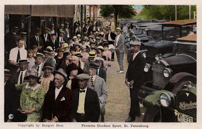
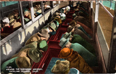
Today we have a puzzle. The postcard above comes with no information other than the caption on the front. Perhaps a solar eclipse was imminent or a display of alligator wrestling. They could be looking forward to a demonstration of tree-cycling or an enthralling trouser-pressing contest. The second image in this series comes from Catalina Island. The mystery here is not so much what they’re looking at (it’s a glass bottomed boat) but why is everyone wearing a hat?

Monday 4 August 2008

Large Letter Postcards


It sometimes seems that there was no town in the United States that was too small or undistinguished for the Curt Teich company of Chicago to design and market a “Large Letter” postcard and enable word of its charms to be dispatched anywhere in the world for the price of a stamp. In their assertive graphic style they have an affinity with California fruit labels with a fondness for bold, three-dimensional letter-forms stretched, compressed, curved and carved. Sunbursts, chevrons, diagonal stripes and dynamic extended curves are marked by strident colour contrasts, often airbrushed, and all employed to achieve a high degree of visibility. As well as tiny, often virtually unreadable, images of local landmarks, the card would sometimes include a sentence about the town’s unique distinction. Some examples follow.

Furniture Center of the World
Soy Bean Capital of the World
Heart of the Panhandle
City of Good Neighbours


This genre of postcard is collectable – click here to see an enthusiast’s collection.


Sunday 3 August 2008

The Tree-cycle


It’s the dream of every civilisation that humankind should develop the ability to climb trees on a bicycle. The Prussian genius for mechanical invention produced this noble effort in the 1920’s but for some reason it failed to capture the public imagination and languishes in obscurity. Sadly, the excitement to be derived from pedalling up tree trunks continues to elude the human race to this day.