Showing posts with label magazines. Show all posts

Tuesday, 23 December 2025

Punch Almanack 1925 - the World of Advertising


Looking back one hundred years when mass circulation printed journals were still expanding their sales and the advertising industry was dependent upon them to an extent inconceivable today. Every year Punch magazine published three special issues that since 1924 had include colour pages of cartoons and advertising - this is a selection of pages from the winter almanack for 2025. Punch was a humorous weekly magazine first published in 1841, founded by Henry Mayhew and Ebenezer Landells. At the time, Mayhew was a prominent playwright and journalist with progressive instincts and an interest in social research.  Ten years on his magnum opus, London Labour and the London Poor (1851) was published, going on become a pioneering landmark in the development of social studies. By contrast Punch was a persistently reactionary publication, patriotic to a fault, obsessed with the empire, the landed gentry and country pursuits.


A reason for publishing the winter almanack was to attract Christmas advertising revenue including premium slots in colour. By 1925 advertising-led consumerism was already flourishing, although only a minority of advertisers were willing to experiment and escape the prevailing preference for verbose text and conservative design and illustration. A rare exception pops up in this issue with E McKnight Kauffer’s salute to the bracing powers of Eno’s Fruit Salt - a singular burst of visual energy in a sea of torpidity.  Harry Rountree does his best to inject some vitality on behalf of Sharp’s Super-Kreem Toffees but most of the featured illustrators strike a decorous note, powerless to resist the copywriters’ insertion of blocks of stodgy text that few would ever read. R T Cooper is worth a mention for his radically simplified limited colour image of a cavalry officer in the service of Gilbey’s whiskey.  The ads for Ovaltine and Mackintosh's Toffee show inventive use of pen and ink. Remarkably, six of these brands are still available in 2025.


Monday, 22 December 2025

Punch Almanack 1925 - the World of Cartooning

The Punch Almanack for 1925 offers a snapshot from 100 years ago of a long defunct popular humorous magazine.   Contributors had a long tradition of expressing offence at the vagaries of fashion in the broadest sense - anything novel or remotely faddish was a subject for mockery.  Less attractive was the tendency to direct their scorn downwards towards the poor and ill-educated as well as those with the misfortune not to have been born British. Non-white  imperial subjects were an especially favoured target for ridicule. Resistance to change was an enduring topic - defence of the vanishing countryside and assault on the tyranny of Modernism and its Cubist sideshow.  Turning to the colour cartoons of 1925, Frank Reynolds was the cover artist, not really at his best with this sombre image of Mr. Punch on horseback but fully compliant with the magazine’s veneration of fox-hunting.  HM Bateman was in an uncharacteristic mellow mood, his habitual malice under restraint. The dancing girl with her legion of admirers is relatively benign while the Plumber’s Paradise in its ramshackle complexity is a nod to W Heath Robinson. Kenneth Bird (1887-1965) signed his distinctive work as Fougasse - his simple style was instantly recognisable and first appeared in Punch in 1916. In 1949 he became the first cartoonist to occupy the editor’s chair at Punch having previously served as art editor since 1937.  Rugby Across the Ages is a product of his lifelong obsession with rugby - speculative projections from the present to the long distant past was a Punch staple. In a sceptical look at modern media Through the Seasons with the Magazine Cover he makes fun of reliance on cliché.  There’s an excellent anthology of Punch cartooning in colour, Best of Punch Cartoons in Colour (2012) edited by Helen Walasek - very easy to find on sale online.


Thursday, 7 November 2024

Leslie Carr on the cover of “Morris Owner”

Images of motoring subjects made up the greater part of Leslie Carr’s output and he had a close relationship with Morris Motors, one of Britain’s most successful volume car manufacturers of the first half of the 20th. century. Morris Owner magazine was launched in 1924 to appeal to existing and prospective customers and in March 1925 Leslie Carr made his first appearance on the front cover.  Many more would follow (as many as 10 in 1926-27) and my selection of 5 is a very small part of his output. Sales were expanding rapidly in the post-war boom as more affordable vehicles attracted the middle class aspiring motorist. The 1920s was the decade of the open air motorist enjoying the freedom of the road in the pre-congestion era. Advertisers were beginning to learn the dark arts of selling dreams and the magazine covers served up a diet of bracing seaside picnics, following the local hunt down empty winding country roads, pitching a tent in deserted beauty spots, bluebell gathering in the woods - all the joys of the new found freedom that car ownership brings.  Carr was a remarkably versatile illustrator with the ability to adapt his style to suit any occasion, always with the support of outstanding drawing skills. A speciality was night scenes where the drama and excitement of contrasting pools of deep velvety darkness and incandescent flashes of artificial light are evoked to perfection. Picture editors recognised this and would routinely assign him to produce a cover for the prestigious Motor Show issues as seen here in 1928 and 1929. If I had to choose one it would be November 1929 where the composition is boldly divided by the angular form of the aircraft wing while the tightly drawn subject matter is confined to the lower third.


Sunday, 18 September 2022

Our Latest Merrie Monarch

It will take some getting used to but within just 48 hours we had a new Prime Minister and a new Sovereign to enhance our lives.  For the former, expectations could hardly be lower, but the latter, for all that he’s been part of the landscape for our entire lives, may surprise us all, though not necessarily in a good way.  This 1952 cover story dates from when he was just 4 years of age and it’s a tribute to the expertise of mid-century character analysts that so much evidence of fine qualities could be deduced from scrutiny of his infant features, though it’s notable they had nothing to say on the subject of intelligence.  It will be fascinating to see how many of these attributes will guide his conduct over the course of his reign but it’s inconceivable that he could display fewer than the new Prime Minister possesses. “Tenacity of Purpose” can be detected in disconcerting abundance, beyond that is mostly a vacuum.


Sunday, 27 April 2014

L’Usine dans la Prairie


The large-format weekly magazine, L’Illustration had been published for 90 years (since 1843) when, with great pride and fanfare, a prestigious new office and print works was opened at Bobigny in the Parisian banlieu. A special issue bulged with photos and architects’ impressions of the nine-storey colossus towering over the hitherto undeveloped fields of the north-western suburbs. The central tower with its giant clock-faces and the stylistic concessions to Art Deco seem designed for another era of success which, unfortunately failed to materialise. During the Occupation of Paris the magazine became a mouthpiece for the Vichy regime and their Nazi masters with the result that it was permanently closed within weeks of the Liberation in 1944. In terms of Graphic Design it was conservative and unimaginative and followed a dreary template similar to that of the Illustrated London News and demonstrated that a large page size was not enough to achieve visual impact. The building still exists – it’s now home to a local university. The bucolic surroundings have not fared well, being swallowed up in the suburban sprawl that now extends for many miles, as far as the CDG airport. 


Monday, 14 April 2014

Airships Dirigibles Blimps Zeppelins


Airship technology is another of those doomed innovations with a glowing future that stubbornly fails to materialise. Immensely popular between the wars when no vision of the future was complete without airships in command of the skies. The airship had proved itself as a leisurely form of international travel although a distressing tendency to premature landfalls or self-immolation rapidly undermined public confidence. In times of conflict it was only effective as an agent of death and destruction in the unlikely event that your opponents lacked a more agile and speedy defence capacity. So the great dream of fleets of floating hotels silently crossing the oceans died a death. The rapid advance of jet engine technology was the final blow as the aviation industry increasingly became addicted to speed. 


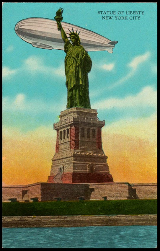
But for a few decades the airship wobbled along on the fringe of viability and enthusiasts continued to develop ever more extravagant plans, quick to capture the public imagination but wildly impractical. Heroic visualisations of gargantuan machines graced the covers of many a magazine with an engineering obsessed readership of impressionable adolescents. For postcard publishers even an embarrassingly incompetent drawing of an airship could be grafted on to refresh a stale and outdated image. As late as 1944 the Goodyear Aircraft Corporation was waxing lyrical about the prospects of the “coming superliner of the skies” and posing the question, “Is this the Luxury Liner of the Future?”


Thursday, 6 December 2012

When love comes to town


Wine and roses scattered on a moon river. Lachrymose balladry pledging eternal love, serenaded in unimpassioned vocals accompanied by an oceanic swell of a thousand strings arranged by Ray Conniff, and punctuated with an inebriated finger-snap from Dean Martin. This was the soundtrack of the Eisenhower years when these romantic illustrations illuminated the fiction pages of American mass circulation magazines. It’s a pictorial journey through the rituals of flirtation from the pick-up, via the proposition and the clinch to the rapturous kiss. Eyebrows are raised, eyelids are lowered, sidelong-glances are exchanged and audiences are scandalised. Cigarettes and alcohol calm the nerves and soothe trembling lips. Jackets and ties were not discarded lightly and the pressure to maintain a convincing show of outward respectability and suppressing all things erotic could not be disregarded. The artistic quality is highly variable – some images are resolutely banal while the best observe their subjects with wit and imagination often suggesting deeper and darker truths to be seen below the surface. Some of the female targets exhibit an air of apprehension as if they can already sense that a future of child-raising, home-making and acting the part of an executive wife may be a high price to pay for material security despite the wine and roses. 


Sunday, 28 October 2012

All Hallows’ Eve


Thanks to a sheltered middle class Anglican childhood I grew up with no awareness of the pagan festival of Halloween and when it finally impinged on my consciousness I assumed it was yet another cultural treasure that crossed the Atlantic from west to east to enrich our meagre existence. Not so – as this artwork by the dashingly named Clixby Watson confirms. Just a few months after the war a toothy pumpkin was bathing these juvenile survivors in its warm glow on the cover of Good Housekeeping. Today’s ever-expanding public appetite for the iconography of supernatural forces seems to march in step with the noisy intrusion of religion into public policy. Both have their roots intertwined deep in our collective past and every generation revives and cultivates them in its own way. These examples of mid-century advertising reveal the extent to which Halloween represented a commercial opportunity for the American confectionery industry.