Showing posts with label railway publicity. Show all posts

Tuesday, 23 February 2021

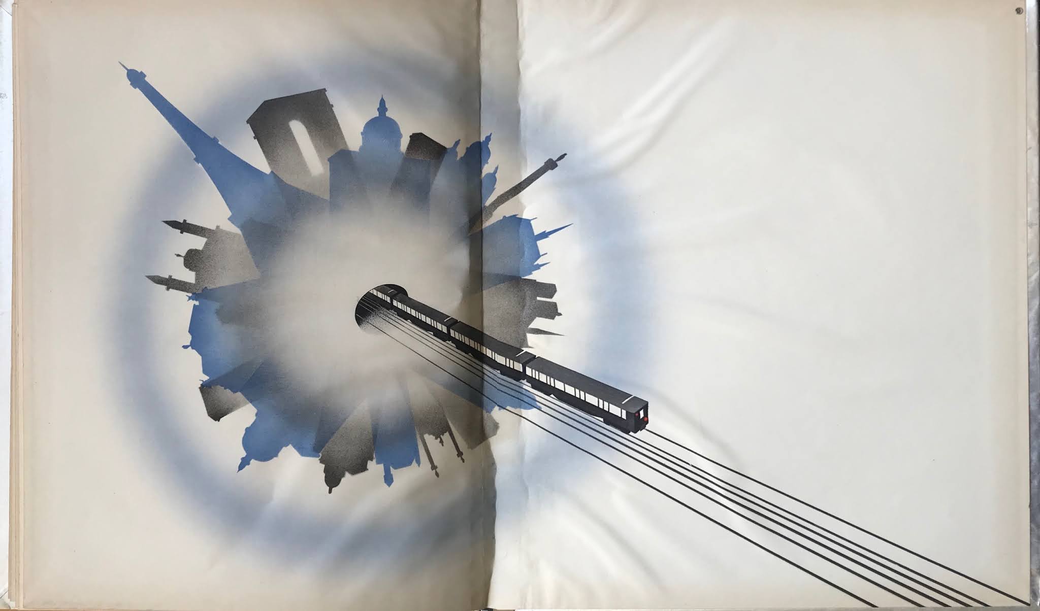
Paris Métro 1931

Every decade in the first half of the 20th. century one or other of Europe’s colonial powers would mount an exhibition to celebrate and legitimise their imperial dominions and plunder.  The principle audience was a domestic one but it also offered an opportunity to remind rival powers of France’s global reach.  Years of planning and a purpose built exhibition building was essential to do justice to the scale of the colonial project and L’Exposition Coloniale opened in May 1931. A subsidiary aim of the exhibition was to portray the French colonial presence as enlightened and benign as if colonial subjects were almost equal partners in a global French nation.  We may look back and see a shaming exercise in imperial condescension and national self-aggrandisement but that’s not how the French public would have seen it.  For them it was a powerful reminder of France’s high standing as an international player.  Reinforcing patriotic values at a time when a gathering economic crisis was threatening the stability of a nation rapidly fracturing into political extremes of Right and Left.  Outdoor exhibits were displayed in the Bois de Vincennes and a more scholarly presentation of indigenous arts and crafts was housed in the newly constructed Palais de la Porte Dorée, about which we posted in February 2015.


The public relations staff at the Paris Métro got swept along in the general fervour and marked the occasion with a lavish presentation book proclaiming the wonders and achievements of Parisian public transport, expensively packaged within a metallic finish board cover.  Inside were tipped-in reproductions of specially commissioned paintings of Métro-related subjects and tables of statistics demonstrating the superiority of the Métro over its international rivals. The endpapers were graced with air-brushed Art Deco-styled imagery of the Métro in action that added to the air of luxury the publishers were striving for.  It was not something to be casually handed out to the general public but almost certainly reserved for honoured guests, foreign diplomats and senior officials as a corporate souvenir gift.


Monday, 23 March 2020

Railroads on Parade 1939-40


This card covered publication was published to accompany Railroads on Parade, a musical pageant celebrating the early days of American railroads at the New York World’s Fair of 1939-40. The Railroad Building was the largest in area at the entire Fair. On the wraparound cover illustration we are shown how the power of steam left the ponies and oxen far behind - at the top an exotic streamliner represents the peak of contemporary technology. Famous mural painter, William A Mackay was the cover artist - it was his misfortune to die of a heart attack on a New York subway train in July 1939, less than 3 months after the Fair opened its doors on April 30th. It sets the tone for the anachronistic folksiness of the theatrical presentation. Kurt Weill was commissioned to compose the music. Since arriving in America in 1933, Weill had immersed himself in the American Songbook and mastered the idioms of the Broadway musical and popular song - this was his first opportunity to compose for a mass audience. Tickets were sold for only 25 cents and the auditorium could seat 4,000 spectators at up to 4 shows a day. The fair was a massive corporate jamboree designed to dazzle the American consumer with visions of future plenty. Major firms competed to offer the most architecturally extravagant pavilions in which to present the technology of the future. The railroad industry looked to the past and devised a historical pageant that catered to the public appetite for nostalgia as well as displaying the latest in locomotive development to build the market for future travellers. Please follow the links below for past posts on the World’s Fair.

World of Tomorrow
Meet the Middletons


Tuesday, 15 August 2017

Santa Fe Railroad Advertising


The Atchison, Topeka and Santa Fe (routinely shortened to Santa Fe) was one of the three major railroads operating trans-continental passenger routes across the USA. The others were Union Pacific (Road of the Streamliners) and the Burlington Route (Vista-Domes and Zephyrs). The Santa Fe comfortably outperformed its competitors in terms of publicity – consistently more imaginative and eye-catching. Santa Fe played up its connection with the Native American traditions over whose lands its tracks passed. And when it came to named trains Santa Fe had by far the most extensive portfolio – including the Super Chief, El Capitan, California Ltd, the Grand Canyon, and San Francisco Chief. While the competition offered Domeliners, Astra Domes and Vista-Domes, Santa Fe tempted travellers with the louche delights of Pleasure Domes. The on-board catering was supplied by the Famous Fred Harvey and ranged from “beefsteak or brook trout to pheasant à la Périgueux”. From 1937 Santa Fe painted its fleet of streamline diesel locomotives in what became known as Warbonnet livery, as seen above. A Native American Circle and Cross motif was displayed on the loco front together with the name of the railroad on a bright yellow ground, itself surrounded by a bright red wrap that extended on to the loco sides in the form of a bonnet. A designer at General Motors (Leland A Knickerbocker) came up with the concept and it was eagerly adopted to great effect by Santa Fe. Competing railroads had trains that were every bit as visually spectacular as Santa Fe’s but their stodgy advertising and publicity was no match for Santa Fe’s bold and colourful offerings. An earlier post featuring Santa Fe advertising can be seen here.


Wednesday, 5 October 2016

Road of a Thousand Wonders


This extravagantly produced book dates from around 1910 and promotes the scenic value of a train journey through the High Sierras from San Francisco to Salt Lake City on the Southern Pacific railroad. Generously illustrated with more than twenty tipped-in photochroms of highlights along the permanent way, it made a fine souvenir of a memorable trip. This copy comes with terse annotations from its original owner who signed herself as Nellie when she inscribed it. The selected images make a pleasing mixture of the sublime and banal, alternating views of soaring mountain peaks and shimmering lakes with dairy farms, hydraulic mining and pulp mills.