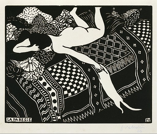
The largesse of Big Pharma is still honoured at the Royal Academy where the wing that bears the infamous Sackler name has been hosting a show of paintings and prints by the Swiss born artist, Félix Vallotton (1865-1925). Vallotton’s position in art history rankings is not especially elevated. Until recently, his reputation rested mainly on the stark and brilliantly inventive satirical woodcuts and illustrations produced in the 1890s while his paintings were little regarded – widely considered bourgeois, academic and unadventurous. The quality of his prints is beyond dispute and the paintings have, in recent years, attracted a wider audience, more receptive to narrative values and the dark, psychological undertones often to be found beneath the smooth, untroubled paint surfaces.

In 1913 Vallotton was looking back half a century to Manet’s Olympia and making his own reworking of Manet’s original. Vallotton has pushed Olympia’s head back into her pillow and closed her eyes – her hips and lower body have been rotated towards the viewer. The power of Manet’s image drew on the confrontational pose of the model, which Vallotton reversed, replacing insolence with indolence. The servant figure shares the same ethnic identity as her original but her relationship with the model has changed from respectful anonymity to that of a companion with her own assertive characteristics. She has stepped forward and sat at the end of the bed from where she directs an unfathomable stare toward the model. The hand-rolled cigarette between her lips suggests a feeling of indifference bordering on low level hostility. But none of this can be claimed with any great certainty because the artist has taken great care to confound any easy interpretation.

Vallotton kept returning to the female nude throughout his career. It was the most problematic part of his output for contemporary audiences and remains so to the present. Concerns about immodesty and exposure may have faded over the century but today’s spectator would be hard pressed to examine most of Vallotton’s paintings of the nude figure without at least a twinge of embarrassment or incredulity. As a cold and dispassionate recorder of female flesh, Vallotton strikes a discordant note, confronting the viewer with a disconcerting sense of physicality that is both emotionally distant and assertively present. An element of distortion and a tendency toward an intentionally clumsy articulation of form, compounds the unease. We have to conclude that Vallotton was not immune to the current of misogyny typical of the Symbolists. Confirmation of this tendency could be found in his writings (he wrote 3 novels, two of which were published in his lifetime) – in 1918 he wrote, “What great evil has man committed that he deserves this terrible partner called woman?” The sentiment, if not the idiom, would gather him a legion of alt-right, incel followers on Twitter.

What little we know of his character and personality suggests a complicated man, remote and sceptical by nature with a capacity for acute observation of human folly. As a Swiss born artist making his way in avant-garde circles in fin-de-siècle Paris, he was always something of an outsider – an acquaintance from that period noted how Vallotton would appear to enter a room sideways and always seemed to be on the defensive. Vuillard and Bonnard became friends and comrades and association with Les Nabis influenced some of the most adventurous compositions of his entire career in the late 1890s. Like Seurat, he seemed attracted to the ideology of anarchism without ever making a single gesture of commitment other than the portrait of “Félix Fénéon at the Revue blanche”. Resistance to social injustice was a frequent theme in his prints but there is no evidence of any involvement in radical causes.

Vallotton’s woodcut prints offer a convincing portrait of turn-of-the-century Parisian street life, dramatically expressed in harsh contrasts of black and white in which fast moving events are compressed into radically simplified compositions by adapting techniques of visualisation borrowed from the art of Japan. Complex forms made simple without any loss of vitality or animation. The themes he explored – political protests, riots, accidents, parades, street performers, itinerant traders and arrests had all the elements that would fascinate a later generation of photographers. When he had the chance, Vallotton would leave his prints behind to focus exclusively on painting. There was some continuity of subject matter but street life would be an infrequent area of interest, unlike the world of interiors.
In a series of woodcuts entitled “Intimités” Vallotton turned a jaundiced eye on the field of relationships between the sexes. The visual language was even more stark as he intruded into the private lives of couples behind closed doors, captured in the act of mutual seduction, pleading, bartering, and deceiving. The air is heavy with hypocrisy, boredom, resentment, lust, betrayal and isolation. In Vallotton’s universe there is no contentment that is unaccompanied by remorse, shame or regret. His eye is tuned to record brief moments of furtive bliss, doomed to evaporate in an instant of disillusion. Couples illicitly embrace in a suffocating airless environment as the anguish of exposure curdles their pleasure. Every amorous encounter is a source of high anxiety or a product of soulless negotiation.
At the age of 34 in 1899, Vallotton married a wealthy and well connected widow, two years his elder. The bride was a daughter of the Bernheim art dealer family, Gabrielle Rodrigues-Henriques. His fortunes were transformed as he embarked on a new life of domesticity and prosperity. Relocated from his Left bank studio to the haut-bourgeois comforts of the 9th. arrondissement and freed from the imperative to pay his way, he redirected all his energies to painting. With an irony that may not have escaped him, he would go on to paint an extensive set of interiors in which the bourgeois dream of respectability, and financial and emotional security that he now enjoyed, is forensically undermined and exposed as a fraud.
I’ve been fascinated by Vallotton since 1976 when the Arts Council put on an exhibition of his prints. The blend of sensuality and political and social comment, so thrillingly expressed was immediately attractive. The recent discovery of Frans Masereel’s wordless novels and an addiction to Film Noir smoothed the way for Vallotton’s terse and uncompromising graphics. It was interesting that while Masereel maintained a lifelong commitment to revolutionary politics, for Vallotton it was a very brief stop on a long and meandering road that led to material prosperity and a spiritual disillusion that seemed to consume him. He would track backwards and forwards through his favoured subject areas from portraits to interiors, from nude studies to still life, and from landscape to allegories but nothing would equal the impact of the graphic work from his first decade in Paris. The paintings that preoccupied his last 25 years had their admirers and patrons but a lack of quality control and a sense of detachment from contemporary developments left him overlooked and largely ignored. It’s only right that recent generations have revalued his work and found much that intrigues in terms of psychological complexity. The shadow of misogyny that hangs over his more problematic work is not so great as to diminish the emotional power of his best paintings.
Apollinaire, the most flamboyant critic of his age, found very little good to say about Vallotton. At best was some grudging praise for his technical facility but Apollinaire could not accept the comparisons made between Vallotton and Ingres – repeatedly dismissing Vallotton for his “cold sterility” and “funereal qualities”. He was offended by Vallotton’s self-satisfaction and went so far on one occasion to advise his readers “not to stop this year in front of Vallotton’s painting”. Vallotton was scornfully described as owing more to Douanier Rousseau than to Ingres. Apollinaire included Vallotton in a list of artists whom he condemned for “debasing the last vestiges of great Classical art”. Vallotton responded to Picasso’s portrait of Gertrude Stein of 1906 by requesting Stein to allow him the same access. Stein agreed and the finished painting was noted for its affinity with Ingres’s portrait of “Monsieur Bertin” that hangs in the Louvre. She revealed her surprise at how Vallotton would work his way in stages down the canvas from the top, never revising or retouching after arriving at the bottom. This was confirmed by other sitters and may be the only thing that Vallotton had in common with Stanley Spencer.