Showing posts with label illustration. Show all posts

Tuesday, 30 June 2026

Eric Fraser at the Seaside

Eric Fraser designed and illustrated this ad for Guinness for publication in the summer of 1951 - the year of the Festival of Britain on London’s South Bank. A gallery of Victorian seaside characters has been assembled in a nostalgic exercise, celebrating the past.  A curiosity of the Festival iconography is the prevalence of Victorian associations and imagery in an exercise designed to embrace the excitement of the future. Most of these stereotypes have long receded into history but the Masher is still with us, though he has swapped the promenade for the manosphere and the dating app. The Punch and Judy Man and the Pierrot were key players in the world of seaside entertainment - a major activity in the first half of the last century, rapidly moving towards extinction by 1951. The concealed charms of the Bathing Belle had given way to a new era of exposure and the prudish Bathing Machine (beach hut on wheels, usually horse-drawn) had long since performed its final trundle along the English foreshore. Producers of vintage postcards captured all these characters at the height of their powers - some examples are posted below. Often they are incidental captures, minor parts of a much broader picture but occasionally a more imaginative photographer will focus on the documentary detail. The Masher was a figure of fun and more likely to turn up on hand drawn illustration postcards. This selection starts at Hastings with a Punch and Judy show of modest dimensions, then moves on to Scarborough, Millport, Clacton and other resorts where Pierrots and Minstrels take to the stage, to be followed by some more generic examples. In another post, the Masher and the Bathing Belle will be considered.


Sunday, 12 April 2026

In Honour of Glen Baxter

In a long career Glen Baxter (who died at the end of last month) created a fine body of work that resisted categorisation. Evolving a style of drawing that gently parodied the banalities of mass market illustration, his imagery had the clarity and simplicity of a textbook diagram combined with the sense of mystery that lay beneath the expressionless surfaces of Magritte’s paintings. In vintage picture books for children he discovered the joys of captions that stated the obvious in utilitarian language with a reckless disregard for the perils of the double-entendre or misinterpretation.  Many of his regular cast of characters came from the same source - the intrepid but hapless explorer, the denizens of Sherwood Forest, cowboys, boy scouts, ancient mariners and deep sea divers. The frisson generated when caption and image pull in separate directions amplified the incongruities that he delighted in exploring. Defining his work by genre or designation feels like a fool’s errand. For some, he was a cartoonist, others saw an illustrator, for me, he was simply an artist. Art world references abounded and it’s intriguing that he exhibited in such disparate galleries as Nigel Greenwood (home of Artists’ Books, Conceptualism and Gilbert and George) and Chris Beetles (citadel of figurative illustration).

In his 1980s prime, Baxter found himself approached by advertising agencies and his artwork began to appear in newspapers and magazines.  In 1987/88 Brooke Bond tea made use of his talents in a trio of full colour amusing drawings - the image of tea-making on the ocean floor was especially arresting.  A commission from Gilbey’s Gin was not without problems due to the client’s persistent efforts to include a ‘pack shot’, it eventually appeared in both newspapers and magazines.  Art postcards enjoyed a season of popularity in the 1980s and many Baxter drawings were reprinted in this format. A further ‘brand extension’ came in a range of Poole Pottery with Baxter designs. There are few more prestigious clients for editorial illustration than the New Yorker and the Glen Baxter Wall Art page displays 79 examples. And the books kept coming, in which every few pages an image guaranteed to astound and amuse would surface. As long ago as 1983, Miles Kington in a slightly ungracious review concluded that Glen Baxter needed to find a new act. Thanks perhaps to never scaling the heights of celebrity status he was able to refresh and renew his distinctive offer, while avoiding ubiquity and the deathly slide into unfashionability.


Tuesday, 23 December 2025

Punch Almanack 1925 - the World of Advertising


Looking back one hundred years when mass circulation printed journals were still expanding their sales and the advertising industry was dependent upon them to an extent inconceivable today. Every year Punch magazine published three special issues that since 1924 had include colour pages of cartoons and advertising - this is a selection of pages from the winter almanack for 2025. Punch was a humorous weekly magazine first published in 1841, founded by Henry Mayhew and Ebenezer Landells. At the time, Mayhew was a prominent playwright and journalist with progressive instincts and an interest in social research.  Ten years on his magnum opus, London Labour and the London Poor (1851) was published, going on become a pioneering landmark in the development of social studies. By contrast Punch was a persistently reactionary publication, patriotic to a fault, obsessed with the empire, the landed gentry and country pursuits.


A reason for publishing the winter almanack was to attract Christmas advertising revenue including premium slots in colour. By 1925 advertising-led consumerism was already flourishing, although only a minority of advertisers were willing to experiment and escape the prevailing preference for verbose text and conservative design and illustration. A rare exception pops up in this issue with E McKnight Kauffer’s salute to the bracing powers of Eno’s Fruit Salt - a singular burst of visual energy in a sea of torpidity.  Harry Rountree does his best to inject some vitality on behalf of Sharp’s Super-Kreem Toffees but most of the featured illustrators strike a decorous note, powerless to resist the copywriters’ insertion of blocks of stodgy text that few would ever read. R T Cooper is worth a mention for his radically simplified limited colour image of a cavalry officer in the service of Gilbey’s whiskey.  The ads for Ovaltine and Mackintosh's Toffee show inventive use of pen and ink. Remarkably, six of these brands are still available in 2025.


Monday, 22 December 2025

Punch Almanack 1925 - the World of Cartooning

The Punch Almanack for 1925 offers a snapshot from 100 years ago of a long defunct popular humorous magazine.   Contributors had a long tradition of expressing offence at the vagaries of fashion in the broadest sense - anything novel or remotely faddish was a subject for mockery.  Less attractive was the tendency to direct their scorn downwards towards the poor and ill-educated as well as those with the misfortune not to have been born British. Non-white  imperial subjects were an especially favoured target for ridicule. Resistance to change was an enduring topic - defence of the vanishing countryside and assault on the tyranny of Modernism and its Cubist sideshow.  Turning to the colour cartoons of 1925, Frank Reynolds was the cover artist, not really at his best with this sombre image of Mr. Punch on horseback but fully compliant with the magazine’s veneration of fox-hunting.  HM Bateman was in an uncharacteristic mellow mood, his habitual malice under restraint. The dancing girl with her legion of admirers is relatively benign while the Plumber’s Paradise in its ramshackle complexity is a nod to W Heath Robinson. Kenneth Bird (1887-1965) signed his distinctive work as Fougasse - his simple style was instantly recognisable and first appeared in Punch in 1916. In 1949 he became the first cartoonist to occupy the editor’s chair at Punch having previously served as art editor since 1937.  Rugby Across the Ages is a product of his lifelong obsession with rugby - speculative projections from the present to the long distant past was a Punch staple. In a sceptical look at modern media Through the Seasons with the Magazine Cover he makes fun of reliance on cliché.  There’s an excellent anthology of Punch cartooning in colour, Best of Punch Cartoons in Colour (2012) edited by Helen Walasek - very easy to find on sale online.


Tuesday, 27 May 2025

Bourneville 1925 Transport

Another Cadbury brochure published to explain the business of chocolate manufacturing to the general public, based on the notion that the public appetite for geography and economics was as great as the appetite for chocolate. A hundred years have passed since Frank Newbould was commissioned to provide the illustrations - a perfect choice given his expertise in transport and industrial process. Newbould’s cover combines road, rail and maritime traffic into a single composition, enhanced by an elevated viewpoint. Designed to impress with the unstoppable energy of commerce, Newbould has omitted any distracting details to focus on the triumph of mechanisation. There’s a map to show us the global presence of Cadbury, drawing in raw materials from every continent via a network of commercial shipping - what we would now call the mysteries of the supply chain. Export cargoes were nailed into wooden packing cases requiring enormous supplies of raw timber from Russia and Scandinavia, moved by rail to Bourneville to be machined in the company saw mills. Cocoa beans, sugar and hazel nuts were stuffed into sacks, that in turn were lashed into nets to be craned on and off mixed cargo ships.  Newbould shows an early stage in the travels of the cocoa bean where local labour loads heavy sacks into small boats that rendezvous out at sea with cargo liners too large to enter the port.  A fair weather vision of breezy skies and surf in which hard labour looks effortless.

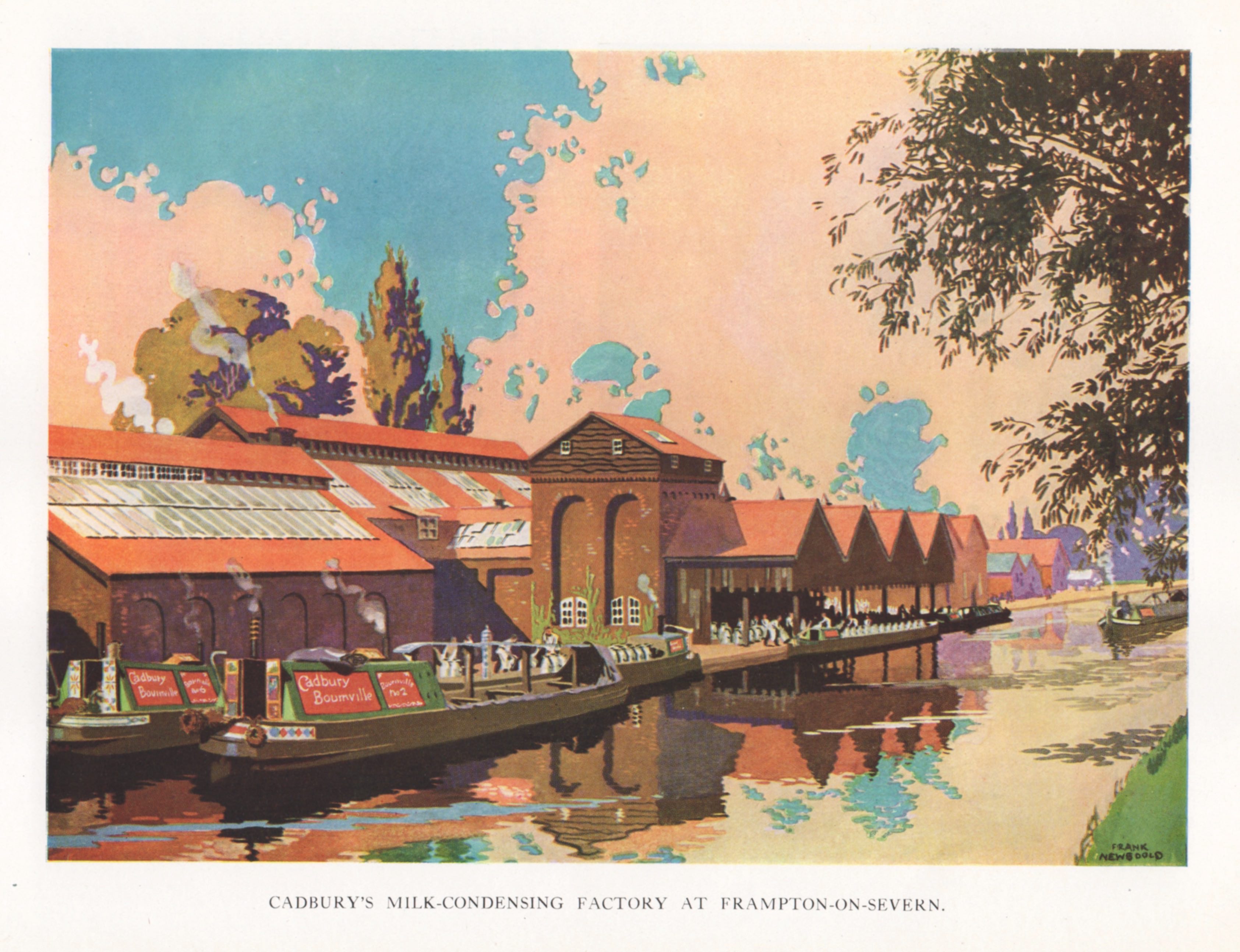
Equally idyllic is Newbould’s bucolic vision of a canal-side milk processing factory built in a restrained vernacular, barges and narrow-boats serenely chugging by. In a double page illustration across the centre pages, Newbould’s attention turns to the Bourneville factory in an aerial view that attempts to balance the vastness of raw industrial power with the sense of the factory cosily enveloped by the splendour of a verdant English countryside in high summer. To finish, Newbould observes the end of the process when the boxed finished products are loaded on to trains by sack truck and trolley.  The facility has all the features of a conventional station minus the passengers. Once again we are invited to admire the scale and complexity of operations thanks to Newbould’s control of colour to create a perfect sense of clarity. Cadbury invested heavily in a wide output of promotional publishing from collectors’ cards and albums to factory guides and brochures like this. Newbould was re-employed in 1927 and dispatched to Trinidad where he made a varied portfolio of location images that featured in Bourneville 1927, Cocoa Story. It can be seen in my post from August 2010.


Sunday, 3 November 2024

Leslie Carr illustrates "By Road, Rail, Air and Sea" (1931)

Fourteen years have passed since I last wrote about the illustrator and poster artist, Leslie Carr and noted the lack of online biographical information. That situation has changed and a lot more detail has emerged about his life and work. We now know he died in the town of his birth, Hove, in 1969 and in his last decade was employed as Art Director for The Motor magazine. In the First World War he served in the Tank Corps and during the Second World War he was a member of the Auxiliary Fire Service. Carr painted a series of paintings of wartime subjects based on his experiences, one of which sold at auction in 2018 for £16,000 after a pre-sale estimate of £200 to £400.

Today’s images come from a Blackie picture book for children published in 1931 titled By Road, Rail, Air and Sea for which Carr supplied the cover art and the majority of illustrations. The cover is a busy dockside scene in which all four transport types are combined in a single image in which areas of unmodified colour are enclosed by crisply incisive contours. In the spirit of the time he mostly employs a sachplakat style, to which he occasionally (and sometimes incongruously) adds some vigorous cross-hatching. Drawings are considered and precise with a subtle and inventive colour palette and at their most radical (the paddle-steamer) display a near-Japanese quality of repose. Examples of his poster work can be seen at Art UK and the Science and Society Picture Library.