Showing posts with label victorian. Show all posts

Tuesday, 21 October 2025

East Midland Arcades

The East Midlands cities of Nottingham and Derby both have vintage shopping arcades from very different eras. The Strand Arcade in Derby dates from 1881 and pre-dates the Council House Arcade (1928) in Nottingham by about 47 years. They also differ in scale - the Derby arcade is a conventional Victorian design, comparable with many other examples in cities such as Cardiff, Birmingham, Bournemouth and Hull with ground floor shops and first floor accommodation.  Unlike others in Norwich, Newcastle or Leeds that dazzle the eye with ceramic splendour, the internal decoration is modest and the walkway, which connects The Strand with Sadler Gate to the north, is relatively intimate in scale.  The Strand itself has a fine continuous Neo-classical 3 and 4 storey frontage and the entrance to the arcade is included in Historic England’s Grade II listing. Rescued from dilapidation in 2006, it seems in good shape with an eclectic range of shops, no empty premises and a decent footfall.


In Nottingham the grand and spacious shopping arcade is part of the city's Council House and dates from 1928. The Council House was designed by the City Architect (T Cecil Howitt) to meet the need for a city hall and council chamber with the addition of a T-shaped shopping arcade inspired by the spectacular  Galleria Vittorio Emanuele in Milan. What came to be built was a much reduced version of the Galleria with clean lines and restrained decoration. Not without its own sense of grandeur, I suspect an association with the architecture of privilege has deterred major retailers. Footfall seems light - it offers only minor advantages to pedestrians in search of a short cut. Nonetheless it survives as a destination for patrons of specialist traders in high value goods and an art dealer.


Monday, 14 October 2024

Scarborough’s Grand Hotel

Above is a detail from a painting of 1867 in the Scarborough Museum and Art Gallery - it shows the seaward side of the just completed Grand Hotel on a day of unusually perfect weather.  The artist is John Wilson Carmichael (1799-1868) whose speciality was maritime subjects and coastal views who retired to Scarborough after a working life based in Newcastle.

In 1852 Cuthbert Brodrick (1821-1905) won a national competition to design a Town Hall for the City of Leeds. When his ambitious design was finally complete in 1858 the opening ceremony was performed by Queen Victoria.  Brodrick was 37 years old and his building had been hailed as a triumph - he stood on the threshold of a brilliant career but it never quite happened.  It has been argued that while his contemporaries mostly worked under the influence of Classical tradition, Brodrick with his preference for the French Second Empire style (“opulent and coarse” in the words of Jonathan Meades) was increasingly out of step with public taste. For the Leeds design Brodrick had made use of Classical elements and restrained his Frenchified tendencies but in his design for the Leeds Corn Exchange he surrendered to his passion for the Halle aux Blés in Paris (later rebuilt as the Bourse de Commerce). For more about the Corn Exchange follow this link to my blogpost of 2008.

Scarborough’s Grand Hotel was Brodrick's last major commission and he seized the opportunity to design a massive and imposing exercise in Second Empire style that wouldn’t look out of place on Haussmann’s Parisian grands boulevards. Built on a V-shaped plan between 1863 and 1867, it was one of Europe's largest luxury hotels adorned with corner domed towers, rounded windows, ornamental balconies and terracotta decoration. On the landward side there are 4 floors plus 2 attic levels, facing the sea an additional 3 basement levels are visible. It is claimed that the 4 domes represent the 4 seasons, while there are 52 chimneys for the weeks in a year and 365 rooms for the days in a year. After remodelling today's hotel has only 250 rooms. It retains a formidable sense of presence on Scarborough’s South Bay but is no longer a destination for the wealthy visitor drawn by the restorative powers of the local Spa waters, operating as a budget hotel as part of the Britannia Hotels group. Britannia Hotels consistently occupy last place in the annual Which survey of customer satisfaction and make less than perfect custodians of Brodrick’s great landmark.  YouTube has many hostile amateur videos of the horrors to be encountered there - one of the less hysterical examples is embedded below and it makes depressing viewing.  There’s no avoiding the evidence of internal dilapidation and the mistreatment of key architectural features and elaborations that seem increasingly obscured by clumsy partitioning and lowered ceilings. This would be Brodrick's last major commission - in 1870 he retired to France where he and his wife lived quietly for decades in the well-heeled western Paris suburb of le Vesinet.


Friday, 25 November 2022

William Burges - Knockback at Knightshayes

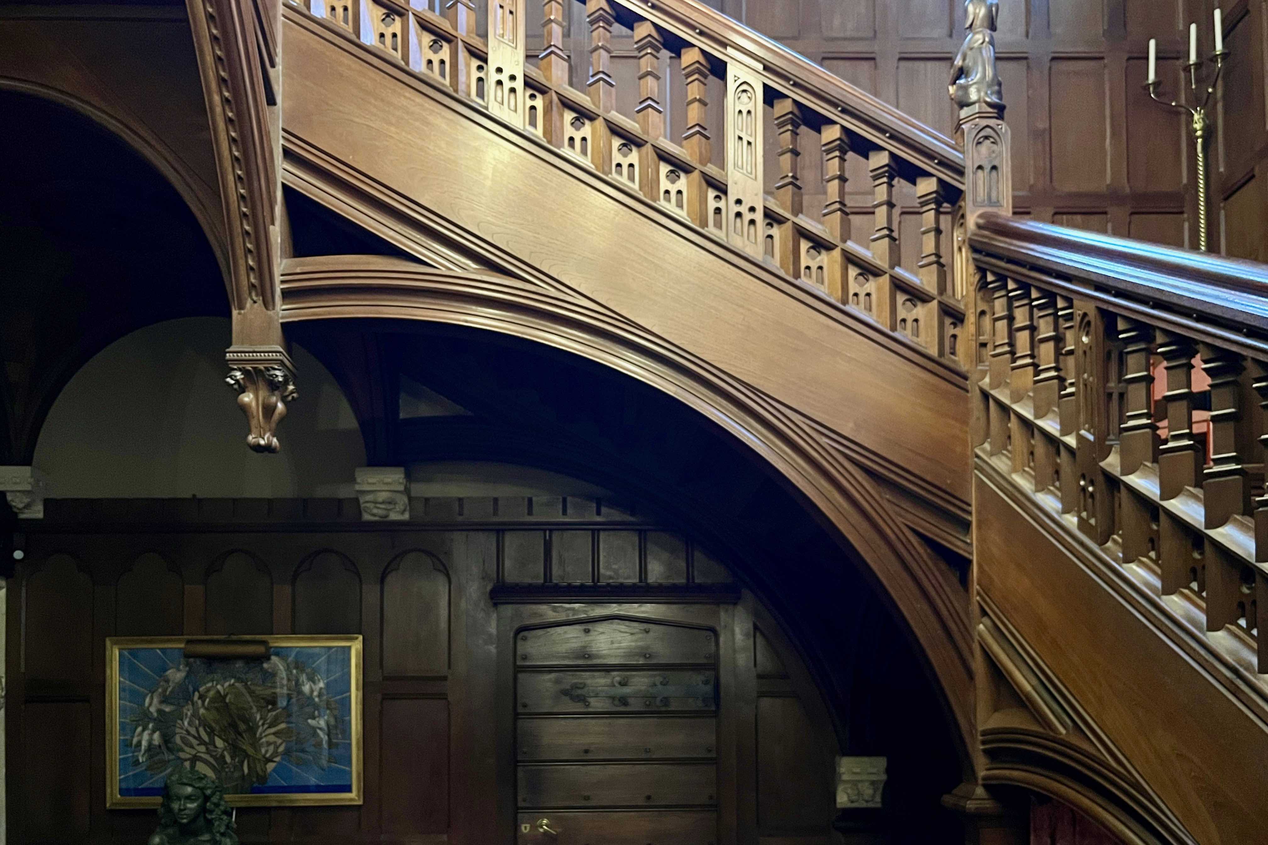
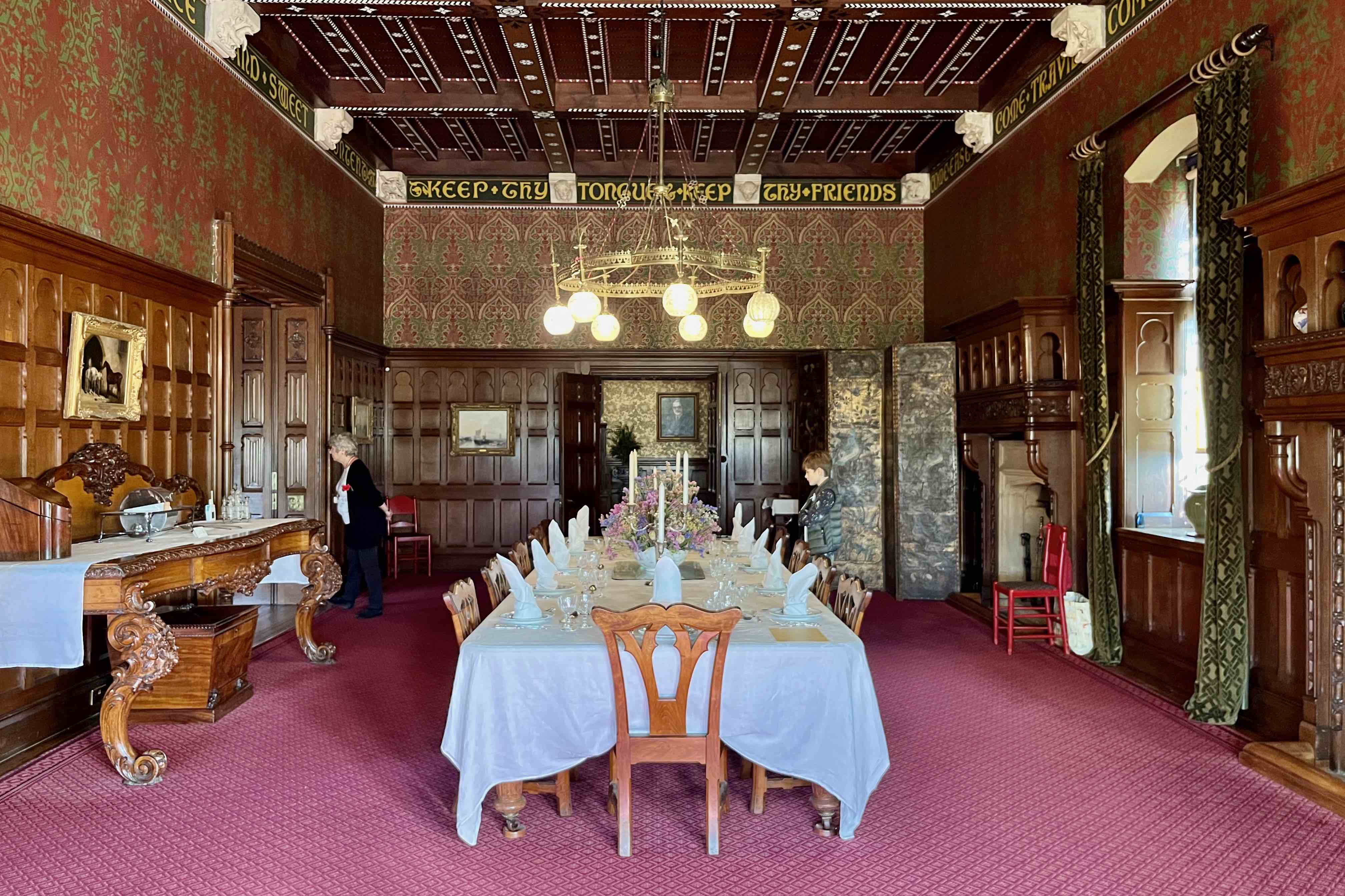
William Burges pulled out all the stops for his Devon client, Sir John Heathcoat Amory, and in 1873 he presented Sir John with a magnificent folio of 57 pages of watercolour drawings of his detailed plans for the interior decor of Knightshayes Court.  Burges’ relatively restrained plans for the exterior and internal partitioning had been approved in 1869 and by 1873, construction was well underway. Sadly for Burges, Sir John would prove to be a lot less indulgent than his regular patron, the Marquess of Bute whose financial commitment to Burges’ extravagantly ornate visions had no limits. While Bute’s coal mines and ports delivered an endless stream of cash, the Heathcoat Amory business (lace and textiles) was more exposed to economic downturns and the money simply wasn’t there to pay for Burges’ lavish scheme.  Sir John occupied himself with hunting foxes and stags on Exmoor, shooting on his Scottish estate or fishing in Norway where he owned a lodge.  It’s easy to imagine that Burges’ bejewelled medievalist fantasies would have held little appeal for such a tweedy character and in 1874 he sacked Burges from the project. 

J D Crace inherited the Burges design scheme and diluted it to suit the family purse and taste.  Crace was a remarkably versatile and successful interior designer and produced a modified version that retained some of Burges’ ideas (such as the jelly mould ceiling decor), discarded the wilder fantasies and came up with a scheme that had a little of Burges about it while being much easier on the eye.  Even this would prove too much for the family who in a few years had contractors in to conceal the ornate coffered ceilings (largely the work of Crace). Fireplaces and other features would follow until what remained was a conventional country house Georgian interior. For Burges, this was another deep frustration, in a career marked by false starts, unrealised projects, and rejected competition entries. Compounded in 1854 when Burgess won the competition for a cathedral in Lille fair and square, only to be laid low by a change in the rules that handed the commission to a French team of architects.

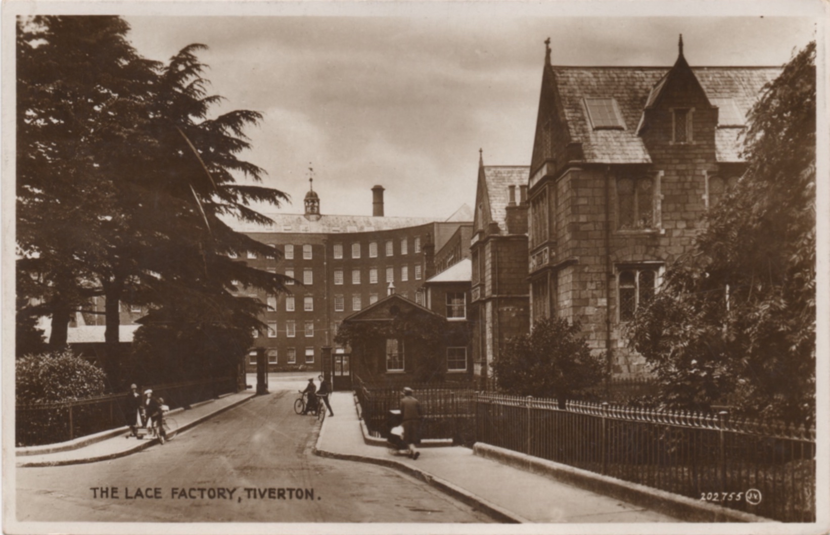
Even without the tower that Burges designed for the west wing, Knightshayes remains an imposing presence thanks to its subtly detailed physical mass.  From the Drawing Room the parkland gently descends, offering a distant view of the family factory and its pair of chimneys. Sir John found running  a business got in the way of the pleasures of the chase and left the task to his younger brother, but without those profits his fine country house would never have been built.  In their growing aversion to all things High Victorian, the family were ahead of the times - several decades would pass before popular taste would finally condemn it to obscurity.  When its rehabilitation came to pass, the National Trust was left with an enormous task to return the house to its as-built original condition.  The photos were taken in mid-November on a day of exceptional warm sunshine.  Regrettably there was no access to the first floor rooms due to a post-Covid shortage of volunteers.


Thursday, 10 February 2022

Postcard of the Day No. 107, County Arcade Leeds

This postcard view of the County Arcade in Leeds shows something of what was on sale in the first decade of the arcade’s existence (1900-1910) - there was a Jeweller, Hairdresser, Optician, Confectioner and seller of umbrellas. The opulent architecture is identical to what we see today. On my annual visit to Leeds I always pay my respects to the splendour of the County Arcade. Although the gleaming mahogany shopfronts stock little of interest to me, the sheer visual exuberance of Frank Matcham’s theatrical fantasy always captivates. The repetition of ornamental cast iron ribs decorated with brilliantly coloured Burmantofts faience, Sienna marble pilasters, balustraded balconies, stone ball finials, and wonderful gilded mosaic panels combine to delight the eye. The Victoria Quarter in Leeds has been valued and cherished as a priceless civic asset offering a sense of continuity with the Victorian heyday of a proud industrial city.  Click here to read a previous post from 2008 on this subject.


Tuesday, 7 December 2021

Mass Transit in Victorian Britain

There are 20 visible passengers, including the coachman, piled high in defiance of gravity on this horse-drawn carriage.  Some look sullen, some apprehensive while others appear quite pleased with themselves.  Another 17 bystanders, plus a groom, line the foreground and face the camera. More socially diverse than the passengers behind, they look as if they just drifted into the frame. There are no clues as to location anywhere on the card but the buildings, with their extensive rustication, suggest a business district in a substantial city around the turn of the twentieth century.  The camera operator has achieved a remarkable degree of focus enabling each of these faces to be seen in surprising detail.  I read somewhere that Apple has a team of 6,000 employees working on the development of the iPhone camera yet they might struggle to produce a better image than this.


Tuesday, 27 July 2021

Some Victorian Steel Engraving

Victorian printing technology steadily advanced through the 19th. century towards the ultimate goal of mass production of photographic imagery.  Along the way the process of printing from engraved imagery on steel plates was constantly refined and improved.  Engraving specialists were kept busy by the demands of mass circulation magazines (The Graphic, Illustrated London News, The Sketch, Punch) for new material to entertain the readers. Pictorial representations of current events, portraits of the great and the good, celebrity portraits and cartoons were especially in demand. Another army of engravers were preparing print versions of critically approved paintings  as shown in Royal Academy exhibitions to enable the rising middle classes to display their taste for the visual arts on the walls of their own homes.  Even more were engaged on topographical subjects - scarcely a manor house, ruined abbey or castle, riverbank, forest, lake, moorland or mountain went unrecorded. There was an affordable prospect for every affluent customer.  The finest of these practitioners achieved spectacular effects in terms of describing detail and creating subtle and dramatic tonal effects through the precision of their mark making.  Reproducing engineering drawings was a highly specialist skill requiring perfect clarity of visual description - this is a section of examples taken from the plates of various encyclopaedias.  They offer impressively analytical images of new applications of steam power and increasingly complex machine technology. Starting with the printing industry, the application of steam in shipping and railways, the selection is completed with a variety of mechanical wood saws. Admire the delicate subtleties of tone, the impersonal drawing and the complete absence of visual rhetoric. 


Thursday, 14 January 2021

Eno’s “Fruit Salt”

In 1924, a bold and colourful poster designed by E McKnight Kauffer appeared on the nation’s billboards with the slogan “First Thing Every Morning”. E McKnight Kauffer, an American emigré, was Britain’s most avant-garde designer, the first to absorb the pictorial language of Cubism and a brave choice to publicise an antiquated Victorian product.  This marked a decisive break with Eno’s Victorian heritage and would be followed by a long association with contemporary designers including Ashley Havinden, Charles Pears and Austin Cooper as well as an extended series of variants on Kauffer’s original. The version shown above was an adaptation miniaturised for use on a Bryant & May matchbook cover.

Eno’s was a product of eternal Victorian anxieties around metabolism, digestion and bowel movements. Advertising was essential to its success and the name was prominently displayed on Victorian railway station platforms and almost every passing omnibus. The Victorian public had an insatiable appetite for miracle cures and instant remedies.  Pharmacists leapt into action, concocting an enormous range of chemical compounds and magic elixirs, to meet the demand. One of the most successful was a Newcastle chemist, James Crossley Eno who invented an effervescent powder that promised to ‘clear the intestines, rouse the torpid liver and stimulate the mucous membrane’.  Decoratively packaged and relentlessly publicised, it rapidly became the market leader and spawned many copies and imitations.

Eno saw no need to employ an advertising agency, convinced as he was that he could do a much better job himself with a mind well-stocked with aphorisms and received ideas.  His bizarre contributions to the history of Victorian advertising were memorably described by E S Turner thus.


The most eccentric, the most obstinately ‘different’ advertisements in late Victorian magazines, and for a long time afterwards, were those personally devised by the founder of Eno’s Fruit Salts. Three quarters of his space would be taken up by high-flown quotations on the theme of man’s unconquerable mind, from the ancient and modern philosophers.  The underlying theme, so far as it was distinguishable, was the sin of allowing the human intellect to be harnessed to a sluggish gut; but often the quotations came so thickly and haphazardly that it was impossible to trace a continuity of thought behind them. Now and again the compiler would throw in an uplifting poem which had taken his fancy, or perhaps an original rhymed tribute from a retired major-general. He kept an artist busy drawing scenes in which lost wanderers stumbled into forest glades and found words like ‘Integrity’ mysteriously carved on the rocks, or in which seated greybeards solemnly drew the attention of milkmaids to moral phrases graven on the ground before them. Sometimes the descent from the cloudless peaks of the intellect to the mucous walls of the intestinal canal was achieved almost in one sentence. For a generation the strong-minded founder of the firm fought off any suggestion that he should ‘modernize’ his announcements.


(The Shocking History of Advertising, 1965 Penguin edition, page 89.)

This drawing of the goddess Hygeia banishing the evil imps of ill-health marked a rare excursion by Arthur Rackham into the world of commercial art.  Taking a break from his routine of terrorising the children of the Edwardian professional classes with nursery tales transformed into nightmares, Rackham drew a small army of evil spirits, from Inferiority Complex to Raspberry Tongue via the Pip and Housemaid’s Knee, all sent packing by the purgative powers of Eno’s.  The mood lifted in the late 1920s when Eno’s engaged the services of W S Crawford advertising agency and began a dramatic shift to a more contemporary visual approach. After McKnight Kauffer came the young Ashley Havinden, who in 1927, fresh from an extended visit to study modern publicity in Germany, designed a famously dynamic ad in which 3 angular horsemen trailed banners emblazoned with the virtues of Eno’s on a diagonal march across the page.  The result owed more to the Gebrausgraphik tradition than to any Bauhaus influence.  It would be followed by many more ads designed to appeal to the contemporary eye while conveying a sense of breezy optimism about the comforting sense of well-being that awaited the consumer of Eno’s Fruit Salts.  Eno (minus the apostrophe ’s’) is today owned and marketed as an antacid in Asia and South America by GlaxoSmithKline (GSK) - a curious afterlife for a quintessentially Victorian patent treatment.