Friday 28 September 2018

HõVIS – Your Baker Bakes It


The enduring survival of certain brand names while others perish is sometimes hard to explain. Manufactured bread was an unglamorous product and had to compete with freshly baked loaves on sale in every town and village and business recognised the need for promotion. A competition was held in 1890 to find a name for the flour and baking products being produced by S Fitton & Sons in Macclesfield – the winning entry was Hovis from the Latin hominis vis. The idiosyncratic letter “o” arrived in 1926 as a result of an advertising campaign in which 5 trains were photographed together bearing headcodes that spelt out the name HōVIS. The story goes that the “ō” derived from the headcode for Hounslow. Even if this story is substantially correct, the date can’t be verified. In the advert above from 1921, the product is named as HõVIS with a small tilde, rather than a macron, as in “ō”. It’s a rather tedious mystery and I don’t possess the energy to pursue it any further.


Part of the reason for the longevity of HõVIS is due to the famous TV advertising campaign directed by Ridley Scott in 1973 that captured the public imagination and has been profitably revived from time to time. This commercial set in an idealised Wessex and a companion set in an equally idealised North Country employed sepia tones and regional accents to ingratiate itself with an audience. There also existed a long tradition of promoting the brand name via outdoor advertising in the enamel sign era. This was accompanied by press campaigns in popular magazines of which some examples are shown here. Much was made of the purity and freshness of the product and a link with good health was stressed. American advertising agencies began setting up in Britain in the 1920s and some of that influence can be detected here in the clarity of images and the sentimental appeal of the winsome child receiving instruction in good manners.


The Hovis Road Map was aimed at the prosperous customer whose wealth extended to the ownership of a motor car. Issued in multiple editions throughout the interwar years, in addition to maps it contained road safety information and a company profile. Best of all was the promise to the curious customer of a guided tour of the factory premises. All that was required was to show your copy of the Road Map to the Manager and all would be arranged. To read an earlier post from 2009 on the subject of Hovis sandwich recipes please click here.


Monday 24 September 2018

Security Measures


Another group of collectors’ cards from Palmin, makers of cooking fats for German kitchens. As so often in the Palmin universe, the focus is on public safety – the theme of this series is sicherheitsmaßnahmen (security measures). We begin on the busy streets of Berlin where pedestrians navigate the traffic under the watchful eye of a uniformed officer. Next the focus is on the motorist whose natural tendencies to anarchic self-destruction are kept in check by traffic signals while the guardians of law and order observe events from an elevated tower (as seen in Pottsdamer Platz) at the centre of the intersection. Signals play a major part in the next picture, regulating the movement of trains for the avoidance of collisions. The remaining cards feature a ship’s radio officer, a mountain railway and an airport with an illuminated runway for night flights. Despite the great bonfire of regulation that preceded the 2008 financial crash, it remains a dirty word in the language of radical right politics. In the desperate search for economic advantage on the part of Britain Alone Against the World, inevitably regulation will come under ever greater assault. Especially those that protect the vulnerable and disadvantaged. It’s interesting to note that there have recently been calls from politicians for an end to speed limits on British roads. We can expect to see more of this sort of libertarian thinking, in defence of the inalienable right of the powerful to conduct themselves with reckless disregard for the safety of lesser mortals. We can also expect the regulations that protect the rights of property owners to be resolutely reinforced. No bonfires there.


Thursday 20 September 2018

Hamburg’s Chilehaus


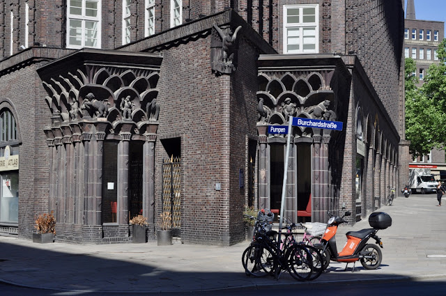
There’s a longstanding building tradition in the Netherlands and North Germany of ingeniously exploiting the potential plasticity of brickwork to escape the monotony of undifferentiated surfaces. Architects and builders devised ever more inventive ways to introduce visual interest by twisting, upending, projecting and re-aligning individual bricks and by combining brick types (especially clinker bricks) of different colour and texture. This practice became an essential component of the early 20th. century style, largely developed in Hamburg and Amsterdam, that became known as Brick Expressionism. Hamburg’s close trading links with New York meant that North American architectural styles quickly found an appreciative audience on the part of architects and developers. German business came to see the value of large scale statement buildings as an expression of corporate confidence in the days of the Weimar Republic.


Hamburg’s Kontorhausviertel is a business district where the prevailing style is Brick Expressionism of which the Chilehaus is the most notable. Other examples include the Burkhardhof and the Sprinkenhof. The awkward, asymmetric dimensions of the Chilehaus building plot lent themselves to the maritime theme adopted by the architect, Fritz Höger. Shipping and international trade were at the heart of the Hamburg story – the references to marine architecture found ready acceptance. Höger’s design included three upper floors with wrap-around balconies to resemble the tiered decks of an ocean going vessel. At the eastern extremity, two flanks of the building meet at an acute angle to create a dramatic image of the prow of a ship. There are three internal courtyards, accessible to the public via generously wide arches allowing a sense of easy circulation between open and constrained spaces. Höger’s client was Henry Sloman, a recently returned German businessman from Chile, where he had made his fortune exporting nitrates to his homeland. Construction began in 1922 and was completed in 1924 – it was a difficult build requiring deep piling to cope with the instability of a site so close to the river Elbe.


Fritz Höger (1877-1949) began his working life as a carpenter and technical draughtsman. Despite a lack of formal training as an architect he developed a successful practice designing substantial dwellings in the wealthy suburbs of Hamburg before going on to design many commercial buildings elsewhere in Berlin and Hannover. Office blocks and factory premises for the most part. Höger joined the staff of the Volkischer Beobachter (Nazi party newspaper) in 1927 and took up party membership in 1932, but his efforts to ingratiate himself with the regime came to nothing. Brick Expressionism was no more acceptable to the authorities than Bauhaus Modernism - despised as impure thus denying him the prestigious public building projects he coveted. His advocacy of Hanseatic clinker brick had a nationalist tinge – he held that its earthy quality corresponded to the enduring nature of the Germanic people.


In 2015 the Kontorhausviertel and adjacent Speicherstadt were awarded Unesco World Heritage status. In the written submission it was clear that the Chilehaus is the landmark building and the focus for all the elements that make the district so special. These photos come from a visit in June 2018 and attempt to show something of what makes this building so arresting. Unlike most maritime inspired buildings that follow a streamlined template, the Chilehaus is angular and aggressive in form. It has the quality of a massive cliff face – an intimidating force of nature, which is balanced by the spatial flow that exists at ground level between enclosed and open spaces. Owen Hatherley has pointed out there was a brief and unsuccessful revolution in Hamburg in October 1923 at the time the Chilehaus was under construction. KPD militants stormed police stations, seizing weapons and building barricades – yet within 24 hours the authorities regained complete control by which time 100 lives had been lost. In the aftermath the German left was fatally divided, to the advantage of the Freikorps and the insurgent NSDAP. Meanwhile construction of capitalist citadels in the Kontorhausviertel continued unabated.


Monday 17 September 2018

Mitsukoshi Department Store


This is a 1930 pocket-size visitor guide to the Mitsukoshi department store. The Japanese were slow to develop the idea of the department store but when they did they proved to be innovative and ambitious. In these pages, designed for the western visitor, they promoted a series of refinements not often seen elsewhere. These included a roof garden, a courtesy bus service and an automatic store directory. The business can trace its origin back to 1673 and continues to trade extensively in Japan though its international presence has declined in the last few decades. The colour postcard shows the great atrium at the flagship Tokyo store at Nihonbashi.


Monday 3 September 2018

Postcard of the Day No. 92 – Interior of Elevated Car, Philadelphia


An air of deepest gloom and melancholy hangs over this sombre group of passengers. Mostly seated and facing the viewer, they appear resigned to their fate – trapped on the infamous Long Black Train, bound for extinction. The dark mood is intensified by the way the passengers huddle in the back of what could easily be taken for convict transport. It makes a stark contrast with Coffee & Cigars and Afternoon Tea in the Salon-de-Luxe. In the former we see a trio of captains of industry browsing the news while in the latter, three ladies of leisure sip tea in plush upholstered surroundings. Both groups have the air of late Victorian narrative painting and scrupulously avoid making eye contact. Prosperity and privilege in locomotion.