Showing posts with label brand character. Show all posts

Monday, 31 October 2022

Meet the Striding Man

History records that the Striding Man was first sketched in 1908 by the illustrator and cartoonist, Tom Browne. Since then, he has marched with single-minded vigour across Johnnie Walker whisky publicity and packaging, sometimes taking centre stage, at others, lurking in the margins in trade mark form. His anachronistic outfit, polished riding boots, narrow white trousers and scarlet frock coat embodied the longevity of the spirit (first introduced in 1820) and an unstoppable forward momentum.  A knob-handled cane, a monocle and a stovepipe top hat complete the ensemble and the association with a man of substance. A rosbif complexion and a bleary-eyed grin suggest some familiarity with the product. He has the air of a partially reformed school bully.

These vintage examples are from both sides of the Atlantic at the height of his powers, dominating all around him and making his presence impossible to ignore. In Britain the illustrator of choice was Clive Uptton (who also worked for Cadbury and Brooke Bond Tea).  In America a wide range of prominent illustrators were enlisted for their personal responses to the product (a subject for another time) while the distinctive square section bottle shared the focus with the Striding Man. A low point came in the 1930s with a racist tableau in which the Striding Man was pictured extending his monocle to a painfully servile, dungaree-clad small boy, for the privilege of giving it a polish.

Of all brand mascots, the Striding Man is one of my least favourite.  His spiritual home is the world of Vanity Fair via Quality Street, an age of affluent idleness much favoured by unimaginative British advertisers as a nostalgic setting for product placement.  Striding Man, full of confidence and entitlement, is designed to appeal to high earners offering well earned respite from the task of wealth creation and makes no effort to endear himself to drinkers of more modest means. Which enables him and his masters to sidestep any responsibility for alcohol abusers.


Monday, 9 May 2022

Big Green Man

We have advertising legend, Leo Burnett to thank for the birth of the Jolly Green Giant.  In 1935 Burnett transformed the Giant’s grim looking predecessor into the sleek and glossy finished brand character in a leafy tunic with pointy ears, who remains in service to the present day.  In his twilight years he has become an orphaned brand, discarded by corporate giant General Mills into the hands of the B & G Foods holding company who operate a rest home for senior brand characters while sweating them for every last cent of revenue.  Much of his long career has been spent persuading the consumer that large green peas can be every bit as flavoursome as small varieties.  Among his great adventures are the time he slid down a fireman’s pole and the day he was interviewed by Art Linkletter, a major radio and TV personality and old pal of Ronald Reagan. Otherwise his main occupation was flexing his muscles while cradling an enormous pea pod, the size of a small canoe and overcoming customer resistance with his disarming and occasionally disconcerting grin.


Sunday, 3 April 2022

Johnny on the Spot

Twenty three year old Johnny Roventini was employed as a bellboy in the lobby of the New Yorker Hotel in 1933 when his potential for bringing a living presence to Philip Morris’s bellboy brand character was spotted by an advertising executive - they would later refer to him as their human trademark. His high-pitched vocal delivery, youthful and perky manner and  diminutive stature worked to great effect in switching smokers to the Philip Morris brand in radio, cinema and print advertising.  The figure of the bellboy was a stock character in the American repertory - a much used device for switching scenes, instantly curtailing the dialogue with a peremptory call for Doctor/Colonel/Bishop/Professor Hackenbush.  This is the world that Johnny now found himself in, courtesy of his service to Philip Morris, there would be no more carrying calling cards on silver platters around a crowded Manhattan hotel lobby. When he wasn’t posing for the advertising photographer, he was at the radio microphone swapping snappy one-liners with Desi Arnaz and Lucille Ball in Morris-sponsored broadcasts.  At the height of his popularity there was a brigade of up to 10 other Johnnys in circulation, bringing Philip Morris to a nationwide audience in multiple simultaneous locations.  The company was and remains a major player in cigarette manufacture and played a significant role in the ruthless campaign to deny any link between smoking and ill health.  A corporate curiosity was the readiness of the business to hire workers from the African American community from the factory floor to senior management at a time when most of their rivals scrupulously avoided integrating their workforces.  This was not quite the enlightened policy it may seem to be - among the large company portfolio there were a number of menthol brands which market research discovered were extremely popular with African American smokers. Later, Philip Morris would become notorious for saturating black neighbourhoods with poster advertising for its menthol products.  At the end of his long and prosperous life in 1998, Johnny Roventini had enjoyed a longevity that few regular smokers of Philip Morris products would have enjoyed and nowhere have I seen any evidence that he ever smoked a single cigarette.


Friday, 11 September 2020

Monocle Men

Monocle Men were never short of employment opportunities in the Universe of Brand Characters. Their association with good breeding and their foppish tendencies made them ideal product ambassadors. Rea Irvin’s creation for the New Yorker, Eustace Tilley, epitomised the air of effortless superiority that a monocle confers. The updated Tilley from 2018 was drawn by Malika Favre. Heinz, of soup and ketchup fame, chose a monocled tomato (known as Mr. Aristocrat) to spearhead their advertising campaigns in the 1930s.  Often deployed in multiple, the top hats were conventional class signifiers but the rubicund features sent out a very mixed message suggestive of short temper and irritability - not the qualities looked for in a brand mascot. The breezy monocled bonhomie of the Striding Man in red frock coat and polished black boots has been around since 1909, embodying the virtues of Johnnie Walker whisky to the present day.  Mr. Brandyman does the same job for Martell with a brandy glass for a head - hand drawn in cartoon form, his raffish demeanour is amplified by the cigar or cigarette that’s never far from his lips.  In 1919 Sharps Toffee introduced Sir Kreemy Knut (biography here) who, with bow tie, briefcase and swagger stick, launched his campaign to ruin the nation’s dental health with caramelised sugar.  A final mention for Mr. Peanut whose contribution to monocled marketing has been featured extensively on this blog, most recently here in 2012.


Friday, 8 March 2019

Fresh From Battle Creek


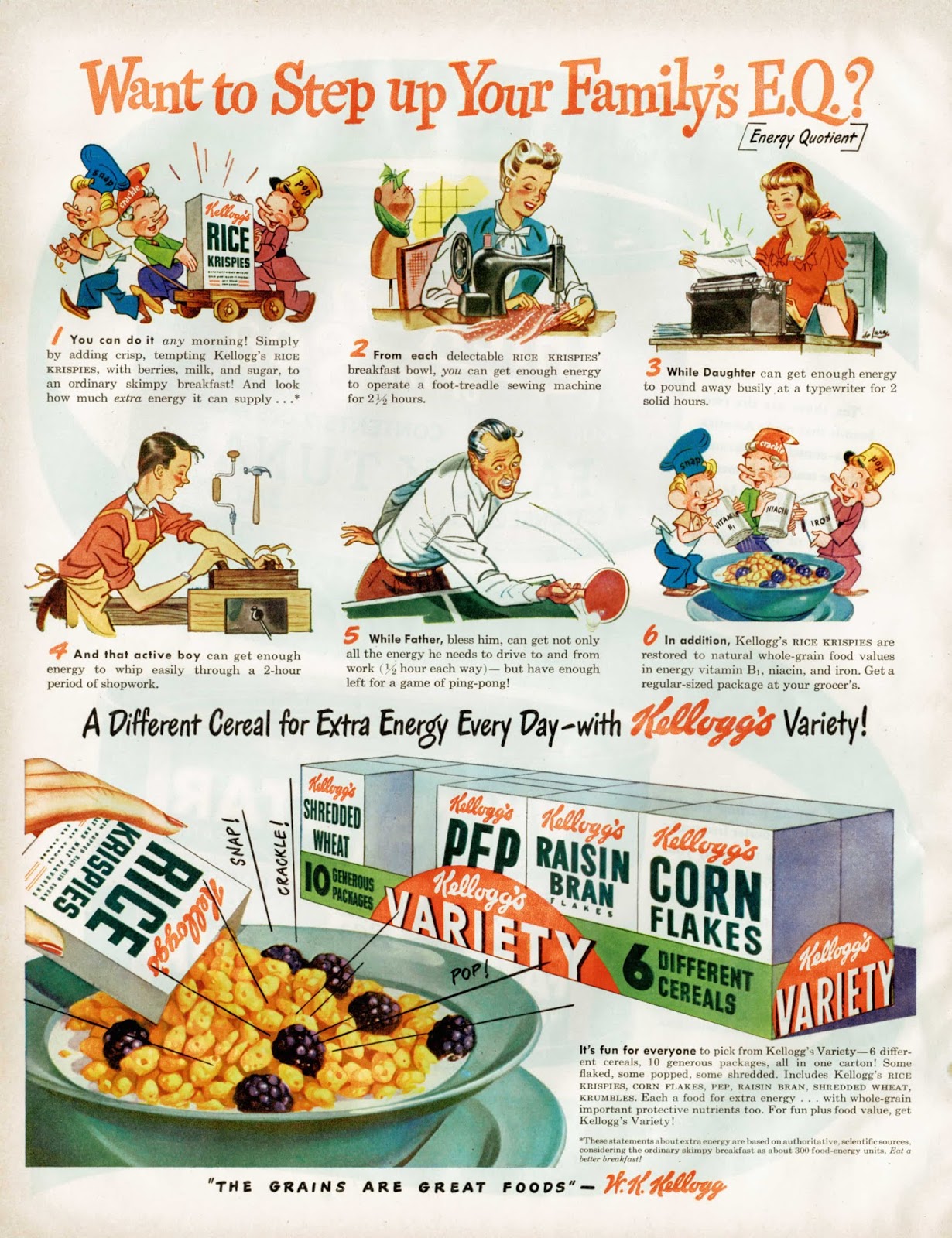
We begin with a postcard from 1958 on which an impressed visitor from South Africa writes home with an account of a visit to the Kellogg’s factory in Battle Creek, Michigan. Unlike many of its competitors, the Kellogg Company has retained its independence and still resides in Battle Creek, where it was founded in 1898. As the postcard illustrates, it has a global presence and there are very few countries where its products are not on sale. It operates in an ultra-competitive market and pioneered the inclusion of free collectable figures and toys in its packages. Offering modest books of pictures and stories for children in return for a nominal sum was another successful strategy in popularising the product with children. Brand characters played their part from Snap! Crackle! and Pop! (Rice Krispies) to Tony the Tiger (Frosties) while established cartoon characters such as Yogi Bear were drafted in on an as-required basis, all to embed themselves in the affections of juvenile consumers. Their efforts were probably more effective on television than they were in print. The logo has been regularly and subtly remodelled but remains recognisable as the signature-based original from 1900. And there’s a Kellogg’s Sans font to support the corporate identity. Movie tie-ins are the staple of today’s promotional activity.


Kellogg’s print advertising is unspectacular but persistent. Sometimes directed exclusively to the junior end of the market – at other times focused on the needs and anxieties of adults. The message to adults is often designed to exploit fears about physical health with a special emphasis on regular bowel movements. Mothers are frequently reminded of their parental responsibilities for child welfare with an implication that a child without Kellogg’s in her diet is a victim of neglect. The use of slogans and taglines is functional but not especially imaginative – few, if any, have passed into popular culture. This survey is concentrated on the period 1930 to 1960 and the only slogan with any staying power seems to be The best to you each morning. Efforts such as The Grains are Great Foods or Mother Knows (Kellogg’s) Best are justly forgotten. The invention of the Variety pack – 5 types of cereal, 10 small servings, all wrapped in cellophane was a masterstroke. Smaller quantities and increased packaging boosted margins while the direct appeal to children made life difficult for parents in the supermarket.