Showing posts with label architecture transport. Show all posts

Tuesday, 20 October 2020

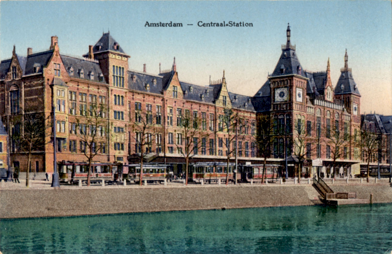
Great Railway Stations No. 17: Amsterdam Centraal

Amsterdam Centraal station is widely admired for its extensive frontage designed by Pierre Cuypers in the same eclectic mix of Northern Renaissance and Gothic styles that graced his design for the Rijksmuseum. It stands on a small chain of artificial islands in the Ij and when originally planned in the late 1870s it aroused fierce opposition in the city because it would completely block all much loved views of the lake from the city centre.  In an exercise of force majeure the government imposed its plan, compelling the city fathers to bow to the inevitable. When the building was completed in 1884 the city was transformed from a waterfront city to one that looked inward for its centre of gravity.  The massive cast iron train shed that sheltered the platforms was designed by L J Eijmer, a civil engineer with the state-owned railway, built in Derby by Andrew Handyside and finally opened to passengers in 1889.  Additional platforms were added in the twentieth century but the building is substantially unchanged from that date.

The station entrance is an ornamented pavilion flanked by two clock towers, one of which displays the wind direction. Heraldic devices, gilded crests and hand-carved decorative panels near the base of the towers and over the centrally positioned windows offer a rich variety of visual distraction. As elsewhere in Europe at that time, there was a nationalistic flavour to the decor with the mercantile splendour and colonial triumphs of the state celebrated in allegoric form, although there is more evidence of restraint than we see, for example, in Antwerp.  During the war, Jewish deportees from the Netherlands began their long and arduous journeys to death and extinction at the hands of the Nazis from these platforms. Best known among them being Anne Frank whose personal journey began in September 1944.  These terrible events cast a long shadow over many major European stations that will last as long as they do.




Tuesday, 10 October 2017

Great Railway Stations Number 12: Tokyo


In 1880 the 26 year old Tatsuno Kingo was working as a student in the architectural practice of William Burges, master of the Gothic Revival. Returning to Japan after Burges’s death in 1881, he established himself as an educationalist and architect in the Western style. Banks and institutions formed the majority of his clients. Later he was appointed architect of Tokyo Station on which work began in 1908. Completion was in 1914 – it opened for business on December 20th. The original 4 platforms have expanded to more than 20 today. A three-storey extended red brick façade with two ribbed domes was designed to impress. A massive steel frame enabled the building to survive earthquake damage in 1923 but US bombing in 1945 greatly diminished it – post-war repairs saw the station reduced to two-storeys while the ruined domes were replaced by simplified angular structures as shown in the last two cards below. A threatened demolition was resisted by the public and a five-year renovation completed in 2012 restored the station to its 1914 splendour. With the singular difference that the present building must compete for attention with the enormous office blocks that tower over it.


Tuesday, 28 July 2015

Great Railway Stations Number 10: Delft


The new railway station in Delft opened on the last day of February 2015 after more than a decade of planning and construction that involved relocating the busy mainline between Rotterdam and Amsterdam from an elevated viaduct to a subterranean track. The new building also houses municipal offices and a new Delft City Hall. At street level it’s a large black and grey box with a gently chamfered roofline that diminishes the visual impact. The glazing features randomly alternating vertical panes of varying widths of high performance glass and moulded glass designed to evoke vintage glazing. Great care has been taken to avoid an oppressive appearance. 


The interior has a cavernous and undulating feel. Under a vaulted ceiling lined with over 4000 baffles each bearing a narrow strip of imagery sliced out of an 1877 vintage map of Delft, a large central space has been carved out to allow banks of escalators and flights of steps that descend to the subterranean train platforms. Overhead light-wells supply dramatic illumination. Disappointingly, like Porta Sousa in Turin and Antwerpen Centraal where mainline trains run below ground in redeveloped stations, the platforms have a utilitarian feel and low light levels. 


The design is the work of the Delft-based Mecanoo practice and replaces a building of 1885 that will be retained and re-used. The aim was to provide a station that offered the arriving traveller a view of Delft inspired by Vermeer’s painting – an enormous panorama of the city is revealed as the traveller turns toward the exit after arriving at ground level. Walls and columns are lined with a mosaic of ceramic fragments in shades of Delft-blue – the standard of finish is immaculate. Cafés and retail units are discreet and built into the fabric of the building – there are no free-standing kiosks or advertising displays. The result is a spacious but not intimidating station concourse that restores a measure of dignity to the travelling public by not exploiting them as a revenue stream ripe for extraction. The scale of this project is formidable and it’s very difficult to conceive of something comparable happening in Britain in a town the size of Woking or Watford. 


Friday, 15 August 2008

Go Greyhound


Today we return to a subject I wrote about last summer, the Greyhound Bus and its distinctive corporate image. All the mainland US states are stitched together by this network of bus routes and the Greyhound survives to this day as one of America’s enduring icons. In terms of visual style, its greatest impact was in the 1930’s and 1940’s when the company constructed a vast number of city centre bus terminals in a highly developed Art Deco-derived idiom making liberal use of streamlined forms, gleaming tiled surfaces in corporate colours with muscular visual branding and signage. The examples shown here come from linen postcards of the period and present an attractive but somewhat idealised image of the company architecture. The postcards are the subject of a recent book, Greyhound in Postcards: Buses, Depots, and Post Houses, details can be seen by clicking here.


While air travel was the preserve of the wealthy, the company’s main competition came from the railroads. The heyday of railway station building was long past by the 1930’s and the railroads were left with oversized and expensive to maintain structures that had become to look antiquated. The strategists at Greyhound exploited their advantage by developing compact structures with a high degree of visibility and an indelible association with Modernism and Streamline Graphics. From 1937 the lead architect responsible for these designs was William S. Arrasmith (1898-1965) of the Louisville firm of Wischmeyer, Arrasmith & Elswick. According to The Encyclopedia of Louisville he designed more than 65 terminals, beginning with this example in his hometown in 1937. He also invented the enamel colouring process with which to clad the buildings in “Greyhound Blue”. The result was that these buildings were extremely effective in the way in which they echoed the blue and chrome trimmed styling of the buses themselves to provide the passenger with a sense of a complete all-embracing experience. In 2006 a book on the subject was published, The Streamline Era Greyhound Terminal: The Architecture of W.S. Arrasmith by Frank E. Wrenick, to read a review, please click here.


Finally, a few examples of Greyhound publicity from the pages of Life and Saturday Evening Post. The Art Deco idiom was not favoured when it came to mass circulation advertising. It would have been exciting if the services of someone like Joseph Binder or A M Cassandre had been employed but more conventional combinations of image and text prevailed. Even so, there’s much to admire in the ingenuity with which the copywriters emphasise the association with the freshness of the great outdoors, thus neatly sidestepping the odour of hot diesel fumes. The advertisers were not slow to spot that the blue livery of the coaches was perfect for making the connection with the air-conditioned interiors. All the discomforts of bus travel, the lack of ventilation, the proximity of strangers of doubtful probity and personal hygiene, the claustrophobic experience of being wedged into your seat, were artfully eliminated from the picture!

Friday, 8 February 2008

St Pancras Revisited


It’s not easy to get past all the hype that’s been flying around this place and vast spaces like this one can numb the critical faculties. At first glance, the impact of the massive roof canopy painted sky blue is astonishing. It’s never looked so enormous or so pristine, at least, in living memory. The restoration of the original fabric is a major triumph and the lighting shows Scott’s architectural details in all their glory. It’s the new infrastructure that I find so disappointing. The subterranean shopping mall has nothing to distinguish it from its numerous suburban counterparts. The retail outlets are clones and have no individual character or distinction. Where commercial considerations come first, we really can’t expect much better but we could have expected a much more imaginative and spectacular train station to match the magnificence and ambition of the original structure.


When the rebuilding of Euston Station was completed in the 1960’s the designers were presumably very satisfied with the way in which they had eliminated almost any trace of the actual trains from the concourse. The very things that were the reason for the building’s existence were relegated to a dimly lit concrete basement. There is a bizarre affectation in the British character that deals with engineering technology by concealing it wherever possible lest it should give offence. The designers of British steam locomotives hid the working parts deep in the interior of the bodywork. This made them much more difficult and expensive to repair and service than their more practical European and North American counterparts that carried their engineering on the outer surfaces of the machine. Much of this thinking has persisted into the 21st. century and might explain why the actual trains themselves are so difficult to see at St. Pancras. This technology should be celebrated in the structure and displayed for all to see and not treated as if it were some rather ugly but essential business to be concluded behind closed doors. It is true that the experience of Eurostar travel has virtually none of the sense of adventure, romance or glamour that traditionally attached to international train travel but that is no reason for so ruthlessly excluding all these qualities from the design.


In the end, what we get reflects a sad lack of imagination and an inability to rise to the challenge set by Barlow and Scott in 1868. There are some expensive materials, a champagne bar that stretches almost to Cricklewood and reflective surfaces are everywhere but all this is small consolation for the pedestrian flavour of the design. And then there is the matter of the Meeting Place sculpture.


As a piece of public art, this is very mediocre. Whenever a group of people set out to create something (in their words) “iconic”, the outcome is likely to be dismal. When the group in question is composed of marketing experts, image consultants and PR professionals, the prospect is even more depressing. The choice of sculpture was entirely dictated by the requirement that it be “iconic”. Conceptually shallow, it presents an image both unconvincing and slightly disturbing.
The male figure has a predatory air and the worrying likeness of a Nazi officer straight from central casting. In reality, he’s probably a consultant who trades in PFI schemes while his female partner is perhaps an Event Organizer or a Fashion Buyer for a chain store. Together they resemble outsize participants in a TV perfume ad who have suddenly found themselves immobilized and immortalised in bronze. To my mind, they would be improved by the addition of some bright colour, in the manner of Jeff Koons. Then it would at least be cheerful kitsch instead of pretentious kitsch.