The figure of a solitary man (and it usually is a man) is not uncommon in the postcard universe. Often he’s there for an obvious reason – to display an unusual phenomenon. Such as the world’s largest cabbage, meteorite, lump of coal, boll weevil, coffee cup, etc. Or he has a custodial task, presenting an unusually fine horse, dolphin, alligator, dancing bear or tree stump for public admiration. Another figure might be demonstrating a skill – use of an ice axe or shovel, herding sheep, gathering fruit or flowers. There are exceptions, occasionally a child will be recruited though female figures are normally exhibited principally for their erotic potential. Such cards offer simple entertainment for connoisseurs of the absurd but more interesting are the single figures for which there is no obvious explanation. In an otherwise empty sea-front pavilion a single figure gazes soulfully at the distant horizon and suddenly a drab scene is relieved by the germ of a narrative. Some figures are accidental or incidental presences, others deliberately posed to enhance the scene with a sense of scale, sometimes hand-drawn in a desperate effort to alleviate tedium. Loiterers and loafers who just never got out of the way for photographers who couldn’t be bothered to retouch them out of existence. A minority are very well concealed – at the Postcard Memory Palace there’s a tag for “emptiness” and more than once a hawk-eyed observer has pointed out the presence of an infinitesimally small figure.
Friday, 29 August 2014
Wednesday, 27 August 2014
Bon Ami - “Hasn’t scratched yet!”
Bon Ami is one of those American consumer products that never crossed the Atlantic leaving us to gaze on it from afar. For a humble scouring powder the name has a Gallic flavour usually reserved for more sophisticated cosmetic or fashion related products. Launched in 1886, within ten years it was well established in the American market bringing a lustre of unprecedented brilliance to sinks and drainers everywhere. An image of a newly hatched chick served as brand character, accompanied by the slogan, “Hasn’t scratched yet!” – a phrase whose resonance has greatly diminished in step with the decline in keeping chickens among the American public. McCann-Erickson Advertising (slogan, “Truth Well Told”) handled Bon Ami promotion from 1904 and featured their achievements in a series of self-promotion ads placed in Fortune magazine. What follows is a small selection of magazine advertising, mostly from the pages of Ladies’ Home Journal. Domestic tableaux replete with gender issue sensitivities are a favourite. The concerned husband complete with pipe and apron, taking his turn drying dishes, expresses his sense of awe and wonder inspired by the dazzling splendour of the kitchen sink. Clearly puzzled that a spouse of such limited competence has scaled such heights of cleaning excellence, it comes as a relief to discover it’s all due to the amazing properties of Bon Ami. For the harassed housewife the message is that Bon Ami can extract an approving comment from the most severe taskmaster. In another, more extended dialogue, a young husband struggles to reconcile the physical attractions of his new bride with her high level cleaning skills. In a daring reversal of roles, she has to educate him by explaining the special character of Bon Ami in a syrupy exchange that only those of a strong stomach should read to the end. The truth is that a key part of a woman’s domestic responsibilities is advocacy for Bon Ami - even in parenting there is no escape as Mommy ambitiously engages the interest of an adorably curly-headed son and heir in the best way to maintain a clean and polished bath-tub. If this early introduction to domesticity was the prelude to a lifetime of obsessively cleaning sanitary ware, Bon Ami would have a lot to answer for.
Labels:
advertising,
americana,
bon ami
Sunday, 17 August 2014
Postcard of the Day No. 68, Grimaldi – Ventimiglia
Today’s card features the frontier between France and Italy near Menton. It’s a popular postcard subject, perhaps because of its proximity to Mediterranean resorts where international tourism first flourished. Frontiers are artificial constructs superimposed on the planetary surface continuity with mapping pens and straight edges. Ants, birds and bees can pass unhindered but human traffic is constrained and regulated. This border crossing, high on the rock-face overlooking the sea is largely unchanged according to Street View. The border guards have departed and traffic passes freely, courtesy of the Schengen Agreement. Checks were still in place at the time of this card. A chauffeur poses next to his limousine, his passengers seated in the back, their luggage stacked on the roof. It could be a storyboard for a cinematic life of Raymond Roussel, forever crossing frontiers with his devoted mother in a limo with the curtains drawn to exclude the world outside. We’ve visited this location before – follow this link to see.
Tuesday, 12 August 2014
Hard Times, Soft Sell
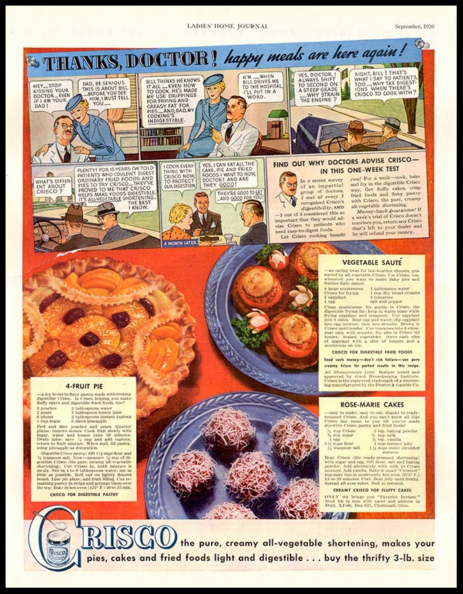
When times are hard and money is in short supply, advertisers are forced to rethink their strategies and fight for every dollar of domestic expenditure. In the Great Depression, new upstart advertising agencies threw away the text heavy, grandiose styles of the 1920s and developed a pared-down model that borrowed the typography and layouts of the tabloid press to suit the mood of the times. This enabled the advertiser to purloin some of the authority of the press, creating the impression that their claims were facts and if the careless reader was confused between promotional and editorial matter, this was no bad thing. At the same time, advertisers became increasingly dependent on another format from the popular press – the strip cartoon.
The onward march of the Funny Papers into the affections of the American populace generated a small army of highly skilled cartoon artists only too happy to enhance their earnings offering their talents to the advertising industry. Specialists in figure drawing, backgrounds and speech bubbles combined in an assembly line approach to the task as the workload expanded throughout the 1930s. Where artists worked on more than one campaign, great care was taken to conceal their identities. Raymond Rubicam (of Young & Rubicam) was an early adopter and coined the phrase “sequence-picture copy” to avoid the words “cartoon” or “comic” passing his lips. There was no television to compete with print media – only radio and the cinema offered alternative outlets for the advertiser’s message, simultaneously creating opportunities for cross-promotion with personalities from radio and Hollywood frequently migrating into print as cartoon characters.
Best of all was the ability to address the consumer directly in his or her favoured medium with simple messages and undemanding dialogues delivered by a repertoire of much loved comic book characters. Children clipped them out and pasted them into scrapbooks, extending the reach of the message. For an adult audience they met another corporate objective by putting a human face on to an otherwise impersonal and monolithic corporation such as General Foods. Hostility to the activities of the giants of capitalism ran high in the course of the Depression leading to valiant, if not always successful, campaigns to promote a warm and cuddly presence in the marketplace. Stylistically these examples are very conservative – they display little evidence of the dynamic sense of movement to be seen in adventure comics that would find its way into the visual vocabulary of the 1940s and 1950s. But their two-dimensional quality and the curious blankness of expression offer a certain enigmatic charm all their own.
An earlier posting on this subject can be read here.
Labels:
advertising,
americana,
cartoon,
comics,
illustration
Tuesday, 29 July 2014
Louxor – a cinema reborn
The architectural language of Classical Greece is heavy with a sense of authority and power but that of Ancient Egypt is indelibly associated with either fun and frivolity or the curious world of freemasonry. Egyptiana is one of the most fundamentally impure architectural styles and finds its place in shopping arcades, theatres and cinemas, where it is viewed with either indulgence or offence depending on your predisposition. The refined and incorruptible eye will see a promiscuous assemblage of dubious decorative devices while the hedonistically inclined will see something cheap and cheerful, unashamedly designed to please.
The Louxor Palais du Cinéma on Boulevard de Magenta (at the Barbès-Rochechouart intersection) opened in 1921 as a dazzling example of Egyptian-inspired Art Deco. It prospered for many decades but time ran out in 1983 when it closed and became, for a while, part of the Tati empire that flourishes on the north side of the crossroads. After years of campaigning by local interest groups the City of Paris funded a programme of renovation that began in 2010 and finished in April 2013 when the Louxor reopened to great acclaim. Every cornice, every lotus leaf and every palm motif meticulously restored. The cinema programming reflects the ethnically diverse character of the locality and has brought much needed community enhancement to one of the least prosperous areas of the city. At the end of this post we offer a brief home-made video portrait of this never less than exhilarating intersection where Parisian drivers, bikers and cyclists put on a magnificent display of manoeuvring at the outer limits of safety.
Labels:
art deco,
barbès,
cinema,
egyptian style,
paris
Wednesday, 16 July 2014
Nicotine Madonna
This ad for Philip Morris cigarettes bears examination for a number of reasons. To begin, it’s a case of borrowing a convention from one product range (soft tissue and personal hygiene) and applying it to another very different. While women were often portrayed in tobacco advertising they were usually presented as either working women, exemplars of high fashion, celebrity goddesses or free spirits asserting their independence. Female smokers formed the target audience but great care was taken to avoid alienating men with troubling indicators of gender equality. I can’t find another example of mother and baby promoting tobacco products. All the noxious fumes associated with tobacco combustion are sweetly dispersed in the mind by a cloud of talcum powder and infant formula. There’s a sense of protection and security and the gentle touch of soft and yielding skin. And the stench of stale tobacco and malodorous breath are all forgotten. As far back as 1927 there were physicians such as Dr. Bertha Van Hoosen who wrote “Motherhood and tobacco are as antagonistic as water and fire ... motherhood is too complex to tamper with tobacco or any other drug-forming habit.” Other medical critics noted links between nicotine and spontaneous abortion and claimed that nicotine was present in amniotic fluid and breast-milk. In the light of all this, to associate motherhood and smoking in this way in 1956 was a masterpiece of effrontery. With hindsight, given what is now known about the impact of smoking on the unborn child, it seems even more impudent and reckless.
This companion piece is an example of one of the most notorious campaigns in advertising history when the tobacco industry responded to the rising tide of health concerns with literally breath-taking counter-claims that smoking was essential for good health, offering protection against coughs and sore throats. And, endorsed by the medical profession. The careless reader of this example (which could be sub-titled Birth of a Smoker) might well conclude that life expectancy was rising hand in hand with the rising consumption of tobacco. The slogan, More Doctors Smoke Camels Than Any Other Cigarette was employed for 6 years in a sustained campaign of disinformation and obfuscation devised to undermine the growing volume of scientific evidence demonstrating a link between smoking and lung cancer. To back up the slogan, free packs of Camels were distributed at medical conferences while a team of pollsters was employed to ask doctors what brand of cigarette they were carrying. The results were presented as ‘independent research’. A detailed and thorough account of this inglorious episode can be read in “The Cigarette Century” by Allan M Brandt (Basic Books, 2007).
Thursday, 10 July 2014
Saltaire World Heritage Site
![]() |
| Salts Mill and the former Midland Railway |
If only Sir Titus Salt, the worsted mogul of West Yorkshire, had succeeded in his attempt to transplant the Crystal Palace to his model industrial settlement of Saltaire, the greatest of all glasshouses might still be with us today and the great fire of Sydenham would never have happened. Although there is something to be said for exploring industrial heritage sites in the rain and gloom the much improved weather on our second visit to Saltaire was very welcome. There was time to tramp the compact network of residential streets (mostly named after the large number of Salt offspring) and admire the ambition and scale of Salt’s achievement in untypically balmy conditions.
![]() |
| The offices at Salts Mill |
![]() |
| New Mill of 1868 with Venetian campanile chimney |
The alpaca and the Angora goat were major contributors to Salt’s fortunes. Salt’s engineers and technicians found ways to spin these intractable materials and supply a commercial advantage over his competitors. In 1848, near the end of a decade of industrial conflict, Salt was elected mayor of Bradford. A rising tide of labour unrest and environmental degradation brought the Chartists out on to the city streets and after a cholera epidemic killed over 400, Salt was one of the first of the mill-owners to realise that things had to change. In 1850 he began work on a plan to relocate the business to the clean air and bucolic surroundings of the Aire Valley alongside purpose built housing for the workforce.
![]() |
| Victoria Road looking north with Victoria Hall tower on the right. The trees lining the road are due to be removed. |
![]() |
| Looking east along Albert Terrace, Saltaire station and Salts Mill to the left and workers’ homes on the right. |
Full implementation of the scheme would take over 20 years but by 1865 it was largely complete with over 400 dwellings, a large public park, a Congregational Church, a Wesleyan Methodist Chapel, a Mechanics’ Institute, a hospital, school and almshouses. The housing stock was mostly back-to back with more spacious dwellings reserved for high status employees. Salt’s Mill itself was strategically positioned between the Leeds and Liverpool Canal and the Midland Railway. The architectural design was the work of the Bradford-based partnership of Lockwood and Mawson who took full advantage of their client’s ambition to make a grand statement. The mill itself was a massive presence with as many as 4,000 employees at its peak and its six storeys were generously embellished with Italianate details. When a second mill (the New Mill) was added in 1868 the chimney was disguised as a Venetian campanile.
![]() |
| Back alleys designed for deliveries of house coal. |
The Salt family gradually lost their grip on Saltaire and by 1892 changing market conditions forced Salts Mill into receivership. The business was rescued and returned to profit under new ownership but the housing was sold off in 1933 and the Mill finally closed in 1986. Conversion to retail and exhibition space followed quickly after the Mill was acquired in 1987 by Bradford entrepreneur, Jonathan Silver. Designation as a UNESCO World Heritage Site in 2001 helped secure the future of Saltaire as a visitor destination. The formidable space in the New Mill is now occupied by Bradford District NHS.
![]() |
| Victoria Hall, former Mechanics' Institute |
![]() |
| Titus Salt Hospital |
Victorian entrepreneurs were not universally given to enlightened paternalism but there were enough to make a difference. Some (especially Quakers) were motivated by their religious beliefs and others by the sort of self-interest that took account of the negative impact of social unrest on a favourable climate for business. As we come ever closer to regressing to Victorian levels of income inequality we cannot expect much in the way of mitigation from today’s generation of plutocrats, most of whom no longer produce tangible products but enrich themselves by the manipulation of capital and the avoidance of taxation. Even the self-interest argument falls on deaf ears when economic power lies in the hands of a callous trans-global minority whose lack of national allegiance has persuaded them that social unrest can never harm their interests.
![]() |
| Tower of the Grade I listed United Reform Church |
Labels:
architecture,
bradford,
industry,
lockwood and mawson,
saltaire,
titus salt
Subscribe to:
Posts (Atom)