Wednesday, 1 September 2021

The Dreamland Express

A group of children - boys and girls - lying face down on the ground, staring over the edge of a precipice.  One of the boys is upright and racing towards the edge in the company of a snake.  Is he planning to jump? The scene has been visualised from above giving a strong sense that they are looking into a terrifying void.  They are, in fact, at the edge of the world.  Beyond is the limitless emptiness of space. This anxiety inducing glimpse of infinity comes from a book for children, written and illustrated by H R Millar (1869-1942), the subject of our previous post.

The Dreamland Express was published by Oxford University Press in 1927 and copies are hard to find. A new edition was issued in 1989 and these scans come from one such copy.  Millar put his heart and soul into this book, writing an adventure story in which a trio of schoolboys follow a voyage of discovery through fantastical and other worldly landscapes, encountering a bewildering sequence of wild and dangerous animals, dragons, giants and citizens of exotic and eccentric civilisations.  Holding it all together was the series of trains in which the young adventurers travelled that enabled Millar to indulge his lifelong passion for railways and spice his narrative with romantic vignettes of life on the rails.  Millar begins his tale with a haunting description of the children discovering a passenger train all but concealed in dense woodland, headed by a majestic steam engine entangled in foliage. A full complement of crew are ready and waiting to welcome them on board and get the journey underway.

In the first half of the book the train races through imaginary cities on bridges and viaducts that have all but escaped the laws of gravity, arriving at an extraordinary cavernous station built in the style of Ancient Egypt. Along the way our heroes meet a flirtatious girl, always an uncomfortable moment of potential disruption to the simple pleasures of male companionship. Unlike John, Peter and George she is not granted the dignity of a name but she wins their respect by revealing an unexpected interest in trains, enough to admit her to the travelling band. Later the group is joined by a school swot whose function is to irritate with displays of pedantry.  The second half of the book involves an enforced change of train - the new locomotive is a decrepit specimen apparently riveted together from a motley assortment of life expired parts in the manner of W Heath Robinson. A Mysterious Oriental with a private train carrying a magnificent retinue of slaves and devoted followers enters the story and by sleight of hand substitutes their locomotive for something even worse - an Oriental fantasy made from porcelain and timber with a silken canopy covering the cab.  Despite the handicap of a disintegrating locomotive our heroes find time to rescue a slave from execution, win the favour of a Giant and emerge unscathed from a pitch-black Canyon of Darkness.

Millar’s visions of alternative worlds are brought to life with pen and ink drawing combined with colour washes - the results are close to the visual conventions of the comic strip. Echoes of Lyonel Feininger and Winsor McCay can be seen in Millar’s eccentric architectural fantasies although no evidence that he ever saw their work exists. Millar employed the voice of a narrator throughout to offer context and commentary and he didn’t flinch from challenging subject matter.  The image of the eternally burning city and the desperation of its inhabitants is the stuff of young nightmares and evokes a sense of dread equal to the confrontation with the edge of the world where the journey ends. Millar resolves this situation by having the three boys simultaneously awaken in their beds back home.  Normality has been restored and the boys can resume their natural progression to adulthood where John flies a Spitfire in the Battle of Britain, eventually becoming a Conservative MP, Peter survives the privations of a Japanese prisoner-of-war camp, later rising through the ranks of the Anglican Church to become a Suffragan Bishop and George, having served as a Junior Officer in the Royal Navy, studies Fine Art at the Slade, briefly exhibits his paintings of railway disasters at the Beaux-Arts Gallery while becoming a notorious habitué of the Colony Room, bantering the night away with George Melly and Francis Bacon.


Thursday, 26 August 2021

On the Railway in 1925

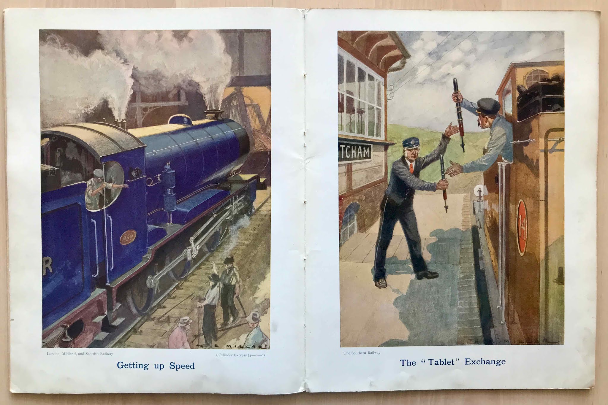
This slender but large format illustrated book dates from around 1925 when it was presented to Master Norman Dore by the Fulham Baptist Band of Hope.  Norman’s good conduct and regular attendance had earned him Second Prize; he also took good care of his book, resisting all temptation to embellish it with his handiwork.  Published by Blackie and illustrated by H R Millar it was one of many such books launched on the market to engage the interest of the junior railway enthusiast.  The illustrations are atmospheric and impressionistic in execution and while paying due respect to the mechanical features on display no attempt has been made to describe them in detail. Scottish born Millar (1869-1942) was a regular contributor of drawings for Punch and Strand Magazine as well as a prolific book illustrator.  Before attending art school he had some training in civil engineering which may have influenced the linear precision to be found in much of his other published work. His collaboration with Edith (Railway Children) Nesbit, best selling author of fantasy books for children, may have been his most fruitful.  Beginning in 1899 he illustrated all her best known books until 1913.  Nesbit, intriguing for her lifelong devotion to socialism, held him in high esteem and his success in bringing her tales of fantastical creatures to life may have encouraged him to write and illustrate his own books. Almost a century after her death in 1924 many of Nesbit’s books remain in print, often reissued with new illustrations including examples by Inga Moore, Brian Robb and Edward Ardizzone. 


Tuesday, 27 July 2021

Some Victorian Steel Engraving

Victorian printing technology steadily advanced through the 19th. century towards the ultimate goal of mass production of photographic imagery.  Along the way the process of printing from engraved imagery on steel plates was constantly refined and improved.  Engraving specialists were kept busy by the demands of mass circulation magazines (The Graphic, Illustrated London News, The Sketch, Punch) for new material to entertain the readers. Pictorial representations of current events, portraits of the great and the good, celebrity portraits and cartoons were especially in demand. Another army of engravers were preparing print versions of critically approved paintings  as shown in Royal Academy exhibitions to enable the rising middle classes to display their taste for the visual arts on the walls of their own homes.  Even more were engaged on topographical subjects - scarcely a manor house, ruined abbey or castle, riverbank, forest, lake, moorland or mountain went unrecorded. There was an affordable prospect for every affluent customer.  The finest of these practitioners achieved spectacular effects in terms of describing detail and creating subtle and dramatic tonal effects through the precision of their mark making.  Reproducing engineering drawings was a highly specialist skill requiring perfect clarity of visual description - this is a section of examples taken from the plates of various encyclopaedias.  They offer impressively analytical images of new applications of steam power and increasingly complex machine technology. Starting with the printing industry, the application of steam in shipping and railways, the selection is completed with a variety of mechanical wood saws. Admire the delicate subtleties of tone, the impersonal drawing and the complete absence of visual rhetoric. 


Friday, 9 July 2021

John Hassall - Poster King

John Hassall is having a moment.  There’s a comprehensive exhibition of his work at the Heath Robinson Museum in Pinner (ending on August 29) accompanied by a new book, The Life and Art of the Poster King by Lucinda Gosling (Unicorn, 2021).  This recognition is long overdue - there has been a persistent reluctance on the part of museums to exhibit the work of graphic artists whose output fell, for the most part into the category of what used to be called commercial art.  The sense that the association of art and advertising is unworthy of close study never quite goes away, along with the gulf in status between Fine Art (engages the higher faculties) and Advertising Art (vaguely disreputable, appeals to the coarser instincts). Curiously as state patronage of the arts declines the art world has been forced into an ever closer funding relationship with the world of business and finance whose tolerance for sponsoring work that questions their activities often wears thin resulting in hidden pressures to focus on work that more closely aligns with corporate interests.  In this context the straightforwardly transactional nature of the work of artists like Hassall can seem less compromised.

The book is superb - the author has unearthed some rarely seen items and chosen to display in depth rather than showcase prime (and often over-familiar) examples. The selection of thumbnail images is generous and judicious and gives a much better impression of the range of Hassall’s output than I’ve ever seen before. Two column text blocks and visual material are well balanced and make for clarity of design. Pictorial boards, illustrated endpapers and a stitched-in bookmark make an excellent package and the absence of a dust-wrapper is something to celebrate.  Hassall’s productivity was a match for Tom Purvis and some of his drawing has the toughness and muscularity of that of Purvis.

Hassall produced all the artwork for this colouring book for children in support of the Belgian Relief Fund in 1914.  The Belgian nation has never been so popular with the British public as it was in the first year of the Great War.  An intensive propaganda campaign in the popular press, demonising the German invaders for the ruthless cruelty inflicted on the civilian population created a great wave of public sympathy, of which this publication was one manifestation.  It is striking to see the extent to which it combined philanthropy with commercial interests - every page had a business sponsor whose consumer products were publicised in Hassall’s drawings in the hope that their virtues would be embedded in young minds as their clumsy brushwork stuttered across the page.  It was presented as an alphabetic sequence with accompanying versification.  Allusions to military campaigns can be found but for the most part the patriotic note is one of restraint.  Given the audience, images of children predominate and the war is very much off stage. None are especially memorable with the possible exception of the sturdy British youth who poses defiantly in his Pesco underwear with hairbrush at the ready, fully prepared to die for King and Country.


Sunday, 27 June 2021

Der Pott, Industriekultur im Ruhrgebiet

A massive block of a book - 640 pages of colour photographs of heavy industry in the Ruhr, mostly relics of the past but a few from the present.  Deindustrialisation wiped out an enormous amount of industrial structures in the region. Some of the more viable plant was exported to China but much of what remained was repurposed as spectacular heritage visitor attractions. More than 70 sites have been combined into a 400 kilometre heritage trail that reaches from Duisburg in the east to Hamm in the west.  Co-ordinating the scheme depended on a level of regional organisation that seems to be impossible in Britain where such sites are numerous but rarely work together.  Another factor that is less common in Germany is the British tendency to eliminate all traces of defunct industrial activity at the earliest opportunity. In part this reflects the shortage of development land in Britain and a pattern of land ownership that is always looking to extract maximum value from land assets. The same forces are at work in Germany but they are subject to stronger regulation in terms of public interest.

There’s long been a sense in Britain that industrial relics are intrinsically unsightly and unworthy of preservation and often the best examples get swept away with the worst.  In the north-east of England an enormous amount of industrial heritage was lost after the deindustrialisation of the region in the 60s and 70s as the ship yards, coal mines and steel works disappeared - it was left to Beamish Museum to salvage what it could but a regionally planned scheme would have been much more comprehensive.  It sometimes felt as if a Ground Zero policy was unofficially sanctioned as if removing the visual evidence of past industry would smooth the transition to a post-industrial future of low-wage insecure employment by breaking the links with lost occupations and the cultural traditions that sustained them.  It’s a process that still goes on - the Mayor of Tees Valley recently posed with indecent pride in front of the closed steelworks at Redcar and proudly announced its total demolition, having rejected all proposals for preservation as a visitor attraction.  The need for regeneration land is held to be paramount despite the vast amount that already exists.

Back to the book - each section has a map or plan, some historic images and explanatory text in English (as well as German and French). Stylistically the photography is primarily intended to record but without the studied neutrality of tone and compositional uniformity found in the work of Bernd and Hilla Becher.  There’s a sense of frontality emphasised by rigorous perspective correction. An interesting comparison is with the photographs of Albert Renger-Patzsch who recorded several of these sites soon after construction in pristine condition before the stresses of intensive operation and the ravages of fire, water, steam and oxidisation brought them to their present state.  Photographs make clear the tension that exists between the architecture of industrial buildings (admin blocks, pit-head enclosures, turbine halls) and the anti-architecture of industrial structures (blast furnaces, smelters, coke ovens, gas tanks, overhead conveyors, cooling towers).  While the buildings are often sensitively proportioned and detailed to incorporate contemporary idioms (Jugendstil, Gründerzeit, Brick Gothic), the industrial plant, despite being meticulously planned in terms of operational requirements, often has an improvisational, bricolage-like appearance, as if random forms have been welded together, as much in hope as expectation.  Functionality is the only consideration whereas architects like to set their sights on higher things in the pursuit of artistic expression. 

So what’s the appeal of the industrial landscape - why is it endlessly fascinating for some while others respond with indifference or outright hostility? Mine is the last generation to be born and raised in a world where the industrial landscape was commonplace, especially so in the north-east where I lived.  Every journey to and from school would pass collieries, shipyards and factories - an unceasing spectacle where welding torches flashed in smoke filled gloom while overhead cranes and hoists propelled massive components in a display of perpetual motion. Pit-head winding gear could be seen spinning at speed, hauling cage-loads of coal to the surface where it was washed, graded and tipped into railway wagons around the clock.  All this industrial activity was so deeply embedded into the locality that to the eyes of a child it seemed it would continue unchanged, for ever.  This is the power of the industrial sublime - to induce nostalgia for jobs that were massively physically demanding and ruinous to health in an environment where water courses were lethally polluted, where the sea was stained charcoal grey from colliery waste and the air quality was laden with toxic fumes. Despite this, displaced industrial workers can often be heard waxing lyrical on the lost camaraderie of the workplace where unions enjoyed 100% support and stood together to resist management’s unreasonable demands. They often recall taking pride in the finished article as the embodiment of their skills and expertise. The continuing appeal of the industrial landscape has cultural, social and aesthetic elements of which the last may prove the most enduring - there’s nothing else in the man-made environment that’s left behind so many extraordinary physical structures enhanced by the patina of ageing and replete with formal repetition wrapped in complex networks of contrasting forms (tubes, cones, pipes, cylinders, grids, filters) on such a vast scale.


See also:


Gelsenkirchen 1914


Past and Present No. 10: Henrichenburg Schiffshebewerk


Ruhrgebiet in Close-up


Margaretenhöhe - refuge from dystopia


Essen Zollverein


Tuesday, 15 June 2021

Motor Wonders

This Thomas Nelson gift book for children dates from 1924 and has a remarkably vibrant set of colour illustrations. The definition of a motor is extended to include any form of transport from motor cycles to zeppelins or battleships to fire appliances, that involves internal combustion.  They are pictures from a perfect world from which all the random untidiness of the streetscene has been removed.  While the sun shines on every scene the technology on display is the most advanced of its time.  It was a time when there was a much less complicated relationship with the idea of progress and continuous improvement.  Calculating the full environmental costs of new technologies has undermined public expectations of a future of endless advance to the frontiers of science.  On the cover is an illustration signed by Hugh Williams and some of those inside are signed by T W Holmes (1872-1929) - an illustrator of children’s annuals and magazines for boys, specialising in transport subjects.