Wednesday, 14 August 2024

Harold Harvey, painting everyday life


This summer’s exhibition at Penlee House, Penzance was devoted to the paintings of Harold Harvey, the only Cornish born artist associated with the Newlyn circle of painters led by Stanhope Forbes and Laura and Harold Knight.  Harvey was an accomplished constructor of convincing figure compositions, ever alert to the awkwardness, discomfort or tension in the individuals portrayed.  Small social gatherings and domestic scenes were minutely observed and described in detail with particular attention to choices of clothing and facial expressions.  Furnishings and decorative accessories in the home came under similar scrutiny. The work of the intensively observed fishing fleet held little interest and he saw the world of the countryside through the lens of manual labour.  Most Newlyn painters ignored the industrial aspect of Cornish life, unwilling to confront the violence done to the local landscape by the activities of extractive industry, notably the excavation of China Clay and the mining of tin and copper.  Distractions of the modern world of popular entertainment and the transport revolution were studiously avoided by almost all local artists but Harvey kept returning to these subjects throughout his career.  Several of his finest paintings - featuring sunbathers and swimmers, girls outside the cinema, travellers on the top deck of a bus - were a product of this fascination.


His figure drawing was uneven in quality, lacking the bravura of Laura Knight or the conviction of Stanhope Forbes, flabbiness kept creeping in. In the 1930s, under the influence of contemporary trends (Stanley Spencer?), he cautiously experimented with figure distortion and elongation to especially good effect in the bathers painting (August 1939).  Two conflicting tendencies can be seen in his use of colour where a preference for clear, vibrant hues applied with firm, controlled brushwork existed alongside a drift into more pastel hues and softer, Renoir-influenced application of paint.  The latter technique being more apparent in portraiture, especially of child subjects.  The key element in his subject choices is his local origin - incomers and outsiders fell heavily for the most picturesque features of Cornish life (fishing, farming and a ravishing coastline in dazzling sunshine).  For Harvey these aspects were taken for granted and he rarely turned to them.  His eyes were focused on a localised experience of everyday life - the domestic middle class interior, the world of work and manual labour, the arrival of mass tourism. Inside the home he was an acute observer of the enigmatic gesture, the unusual body posture and the ambivalent glance, sometimes hinting at an underlying disquiet or noting the vagaries of fashion and the faintly absurd.  Friends and acquaintances described him as affable and good natured, though somewhat taciturn.  In later life he converted to Catholicism but nothing of his spiritual life made its way into his work which remained resolutely materialist.


Monday, 22 July 2024

Georges Perec Arranging One’s Books

Georges Perec had a great talent for writing seriously about matters that most writers would have regarded as beneath their station. Such things as the objects to be seen on his work table, compiling a list of all food and drink that passed his lips in 1974, neighbourhoods, streets, apartments, the date of his birth and the art of arranging books. So all my Perec-related books came down from the shelf for an exercise in rearrangement.  A number of possibilities suggested themselves as follows:

  by height from high to low or reverse

by date of publication

by date of acquisition

alphabetised by title

by colour on the spine

by pagination

by font size

by mass displacement

by ISBN

by degree of reader satisfaction

by degree of water resistance

by degree of calorific energy

by vertical stacking on a horizontal axis

Some of these ideas had to be rejected on the grounds that experimentation with fire and water would involve irreversible damage.  Others were simply too difficult to ascertain - popularity ratings on goodreads only go so far.  Frankly, there were some that made very little sense, suggesting an element of desperation creeping in.  Vertical stacking implied a more sculptural approach - an assemblage rather than an arrangement.  Which lead directly to the photographs posted here.  When the exercise was complete the books returned to the shelf where they presently rest between Jacques Prévert and Jean Claude Izzo.


Friday, 28 June 2024

John Soane and the Bank of England

When the profession of architect emerged in the Western tradition, typical clients were drawn from the ranks of Dukes, Princes, Sovereigns, Archbishops and Popes.  Sir John Soane who worked for 45 years as architect to the Bank of England must have been the first to be employed by corporate finance, designing a group of major banking halls and a grand rotunda. He oversaw every detail of the construction process from the acquisition of land to the choice and sourcing of materials. Soane’s property dealing enabled the bank to realise its ambition to detach itself from the tightly packed jumble of city streets around its boundaries and develop an island site, fit to repel intruders.  Whenever the nation’s leaders embarked on a military conflict or a naval adventure they turned to the bank to raise the finance.  Britain’s colonial expansion was financed from the same source.  The great families of the landed gentry and the rising merchant class looked to the bank as a secure resting place for their assets to generate revenue.  It was a private company whose existence was absolutely crucial to the imperial project from the mastery of the seas to the murky business of extracting value from colonial possessions via the deployment of slave labour.

In a business where trust was vital, the bank had to maintain a spotless reputation for integrity and financial rectitude - it’s instructive to browse the official portraits of past Governors and Deputy Governors to observe their formidably impassive and callous expressions, radiating moral certainty with a flavour of the parsimonious, ill-concealed behind luxuriant displays of facial hair.  It was equally important that the buildings should play their part - on the exterior by presenting facades of impregnability while internally impressing the visitor with grand spaces supported and enclosed by substantial forms designed to convey an overwhelming impression of stability and probity. Soane went above and beyond the call of duty to meet his employer’s requirements in every respect throughout his 45 years in office.

The Bank that Soane built was an institution that dealt directly with the public and the great banking halls, each dedicated to a specific type of investment would be thronged with customers for most of the working day.  This changed over the years as some of the Bank’s functions migrated over the road to the Royal Exchange while financial transactions became increasingly paper-based requiring much less handling of currency while documentation could be delivered by the postal service. By the 1920s all of the Soane-designed public spaces had been sub-divided into cubicles as the Bank ran out of office space and it was decided to embark on a major rebuilding programme of expansion.  Sir Herbert Baker was the chosen architect. Baker had moved from South Africa with a reputation for designing mediocre and pompous civic buildings to England where these qualities were easily mistaken for greatness. Monumental imperialist bluster was his trademark with a sideline in war cemeteries and memorials. By the time Baker’s work was complete the Bank had more than doubled in height leaving Soane’s facade overshadowed by a massive classical portico.  All four of the lofty, light filled, beautifully proportioned banking halls were demolished, an action denounced by Pevsner as “the greatest architectural crime in the City of London of the twentieth century”. this judgement was unlikely to trouble Walker who was knighted shortly after his ruination of the Bank and would go on to work alongside Lutyens on the rebuilding of New Delhi in the 1930s. When he died in 1946 he was buried in Westminster Abbey.

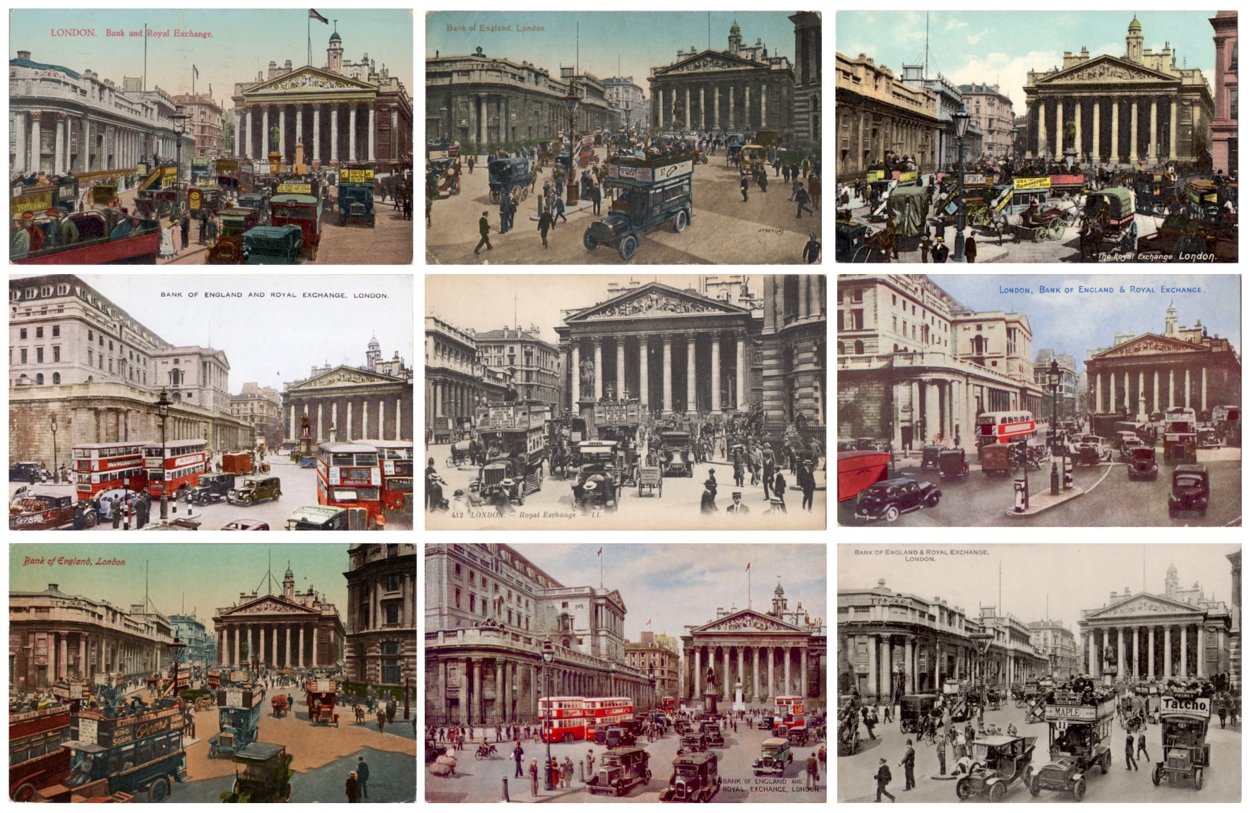
Postcard publishers would regularly dispatch their photographers to record the Bank and the Royal Exchange, a motif that would comfortably sit within the top ten London subjects.  In the montage we have before and after views of the Bank with three of them revealing the overpowering presence of Baker’s additions.  Next is a rare postcard view of the measured proportions of Soane’s frontage follow by three images of Soane-designed banking halls.  The interior views are based on official photographs from 1894, still in circulation in 1910 when these cards were posted to an address in Maida Vale. Last is a YouTube link to a curiously informal natter about Soane and the Bank - a trifle long-winded but authoritative and informing.


Sunday, 26 May 2024

Pioneers of German Graphic Design - Part One


In my judgement, by some distance the best book on this subject in English. Comprehensive and beautifully organised and illustrated, it does real justice to some highly accomplished artists and designers whose achievements tower over many of their counterparts in the English-speaking world.  The Weimar years famously created the conditions for an extraordinary explosion of experimentation and creativity in the visual arts as Germany began rebuilding its industrial power. From 1919 the Bauhaus was promoting a reinvention of architecture and industrial design as well as developing the visual language of Modernism and New Typography (Universal, Futura) whose influence can still be seen today. Herbert Bayer’s work is the best representation of the Bauhaus in this book.  

While commercial and public sector clients were increasingly accepting of radically new graphic styles there was a menacing tide of resistance building as the Nazi culture warriors intruded into every aspect of national life. Most of these designers would run into trouble after 1933 with the rise of the Third Reich and many would be barred from working.  Five were forced into exile, one was murdered in the Holocaust while more than a few made unworthy accommodation with the Nazi regime - at least one, Ludwig Hohlwein was a committed Nazi cheerleader who continued to prosper as his former colleagues faced persecution and, in the case of Julius Klinger, death.

Fourteen key figures have been selected for a twenty page extended career survey, including some like Jan Tschichold known as designers and typographers and Peter Behrens whose graphic work on corporate identity for AEG was complementary to his career as an architect (often for AEG) and designer maker. There are others like Hohlwein who were almost exclusively illustrators, with most combining graphic design with illustration. Emil Preetorius was better known for his 9 year tenure as Stage Director of the Bayreuth Festival until he fell victim to the internal politics of the Wagner clan and in 1942 faced Gestapo interrogation after being accused of being friendly to Jews - his release from detention followed Hitler’s personal intervention.  


Callisto Publishers Berlin, 2017 (ISBN: 9783981753912)


Part 2 (Schulpig to Wiertz) will follow soon.


Wednesday, 22 May 2024

London Stations - Southwark (Jubilee Line)

Opened in 1999 as part of the Jubilee Line Extension (JLE) to Stratford, Southwark has a unique design thanks to the physical constraints of its site close to Waterloo East, the only station to which it has a direct link.  Sir Richard MacCormac, who designed the controversial  Hampstead home of Thierry Henry, was the architect and somehow came up with a subdued theatrical presentation that combined spatial intrigue with formal elegance, all of which is achieved in an understated way, free of grandiose gestures and set pieces.

The ground level entrance is a compact homage to Charles Holden and his preference for circular ticket halls (Arnos Grove, Southgate etc), from which escalators descend to an unexpected  tall and top lit concourse. On one side is a shimmering deep blue wall of triangular glazed tiles, opposite is an austere block built wall pierced by openings for up and down escalators - the sight of the escalators folded into steep dark apertures is strangely unsettling as if they were links to a sinister underworld.  The blue wall is the work of Alexander Beleschenko and has the effect of leading the eye upwards following the tonal trajectory to the crescent of light overhead.  For Simon Jenkins writing in Britain’s 100 Best Stations (Penguin, 2017), Southwark is the jewel of the JLE and he describes it as “idiosyncratic and hard to place in the modernist spectrum”


Thursday, 16 May 2024

At the Imperial War Museum

These are some highlights from a recent visit to the upper decks of the Imperial War Museum to see the recently opened Blavatnik Galleries.  This has enabled the museum to display a more complete survey of their visual arts collection to include film and photography alongside paintings.  A decent selection of the museum’s major paintings was supported by a large group of lesser known pictures from the hidden depths of what is a vast collection of works.  It’s always fascinating to see what emerges from a museum store after a deep curatorial dive and many unjustly neglected paintings (often by female artists) have been rescued from oblivion.

Percy Wyndham Lewis,   A Battery Shelled  (1919)

Lewis had a remarkably inventive visual imagination - his Cubist-inspired bio-mechanical figures were the perfect combatants in a war that was increasingly an inhumane  technological struggle for supremacy.  On the left a stylised trio of officers, two seem lost in thought, only one observes the incoming fire and the frantic efforts of the troops in a shattered landscape on the ground.  Crates of unused shells look terrifyingly vulnerable to enemy fire.

Paul Nash,   The Menin Road  (1919)

Nash served as an officer in this part of the Western Front in early 1917, later that year he returned as a War Artist and made the sketches and studies that would form the basis of this painting completed in London in 1919.  His experiences were condensed into this tormented landscape, blown apart by the exchange of explosive forces.  For an artist whose sensibility was largely formed by a reverence for the natural world, this sight was the ultimate affront. Displaced concrete defences and curls of corrugated iron are scattered on the cratered woodland floor, to which a handful of splintered tree stumps remain anchored.  All under a turbulent sky pierced by searchlight beams, illuminating the scene in a sickly, unnatural glare.

Anna Airy,   Shell Forge, Hackney Marshes  (1918)

With so many male artists overseas, female painters landed some major commissions recording the Home Front.  Anna Airy, an established Slade-trained realist painter in her mid-thirties spent a year travelling the country painting the spectacle of heavy industry in the service of the war effort - manufacturing munitions, assembling aircraft and extracting domestic gas from coking coal.  Her command of perspective and ability to build a coherent composition in challenging environments were every bit as effective as similar works by the much more celebrated Terence Cuneo.

Douglas Fox-Pitt,   Indian Army Injured in Hospital in Dome, Brighton  (1918)

Fox-Pitt was a son of the founder of Oxford’s Pitt Rivers Museum, blessed with competent drawing skills he drifted into the fringes of London’s art world, linking with the painters of the Camden Town Group. In this painting he records a curious wartime episode when the dome of the Brighton Pavilion was commandeered as a hospital for the treatment of Indian and Asian troops injured on the Western Front. It’s a boldly coloured and attractively naive composition - an elevated viewpoint enhances the artist’s pattern making impulse.

John Wood,   ARP in Jamaica  (1941)

Five female nurses of the Order of St John in training in Jamaica. Commissioned as part of the scheme for "War Pictures by Native-born Colonial artists", 1941

Ethel Gabain,   Bunyan-Stannard First Aid Envelope for Burns Victims  (1943)

Sequential four part image showing different aircrew at work with protective silk envelopes shielding their injured hands.  A varied selection of her portraiture (mostly theatrical subjects) and workplace studies from the war can be seen here.

John Singer Sargent,  Gassed (1919)

Sargent’s monumental picture of the victims of mustard gas dominates the space.  Blindfolded and carrying their weapons they process across the picture plain with hands resting on the shoulder of the man in front. Another line of injured men sprawl in the foreground.  In August 1918 Sargent was witness to just such a scene on a day when hundreds of injured men were led from the trenches for treatment behind the lines.  The epic scale and the cinematic presentation make a powerful statement about the random cruelties of armed conflict.